I feel the same this year as I have in the past. Web standards, as an overall idea, has entirely taken hold and won the day. That’s worth celebrating, as the web would be kind of a joke without them. So now, our job is to uphold them. We need to cry foul when we see a browser go rogue and ship an API outside the standards process. That version of competition is what could lead the web back to a dark place where we’re creating browser-specific versions. That becomes painful, we stop doing it, and slowly, the web loses.
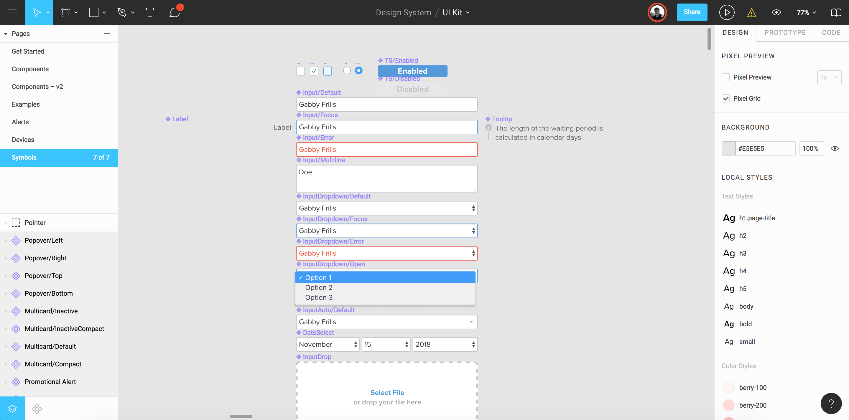
For the past couple of weeks, I’ve been building our UI Kit at Gusto, where I work, and this is a Figma document that contains all of our design patterns and components so that designers on our team can hop in, go shopping for a component that they need, and then get back to working on the problem that they’re trying to solve.
There’s a couple things that I’ve learned since I started. First, building a UI Kit is immensely delicate work and takes a really long time (although it happens to be very satisfying all the while). But, most importantly, embedding Figma components within other components is sort of magic.
Here’s why.
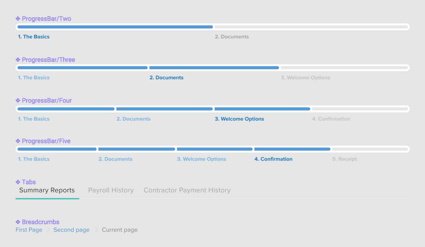
First, it’s important to note that I’ve tried to break down our components into the smallest, littlest chunks. So, for example, our Breadcrumbs, Tabs, and Progress Bar components are all separate from one another and I’ve dumped them all into a Symbols page.
Here’s an example of how I’ve started to build our form elements:
From what I can tell, this is how a lot of UI Kits are designed — there’s a welcome page that introduces what this document is and how to use it; there’s a symbols page that the design systems folks will maintain that has everything from buttons to forms inside it as symbols or components; and then there’s typically another page that has examples of these symbols that represent the final application.
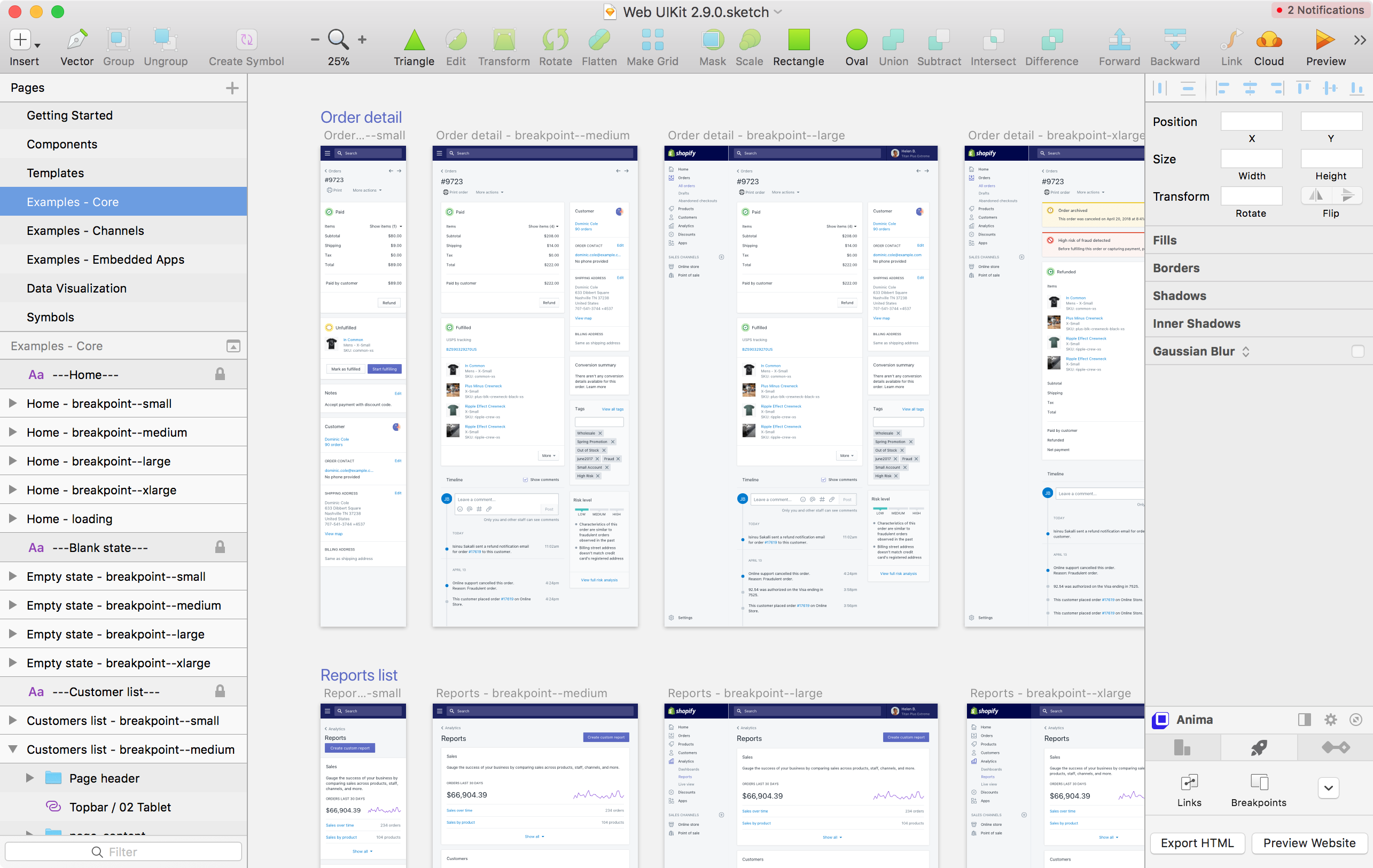
Shopify’s design system, Polaris, does also this with their Sketch file, but so do a lot of examples I’ve seen from other big design teams:
But anyway, going back to my design in Figma — notice below that a forward slash (/) is used in the name of ProgressBar/Two and ProgressBar/Three components.
Well, that’s Figma’s naming convention for identifying Instances. What this means is that when a designer drags in the ProgressBar component from the UI Kit, they can switch between different options, like this:
That’s nifty! But once I broke up our UI into these tiny components, I started to wonder how I might combine these pieces together to make things even easier for our design team. I soon realized that in our app we have navigation items like breadcrumbs or progress bars but they always have a title associated with them. Once I figured that out, I started a series of new components called Header/Default, Header/Breadcrumbs, Header/ProgressBar, etc., which have all these components embedded within them.
So, now when a designer drags in the Header component into their mockups, they can do the following:
We’re switching between the different Header instances there and that doesn’t look like much, yet. But! Since we’re nesting components within our Header component, designers can jump down into the subcomponents, like ProgressBar and update that, too:
How neat is that? And again, this doesn’t look particularly useful just yet but nesting components within larger components means that you can start to use them in clever ways.
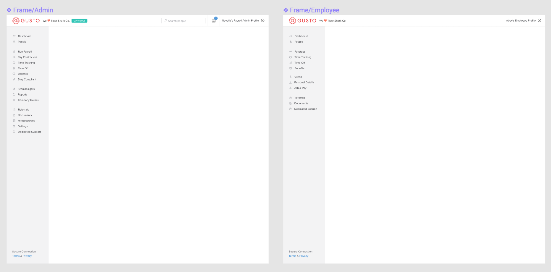
Where this gets interesting is here: at Gusto, we have two different UIs for our types of customers. We have admins that run payroll and then their employees that can access their account to see how much they’ve been paid. There’s different navigation and options for both, so I created two components for them: Frame/Admin and Frame/Employee.
These two components have the sidebar and navigation items but are then placed into a separate component called Layout/Default where we’ve placed our Header component. But since these components are instances and nested together, we can begin to click-clack bits of the UI together to get the precise interface that we want.
Now, whenever designers need to switch between different UIs, they can use these nested components and instances to toggle between them super fast. I’ve only just started experimenting with this but the idea is that by using these nested components you give folks a way to toggle between the different variants inside them whilst also providing a nice API for larger layouts.
If you’re using instances in Figma, Sketch, or another design tool — let me know! I’m constantly on the lookout for improving things here, but I think this is certainly a good start.
With DropInBlog, you can embed a blog into your site in only three minutes. A quick JavaScript/HTML widget, or a full-featured JSON API, is all it takes.
A headless blog you can take anywhere
Ever been working on your existing static site or anything that wasn’t built with WordPress, wanted to integrate a blog, but then couldn’t find a clean solution?
Now you can quickly integrate a full featured blog into any existing site. Actually, any existing page. Drop it right into your existing template. It’s so easy you can be up and running in just a few minutes. Check out this live example:
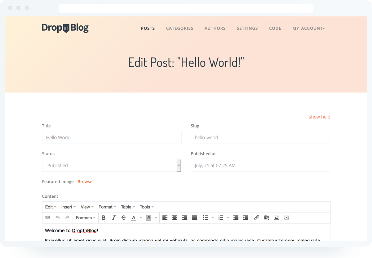
You’ll feel at home with the simple admin panel. Effortlessly create posts, categories, and authors. Tweak the blog output settings and enable features like share buttons, Disqus or Facebook comments with a couple of clicks.
You can embed your blog on a site in about three quick minutes. From there, you have a ton of control to customize and even put a variety of widgets to use, like Author List, Recent Post List, Category List… and more!
Check out this short video to see how quickly you can get up and running:
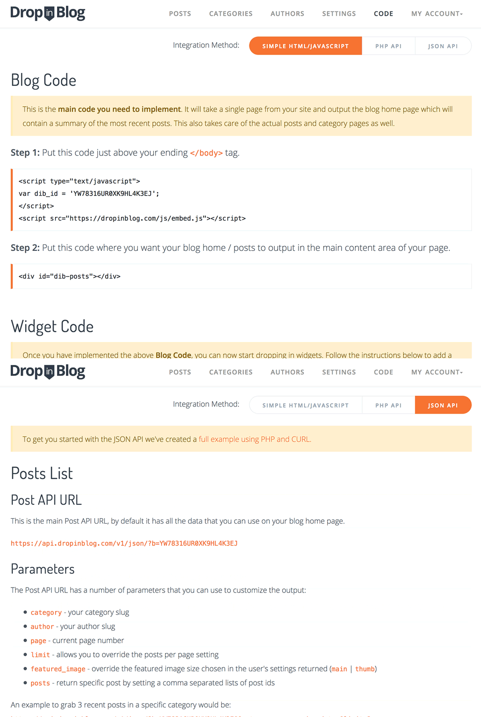
There are a few integration options ranging from the drop-dead simple JavaScript method to the super flexible JSON API. You get to choose what works best for you.
This is such an interesting conversation thread that keeps popping up year after year. The idea is that there could (and perhaps should) be in-browser tooling that helps web designers do their job. This tooling already exists to some degree. Let’s check in on perspectives from a wide array of people and companies who have shared thoughts on this topic.
Ahmad Shadeed wrote for us last year about how DevTools can be useful to designers in a number of ways, like changing state, content, colors, variables, etc.:
Editing things visually like that will give [designers] more control over some design details, they can tweak things in the browser and show the result to the developer to be implemented.
In a post titled, „A DevTools for Designers”, A.J. Kandy wrote that, just because you’re a designer, it doesn’t mean you don’t know how to code — but you might not be production-level and might be faster elsewhere:
I can edit front-end markup; I’m just way faster at drawing rectangles and arranging them into user interfaces. I’m technical, but not a coder.
It sparked a lot of responses and thoughts back when we originally shared the post:
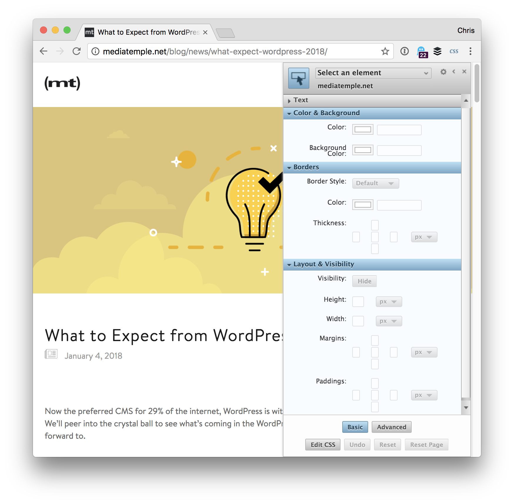
It’s one thing to augment the existing DevTools to be better for designers. Firefox has done great work in that area with stuff like their animation tooling, flexbox and grid inspectors. At the same time, it’s also nice to see entirely fresh takes on how we can approach it! For example, Google dropped VisBug, an extension with designers squarely in mind. The video is only 30 seconds:
There have been a lot of opinions about browser extensions that allow design editing over the years. Check out options like Stylebot (Chrome store link).
There is another visual design browser plugin called Visual Inspector:
Don’t forget this classic trick:
My favourite trick to do in devTools is probably `document.designMode = "on"`. Turn it on and start editing text on any element on a website. Super cool! https://t.co/bdV9yONayTpic.twitter.com/rkC0ZsTCcD
Browser dev tools were traditionally useful for debugging JavaScript and inspecting network requests. More recently, we’ve seen browsers add graphical interfaces for manipulating CSS. Most browsers offer a color picker and eyedropper tool for selecting colors. In Chrome, this tool will helpfully display a color-contrast ratio. Chrome also offers a GUI for adding or tweaking text-shadow and box-shadow.
Perhaps design tooling will lead us in this direction in a big way?
✨isual ✨ evelopment ✨ nvironments
☝️Just like most code-based developers use IDEs to develop software today, we're going to start seeing multiple new VDEs emerge that enable a primarily-visual way of designing and shipping software.
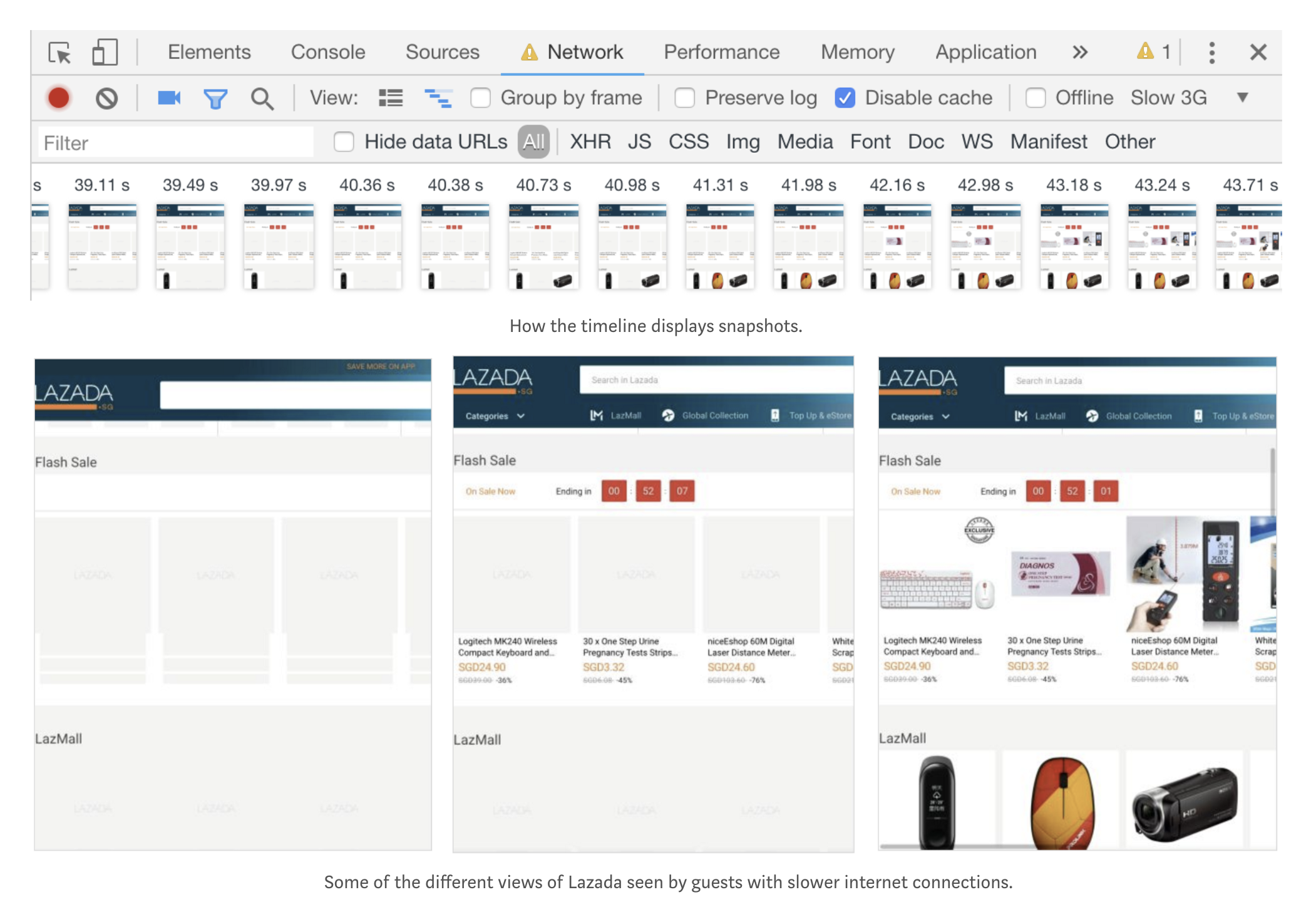
… it’s possible to use Chrome DevTools to investigate competitors, see what’s not working with add-ons, change your viewport, understand page load timings and edit the web; all of which can help digital marketers, product managers or anyone working with a website to do their job more efficiently. It’s a tool which I use every day and I hope that you will too!
Hard to look at all that and not see this is where tooling is headed.
Here’s a great talk by Das Surma where he looks into what Houdini is and how much of it is implemented in browsers. If you’re unfamiliar with that, Houdini is a series of technologies and APIs that gives developers low level access to how CSS properties work in a fundamental way. Check out Ana Tudor’s deep dive into its impact on animations for some incredible examples of it in practice.
What I particularly like about this video is the way Das mentions the CSS Paint API which lets you do a bunch of bizarre things with CSS, such as creating „squircle” shapes and changing how borders work. It looks wonderfully robust and it should give us super powers in the near future. Ruth John wrote up this extensive overview on the topic earlier this year and it’s worth a read as well.
When you need to add icons to your interface, the whole process can really suck. “Should I use all these default bootstrap icons? Maybe I’ll just use the same Google Material icons for the hundredth time?”
Some important yet often overlooked things to consider when choosing an icon set includes, the size of the icons, style, consistency, and quantity. It’s frustrating to find icons that only cover half of the use cases you need.
We constantly felt this frustration too and decided to do something about it. This ultimately led to creating Streamline icon set.
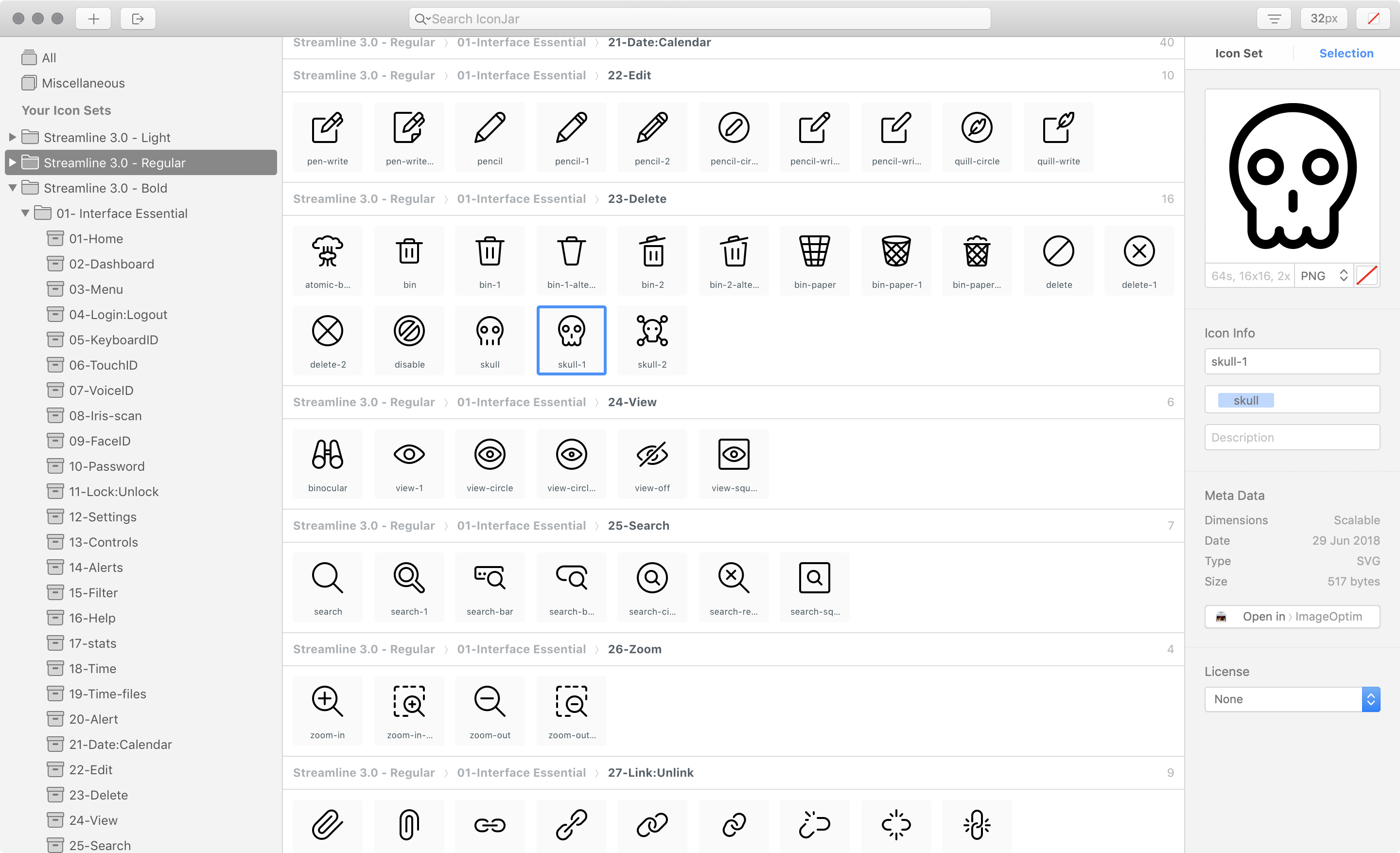
Now in version 3.0, Streamline contains a whopping 30,000 icons in three distinct weights, similar to a font family. There are tons of options to pick the perfect icon for any interface you’re working with, whether it’s a big web application, documentation, or a marketing site.
„I own several icon sets but the one that I return to over and over is the copious Streamline pack, which almost always seems to have just the pictogram I need when I dig into its catalog.”
If you’re an IconJar user, you can also search for icons by name and drag and drop them into your project folder. We’re currently under development on this functionality for our web viewer too.
Every Streamline Icon pack comes with the following file types: .svg, .iconjar, .sketch, .fig, .ai, .pdf, .png, .xd.
So now matter how you like to work with icons, you have the file types you need.
„Streamline 3.0 is one of the most versatile and detailed icon packs I’ve ever used. The structure and hierarchy make it super easy to work with. This is an amazing product. Bravo, Vincent.”
—Stephanie Walter, UX & UI Designer
Optimized SVG
The SVG versions of Streamline is already dev-ready with proper viewbox tags in place and currentColor set as the color properties for all strokes and fills. You can pop in Streamline using your favorite SVG technique and start changing the color of the icons with CSS right out of the gate.
Every weight—light, regular, and bold—was designed with a very consistent style to give you tons of consistency within your interface.
Light
The classic Streamline style with bits of detail here and there. Designed with 1px stroke on a 24px grid. The Light icons are great for interfaces that need lots of fun personality. They also work well scaled up to 48px as small illustrations.
Regular
A new minimal and geometric style. Designed with a 1.5px stroke on a 24px grid. These are perfect to use on clean and modern web interfaces.
Bold
A new solid style akin to the latest iOS guidelines. Designed with fills and a 2px stroke on a 24px grid. The bold style gives a little more punch for an iOS style interface.
Put Streamline to work for you
There are two different package types available—Essential and Ultimate.
Essential contains 14 categories all related to interfaces and web design, whereas the Ultimate pack contains all 53 categories, including things like Pets, Weather, Finance, Outdoors, Transportation, and so much more.
I recently had an opportunity to work on a fantastic research and development project at Netguru. The goal of project (codename: „Wordguru”) was to create a card game that anyone can play with their friends. You can see the outcome here.
One element of the development process was to create an interactive card stack. The card stack had a set of requirements, including:
It should contain a few cards from the collection.
The first card should be interactive.
The user should be able to swipe the card in different directions that indicate an intent to accept, reject or skip the card.
This article will explain how to create that and make it interactive using Vue.js and interact.js. I created an example for you to refer to as we go through the process of creating a component that is in charge of displaying that card stack and a second component that is responsible for rendering a single card and managing user interactions in it.
Let’s start by creating a component that will show a card, but without any interactions just yet. We’ll call this file GameCard.vue and, in the component template, we’ll render a card wrapper and the keyword for a specific card. This is the file we’ll be working in throughout this post.
In the script section of the component, we receive the prop card that contains our card content as well as an isCurrent prop that gives the card a distinct look when needed.
Now that we have a single card, let’s create our card stack.
This component will receive an array of cards and render the GameCard for each card. It’s also going to mark the first card as the current card in the stack so a special styling is applied to it.
Here’s what we’re looking at so far, using the styles pulled from the demo:
At this point, our card looks complete, but isn’t very interactive. Let’s fix that in the next step!
Step 3: Add interactivity to GameCard component
All our interactivity logic will live in the GameCard component. Let’s start by allowing the user to drag the card. We will use interact.js to deal with dragging.
We’ll set the interactPosition initial values to 0 in the script section. These are the values that indicate a card’s order in the stack when it’s moved from its original position.
In the mounted lifecycle hook, we make use of the interact.js and its draggable method. That method allows us to fire a custom function each time the element is dragged (onmove). It also exposes an event object that carries information about how far the element is dragged from its original position. Each time user drags the card, we calculate a new position of the card and set it on the interactPosition property. That triggers our transformString computed property and sets new value of transform on our card.
We use the interact onend hook that allows us to listen when the user releases the mouse and finishes the drag. At this point, we will reset the position of our card and bring it back to its original position: { x: 0, y: 0 }.
We also need to make sure to remove the card element from the Interactable object before it gets destroyed. We do that in the beforeDestroy lifecycle hook by using interact(target).unset(). That removes all event listeners and makes interact.js completely forget about the target.
We need to add one thing in our template to make this work. As our transformString computed property returns a string, we need to apply it to the card component. We do that by binding to the :style attribute and then passing the string to the transform property.
With that done, we have created interaction with our card — we can drag it around!
You may have noticed that the behavior isn’t very natural, specifically when we drag the card and release it. The card immediately returns to its original position, but it would be more natural if the card would go back to initial position with animation to smooth the transition.
That’s where transition comes into play! But adding it to our card introduces another issue: there’s a lag in the card following as it follows the cursor because transition is applied to the element at all times. We only want it applied when the drag ends. We can do that by binding one more class (isAnimating) to the component.
We can add and remove the animation class by changing the isInteractAnimating property.
The animation effect should be applied initially and we do that by setting our property in data.
In the mounted hook where we initialize interact.js, we use one more interact hook (onstart) and change the value of isInteractAnimating to false so that the animation is disabled when the during the drag.
We’ll enable the animation again in the onend hook, and that will make our card animate smoothly to its original position when we release it from the drag.
We also need to update transformString computed property and add a guard to recalculate and return a string only when we are dragging the card.
Our card stack is ready for second set of interactions. We can drag the card around, but nothing is actually happening — the card is always coming back to its original place, but there is no way to get to the second card.
This will change when we add logic that allows the user to accept and rejecting cards.
Step 4: Detect when the card is accepted, rejected, or skipped
The card has three types of interactions:
Accept card (on swipe right)
Reject card (on swipe left)
Skip card (on swipe down)
We need to find a place where we can detect if the card was dragged from its initial position. We also want to be sure that this check will happen only when we finish dragging the card so the interactions do not conflict with the animation we just finished.
We used that place earlier smooth the transition during animation — it’s the onend hook provided by the interact.draggable method.
Let’s jump into the code.
First, we need to store our threshold values. Those values are the distances as the card is dragged from its original position and allows us to determine if the card should be accepted, rejected, or skipped. We use X axis for right (accept) and left (reject), then use the Y axis for downward movement (skip).
We also set coordinates where we want to place a card after it gets accepted, rejected or skipped (coordinates out of user’s sight).
Since those values will not change, we will keep them in the static property of our component, which can be accessed with this.$options.static.interactYThreshold.
We need to check if any of our thresholds were met in our onend hook and then fire the appropriate method that happened. If no threshold is met, then we reset the card to its initial position.
OK, now we need to create a playCard method that’s responsible for handling those interactive actions.
Step 5: Establish the logic to accept, reject, and skip cards
We will create a method that accepts a parameter telling us the user’s intended action. Depending on that parameter, we will set the final position of the current card and emit the accept, reject, or skip event. Let’s go step by step.
First, our playCard method will remove the card element from the Interactable object so that it stops tracking drag events. We do that by using interact(target).unset().
Secondly, we set the final position of the active card depending on the user’s intention. That new position allows us to animate the card and remove it from the user’s view.
Next, we emit an event up to the parent component so we can deal with our cards (e.g. change the current card, load more cards, shuffle the cards, etc.). We want to follow the DDAU principle that states a component should refrain from mutating data it doesn’t own. Since our cards are passed down to our component, it should emit an event up to the place from where those cards come.
Lastly, we hide the card that was just played and add a timeout that allow the card to animate out of view.
Next we created another component that renders the cards in a stack.
Thirdly, we implemented interact.js to allow interactive dragging.
Then we detected when the user wants takes an action with the current card.
Finally, we established the to handle those actions.
Phew, we covered a lot! Hopefully this gives you both a new trick in your toolbox as well as a hands-on use case for Vue. And, if you’ve ever had to build something similar, please share in the comments because it would be neat to compare notes.
There is good news on this front! The standards bodies that be have moved toward a standardizing methods to style scrollbars, starting with the gutter (or width) of them. The main property will be scrollbar-gutter and Geoff has written it up here. Hopefully Autoprefixer will help us as the spec is finalized and browsers start to implement it so we can start writing the standardized version and get any prefixed versions from that.
The subject of scaling CSS came up a lot in a recent ShopTalk Show with Ben Frain. Ben has put a lot of thought into the subject, even writing a complete book on it, Enduring CSS, which is centered around a whole ECSS methodology.
He talked about how there are essentially two solutions for styling at scale:
Total isolation
Total abstraction
Total isolation is some version of writing styles scoped to some boundary that you’ve set up (like a component) in which those styles don’t leak in or out.
Total abstraction is some version of writing styles that are global, yet so generic and re-usable, that they have no unintended side effects.
Total isolation might come from <style scoped> in a .vue file, CSS modules in which CSS class selectors and HTML class attributes are dynamically generated gibberish, or a CSS-in-JS project, like glamerous. Even strictly-followed naming conventions like BEM can be a form of total isolation.
Total abstraction might come from a project, like Tachyons, that gives you a fixed set of class names to use for styling (Tailwind is like a configurable version of that), or a programmatic tool (like Atomizer) that turns specially named HTML class attributes into a stylesheet with exactly what it needs.
It’s the middle ground that has problems. It’s using a naming methodology, but not holding strictly to it. It’s using some styles in components, but also having a global stylesheet that does random other things. Or, it’s having lots of developers contributing to a styling system that has no strict rules and mixes global and scoped styles. Any stylesheet that grows and grows and grows. Fighting it by removing some unused styles isn’t a real solution (and here’s why).
Note that the web is a big place and not all projects need a scaling solution. A huge codebase with hundreds of developers that needs to be maintained for decades absolutely does. My personal site does not. I’ve had my fair share of styling problems, but I’ve never been so crippled by them that I’ve needed to implement something as strict as Atomic CSS (et al.) to get work done. Nor at at any job I’ve had so far. I see the benefits though.
Imagine the scale of Twitter.com over a decade! Nicolas has a great thread where he compares Twitter’s PWA against Twitter’s legacy desktop website.
The legacy site’s CSS is what happens when hundreds of people directly write CSS over many years. Specificity wars, redundancy, a house of cards that can’t be fixed. The result is extremely inefficient and error-prone styling that punishes users and developers alike.
I find GraphQL extremely fun and empowering tech to work with, even as a novice just getting started. You’ve probably heard the elevator pitch before: it allows you to ask for exactly the data you need whenever you need it (probably at the component level), and it arrives as lovely JSON data for your usage.
I see it used as part of modern website builds all the dang time. The overall vibe is, „I want to do whatever I want on the front end, and that actually allows for more back-end choices as well.” And by „whatever” on the front end, that generally means a fancy SPA-ish JavaScript-powered thing or a static-site generator-ish thing.
Here’s a quick smattering of articles that are everywhere these days. Instead of the actual article titles, I’ll rename with the stack parts.