Hey gang, time for another broad update about various goings on as we tend to do occasionally. Some various happenings around here, appearances on other sites, upcoming conferences, and the like.
At the end of this month, October 29th-30th, I’ll be speaking at JAMstack_conf. Ever since I went to a jQuery conference several million years ago (by my count), I’ve always had a special place in my heart for conferences with a tech-specific focus. Certainly this whole world of JAMstack and serverless can be pretty broad, but it’s more focused than a general web design conference.
In December, I’ll be at WordCamp US. I like getting to go to WordPress-specific events to help me stay current on that community. CSS-Tricks is, and always has been a WordPress site, as are many other sites I manage. I like to keep my WordPress development chops up the best I can. I imagine the Gutenburg talk will be hot and heavy! I’ll be speaking as well, generally about front-end development.
Next Spring, March 4th-6th, I’ll be in Seattle for An Event Apart !
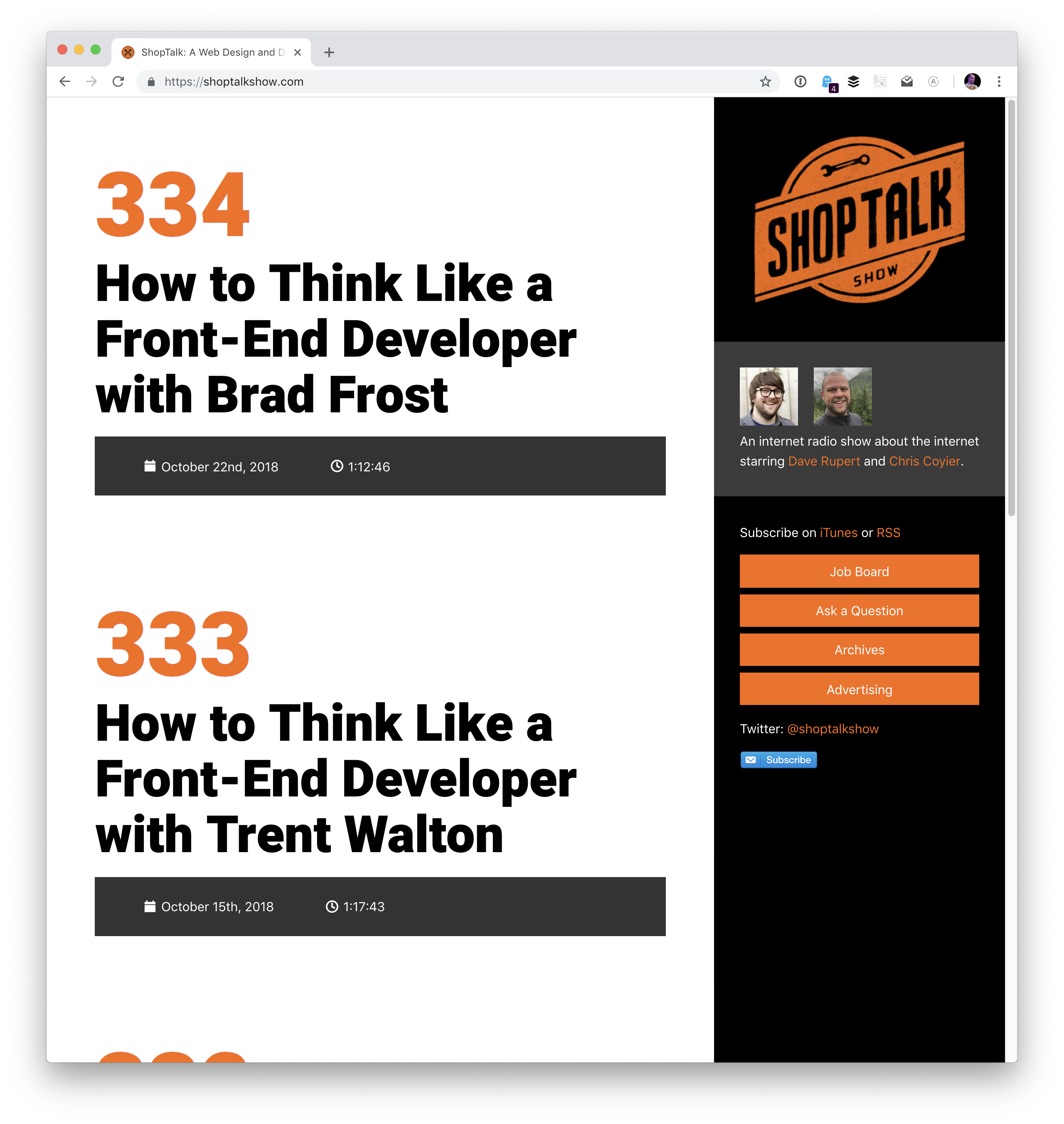
Over on ShopTalk, Dave and I have kicked off a series of shows we’re calling „How to Think Like a Front-End Developer.”
I’ve been fascinated by this idea for a while and have been collecting thoughts on it. I have my own ideas, but I want to contrast them with the ideas of other front-end developers much more accomplished than myself! My goal is to turn all this into a talk that I can give toward the end of this year and next year. This is partially inspired by some posts we’ve published here over the years:
…as well other people’s work, of course, like Brad Frost and Dan Mall’s Designer/Developer Workflow, and Lara Schenck and Mandy Michael’s thoughts on front-end development. Not to mention seismic shifts in the front-end development landscape through New JavaScript and Serverless.
Speaking of ShopTalk, a while back Dave and I mused about wanting to redesign the ShopTalk Show website. We did all this work on the back end making sure all the data from our 350+ episodes is super clean and easy to work when, then I slapped a design on top of it that is honestly pretty bad.
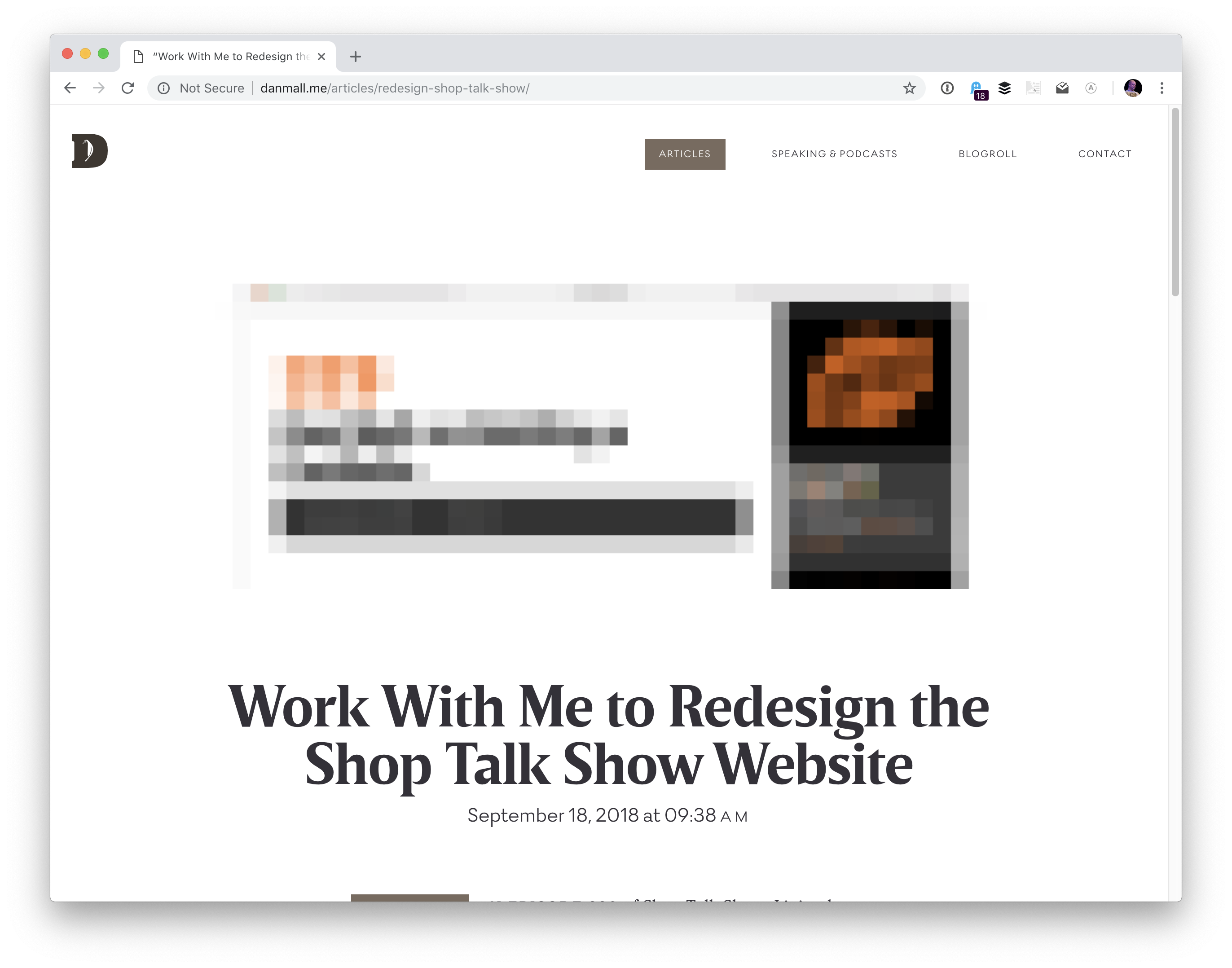
Dan Mall heard us talk about it and reached out to us to see if he could help. Not to do the work himself… that would be amazing, but Dan had an even better idea. Instead, we would all work together to find a newcomer to design and have them work under Dan’s direction and guidence to design the site. Here’s Dan’s intro post (and note that applications are now closed).
We’re currently in the process of narrowing down the applicants and interviewing finalists. We’re planning on being very public about the process, so not only will we hopefully be helping someone who could use a bit of a break into this industry, but we’ll also help anyone else who cares to watch it happen.
I’ve recently had the pleasure of being a guest on other shows.
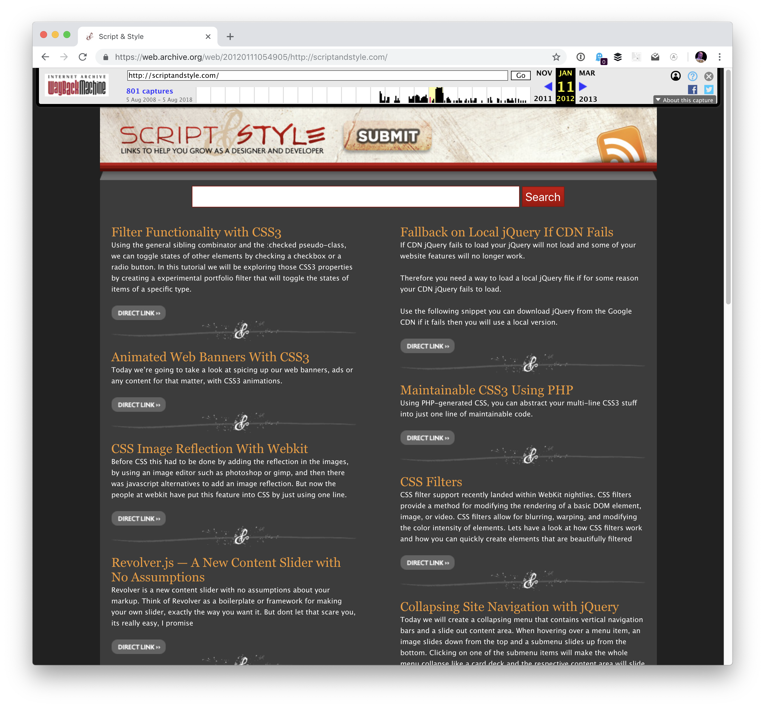
First up, I was on the Script & Style Show with David Walsh and Todd Gardner
I love that David has ressurected the name Script & Style. We did a site together quite a few years back with that same name!
What one piece of advice would you give to other makers?
I’d say that you’re lucky. The most interesting people I know that seem to lead the most fulfilling, long, and interesting lives are those people who do interesting things, make interesting things, and generally just engage with life at a level deeper than just skating by or watching.
If you happen to live in Central Oregon, note that our BendJS meetups have kicked back up for the season. We’ve been having them right at our CodePen office and it’s been super fun.
I haven’t even gotten to CodePen stuff yet! Since my last chronicle, we’ve brought in a number of new employees, like Klare Frank, Cassidy Williams, and now Stephen Shaw. We’re always chugging away at polishing and maintaining CodePen, building new features, encouraging community, and everything else that running a social coding site requires.
Oh and hey! CodePen is now a registered trademark, so I can do this: CodePen®. One of our latest user-facing features is pinned items. Rest assured, we have loads of other features that are in development for y’all that are coming soon.
If you’re interested in the technology side of CodePen, we’ve dug into lots of topics lately on CodePen radio like:
Kelly Sutton with good advice on code reviews. Hard to pick a favorite. I like all the stuff about minding your tone and getting everyone involved, but I also think the computerization stuff is important:
If a computer can decide and enforce a rule, let the computer do it. Arguing spaces vs. tabs is not a productive use of human time.
Kelly Sutton with good advice on code reviews. Hard to pick a favorite. I like all the stuff about minding your tone and getting everyone involved, but I also think the computerization stuff is important:
If a computer can decide and enforce a rule, let the computer do it. Arguing spaces vs. tabs is not a productive use of human time.
CSS is designed in a way that allows for relatively seamless addition of new features. Since the dawn of the language, specifications have required browsers to gracefully ignore any properties, values, selectors, or at-rules they do not support. Consequently, in most cases, it is possible to successfully use a newer technology without causing any issues in older browsers.
Consider the relatively new caret-color property (it changes the color of the cursor in inputs). Its support is still low but that does not mean that we should not use it today.
.myInput {
  color: blue;
  caret-color: red;
}
Notice how we put it right next to color, a property with practically universal browser support; one that will be applied everywhere. In this case, we have not explicitly discriminated between modern and older browsers. Instead, we just rely on the older ones ignoring features they do not support.
It turns out that this pattern is powerful enough in the vast majority of situations.
When feature detection is necessary
In some cases, however, we would really like to use a modern property or property value whose use differs significantly from its fallback. In those cases, @supports comes to the rescue.
@supports is a special at-rule that allows us to conditionally apply any styles in browsers that support a particular property and its value.
@supports (display: grid) {
  /* Styles for browsers that support grid layout... */
}
It works analogously to @media queries, which also only apply styles conditionally when a certain predicate is met.
To illustrate the use of @supports, consider the following example: we would like to display a user-uploaded avatar in a nice circle but we cannot guarantee that the actual file will be of square dimensions. For that, the object-fit property would be immensely helpful; however, it is not supported by Internet Explorer (IE). What do we do then?
As a not-so-pretty fallback, we will squeeze the image width within the avatar at the cost that wider files will not completely cover the avatar area. Instead, our single-color background will appear underneath.
Even though the Selectors Level 4 specification is still a Working Draft, some of the selectors it defines — such as :placeholder-shown — are already supported by many browsers. Should this trend continue (and should the draft retain most of its current proposals), this level of the specification will introduce more new selectors than any of its predecessors. In the meantime, and also while IE is still alive, CSS developers will have to target a yet more diverse and volatile spectrum of browsers with nascent support for these selectors.
It will be very useful to perform feature detection on selectors. Unfortunately, @supports is only designed for testing support of properties and their values, and even the newest draft of its specification does not appear to change that. Ever since its inception, it has, however, defined a special production rule in its grammar whose sole purpose is to provide room for potential backwards-compatible extensions, and thus it is perfectly feasible for a future version to add the ability to condition on support for particular selectors. Nevertheless, that eventuality remains entirely hypothetical.
Selector counterpart to @supports
First of all, it is important to emphasize that, analogous to the aforementioned caret-color example where @supports is probably not necessary, many selectors do not need to be explicitly tested for either. For instance, we might simply try to match ::selection and not worry about browsers that do not support it since it will not be the end of the world if the selection appearance remains the browser default.
Nevertheless, there are cases where explicit feature detection for selectors would be highly desirable. In the rest of this article, we will introduce a pattern for addressing such needs and subsequently use it with :placeholder-shown to build a CSS-only alternative to the Material Design text field with a floating label.
Fundamental property groups of selectors
In order to avoid duplication, it is possible to condense several identical declarations into one comma-separated list of selectors, which is referred to as group of selectors.
Thus we can turn:
.foo { color: red }
.bar { color: red }
…into:
.foo, .bar { color: red }
However, as the Selectors Level 3 specification warns, these are only equivalent because all of the selectors involved are valid. As per the specification, if any of the selectors in the group is invalid, the entire group is ignored. Consequently, the selectors:
..foo { color: red } /* Note the extra dot */
.bar { color: red }
…could not be safely grouped, as the former selector is invalid. If we grouped them, we would cause the browser to ignore the declaration for the latter as well.
It is worth pointing out that, as far as a browser is concerned, there is no difference between an invalid selector and a selector that is only valid as per a newer version of the specification, or one that the browser does not know. To the browser, both are simply invalid.
We can take advantage of this property to test for support of a particular selector. All we need is a selector that we can guarantee matches nothing. In our examples, we will use :not(*).
.foo { color: red }

:not(*):placeholder-shown,
.foo {
  color: green
}
Let us break down what is happening here. An older browser will successfully apply the first rule, but when processing the the rest, it will find the first selector in the group invalid since it does not know :placeholder-shown, and thus it will ignore the entire selector group. Consequently, all elements matching .foo will remain red. In contrast, while a newer browser will likely roll its robot eyes upon encountering :not(*) (which never matches anything) it will not discard the entire selector group. Instead, it will override the previous rule, and thus all elements matching .foo will be green.
Notice the similarity to @supports (or any @media query, for that matter) in terms of how it is used. We first specify the fallback and then override it for browsers that satisfy a predicate, which in this case is the support for a particular selector — albeit written in a somewhat convoluted fashion.
We can use this technique for our input with a floating label to separate browsers that do from those that do not support :placeholder-shown, a pseudo-class that is absolutely vital to this example. For the sake of relative simplicity, in spite of best UI practices, we will choose our fallback to be only the actual placeholder.
As before, the key is to first add styles for older browsers. We hide the label and set the color of the placeholder.
.input {
  height: 3.2em;
  position: relative;
  display: flex;
  align-items: center;
  font-size: 1em;
}

.input-control {
  flex: 1;
  z-index: 2; /* So that it is always "above" the label */
  border: none;
  padding: 0 0 0 1em;
  background: transparent;
  position: relative;
}

.input-label {
  position: absolute;
  top: 50%;
  right: 0;
  bottom: 0;
  left: 1em; /* Align this with the control's padding */
  z-index: 1;
  display: none; /* Hide this for old browsers */
  transform-origin: top left;
  text-align: left;
}
For modern browsers, we can effectively disable the placeholder by setting its color to transparent. We can also align the input and the label relative to one other for when the placeholder is shown. To that end, we can also utilize the sibling selector in order to style the label with respect to the state of the input.
Finally, the trick! Exactly like above, we override the styles for the label and the input for modern browsers and the state where the placeholder is not shown. That involves moving the label out of the way and shrinking it a little.
Fundamentally, this technique requires a selector that matches nothing. To that end, we have been using :not(*); however, its support is also limited. The universal selector * is supported even by IE 7, whereas the :not pseudo-class has only been implemented since IE 9, which is thus the oldest browser in which this approach works. Older browsers would reject our selector groups for the wrong reason — they do not support :not! Alternatively, we could use a class selector such as .foo or a type selector such as foo, thereby supporting even the most ancient browsers. Nevertheless, these make the code less readable as they do not convey that they should never match anything, and thus for most modern sites, :not(*) seems like the best option.
As for whether the property of groups of selectors that we have been taking advantage of also holds in older browsers, the behavior is illustrated in an example as a part of the CSS 1 section on forward-compatible parsing. Furthermore, the CSS 2.1 specification then explicitly mandates this behavior. To put the age of this specification in perspective, this is the one that introduced :hover. In short, while this technique has not been extensively tested in the oldest or most obscure browsers, its support should be extremely wide.
Lastly, there is one small caveat for Sass users (Sass, not SCSS): upon encountering the :not(*):placeholder-shown selector, the compiler gets fooled by the leading colon, attempts to parse it as a property, and when encountering the error, it advises the developer to escape the selector as so: \:not(*):placeholder-shown, which does not look very pleasant. A better workaround is perhaps to replace the backslash with yet another universal selector to obtain *:not(*):placeholder-shown since, as per the specification, it is implied anyway in this case.
Dependencies in JavaScript are pretty straightforward. I can’t write library.doThing() unless library exists. If library changes in some fundamental way, things break and hopefully our tests catch it.
Dependencies in CSS can be a bit more abstract. Robin just wrote in our newsletter how the styling from certain classes (e.g. position: absolute) can depend on the styling from other classes (e.g. position: relative) and how that can be — at best — obtuse sometimes.
Design has dependencies too, especially in design systems. Nathan Curtis:
You release icon first, and then other components that depend on it later. Then, icon adds minor features or suffers a breaking change. If you update icon, you can’t stop there. You must ripple that change through all of icon’s dependent in the library too.
“If we upgrade and break a component, we have to go through and fix all the dependent components.” — Jony Cheung, Software Engineering Manager, Atlassian’s Atlaskit
The biggest changes happen with the smallest components.
.email::before {
  content: attr(data-done) " Email: "; /* This gets inserted before the email address */
}
The property generally takes anything you drop in there. However, there are some invalid values it won’t accept. I heard from someone recently who was confused by this, so I had a little play with it myself and learned a few things.
This works fine:
/* Valid */
::after {
  content: "1";
}
…but this does not:
/* Invalid, not a string */
::after {
  content: 1;
}
I’m not entirely sure why, but I imagine it’s because 1 is a unit-less number (i.e. 1 vs. 1px) and not a string. You can’t trick it either! I tried to be clever like this:
But of course, you’d never use generated content for important information like a price, right?! (Please don’t. It’s not very accessible, nor is the text selectable.)
Even though you can get and display that number, it’s just a string. You can’t really do anything with it.
Heads up! Don’t try concatenating strings like you might in PHP or JavaScript:
/* These will break */
::after {
  content: "1" . "2" . "3";
  content: "1" + "2" + "3";

  /* Use spaces */
  content: "1" "2" "3";
  /* Or nothing */
  content: "1 2 3";
  /* The type of quote (single or double) doesn't matter, but content not coming back from attr() does need to be quoted. */
}
There is a thing in the spec for converting attributes into the actual type rather than treating them all like strings…
<wood length="12" />
wood {
  width: attr(length em); /* or other values like "number", "px", or "url" */
}
…but I’m fairly sure that isn’t working anywhere yet. Plus, it doesn’t help us with pseudo elements anyway, since strings already work and numbers don’t.
The person who reached out to me over email was specifically confused why they were unable to use calc() on content. I’m not sure I can help you do math in this situation, but it’s worth knowing that pseudo elements can be counters, and those counters can do their own limited form of math. For example, here’s a counter that starts at 12 and increments by -2 for each element at that level in the DOM.
The only other thing we haven’t mentioned here is that a pseudo element can be an image. For example:
p:before {
  content: url(image.jpg);
}
…but it’s weirdly limited. You can’t even resize the image. ¯\_(ツ)_/¯
Much more common is using an empty string for the value (content: "";) which can do things like clear floats but also be positioned, sized and have a background of its own.
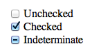
There is a such thing as an indeterminate checkbox value. It’s a checkbox (<input type="checkbox">) that isn’t checked. Nor is it not checked. It’s indeterminate.
We can even select a checkbox in that state and style it with CSS!
Some curious points though:
It’s only possible to set via JavaScript. There is no HTML attribute or value for it.
It doesn’t POST (or GET or whatever else) or have a value. It’s like being unchecked.
And, for whatever reason, you make that checkbox indeterminate:
let veg = document.querySelector(".veg");
veg.indeterminate = true;
If you serialize that form and take a look at what will POST, you’ll get "name=Chris". No value for the checkbox. Conversely, had you checked the checkbox in the HTML and didn’t touch it in JavaScript, you’d get "name=Chris&vegetarian=on".
Apparently, this is by design. Checkboxes are meant to be boolean, and the indeterminate value is just an aesthetic thing meant to indicate that visual „child” checkboxes are in a mixed state (some checked, some not). That’s fine. Can’t change it now without serious breakage of websites.
But say you really need to know on the server if a checkbox is in that indeterminate state. The only way I can think of is to have a buddy hidden input that you keep in sync.
let veg = document.querySelector(".veg");
let veg_value = document.querySelector(".veg-value");
veg.indeterminate = true;
veg_value.value = "indeterminate";
I’ve set the indeterminate value of one input and I’ve set another hidden input value to "indeterminate", which I can POST. Serialized means it looks like "name=Chris&vegetarian-value=indeterminate". Good enough.
There is a such thing as an indeterminate checkbox value. It’s a checkbox (<input type="checkbox">) that isn’t checked. Nor is it not checked. It’s indeterminate.
We can even select a checkbox in that state and style it with CSS!
Some curious points though:
It’s only possible to set via JavaScript. There is no HTML attribute or value for it.
It doesn’t POST (or GET or whatever else) or have a value. It’s like being unchecked.
And, for whatever reason, you make that checkbox indeterminate:
let veg = document.querySelector(".veg");
veg.indeterminate = true;
If you serialize that form and take a look at what will POST, you’ll get "name=Chris". No value for the checkbox. Conversely, had you checked the checkbox in the HTML and didn’t touch it in JavaScript, you’d get "name=Chris&vegetarian=on".
Apparently, this is by design. Checkboxes are meant to be boolean, and the indeterminate value is just an aesthetic thing meant to indicate that visual „child” checkboxes are in a mixed state (some checked, some not). That’s fine. Can’t change it now without serious breakage of websites.
But say you really need to know on the server if a checkbox is in that indeterminate state. The only way I can think of is to have a buddy hidden input that you keep in sync.
let veg = document.querySelector(".veg");
let veg_value = document.querySelector(".veg-value");
veg.indeterminate = true;
veg_value.value = "indeterminate";
I’ve set the indeterminate value of one input and I’ve set another hidden input value to "indeterminate", which I can POST. Serialized means it looks like "name=Chris&vegetarian-value=indeterminate". Good enough.