There’s a ton of very quotable stuff from Rachel Andrew’s latest post all about CSS and how we talk about it in the community:
CSS has been seen as this fragile language that we stumble around, trying things out and seeing what works. In particular for layout, rather than using the system as specified, we have so often exploited things about the language in order to achieve far more complex layouts than it was ever designed for. We had to, or resign ourselves to very simple looking web pages.
Rachel goes on to argue that we probably shouldn’t disparage CSS for being so weird when there are very good reasons for why and how it works — not to mention that it’s getting exponentially more predictable and powerful as time goes by:
There is frequently talk about how developers whose main area of expertise is CSS feel that their skills are underrated. I do not think we help our cause by talking about CSS as this whacky, quirky language. CSS is unlike anything else, because it exists to serve an environment that is unlike anything else. However we can start to understand it as a designed language, with much consistency. It has codified rules and we can develop ways to explain and teach it, just as we can teach our teams to use Bootstrap, or the latest JavaScript framework.
I tend to feel the same way and I’ve been spending a lot of time thinking about how best to reply to folks that argue that “CSS is dumb and weird.” It can sometimes be a demoralizing challenge, attempting to explain why your career and area of expertise is a useful one.
I guess the best way to start doing that is to stand up and say, “No, CSS is not dumb and weird. CSS is awesome!”
WordPress 5.0 is quickly approaching, and the new Gutenberg editor is coming with it. There’s been a lot of discussion in the WordPress community over what exactly that means for users, designers, and developers. And while Gutenberg is sure to improve the writing experience, it can cause a bit of a headache for developers who now need to ensure their plugins and themes are updated and compatible.
One of the clearest ways you can make sure your theme is compatible with WordPress 5.0 and Gutenberg is to add some basic styles for the new blocks Gutenberg introduces. Aside from the basic HTML blocks (like paragraphs, headings, lists, and images) that likely already have styles, you’ll now have some complex blocks that you probably haven’t accounted for, like pull quotes, cover images, buttons, and columns. In this article, we’re going to take a look at some styling conventions for Gutenberg blocks, and then add our own styles for Gutenberg’s Columns block.
Block naming conventions
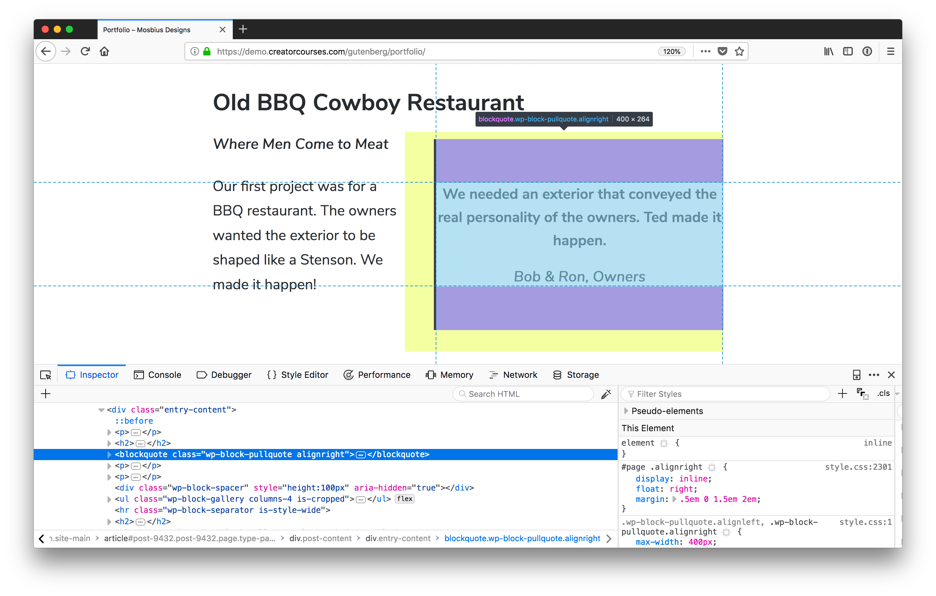
First things first: how are Gutenberg blocks named? If you’re familiar with the code inspector, you can open that up on a page using the block you want to style, and check it for yourself:
The Gutenberg Pull Quote block has a class of wp-block-pullquote.
Now, it could get cumbersome to do that for each and every block you want to style, and luckily, there is a method to the madness. Gutenberg blocks use a form of the Block, Element, Modifier (BEM) naming convention. The main difference is that the top level for each of the blocks is wp . So, for our pull quote, the name is wp-block-pullquote. Columns would be wp-block-columns, and so on. You can read more about it in the WordPress Development Handbook.
Class name caveat
There is a small caveat here in that the block name may not be the only class name you’re dealing with. In the example above, we see that the class alignright is also applied. And Gutenberg comes with two new classes: alignfull and alignwide. You’ll see in our columns that there’s also a class to tell us how many there are. But we’ll get to that soon.
Applying your own class names
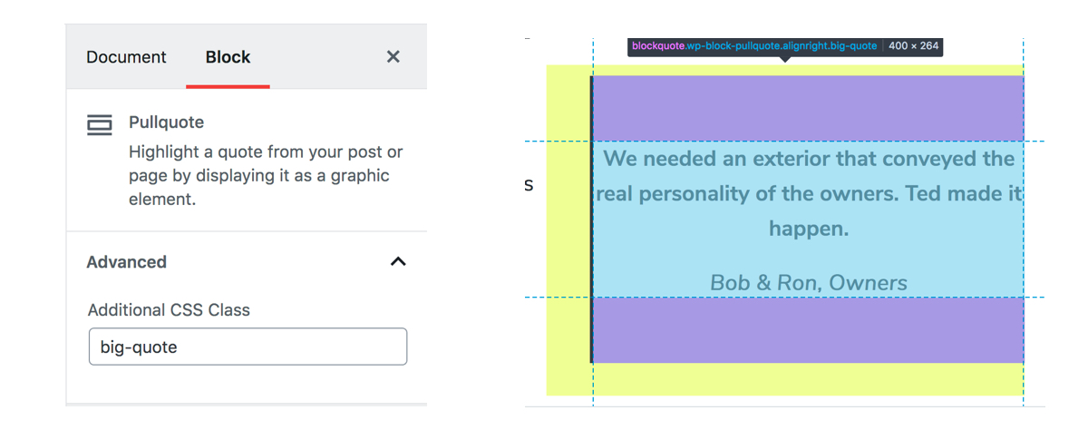
Gutenberg blocks also give us a way to apply our own classes:
The class added to the options panel in the Gutenberg editor (left). It gets applied to the element, as seen in DevTools (right).
This is great if you want to have a common set of classes for blocks across different themes, want to apply previously existing classes to blocks where it makes sense, or want to have variations on blocks.
Much like the current (or “Classic”) WordPress post editor, Gutenberg makes as few choices as possible for the front end, leaving most of the heavy lifting to us. This includes the columns, which basically only include enough styles to make them form columns. So we need to add the padding, margins, and responsive styles.
Styling columns
Time to get to the crux of the matter: let’s style some columns! The first thing we’ll need to do is find a theme that we can use. There aren’t too many that have extensive Gutenberg support yet, but that’s actually good in our case. Instead, we’re going to use a theme that’s flexible enough to give us a good starting point: Astra.
Astra is available for free in the WordPress Theme Directory. (Source)
Astra is a free, fast, and flexible theme that has been designed to work with page builders. That means that it can give us a really good starting template for our columns. Speaking of which, we need some content. Here’s what we’ll be working with:
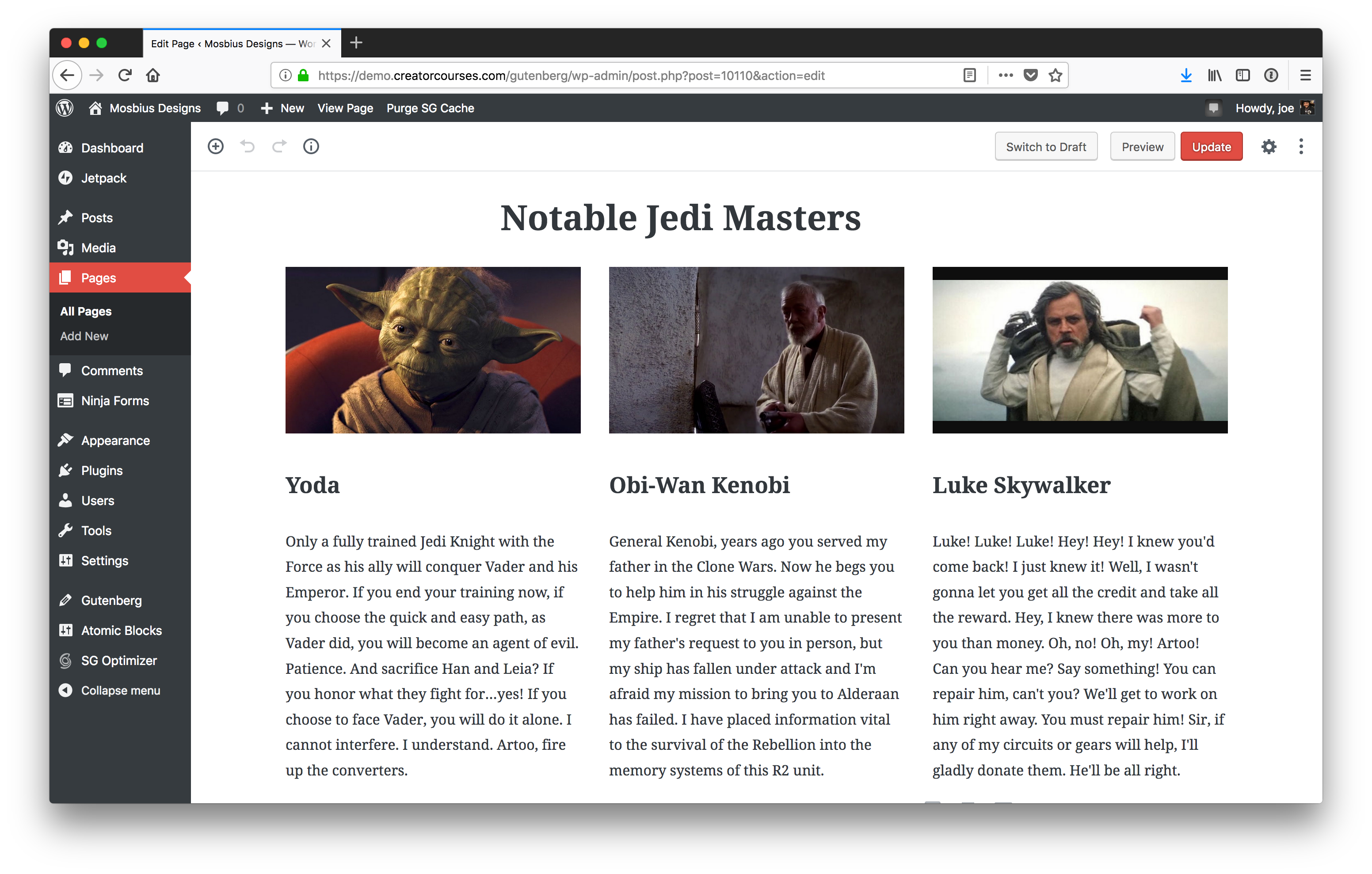
Our columns inside the Gutenberg editor.
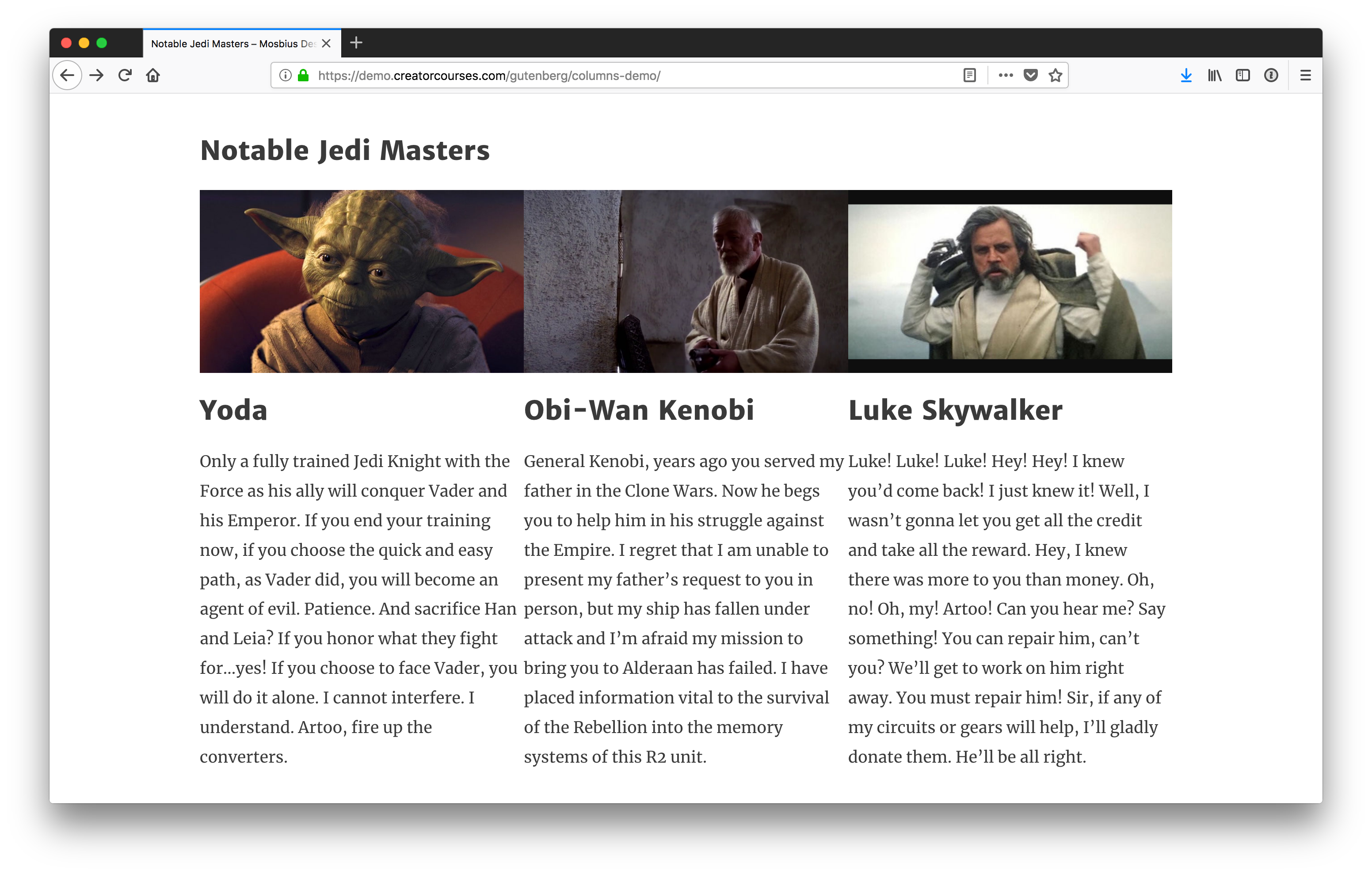
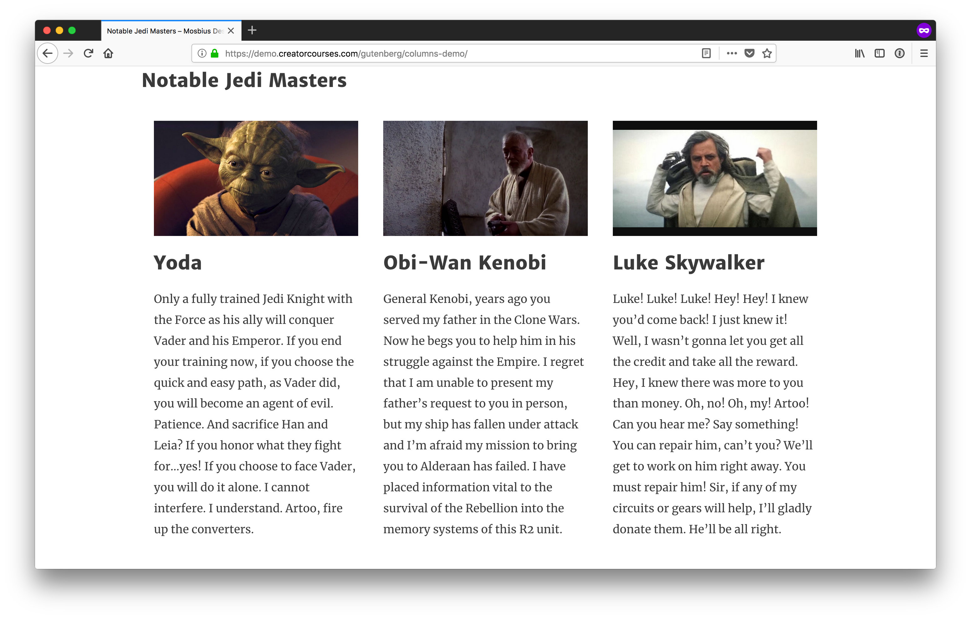
We have a three-column layout with images, headings, and text. The image above is what the columns look like inside the Gutenberg editor. Here’s what they look like on the front end:
Our columns on the front end.
You can see there are a few differences between what we see in the editor and what we see on the front end. Most notably, there is no spacing in between the columns on the front end. The left end of the heading on the front end is also lined up with the left edge of the first column. In the editor, it is not because we’re using the alignfull class.
Note: For the sake of this tutorial, we’re going to treat .alignfull, .alignwide, and no alignment the same, since the Astra theme does not support the new classes yet.
How Gutenberg columns work
Now that we have a theme, we to answer the question: “how do columns in Gutenberg work?”
Until recently, they were actually using CSS grid, but then switched to flexbox. (The reasoning was that flexbox offers wider browser support.) That said, the styles are super light:
We’ve got a pen with the final styles if you want to see the result we are aiming for. You can see in it that Gutenberg is only defining the flexbox and then stating each column should be the same length. But you’ll also notice a couple of other things:
The parent container is wp-block-columns.
There’s also the class has-3-columns, noting the number of columns for us. Gutenberg supports anywhere from two to six columns.
The individual columns have the class wp-block-column.
This information is enough for us to get started.
Styling the parents
Since we have flexbox applied by default, the best action to take is to make sure these columns look good on the front end in a larger screen context like we saw earlier.
First and foremost, let’s add some margins to these so they aren’t running into each other, or other elements:
/* Add vertical breathing room to the full row of columns. */
.wp-block-columns {
  margin: 20px 0;
}

/* Add horiztonal breathing room between individual columns. */
.wp-block-column {
  margin: 0 20px;
}
Since it’s reasonable to assume the columns won’t be the only blocks on the page, we added top and bottom margins to the whole parent container so there’s some separation between the columns and other blocks on the page. Then, so the columns don’t run up against each other, we apply left and right margins to each individual column.
Columns with some margins added.
These are starting to look better already! If you want them to look more uniform, you can always throw text-align: justify; on the columns, too.
Making the columns responsive
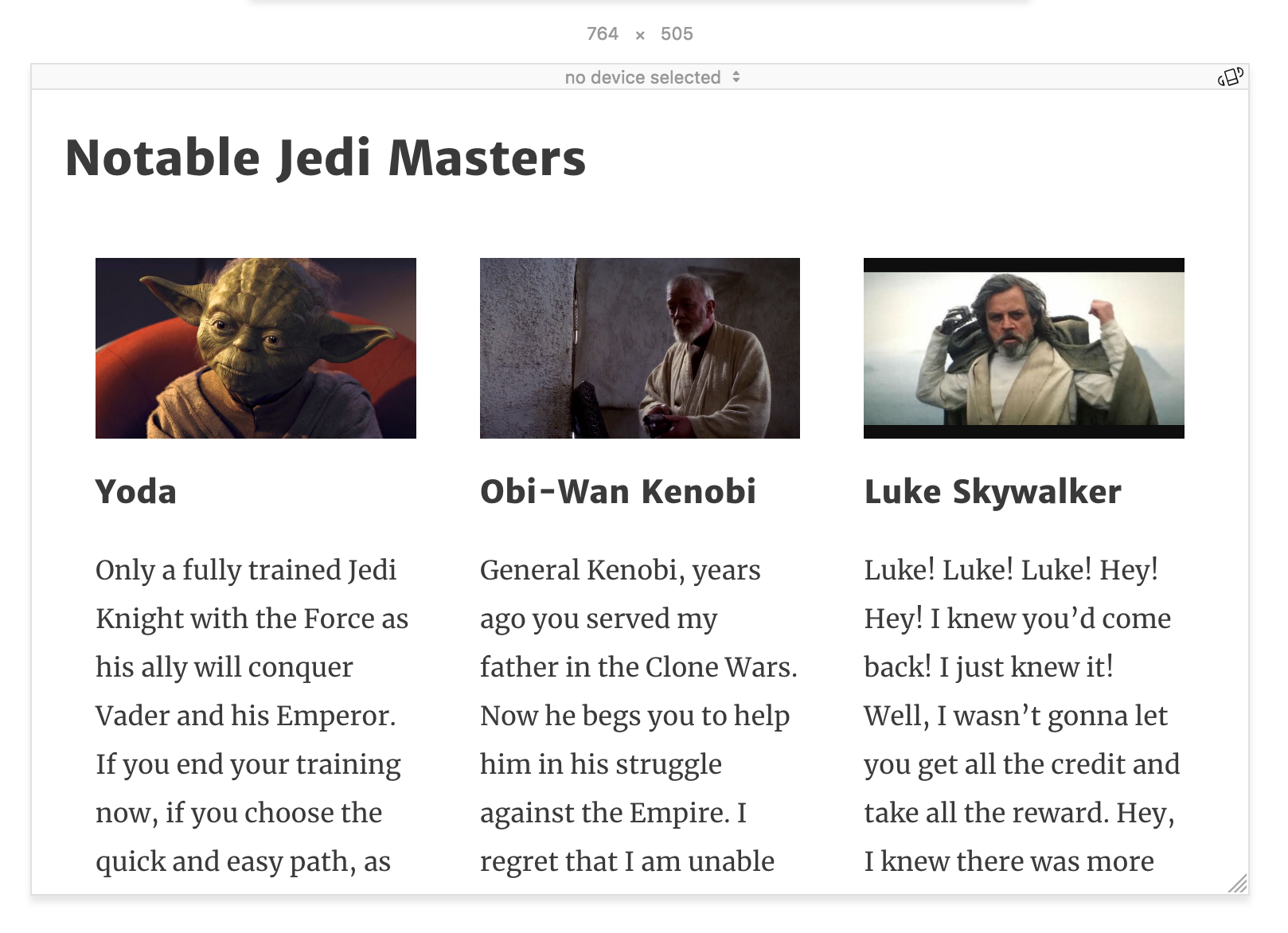
The layout starts to fall apart when we move to smaller screen widths. Astra does a nice job with reducing font sizes as we shrink down, but when we start to get around 764px, things start to get a little cramped:
Our columns at 764px wide.
At this point, since we have three columns, we can explicitly style the columns using the .has-3-columns class. The simplest solution would be to remove flexbox altogether:
This would automatically convert our columns into blocks. All we’d need to do now is adjust the padding and we’re good to go — it’s not the prettiest solution, but it’s readable. I’d like to get a little more creative, though. Instead, we’ll make the first column the widest, and then the other two will remain columns under the first one.
This will only work depending on the content. I think here it’s forgivable to give Yoda priority as the most notable Jedi Master.
In the first few lines after the media query, we’re targeting .has-3-columns to change the flex-flow to row wrap. This will tell the browser to allow the columns to fill the container but wrap when needed.
Then, we target the first column with .wp-block-column:first-child and we tell the browser to make the flex-basis 100%. This says, “make the first column fill all available space.” And since we’re wrapping columns, the other two will automatically move to the next line. Our result is this:
Our newly responsive columns.
The nice part about this layout is that with row wrap, the columns all become full-width on the smallest screens. Still, as they start to get hard to read before that, we should find a good breakpoint and set the styles ourselves. Around 478px should do nicely:
This removes the flex layout, and reverses the margins on the individual columns, maintaining the spacing between them as they move to a stacked layout.
Our small screen layout.
Again, you can see all these concepts come together in the following demo:
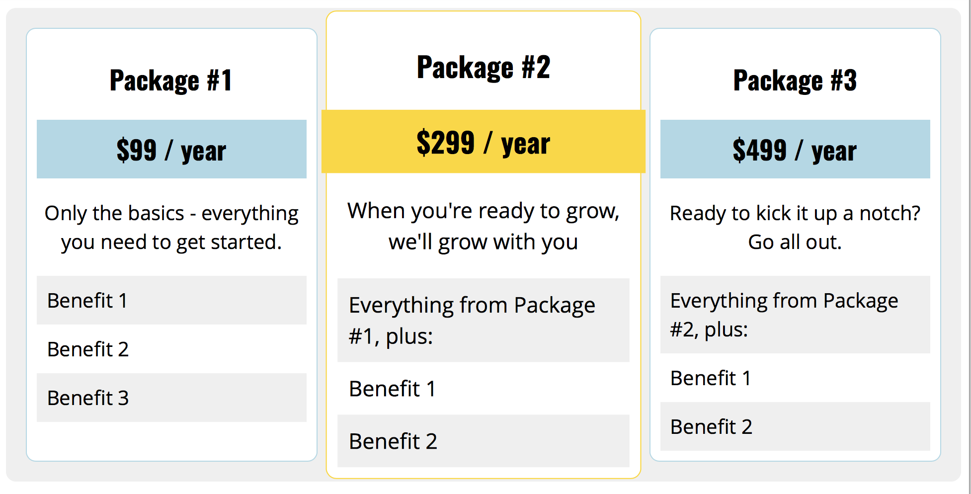
So, there you have it! In this tutorial, we examined how Gutenberg’s Columns block works, it’s class naming conventions, and then applied basic styles to make the columns look good at every screen size on the front end. From here, you can take this code and run with it — we’ve barely scratched the surface and you can do tons more with the CSS alone. For example, I recently made this pricing table using only Gutenberg Columns:
And, of course, there are the other blocks. Gutenberg puts a lot of power into the hands of content editors, but even more into the hands of theme developers. We no longer need to build the infrastructure for doing more complex layouts in the WordPress editor, and we no longer need to instruct users to insert shortcodes or HTML to get what need on a page. We can add a little CSS to our themes and let content creators do the rest.
If you want to get more in-depth into preparing your theme for Gutenberg, you can check out my course, Theming with Gutenberg. We go over how to style lots of different blocks, set custom color palettes, block templates, and more.
Let’s say you wanted to move the background-position on an element as you mouse over it to give the design a little pizzazz. You have an element like this:
<div class="module" id="module"></div>
And you toss a background on it:
.module {
  background-image: url(big-image.jpg);
}
You can adjust the background-position in JavaScript like this:
Here’s an example that moves the background directly in JavaScript, but with a transition applied so it slides to the new position rather than jerking around the first time you enter:
Or, you could move an actual element instead (rather than the background-position). You’d do this if there is some kind of content or interactivity on the sliding element. Here’s an example of that, which sets CSS custom properties again, but then actually moves the element via a CSS translate() and a calc() to temper the speed.
I’m sure there are loads of other ways to do this — a moving SVG viewBox, scripts controlling a canvas, webGL… who knows! If you have some fancier ways to handle this, link ’em up in the comments.
With our robust SDK, super clean dashboard, detailed documentation, and world-class support, HelloSign API is one of the most flexible and powerful APIs on the market. Start building for free today.
Perhaps you know this one: if any part of a selector is invalid, it invalidates the whole selector. For example:
div, span::butt {
  background: red;
}
Even though div is a perfectly valid selector, span:butt is not, thus the entire selector is invalidated — neither divs nor span::butt elements on the page will have a red background.
Normally that's not a terribly huge problem. It may even be even useful, depending on the situation. But there are plenty of situations where it has kind of been a pain in the, uh, <code>:butt.
Here’s a classic:
::selection {
  background: lightblue;
}
For a long time, Firefox didn’t understand that selector, and required a vendor prefix (::-moz-selection) to get the same effect. (This is no longer the case in Firefox 62+, but you take the point.)
In other words, this wasn’t possible:
/* would break for everyone */
::selection, ::-moz-selection {
  background: lightblue;
}
That would break for browsers that understood ::selection and break for Firefox that only understood ::-moz-selection. It made it ripe territory for a preprocessor @mixin, that’s for sure.
That was annoying enough that browsers have apparently fixed it. In a conversation with Estelle Weyl, I learned that this is being changed. She wrote in the MDN docs:
Generally, if there is an invalid pseudo-element or pseudo-class within in a chain or group of selectors, the whole selector list is invalid. If a pseudo-element (but not pseudo-class) has a -webkit- prefix, As of Firefox 63, Blink, Webkit and Gecko browsers assume it is valid, not invalidating the selector list.
This isn’t for any selector; it’s specifically for pseudo-elements. That is, double colons (::).
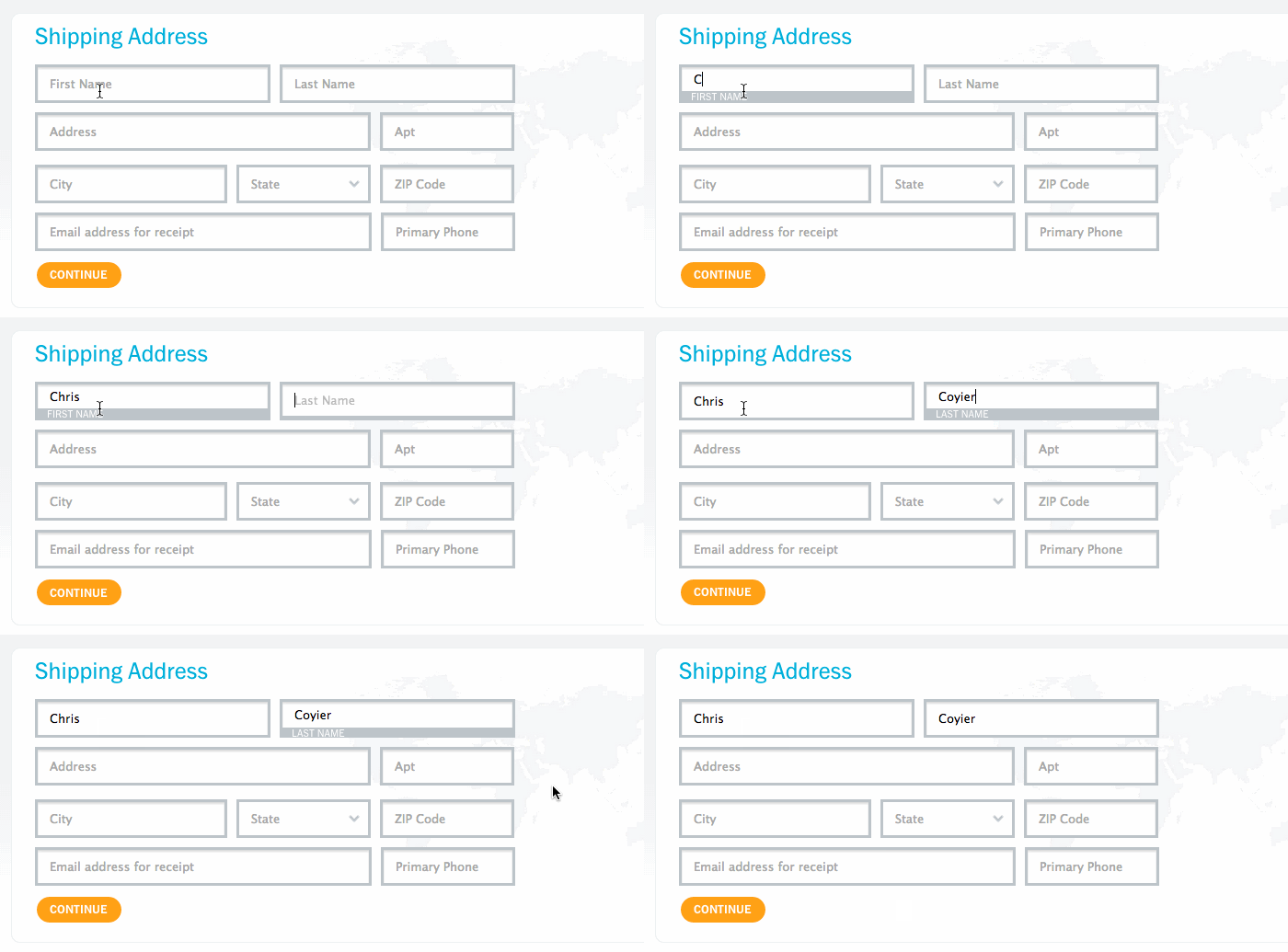
The floated label technique has been around for a good long while and the general idea is this: we have an text input with the placeholder attribute acting as a label. When a user types into that input, the label moves from inside the input to outside of it.
Like so:
Although I don’t see this pattern used on the web all that much, I do think it’s an interesting one! There are different approaches to it, but Nick Salloum describes a new one using a combination of :not and :placeholder-shown:
This UI technique does indeed slightly bend the definitions of label and placeholder listed above, in the sense that we’re giving the placeholder more initial importance in having to explain the input to the user, but it’s a tradeoff for a neat UI component, and one that I’m personally comfortable making.
I wonder if there are other peculiar ways :not and :placeholder-shown could be put to use.
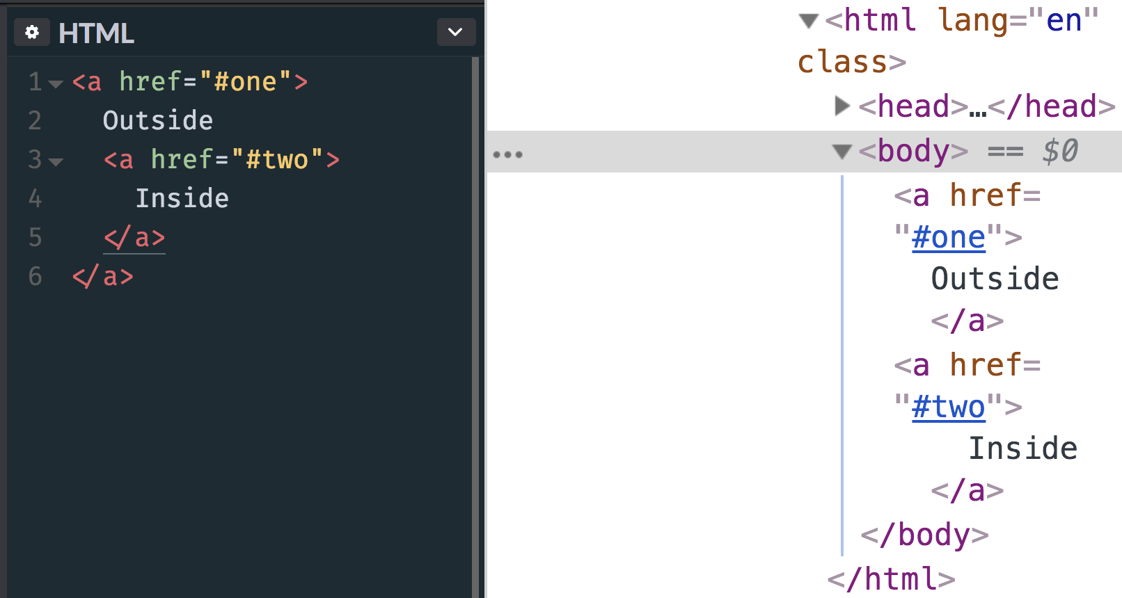
The other day I posted an image, quite literally as a thought exercise, about how you might accomplish „nested” links. That is, a big container that is linked to one URL that contains a smaller container or text link inside of it that goes to another URL. That’s harder than it might seem at first glance. The main reason being that…
<!-- this is invalid and won't render as expected -->
<a href="#one">
  Outside
  <a href="#two">
    Inside
  </a>
</a>
Eric Meyer once called for more flexible linking, but even that doesn’t quite handle a situation where one link is nested inside another.
Here’s what happens with that HTML, by the way:
The nested link gets kicked out.
My first inclination would be to simply not nest the links in the markup, but make them appear nested visually. Some folks replied to the tweet, including Nathan Smith, who shared that same thought: have a relatively positioned parent element and absolutely position both links. The larger one could fill up the whole area and the smaller one could sit on top of it.
I have literally no idea how kosher that is from an accessibility perspective. It looks gross to me so I’m just going to assume it’s bad news.
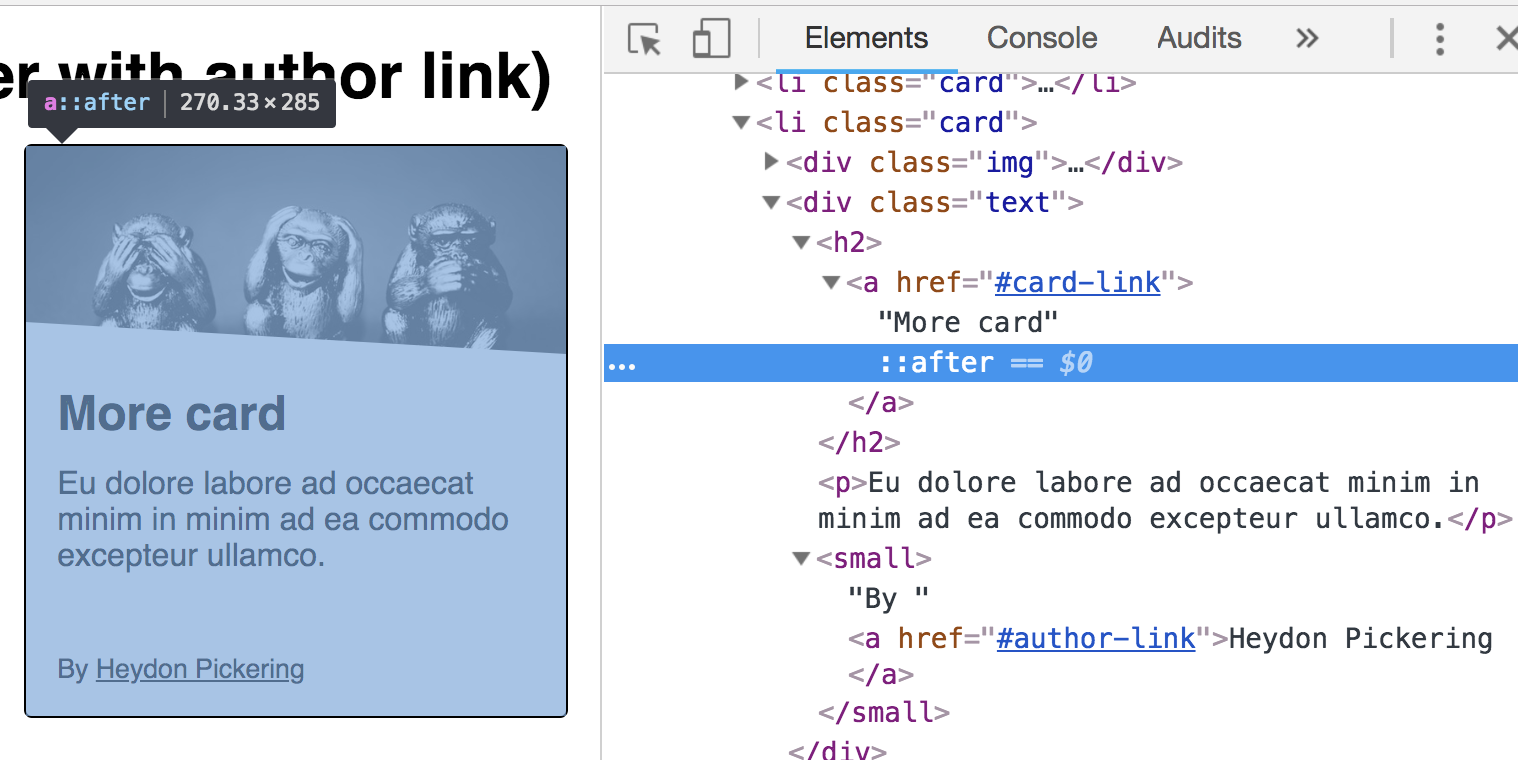
Speaking of accessibility, Heydon Pickering has a whole article about card components which is a popular design pattern where this situation often comes up. His solution is to have a relatively positioned parent element, then a normally-placed and functional main link. That first link has an absolutely positioned pseudo-element on it covering the entire card. Any sub-links are relatively positioned and come after the initial link, so they’d sit on top of the first link by way of z-index.
I had the same requirement a couple of years ago when I was building the front-end foundation for Smashing Magazine. So I thought I’d write my response to Chris’s thread out in the form of a blog post.
Sara has written about this with much more detail and care than I have here, so definitely check that out. It looks like both she and Heydon have landed on nearly the same solution, with the pseudo-element cover that contains sub-links poking above it as needed.
The other day I posted an image, quite literally as a thought exercise, about how you might accomplish „nested” links. That is, a big container that is linked to one URL that contains a smaller container or text link inside of it that goes to another URL. That’s harder than it might seem at first glance. The main reason being that…
<!-- this is invalid and won't render as expected -->
<a href="#one">
  Outside
  <a href="#two">
    Inside
  </a>
</a>
Eric Meyer once called for more flexible linking, but even that doesn’t quite handle a situation where one link is nested inside another.
Here’s what happens with that HTML, by the way:
The nested link gets kicked out.
My first inclination would be to simply not nest the links in the markup, but make them appear nested visually. Some folks replied to the tweet, including Nathan Smith, who shared that same thought: have a relatively positioned parent element and absolutely position both links. The larger one could fill up the whole area and the smaller one could sit on top of it.
I have literally no idea how kosher that is from an accessibility perspective. It looks gross to me so I’m just going to assume it’s bad news.
Speaking of accessibility, Heydon Pickering has a whole article about card components which is a popular design pattern where this situation often comes up. His solution is to have a relatively positioned parent element, then a normally-placed and functional main link. That first link has an absolutely positioned pseudo-element on it covering the entire card. Any sub-links are relatively positioned and come after the initial link, so they’d sit on top of the first link by way of z-index.
I had the same requirement a couple of years ago when I was building the front-end foundation for Smashing Magazine. So I thought I’d write my response to Chris’s thread out in the form of a blog post.
Sara has written about this with much more detail and care than I have here, so definitely check that out. It looks like both she and Heydon have landed on nearly the same solution, with the pseudo-element cover that contains sub-links poking above it as needed.
DigitalOcean invites you to experience a better, faster and simpler cloud platform designed to scale based on your needs. Get started for free with a $100 credit toward your first project and discover why the most innovative companies are already hosting on DigitalOcean.
Some people prefer to write JavaScript with React. For others, it’s Vue or jQuery. For others still, it is their own set of tools or a completely blank document. Some setups are minimal, some allow you to get things done quickly, and some are crazy powerful, allowing you to build complex and maintainable applications. Every setup has advantages and disadvantages, but positives usually outweigh negatives when it comes to popular frameworks verified and vetted by an active community.
React and Vue are powerful JavaScript frameworks. Of course they are — that’s why both are trending so high in overall usage. But what is it that makes those, and other frameworks, so powerful? Is it the speed? Portability to other platforms like native desktop and mobile? Support of the huge community?
The success of a development team starts with an agreement. An agreement of how things are done. Without an agreement, code would get messy, and the software unsustainable quite quickly, even for relatively small projects. Therefore, a lot (if not most) of the power of a framework lies within this agreement. The ability to define conventions and common patterns that everyone adheres to. That idea is applicable to any framework, JavaScript or not. Those „rules” are essential to development and bring teams maintainability at any size, reusability of code, and the ability to share work with a community in a form anyone will understand. That’s why we can web search for some component/plugin that solves our problem rather than writing something on our own. We rely on open-source alternatives, no matter what framework we use.
Unfortunately, there are downsides to frameworks. As Adrian Holovaty (one of the Django creators) explains in his talk, frameworks tend to get bulky and bloated with features for one particular use case. It could be the inclusion of a really good idea. It could also be a desire to provide a one-size-fits-all solution for anyone and everyone’s needs. It could be to remain popular. Either way, there are downsides to frameworks in light of all the upsides they also have.
In server-rendered world, where we work with content that’s delivered to the browser from a server, this „framework mission” is filled with skills, ideas, and solutions that people share with co-workers, friends, and others. They tend to adopt consistent development rules and enforce them within their teams or companies, rather than relying on a predefined framework. For a long time, it’s been jQuery that has allowed people to share and reuse code on a global scale with its plugins — but that era is fading as new frameworks are entering the fold.
Let’s take a look at some core points that any framework — custom or not — ought to consider essential for encouraging a maintainable and reusable codebase.
Naming conventions
Some might say that naming is the hardest part of development. Whether it’s naming JavaScript variables, HTML classes, or any other number of things, a naming convention has a big impact on how we work together because it adds context and meaning to our code. A good example of a naming convention is BEM, a CSS methodology created by the folks at Yandex and adopted by many, many front-enders. That sort of standardization and consistency can help inform our objective, which is to have a standard convention for naming JavaScript selectors.
This situation might seem familiar: you revisit a project after a few months and you see some behavior happening on the page — maybe something you want to modify or fix. However, finding the source of that behavior can be a tricky thing. Is it the id attribute I should search for? Is it one of the classes? Maybe the data attribute for this particular element?
I think you get the point. What helps is having some kind of convention to simplify the process and make everyone work with the same names. And it doesn’t really matter if we’re going with classes (e.g. js-[name]) or data attributes (e.g. data-name="[name]"). All that matters is that the names conform to the same style. Surely enough, any framework you will meet will enforce a naming convention of some sort as well, whether it’s React, Vue, Bootstrap, Foundation, etc.
Scope
A developer will likely struggle with JavaScript scope at some point in time, but we are specifically focusing on DOM scope here. No matter what you do with JavaScript, you’re using it to affect some DOM element. Limiting parts of the code to a DOM element encourages maintainability and makes code more modular. Components in both React and Vue operate in a similar fashion, although their „component” concept is different than the standard DOM. Still, the idea scopes the code to a DOM element that is rendered by those components.
While we’re on the topic of DOM manipulation, referencing elements within the root element of the component is super helpful because it help avoids the constant need to select elements. React and Vue do this out of the box in a very good way.
Lifecycle
In the past, the page lifecycle was very straightforward: the browser loaded the page and the browser left the page. Creating or removing event listeners, or making code run at the right time was much simpler, as you would simply create everything you need on load, and rarely bother with disabling your code, since the browser would do it for you by default.
Nowadays, the lifecycle tends to be much more dynamic, thanks to state management and the way we prefer to manipulate changes directly to the DOM or load the contents of pages with JavaScript. Unfortunately, that usually brings some issues where you may need to re-run parts of your code at certain times.
I can’t tell how many times in my life I’ve had to play around with code to get my event handlers to run correctly after re-writing part of the DOM. Sometimes it is possible to solve this with event delegation. Other times, your code handlers don’t run at all or run several times because they are suddenly attached twice.
Another use case would be the need to create an instance of libraries after changing the DOM, like „fake selects.”
In any case, the lifecycle is important and limiting your code to a DOM element certainly helps here as well, since you know that the code applied to that element needs to be re-run in case the element is re-rendered.
Frameworks do the same with functions as componentDidMount or componentDidUpdate, which give you an easy way of running code exactly when you need it.
Reusability
Copying code from somewhere else and reusing it is super common. Who hasn’t used a snippet from a past project or an answer from StackOverflow, right? People even invented services like npm meant for one thing: to easily share and reuse code. There is no need to reinvent the wheel and sharing code with others is something that is convenient, handy, and often more efficient than spinning something up from scratch.
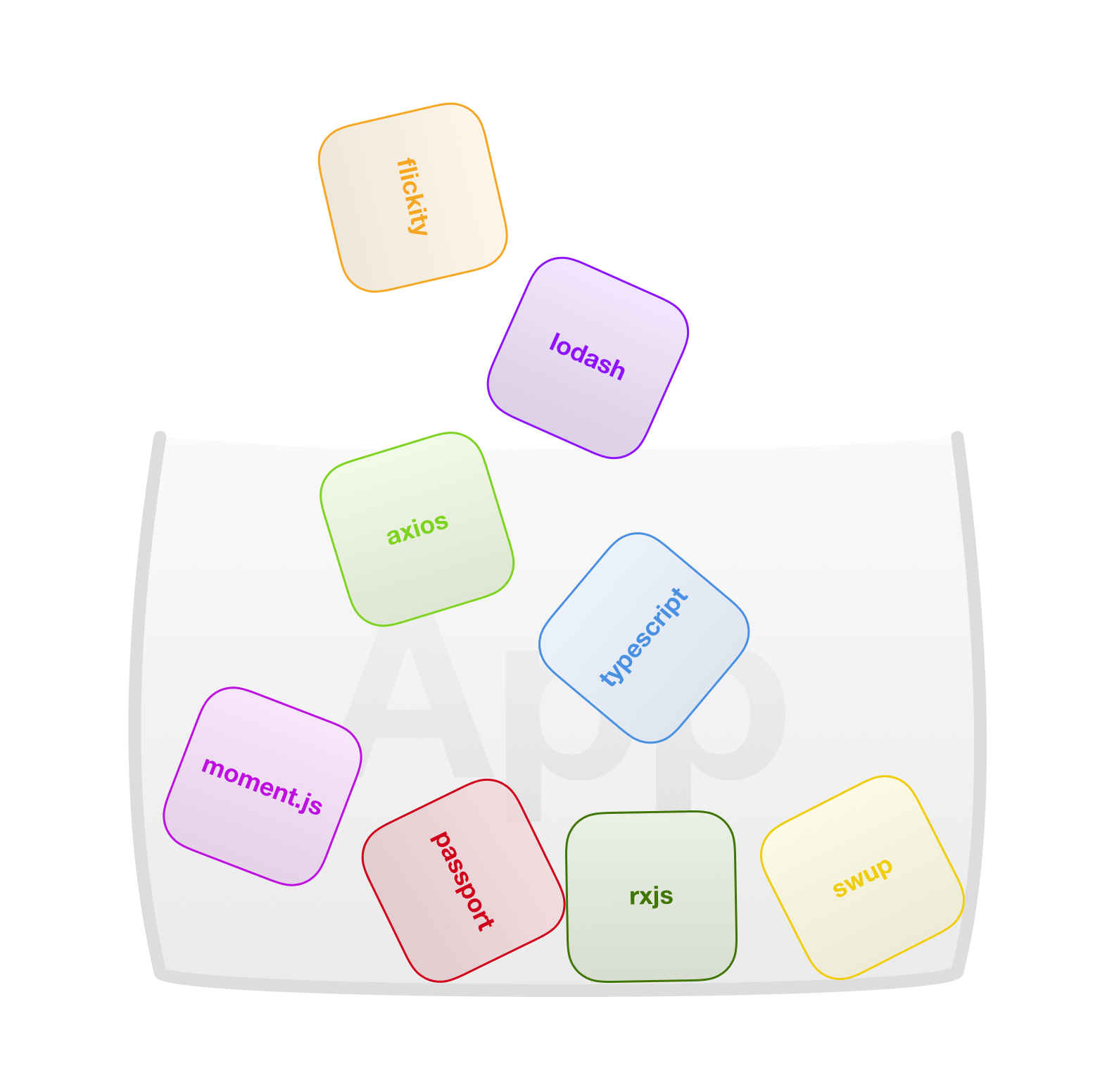
Components, whether it’s React, Vue, or any other building block of a framework encourage reusability by having a wrapper around a piece of code that serves some specific purpose. A standardized wrapper with an enforced format. I would say this is more of a side effect of having some base we can build on, than an intentional effort for reusability, as any base will always need some standard format of a code it can run, the same way programming languages have a syntax we need to follow… but it is a super convenient and useful side effect, for sure. By combining this gained reusability with package managers like Yarn, and bundlers like webpack, we can suddenly make code written by many developers around the world work together in our app with almost no effort.
While not all code is open-source and shareable, a common structure will help folks in smaller teams as well, so anyone is able to understand most of the code written within the team without having to consult its author.
DOM manipulation with performance in mind
Reading and writing to the DOM is costly. Developers of front-end frameworks keep that in mind and try to optimize as much as possible with states, virtual DOM and other methods to make changes to the DOM when it’s needed and where it’s needed… and so should we. While we’re more concerned with server-rendered HTML, most of the code ends up reading or writing to the DOM. After all, that’s what JavaScript is for.
While most of the changes of the DOM are minimal, they can also occur quite often. A nice example of frequent reading/writing is executing a script on page scroll. Ideally, we would like to avoid adding classes, attributes or changing the contents of elements directly in the handler, even if we write the same classes, attributes or contents because our changes still get processed by the browser and are still expensive, even when nothing changes for the user.
Size
Last, but not least: size. Size is critical or at least should be for a framework. The code discussed in this article is meant to be used as a base across many projects. It should be as small as possible and avoid any unnecessary code that could be added manually for one-off use cases. Ideally, it should be modular so that we can pull pieces of it out à la carte, based on the specific needs for the project at hand.
While the size of self-written code is usually reasonable, many projects end up having at least some dependencies/libraries to fill in gaps, and those can make things quite bulky really fast. Let’s say we have a carousel on a top-level page of a site and some charts somewhere deeper. We can turn to existing libraries that would handle these things for us, like slick carousel (10 KB minified/gzipped, excluding jQuery) and highcharts (73 KB minified/gzipped). That’s over 80 KB of code and I’d bet that not every byte is needed for our project. As Addy Osmani explains, JavaScript is expensive and its size is not the same as other assets on a page. It’s worth keeping that in mind the next time you find yourself reaching for a library, though it shouldn’t discourage you from doing it if the positives outweigh the negatives.
A look at a minimal solution we call Gia
Let’s take a look at something I’ve been working on and using for a while with my team at Giant. We like JavaScript and we want to work directly with JavaScript rather than a framework. But at the same time, we need the maintainability and reusability that frameworks offer. We tried to take some concepts from popular frameworks and apply them to a server-rendered website where the options for a JavaScript setup are so wide, and yet so limited.
We’ll go through some basic features of our setup and focus on how it solves the points we’ve covered so far. Note that many of the solutions to our needs are directly inspired by big frameworks, so if you see some similarities, know that it’s not an accident. We call it Gia (get it, like short for Giant?!) and you can get it from npm and find the source code on GitHub.
Gia, like many frameworks, is built around components that give you a basic building block and some advantages we’ll touch on in a bit. But don’t confuse Gia components with the component concepts used by React and Vue, where all your HTML is a product of the component. This is different.
In Gia, a component is a wrapper for your own code that runs in the scope of a DOM element, and the instance of a component is stored within the element itself. As a result, an instance is automatically removed from the memory by the garbage collector in case the element is removed from the DOM. The source code of the component can be found here and is fairly simple.
Apart from a component, Gia includes several helpers to apply, destroy and work with the component instance or communicate between components (with standard eventbus included for convenience).
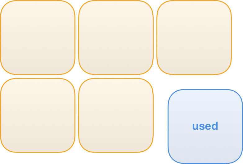
Let’s start with a basic setup. Gia is using an attribute to select elements, along with the name of the component to be executed (i.e. g-component="[component name]"). This enforces a consistent naming convention. Running the loadComponents function creates the instances defined with the g-component attribute.
Gia components also allow us to easily select elements within the root element with the g-ref attribute. All that needs to be done is to define the refs that are expected and whether we’re working with a single element or an array of them. Reference is then accessible in the this.ref object within the component.
The component includes methods that are executed at different times, in order to solve the lifecycle issue. Here’s an example that shows how a component can be initialized or removed:
Notice how loadComponents function doesn’t apply the same component when it already exists.
It is not necessary to remove listeners attached to the root element of a component or elements within it before re-rendering them since the elements would be removed from the DOM anyway. However, there can be some listeners created on global objects (e.g. window), like the ones used for scroll handling. In this case, it is necessary to remove the listener manually before destroying the component instance in order to avoid memory leaks.
The concept of a component scoped to a DOM element is similar in its nature to React and Vue components, but with a key exception that the DOM structure is outside of the component. As a result, we have to make sure it fits the component. Defining the ref elements certainly helps, as Gia component will tell you when the required refs are not present. That makes the component reusable. The following is example implementation of a basic carousel that could be easily reused or shared:
While we’re talking about reusability, it’s important to mention that components don’t have to be reused in their existing state. In other words, we can extend them to create new components as any other JavaScript class. That means we can prepare a general component and build upon it.
To give an example, a component that would give us the distance between the cursor and the center of an element seems like a thing that could be useful someday. Such a component can be found here. After having that ready, it’s ridiculously easy to build upon it and work with provided numbers, as the next example shows in the render function, although we could argue about the usefulness of this particular example.
Let’s try to look into optimized DOM manipulations. Detecting if a change to the DOM is supposed to happen can be manually stored or checked without directly accessing the DOM, but that tends to be a lot of work which we might want to avoid.
This is where Gia really drew inspiration from React, with simple, stripped down component state management. The state of a component is set similarly to states in React, using a setState function.
That said, there is no rendering involved in our component. The content is rendered by the server, so we need to make a use of the changes in state elsewhere. The state changes are evaluated and any actual changes are sent to the stateChange method of a component. Ideally, any interaction between the component and the DOM would be handled in this function. In case some part of the state doesn’t change, it won’t be present in the stateChanges object passed into a function and therefore won’t be processed — the DOM won’t be touched without it being truly necessary.
Check the following example with a component showing sections that are visible in the viewport:
Notice how writing to the DOM (visualized by the blink) is only done for items where the state actually changes.
Now we are getting to my favorite part! Gia is truly minimal. The entire bundle containing all the code, including all the helpers, takes up a measly 2.68 KB (minified/gzipped). Not to mention that you most likely won’t need all of Gia’s parts and would end up importing even less with a bundler.
As mentioned earlier, the size of the code can rapidly increase by including third-party dependencies. That’s why Gia also includes code splitting support where you can define a dependency for a component, which will only be loaded when the component is being initialized for the first time, without any additional setup required to the bundler. That way, the bulky libraries used somewhere deep within your site or application don’t have to slow things down.
In case you decide one day that you really want to take advantage of all the goodies big frameworks can offer somewhere in your code, there is nothing easier than just loading it like any other dependency for the component.
I guess the main point of this article is that you don’t need a framework to write maintainable and reusable code. Following and enforcing a few concepts (that frameworks use as well) can take you far on its own. While Gia is minimal and does not have many of the robust features offered by big players, like React and Vue, it still helps us get that clean structure that is so important in the long term. It includes some more interesting stuff that didn’t make the cut here. If you like it so far, go check it out!
There are lots and lots of use cases, and different needs require different approaches. Various frameworks can do plenty of the work for you; in other cases, they may be constraining.
What is your minimal setup and how do you account for the points we covered here? Do you prefer a framework or non-framework environment? Do you use frameworks in combination with static site generators like Gatsby? Let me know!