Archiwum kategorii: CSS

Developing With Automad

Post pobrano z: Developing With Automad

Selecting the right CMS for a blog or website can be difficult. Every web project has its own needs and requirements, meaning one CMS may be a better fit for one site but not so much for a different site. Simple solutions might be lacking some essential features, while more complex systems can create easily overhead for a given task.

I want to cover Automad, a CMS that is less-known than, say, a behemoth like WordPress, but still offers some powerful features like it while maintaining the nimbleness of smaller, simpler solutions, like static site generators.

Specifically, Automad fills a gap between larger and smaller offerings in a few key ways:

  • It is file-based, but does not require a database. This ensures quick setup, portability, security, speed, and easy deployment.
  • Even without a database, it offers database features like searching, tagging, filtering, and sorting.
  • A multi-layer caching engine caches content stored in the file system efficiently.
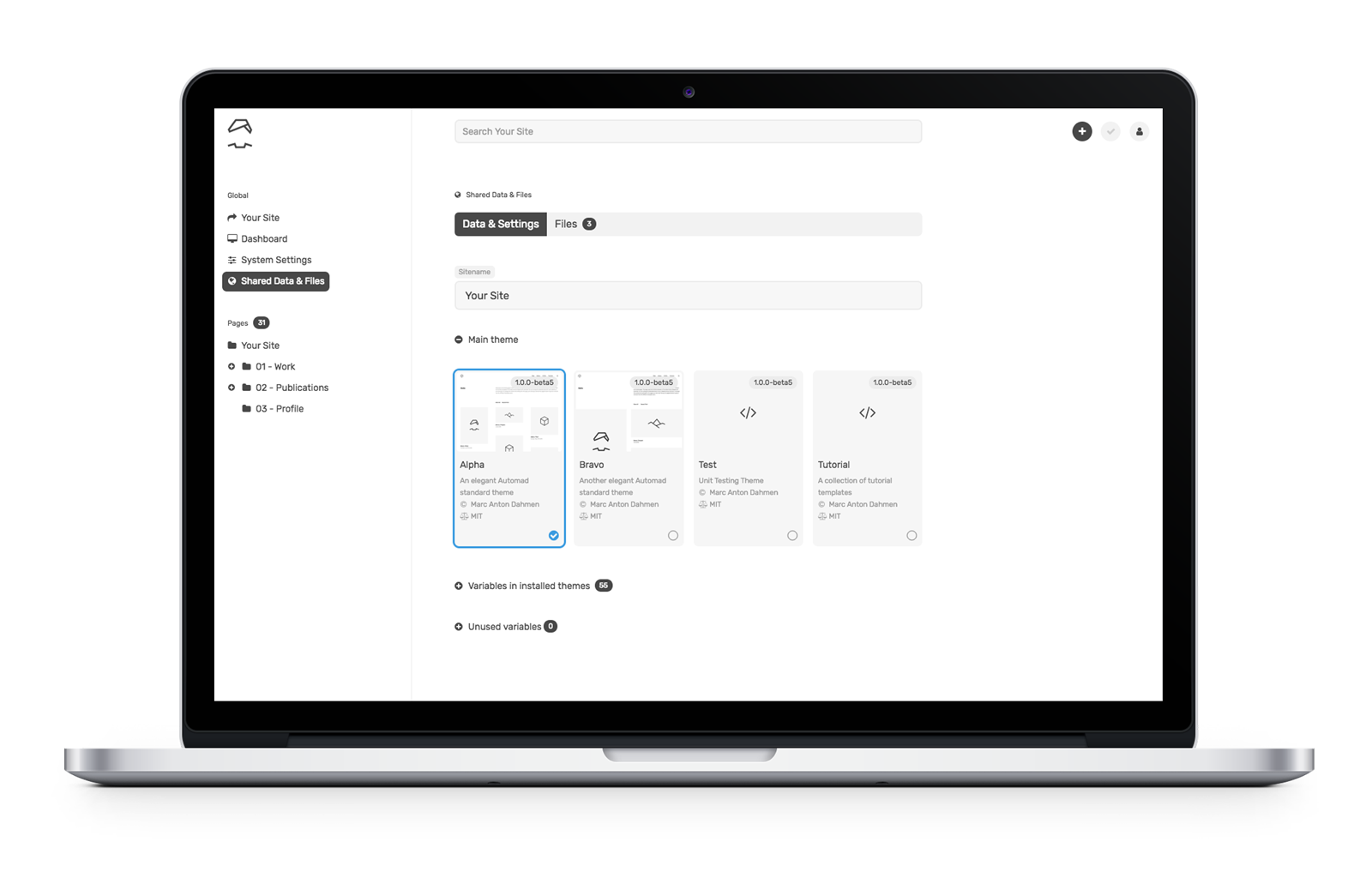
  • The browser-based dashboard and the in-page (“live”) edit mode allows for intuitive content management.

But what makes Automad really different, is its integrated template engine. Templating is a core requirement for may CMSs because it creates and sets the base for a site’s visual display. Since Automad’s template engine is so close to the core, it allows you to create templates with complex navigations and to batch process images using a clean and short syntax. You’ll feel the difference once you get your hands on it, and we’ll walk through an example together in just a bit.
But first, a quick overview of templating

As a designer or a developer, you’re probably curious about how to develop themes and templates for Automad. I mean, it’s the crux for why any of us really use a CMS in the first place. If you’ve done any level of theming with WordPress, then working with Automad will feel vaguely familiar, and perhaps even easier.
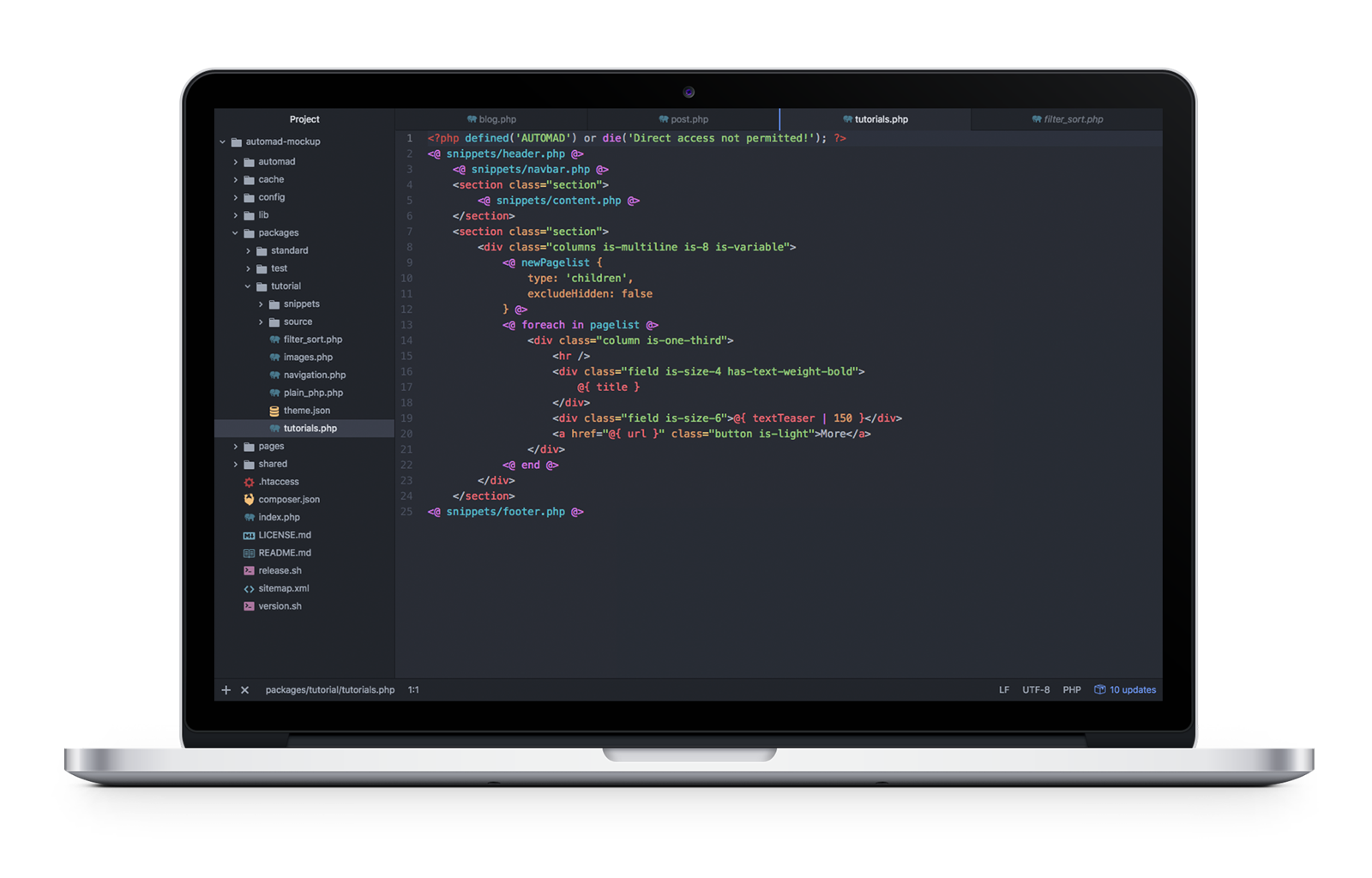
The minimal requirement for creating an Automad theme is a single .php file and a theme.json file bundled together in a subdirectory you create inside the top-level /packages directory in a default Automad installation:

packages/
  yourTheme/
    yourTemplate.php
    theme.json

The tutorial package shipped with Automad provides a good starting point for understanding the basic concepts of themes.

A look at the syntax used in Automad templates

While it is possible to write templates in plain PHP, it is not required and actually not recommended. The reason is that Automad’s own template syntax is shorter, more readable, and integrates well with the user interface by automatically listing all of the used variables in the dashboard. It can be seamlessly mixed into HTML markup.

Basically, the syntax can be split into two groups:

  1. Echoing content: @{ variable }
  2. Statements, like functions, loops and conditionals: <@ function @> or <@ statement @>…<@ end @>

Echo content

Let’s say we want to pull the body content for a post into a template and we have a variable set up for that called text. In WordPress, this would be a global variable (the_content) that is called in PHP:

<?php the_content(); ?>

In Automad, we can do the same without PHP:

<p>@{ text }</p>

It is possible to manipulate the output of variables by passing the value to a function using the pipe (|) operator. The following example shows how to shorten a given text to a maximum of 100 characters without cutting words:

@{ text | shorten (100) }

This would be the same of thing you might do to define the excerpt of a post in WordPress using a function:

/* Limit excerpt to 20 words */
function my_custom_excerpt_length( $length ) {
    return 20;
}
add_filter( 'excerpt_length', 'wpdocs_custom_excerpt_length', 999 )
}

One of the key benefits of some CMS solutions, like Jeykll, is that using Markdown to create site content is a native feature. Automad can do the same. Let’s say we want to convert Markdown text to HTML. It’s pretty darn simple (and efficient) using the pipe operator:

@{ text | markdown }

Using statements

Statements are a handy way to define content and display it conditionally. Unlike variables, statements are wrapped in <@ … @> delimiters. The following example can be used to create a simple top level menu by using the nav function:

<@ nav { context: "/", class: "nav" } @>

Let’s say you want to display your post content by default but display a fallback if that content does not exist for some reason. That’s where we can put conditional statements and control structures to use:

<# If the post content exists then display... #>
<@ if @{ text } @>
  <p>...</p>

<# Otherwise, display this... #>
<@ else @>
  <p>Sorry, no content here!</p>

<# OK, no more conditions. #>
<@ end @>

Want to create a loop? This is where display a list of posts or any repeatable content that matches a condition is super useful. We can do that in Automad by providing one or more glob patterns in a foreach loop.

For example, let’s display all JPG and PNG images for a post cropped at 400x300 with their captions:

<@ foreach in "*.jpg, *.png" { width: 400, height: 300, crop: true } @>
  <img src="@{:fileResized}" width="@{:widthResized}" height="@{:heightResized}">
  <p>@{:caption}</p>
<@ end @>

Did you catch that?! As shown by this example, a remarkable Automad feature is the ability to embed resizing options for each matching file inside the loop statement. No more complicated functions to register sizes that then need to be called in the template!
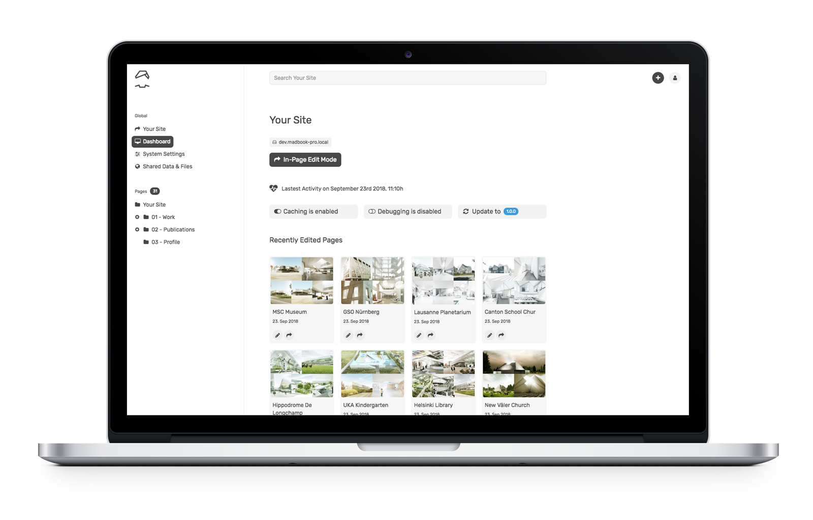
It’s worth noting that foreach loops can also be used to iterate over objects. Automad knows multiple types of objects. One of the most important objects is pagelist because of its ability to output all of the pages on the site, like you might want to do when building navigation. When iterating a pagelist, the context changes with every iteration to the current page in the loop. That way, it is possible to use page variables within the loop’s code block.

To configure the pagelist, we can use the newPagelist function like this:

<@ newPagelist { context: "/", type: "children" } @>
<ul>
  <@ foreach in pagelist @>
    <li><a href="@{ url }">@{ title }</a></li>
  <@ end @>
</ul>

A sneak peek behind the scenes for you super geeks 🤓

Automad’s template interpreter is written in pure PHP and it processes templates on the fly. Therefore, no extra build process is required at all. The list of system requirements is also rather short. A web server (Apache or Nginx) and PHP 5.4+ is already enough to run a site. Pages are only rendered when content has changed or after system updates.

Automad’s multi-layer caching engine stores the rendered pages in separate .html files as well as all crawled data in the file system as a kind of content object. That object is also used to speed up page searching and filtering.

Due to that mechanism, it is possible to either edit the content of a site directly in production online using the browser-based dashboard or edit a site locally and deploy it via Git or plain rsync.

Let’s write some code!

The best way to get acquainted with anything on the web is to just build websites. Here are some examples of how we’d get started with that using Automad.

Example 1: Recursive navigation

Creating a site-tree navigation is a good example for using recursion in templates. Conceptually, creating such a recursive navigation can be split into three steps:

  1. Defining a reusable snippet of code to create a single branch of the site-tree which calls itself conditionally
  2. Configuring a dynamic pagelist which automatically only contains children of its current context
  3. Defining the root page of the site-tree (for instance the homepage) and call the recursive snippet initially

Let’s break those steps down into greater detail…

Defining a reusable snippet of code

In Automad, blocks of code can be defined to be reused at a later point by using the snippet keyword. Regarding this example, the following snippet will call itself conditionally when looping through a pagelist and the active page of the current iteration itself has children pages:

<@ snippet navigation @>  
  <ul class="menu-list">       
    <@ foreach in pagelist @>
      <li>
        <a href="@{ url }">@{ title }</a>
        <# Call snippet recursively. #>
        <@ navigation @>
      </li>
    <@ end @>
  </ul>
<@ end @>
Configuring a dynamic pagelist

The pagelist has to be configured a children type. The context (or parent page) will always change recursively within the snippet defined above in that way. The pagelist will automatically only contain children pages of the currently processed page.

<@ newPagelist { 
  type: 'children'
} @>
Defining the root page

In the last step, the root context of the navigation tree has to be defined and the snippet has to be called once to initiate the recursion. The with statement is used here to change the context to the homepage.

<div class="menu">
  <@ with '/' @>
    <@ navigation @>
  <@ end @>
</div>

A complete working tutorial template is already included in Automad.

Example 2: Working with files

Since images are super important for content management, working with them should be as easy and intuitive as possible. Automad’s template language provides handy methods for basic image processing, like resizing and cropping. When using a single image or iterating a set of images, resizing options can be passed to a with statement or foreach loop. Check out the <a href="https://dev.automad.org/tutorials/working-with-images"Working with Images tutorial that ships with Automad to get started quickly.

<@ foreach in '*.jpg, *.png' { width: 400, height: 300, crop: true } @>
  <# Code to be used for each image in the filelist. #>
  <img 
  src="@{ :fileResized }" 
  alt="@{ :basename }"
  title="@{ :file }"
  width="@{ :widthResized }"
  height="@{ :heightResized }"
  >
  <p>@{ :caption | markdown }</p>
<@ else @>
  <# Code to be used when the list of images is empty. #>
<@ end @>

Instead of using a glob pattern in the foreach loop, it is also possible to use the filelist object.

If you look at the example code above, you will notice the use of certain runtime variables to access image properties within a code block. While the :file variable represents the original file, :fileResized refers to path of the resized and cached version. The :caption variable enables you to get the caption text stored along with the file.


What will you build?

We merely scratched the surface of Automad here, but hopefully everything we covered gives you a good idea of the possibilities it provides for content management. While there is no one-size-fits-all mold in the CMS world, there will likely be scenarios where a CMS that sits somewhere between the robust and slimmed-down options will come in handy.

Additional Resources

The post Developing With Automad appeared first on CSS-Tricks.
Developing With Automad

Post pobrano z: Developing With Automad

Selecting the right CMS for a blog or website can be difficult. Every web project has its own needs and requirements, meaning one CMS may be a better fit for one site but not so much for a different site. Simple solutions might be lacking some essential features, while more complex systems can create easily overhead for a given task.

I want to cover Automad, a CMS that is less-known than, say, a behemoth like WordPress, but still offers some powerful features like it while maintaining the nimbleness of smaller, simpler solutions, like static site generators.

Specifically, Automad fills a gap between larger and smaller offerings in a few key ways:

  • It is file-based, but does not require a database. This ensures quick setup, portability, security, speed, and easy deployment.
  • Even without a database, it offers database features like searching, tagging, filtering, and sorting.
  • A multi-layer caching engine caches content stored in the file system efficiently.
  • The browser-based dashboard and the in-page (“live”) edit mode allows for intuitive content management.

But what makes Automad really different, is its integrated template engine. Templating is a core requirement for may CMSs because it creates and sets the base for a site’s visual display. Since Automad’s template engine is so close to the core, it allows you to create templates with complex navigations and to batch process images using a clean and short syntax. You’ll feel the difference once you get your hands on it, and we’ll walk through an example together in just a bit.

But first, a quick overview of templating

As a designer or a developer, you’re probably curious about how to develop themes and templates for Automad. I mean, it’s the crux for why any of us really use a CMS in the first place. If you’ve done any level of theming with WordPress, then working with Automad will feel vaguely familiar, and perhaps even easier.

The minimal requirement for creating an Automad theme is a single .php file and a theme.json file bundled together in a subdirectory you create inside the top-level /packages directory in a default Automad installation:

packages/
  yourTheme/
    yourTemplate.php
    theme.json

The tutorial package shipped with Automad provides a good starting point for understanding the basic concepts of themes.

A look at the syntax used in Automad templates

While it is possible to write templates in plain PHP, it is not required and actually not recommended. The reason is that Automad’s own template syntax is shorter, more readable, and integrates well with the user interface by automatically listing all of the used variables in the dashboard. It can be seamlessly mixed into HTML markup.

Basically, the syntax can be split into two groups:

  1. Echoing content: @{ variable }
  2. Statements, like functions, loops and conditionals: <@ function @> or <@ statement @>…<@ end @>

Echo content

Let’s say we want to pull the body content for a post into a template and we have a variable set up for that called text. In WordPress, this would be a global variable (the_content) that is called in PHP:

<?php the_content(); ?>

In Automad, we can do the same without PHP:

<p>@{ text }</p>

It is possible to manipulate the output of variables by passing the value to a function using the pipe (|) operator. The following example shows how to shorten a given text to a maximum of 100 characters without cutting words:

@{ text | shorten (100) }

This would be the same of thing you might do to define the excerpt of a post in WordPress using a function:

/* Limit excerpt to 20 words */
function my_custom_excerpt_length( $length ) {
    return 20;
}
add_filter( 'excerpt_length', 'wpdocs_custom_excerpt_length', 999 )
}

One of the key benefits of some CMS solutions, like Jeykll, is that using Markdown to create site content is a native feature. Automad can do the same. Let’s say we want to convert Markdown text to HTML. It’s pretty darn simple (and efficient) using the pipe operator:

@{ text | markdown }

Using statements

Statements are a handy way to define content and display it conditionally. Unlike variables, statements are wrapped in <@ … @> delimiters. The following example can be used to create a simple top level menu by using the nav function:

<@ nav { context: "/", class: "nav" } @>

Let’s say you want to display your post content by default but display a fallback if that content does not exist for some reason. That’s where we can put conditional statements and control structures to use:

<# If the post content exists then display... #>
<@ if @{ text } @>
  <p>...</p>

<# Otherwise, display this... #>
<@ else @>
  <p>Sorry, no content here!</p>

<# OK, no more conditions. #>
<@ end @>

Want to create a loop? This is where display a list of posts or any repeatable content that matches a condition is super useful. We can do that in Automad by providing one or more glob patterns in a foreach loop.

For example, let’s display all JPG and PNG images for a post cropped at 400x300 with their captions:

<@ foreach in "*.jpg, *.png" { width: 400, height: 300, crop: true } @>
  <img src="@{:fileResized}" width="@{:widthResized}" height="@{:heightResized}">
  <p>@{:caption}</p>
<@ end @>

Did you catch that?! As shown by this example, a remarkable Automad feature is the ability to embed resizing options for each matching file inside the loop statement. No more complicated functions to register sizes that then need to be called in the template!

It’s worth noting that foreach loops can also be used to iterate over objects. Automad knows multiple types of objects. One of the most important objects is pagelist because of its ability to output all of the pages on the site, like you might want to do when building navigation. When iterating a pagelist, the context changes with every iteration to the current page in the loop. That way, it is possible to use page variables within the loop’s code block.

To configure the pagelist, we can use the newPagelist function like this:

<@ newPagelist { context: "/", type: "children" } @>
<ul>
  <@ foreach in pagelist @>
    <li><a href="@{ url }">@{ title }</a></li>
  <@ end @>
</ul>

A sneak peek behind the scenes for you super geeks 🤓

Automad’s template interpreter is written in pure PHP and it processes templates on the fly. Therefore, no extra build process is required at all. The list of system requirements is also rather short. A web server (Apache or Nginx) and PHP 5.4+ is already enough to run a site. Pages are only rendered when content has changed or after system updates.

Automad’s multi-layer caching engine stores the rendered pages in separate .html files as well as all crawled data in the file system as a kind of content object. That object is also used to speed up page searching and filtering.

Due to that mechanism, it is possible to either edit the content of a site directly in production online using the browser-based dashboard or edit a site locally and deploy it via Git or plain rsync.

Let’s write some code!

The best way to get acquainted with anything on the web is to just build websites. Here are some examples of how we’d get started with that using Automad.

Example 1: Recursive navigation

Creating a site-tree navigation is a good example for using recursion in templates. Conceptually, creating such a recursive navigation can be split into three steps:

  1. Defining a reusable snippet of code to create a single branch of the site-tree which calls itself conditionally
  2. Configuring a dynamic pagelist which automatically only contains children of its current context
  3. Defining the root page of the site-tree (for instance the homepage) and call the recursive snippet initially

Let’s break those steps down into greater detail…

Defining a reusable snippet of code

In Automad, blocks of code can be defined to be reused at a later point by using the snippet keyword. Regarding this example, the following snippet will call itself conditionally when looping through a pagelist and the active page of the current iteration itself has children pages:

<@ snippet navigation @>  
  <ul class="menu-list">       
    <@ foreach in pagelist @>
      <li>
        <a href="@{ url }">@{ title }</a>
        <# Call snippet recursively. #>
        <@ navigation @>
      </li>
    <@ end @>
  </ul>
<@ end @>
Configuring a dynamic pagelist

The pagelist has to be configured a children type. The context (or parent page) will always change recursively within the snippet defined above in that way. The pagelist will automatically only contain children pages of the currently processed page.

<@ newPagelist { 
  type: 'children'
} @>
Defining the root page

In the last step, the root context of the navigation tree has to be defined and the snippet has to be called once to initiate the recursion. The with statement is used here to change the context to the homepage.

<div class="menu">
  <@ with '/' @>
    <@ navigation @>
  <@ end @>
</div>

A complete working tutorial template is already included in Automad.

Example 2: Working with files

Since images are super important for content management, working with them should be as easy and intuitive as possible. Automad’s template language provides handy methods for basic image processing, like resizing and cropping. When using a single image or iterating a set of images, resizing options can be passed to a with statement or foreach loop. Check out the <a href="https://dev.automad.org/tutorials/working-with-images"Working with Images tutorial that ships with Automad to get started quickly.

<@ foreach in '*.jpg, *.png' { width: 400, height: 300, crop: true } @>
  <# Code to be used for each image in the filelist. #>
  <img 
  src="@{ :fileResized }" 
  alt="@{ :basename }"
  title="@{ :file }"
  width="@{ :widthResized }"
  height="@{ :heightResized }"
  >
  <p>@{ :caption | markdown }</p>
<@ else @>
  <# Code to be used when the list of images is empty. #>
<@ end @>

Instead of using a glob pattern in the foreach loop, it is also possible to use the filelist object.

If you look at the example code above, you will notice the use of certain runtime variables to access image properties within a code block. While the :file variable represents the original file, :fileResized refers to path of the resized and cached version. The :caption variable enables you to get the caption text stored along with the file.


What will you build?

We merely scratched the surface of Automad here, but hopefully everything we covered gives you a good idea of the possibilities it provides for content management. While there is no one-size-fits-all mold in the CMS world, there will likely be scenarios where a CMS that sits somewhere between the robust and slimmed-down options will come in handy.

Additional Resources

The post Developing With Automad appeared first on CSS-Tricks.
All Fired Up About Specificity

Post pobrano z: All Fired Up About Specificity

You never know where the next Grand Debate™ in front-end is going to come from! Case in point: we just saw one recently based on a little Twitter poll by Max Stoiber in which 57% of people got it wrong. There were reactions ranging from the innocuous hey fun a little brain teaser! to the state of web education is in shambles and beyond.

I heard from a number of folks that they just felt sad that so many people don’t know the answer to a fairly simple question. To be fair, it was (intentionally, I’m sure) rather tricky! It wasn’t really a question about CSS — it was more about the idea that the order of HTML attributes doesn’t matter. It’s the order of CSS that does.

One extreme response I saw said that front-end stuff like this is needlessly complicated and getting it wrong is almost a point of pride. This sentiment was so strong that I heard it suggested that people who know the answer have filled their brains with useless information and that somehow makes them a worse developer. Equally extreme were suggestions that writing HTML and CSS raw like that should always be avoided in favor of tooling abstractions to „fix” these „problems.”

(Excuse the quotes there, I’m not trying to pick a side so much as to emphasize that not everyone considers these problems that need to be fixed.)

Another take was that the vibe would be different if something similar happened in JavaScript-land. The perception is that it’s embarrassing or bad not to know JavaScript basics, but not knowing HTML and CSS basics is the fault of the language, or that the value of knowing it is not worth bothering to understand.

At the same time, this poll became the perfect mirror to see the strong opinions people have about front-end practices. Fascinating, really.

Here are a few more takes from folks who chimed from their own blogs:

Keith Grant:

I hate that this has somehow become some “old guard” vs. “new guard” thing.

The problem with drawing lines like this: whichever side you find yourself on, there are some whackos out there throwing ridiculous arguments into the mix. And now people on the other side associate that viewpoint with you.

Tim Kadlec:

It doesn’t bother me too much that people are getting the question wrong. Everyone is at different stages in their career and everyone has different problems they’re facing in their daily tasks, so sure, not everyone is going to know this yet.

I do find it a bit alarming just how many folks got it wrong though.

John Allsopp:

One the one hand (and this will somewhat simplify each ‘side’, for the sake of brevity, not disrespect to either), we have those, and I’d on balance probably include myself in this camp, who’d argue that the core technologies of the Web are precisely that–foundational, and a deep understanding of them conceptually (not necessarily an encyclopedic knowledge of every syntactic aspect) is fundamental working knowledge for professional Web developers.

Kevin Ball:

With the growth of the importance of front-end development, we’re seeing the story play out again.

The systematic devaluation of CSS, and more, the people who use CSS.

The constant „mansplaining” of CSS features to women who literally are the reason it exists.

Conference speakers asked questions about whether „there is any value in people who cannot write JavaScript?”.

All of this at a time when CSS is improving faster than ever and enabling dramatic changes in web design.

This isn’t about better technology, it’s about exclusion.


Have you seen any other takes or have any of your own?

The post All Fired Up About Specificity appeared first on CSS-Tricks.

Introducing the YOOtheme Pro Page Builder

Post pobrano z: Introducing the YOOtheme Pro Page Builder

(This is a sponsored post.)

YOOtheme Pro is a powerful theme and page builder developed by YOOtheme that provides a new experience of building websites in WordPress. Designers will get an easy and exciting way to design and create websites due to premium layouts and an intuitive page builder, and developers will especially appreciate its extendability and clean and semantic code. YOOtheme has been known as a leading theme provider for over 10 years, and now with YOOtheme Pro they created the next page builder to be watched for on the WordPress market.

The Page Builder

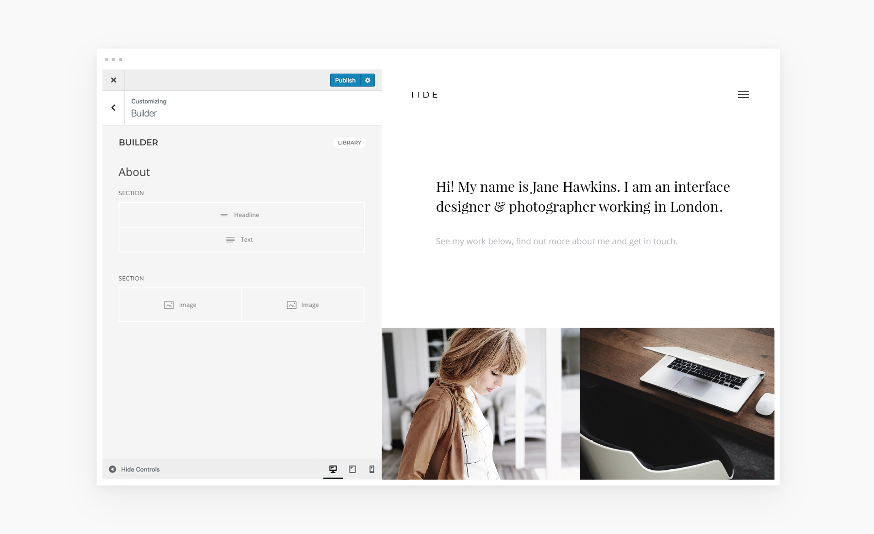
If you are familiar with WordPress, YOOtheme Pro is a perfect choice for you since it is seamlessly integrated into the native WordPress customizer. You can easily create your layouts by dividing your content into sections, rows and grids. And thanks to the drag and drop interface, you can design beautiful responsive page layouts without even having to code. All your changes will be instantly shown in live preview.

Arrange Your Content With Ease

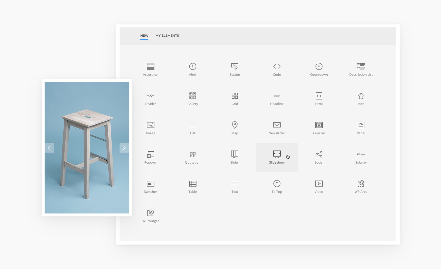
YOOtheme Pro has a growing library of over 30 content elements. Here you can find both common elements like the Video, Panel, Image or Heading, but you can also expect some advanced elements such as the Slider, Slideshow or Gallery with the masonry effect and filter option and even more. YOOtheme Pro also allows you to place WordPress widgets anywhere in your layout. All elements are built with the popular front-end framework UIkit that provides modern codebase with fast and sleek JavaScript.

Sophisticated Layouts for Your Website

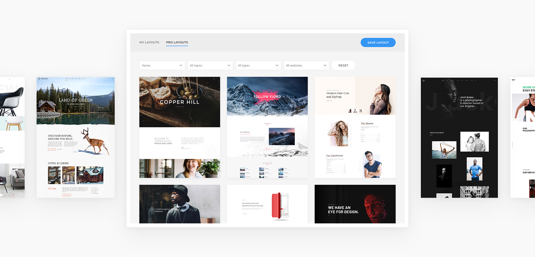
YOOtheme invests a lot of time and effort into the development of their layouts. A team of professional designers regularly creates complete website concepts with a thought-out content structure and focus on modern design trends. They already have over 100 layouts with free-to-use images and even hand-made illustrations that can be found in the Layout Library. You can filter layouts according to topics and types, mix and match them, save your own layouts to reuse them later. This provides you with unlimited possibilities and makes creating websites in WordPress as easy as can be.

A Library of Over 70 Beautiful Styles

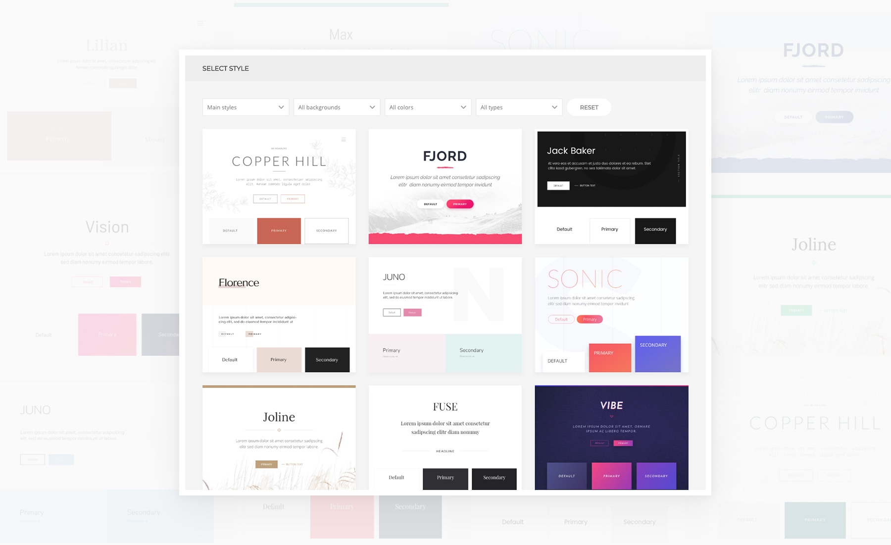
What makes YOOtheme Pro stand out even more is the Style Library that includes over 70 handcrafted styles. One click, and the look of your website changes completely. Whether you are looking for a minimalistic or a bold style, this substantial collection represents all trends. You can customize next to anything with YOOtheme Pro, from changing the style of each item separately to applying changes globally. This gives you all the power to style your WordPress website with none of the coding.

Integrated Unsplash Image Library

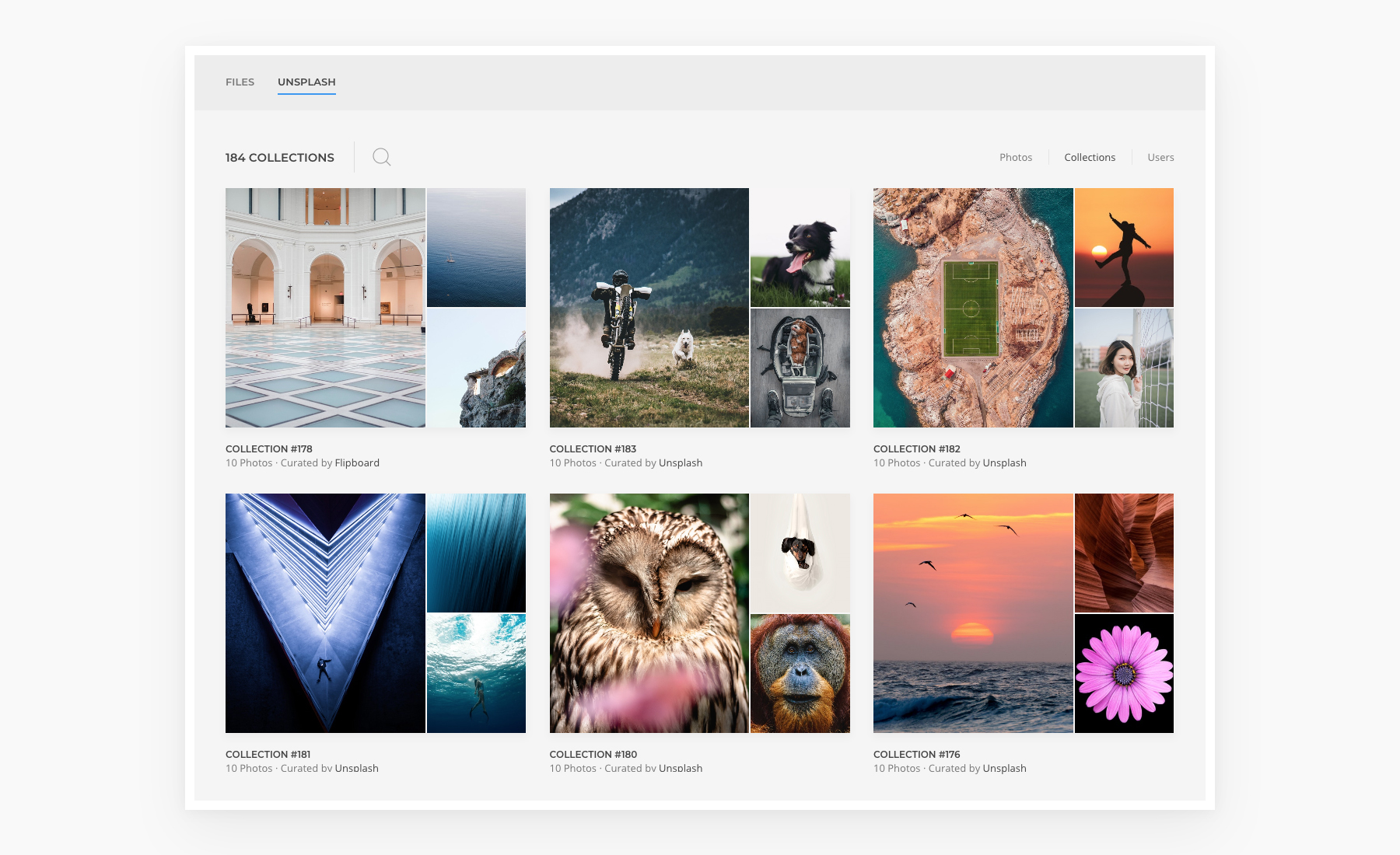
The popular Unsplash library that provides quality and free-to-use photos is seamlessly integrated into YOOtheme Pro. Due to this integration you can search through the library and try out images directly on your website without having to leave YOOtheme Pro. Use filter, browse through collections and users and insert images directly into your layouts. The images will only be downloaded after your click Save. This feature is a real time-saver for every designer.

Lightning-fast and Developer-friendly

YOOtheme Pro is a true piece of German engineering, it is fast, lightweight and easy like no other page builder. Powered by Vue.js and Uikit, it provides a great user experience. YOOtheme Pro also cares about speed. The small code size as well as the latest web technologies ensure the first meaningful paint gets quickly on the screen. And with auto-generated srcsets, lazy loading images and next-gen image formats like WebP YOOtheme Pro will boost the Google PageSpeed rank for your WordPress website. What’s more, Google Fonts are stored locally, which saves the request to Google and ensures GDPR compliance.

A modular and extendable architecture makes YOOtheme Pro extremely developer-friendly. It allows you to override everything, add custom elements, CSS, JavaScript and new themes settings. An extensive documentation including video tutorials and a section specifically written for developers will help you get started in no time.

Get YOOtheme Pro

YOOtheme Pro both simplifies and empowers website building. Regular release of theme packages including sophisticated layouts on a specific topic, six style variations and free-to-use images will make YOOtheme Pro the only thing you’ll need to create a website. And while we could talk more about how YOOtheme Pro supports WooCommerce and has a a Footer Builder and many desktop and mobile header layouts, we’d rather let you see for yourself. Get YOOtheme Pro and experience the future of website building today.

Direct Link to Article — Permalink

The post Introducing the YOOtheme Pro Page Builder appeared first on CSS-Tricks.

Having fun with link hover effects

Post pobrano z: Having fun with link hover effects

A designer I work with was presenting comps at a recent team meeting. She had done a wonderful job piecing together the concept for a design system, from components to patterns and everything in between that would make any front-end developer happy.

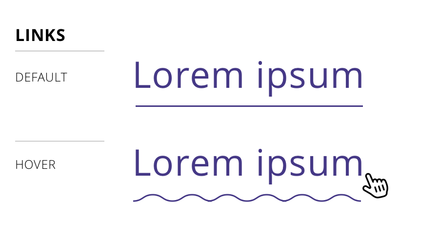
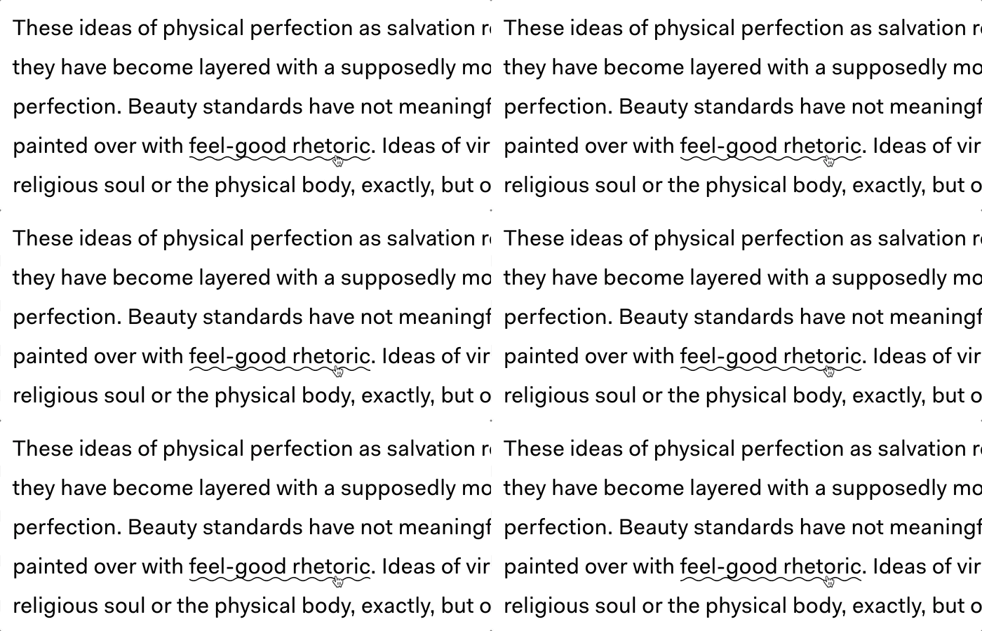
But there was a teeny tiny detail in her work that caught my eye: the hover state for links was a squiggle.

Default link (top) and hover effect (bottom)

Huh! Not only had I not seen that before, the idea had never even crossed my mind. Turns out there are plenty of instances of it on live sites, one being The Outline. That was the one that was implementation that inspired the design.

Cool, I figured. We can do something like a linear background gradient or even a background image. But! That wasn’t the end of the design. Turns out it’s animated as well. Again, from The Outline:

Screenshot from The Outline article (source)

Whoa! That’s pretty wild. I wasn’t sure how to approach that, honestly, because animating any of my initial ideas would be difficult, especially for cross-browser support.

So, how did The Outline do it? Turns out, it’s SVG. We can make a squiggly path and animate it pretty easily:

See the Pen Squiggle by Geoff Graham (@geoffgraham) on CodePen.

But how does that work with a link? Well, we can use SVG on the background-image property:

See the Pen Squiggle by Geoff Graham (@geoffgraham) on CodePen.

But that’s kinda crappy because we can’t really animate that. We need better values for that. However, we can inline CSS directly on the SVG in the background-image property. We can’t simply copy and paste the SVG code into the property, but we can with some proper encoding:

See the Pen Squiggle by Geoff Graham (@geoffgraham) on CodePen.

And, since SVG can contain its own styles within the markup, the animation can be tossed right there in the background-image property, the same way we would do it with CSS in an HTML document head or inline CSS in HTML.

See the Pen Squiggle by Geoff Graham (@geoffgraham) on CodePen.

We can style it up a little differently, if we’d like:

See the Pen Link Effectz – Squiggle by Geoff Graham (@geoffgraham) on CodePen.

This is inspiring!

I have no idea if an animated squiggle makes for a good user experience and, frankly, that’s not the point of this post. The point is that The Outline had a fun idea with a slick CSS implementation.

That got me thinking about other non-standard (perhaps even unconventional) hover styling we can do with links. Again, tossing aside usability and have a grand ol’ time with CSS…

The Border to Background Effect

Maybe that same bottom border on the default link can grow and become the full background of the link on hover:

See the Pen Link Effectz – Background on hover by Geoff Graham (@geoffgraham) on CodePen.

Heck, we can even do something similar horizontally:

See the Pen Link Effectz – Horizotonal Background by Geoff Graham (@geoffgraham) on CodePen.

The Outlined Text Effect

Let’s strip out the font color and leave an outline behind.

See the Pen Link Effectz – Outline on hover by Geoff Graham (@geoffgraham) on CodePen.

The Raised Text Effect

Another idea is to raise the text as if it grows out of the page on hover:

See the Pen Link Effectz – Raised text on hover by Geoff Graham (@geoffgraham) on CodePen.

The Font Swapper-oo Effect

This is so impractical that it makes me LOL, but why not:

See the Pen Link Effectz – Swap font on hover by Geoff Graham (@geoffgraham) on CodePen.

The „Turn it Up, Chris” Effect

Sorry, Chris. You know you love it. ❤️

See the Pen Link Effectz – Turn it up, Chris! by Geoff Graham (@geoffgraham) on CodePen.

What can you come up with?

Have ideas? Let me know in the comments and I’ll toss ’em in the CodePen collection I’ve started.

The post Having fun with link hover effects appeared first on CSS-Tricks.

Safari Ripper ☠️

Post pobrano z: Safari Ripper ☠️

Security researcher Sabri posted a bit of code that will „force restart any iOS device.” It’s interesting to see HTML & CSS have this kind of dangerous power. It’s essentially a ton of <div>s scaled to be pretty huge and then set over a repeating JPG image with each <div> blurring the background via backdrop-filter. It must cause such extreme and unhandled memory usage that it wreaks havoc on the browser as well as the entire operating system.

I was trying to test it out myself and be really careful not to execute it… but of course I did, and it crashed my Chrome 68 on a MacBook Pro. Not the whole operating system, but I had to force quit the browser. Then again, I suppose even while(true) {} can do that!

The comment thread on the gist hast more interesting details, like how it crashes iOS Safari 9+ (including the new version 12!) and weird behavior on the PlayStation 3 native browser.

Direct Link to Article — Permalink

The post Safari Ripper ☠️ appeared first on CSS-Tricks.

What’s the difference between ./dogs.html and /dogs.html?

Post pobrano z: What’s the difference between ./dogs.html and /dogs.html?

They are both URL paths. They have different names, though.

<!-- root-relative -->
<a href="./dogs.html">Dogs</a>

<!-- absolute -->
<a href="/dogs.html">Dogs</a>

There are also fully-qualified URLs that would be like:

<!-- fully qualified -->
<a href="https://website.com/dogs.html">Dogs</a>

Fully-qualified URL’s are pretty obvious in what they do — that link takes you to that exact place. So, let’s look those first two examples again.

Say you have a directory structure like this on your site:

public/
├── index.html
└── animals/
    ├── cats.html
    └── dogs.html

If you put a link on cats.html that links to /dogs.html (an „absolute” path), it’s going to 404 — there is no dogs.html at the base/root level of this site! The / at the beginning of the path means „start at the very bottom level and go up from there” (with public/ being the very bottom level).

That link on cats.html would need to be written as either ./dogs.html (start one directory back and work up) or /animals/dogs.html (explicitly state which directory to start at).

Absolute URLs get longer, naturally, the more complex the directory structure.

public/
├── animals/
  └── pets/
      ├── c/
      |   └── cats.html
      └── d/
          └── dogs.html

With a structure like this, for dogs.html to link to cats.html, it would have to be either…

<!-- Notice the TWO dots, meaning back up another folder level -->
<a href="../c/cats.html">cats</a>

<!-- Or absolute -->
<a href="/animals/pets/c/cats.html">cats</a>

It’s worth noting in this scenario that if animals/ was renamed animal/, then the relative link would still work, but the absolute link would not. That can be a downside to using absolute links. When you’re that specific, making a change to the path will impact your links.

We’ve only looked at HTML linking to HTML, but this idea is universal to the web (and computers, basically). For example, in a CSS file, you might have:

body {
  /* Back up one level from /images and follow this path */
  background-image: url(./images/pattern.png);
}

…which would be correct in this situation:

public/
├── images/
|   └── pattern.png
├──index.html
└── style.css

But if you were to move the CSS file…

public/
├── images/
|   └── pattern.png
├── css/
|   └── style.css
└── index.html

…then that becomes wrong because your CSS file is now nested in another directory and is referencing paths from a deeper level. You’d need to back up another folder level again with two dots, like ../images/pattern.png.

One URL format isn’t better than another — it just depends on what you think is more useful and intuitive at the time.

For me, I think about what is the least likely thing to change. For something like an image asset, I find it very unlikely that I’ll ever move it, so linking to it with an absolute URL path (e.g. /images/pattern.png) seems the safest. But for linking documents together that all happen to be in the same directory, it seems safer to link them relatively.

The post What’s the difference between ./dogs.html and /dogs.html? appeared first on CSS-Tricks.

HTML elements, unite! The Voltron-like powers of combining elements.

Post pobrano z: HTML elements, unite! The Voltron-like powers of combining elements.

Guides, resources and discussions about Semantic HTML are often focused around specific elements, like a heading, or a sectioning element, or a list. It’s not often that we talk specifically about how we can combine HTML elements to increase their effectiveness.

Normally, when we introduce HTML, we talk about how it is used to apply meaning to content in a document, and we do this by using examples like:

  • „Is it a paragraph?”
  • „Is it a heading?”
  • „Is it a numbered list”
  • „Is it a button”

We use these examples because they are easy to understand — it’s a single piece or chunk of the same content that needs to be represented in a particular way. This is useful, but it only scratches the surface of how we can use and combine elements to provide more context and meaning.

You remember Voltron, right? Each member of the Voltron force was powerful in their own right, but it was when they combined together to form a towering figure that their mighty powers became unstoppable.

The same is true of HTML elements. I have a few favorite combinations that I’ll take you through. They may seem obscure, but you’d be surprised at how often they come up when you take the time to think outside of divs and spans.

Abbreviations and Definitions

<abbr> and <dfn> are two of my favorite HTML elements. I particularly like them because they work really well together.

You can combine the abbreviation and definition elements to allow browsers, search bots, and other technologies to recognize that something is being defined and that the acronym is associated to that phrase.

<p>
  The <dfn><abbr title="International Good
  Dog Association">IGDA</abbr></dfn> is an international,  
  not-for-profit organization responsible for determining
  that all dogs are good.
</p>

In the above example, I’m defining that the acronym „IGDA” as „International Good Dogs Association.” I do this by wrapping the acronym in an <abbr> element with a title attribute defining the full name. By adding the <dfn> element around the abbreviation, it indicates that the surrounding paragraph defines the term „International Good Dogs Association.”

The <abbr> element is useful because it can tell screen readers what they should read, while also providing a useful visual representation in the form of a tooltip explaining what the abbreviation is.

Visual representation of <abbr> and <dfn>.

Keyboard, Sample and Variable

If you haven’t heard of these elements, then get ready to have your socks blown off, because they are awesome.

First up, the <kbd> element is used to represent text for a textual user input (e.g. from a keyboard). You can also nest multiple <kbd> elements to represent multiple keystrokes. I love this because, as developers, we find ourselves (hopefully) writing documentation, blog posts, and guides on a regular basis and HTML provides us with native ways to represent this content straight out of the box!

If I wanted to tell someone how you copy and paste with the keyboard, I could mark it up like the code below.

<p>I like to <kbd><kbd>Ctrl</kbd>+<kbd>C</kbd></kbd> and <kbd><kbd>Ctrl</kbd>+<kbd>V</kbd></kbd> a lot.</p>

It looks a bit nuts but the above code, when rendered, looks like the following without any styling applied to it. If you are wondering why kbd is nested inside another kbd element, what this does is specify that the key or input is part of a larger input. Even more combined superpowers!

See the Pen rZpNPy by CSS-Tricks (@css-tricks) on CodePen.

You can further target the <kbd> elements with CSS to make it look more like little keyboard controls. (Note: Browsers tend to render this by default with a monospace font.)

See the Pen gdoOqE by CSS-Tricks (@css-tricks) on CodePen.

If you’re wondering what the difference is between using <kbd> versus a span, I believe it comes down to information. I will repeat this sentiment a lot: we do not know how someone is going to consume our HTML, so give your content it’s best chance by representing it in the most meaningful and contextual way possible. If you are still not on board, then please go read my post about HTML as told by TypeScript.

The <samp> element is really cool because you can nest it inside the <kbd> element and vice versa. WHAT? I know, so versatile! Let’s have a look at some examples from MDN.

The following code is an example of nesting a <samp> element inside a <kbd> element. This is used to mark up content that represents input based on the text displayed by the system (e.g. button names).

<p>To save the image file, select <kbd><kbd><samp>File</samp></kbd> - <kbd><samp>Save as...</samp></kbd></kbd>.
</p>

See the Pen YOYzbJ by CSS-Tricks (@css-tricks) on CodePen.

In the above code, we define our keyboard shortcuts the same as our previous example, but we also determine that the menu and menu item names (contained within both <kbd> and <samp>) are an input selected from something displayed by the system, e.g. a dialog or widget.

In other words, this piece of text is a message from the system which has some user inputs that you need to follow (like File and Save as…).

Whereas, when we nest <kbd> inside <samp>, we determine that the input has been echoed back to the user by the system.

<p><samp>yarn start:theproject does not exist, did you mean:</p>
<blockquote><samp><kbd>yarn start:the-project</kbd></samp></blockquote>

Finally, the <var> element! This is used to mark up the name of a variable in math or programming, for example:

<var>E</var> = <var>m</var><var>c</var><sup>2</sup>.
<samp>Error: <var>console<var> is undefined.</samp>

Here you can start to see how combining <var> with other elements like <pre>, <code>, <kbd> or <samp> starts to make your content’s markup more explicit by adding more context. Anything that interprets your HTML markup can start to derive more meaning from the elements you are using rather than just assuming that it’s all standard text.

If you put this content in a paragraph with some spans, there is no way for technology to distinguish this from any other old text on your page. You don’t have to resort to <span> or a <div> to represent this content because HTML already provides us with more semantically accurate elements we can use. HTML is not just about presentation; it’s about meaning. Various technologies outside of visual rendering engines rely on this meaning to make decisions about how to communicate our content in the most meaningful way (e.g. screen readers, text to voice, reading apps, bots, or the next big thing in the future).

Figures

Figures (<figure>) are a great example of a power combination element. Unfortunately, I think it is widely misused and under appreciated (much like <aside>, which I could talk about for hours). The obvious combination you are probably familiar with is using <figure> and <figcaption> together. We often use this duo to represent graphical content like images, illustrations and diagrams — but it can also be used for things like code, poems and quotes!

Because a figure is so flexible in what kind of content it represents, there are a bunch of different HTML elements you can use within a figure to provide more context around the type of content you are putting in your page.

Figcaption

The <figure> element is often seen with an optional <figcaption> which represents a caption or legend for a figure. It should be the first child or last child of the <figure> element. You can also use any flow content (e.g. paragraphs, headings, etc.) in the <figcaption> to provide more context and you can have multiple images inside a <figure> represented by a single <figcaption>.

<figure>
  <img src="jello.jpg" alt="Golden Retriever Puppy" />
  <figcaption>Jello the Golden Retriever enjoying being carried home.</figcaption>
</figure>

Preformatted Text

The <pre> element is used to display preformatted text or code and is usually rendered using a monospace font. While <pre> can be used on its own, it can also be combined with <figure> and <figcaption>. By doing this, the content inside the <pre> element becomes more accessible to assistive technologies, like screen readers, since it allows us to use <figcaption> as a label for the text or code.

We can go even further by combining the <pre> and <code> elements to identify the pre- formatted content as code.

See the Pen QVaWVW by CSS-Tricks (@css-tricks) on CodePen.

Because <code> is considered flow content, it can also be used inside a <figcaption> to mark up inline references to code (i.e. a single phrase or line).

Cite and Blockquote

Quotations are something I use a lot and it honestly didn’t occur to me it could be used as part of a figure. But it still makes sense to use cite or quotation if the content they contain is relevant to the overall content, even if it is not part of the main document flow.

I like the example of using a figure for poems, mainly so I could share the amazing poem I wrote about my dog. Here I use the <cite> element inside the <figcaption>:

<figure>
  <p>
    Jello - A little fluffy dog.
    Hello! 
    Squishy Jello - you little fluffy fellow.
    BOUNCY yellow Jello.
        A very mellow fellow.
    EATING MY MARSHMALLOW.
  </p>
  <figcaption><cite>Eating my Marshmallow by Mandy Michael</figcaption>
</figure>

It’s easy to fall into the trap of thinking that the figure element is just for images or image-like content, but you can use it for content like audio, video, charts, poems, quotations or even tables of statistics. Because the element is so versatile you can combine it with so many other elements to provide more and more context about the figure for assistive technology, browsers, and other technologies consuming your website.

Wrapping Up

These are just some of the ways HTML elements can be combined for better context. HTML elements are indeed useful and valuable on their own when used as isolated pieces — and using them this way is a good first step. But, like Voltron, when you combine HTML elements together, the individual pieces form a greater whole and gain much more meaning and power. It’s important that we don’t think of HTML as individual pieces of code, but parts of a whole because HTML is really a mass of totally amazing combinations.

You can combine and use HTML elements in any number of ways to best represent your content. Don’t simply stick to the same old things you know; take the time to explore HTML and learn about all it has to offer. Like any language, we should make the most of it and use it to its full potential.

The more accurate you are in marking up your content, the better that content will be represented across technologies, and the more prepared it will be for any anything else that is used to interpret your HTML in the future.

So, go forth and HTML elements, unite!


Resources

In my opinion, the best resource for learning and understanding how to use HTML (outside of the spec itself) is the MDN Web Docs. It lists all the HTML elements you could ever need.

The following are among the elements covered in this post:

If you are a TypeScript fan and don’t understand why Semantic HTML is important, I wrote this post just for you: Understanding why Semantic HTML is important as told by TypeScript.

The post HTML elements, unite! The Voltron-like powers of combining elements. appeared first on CSS-Tricks.

Why Designers Don’t Want to Think When They Read

Post pobrano z: Why Designers Don’t Want to Think When They Read

We’ve all seen articles like „The Top 5 Ways To Fix Your Sign Up Flow and Get On With Your Life.” Articles like this aren’t wrong or bad, they are just shallow and a bit junk food-y and BuzzFeed-y. Of course, a designer’s actual job is complicated, nuanced, and difficult. But deep dives into all that are far less common.

Khoi Vinh has been writing about this and points to some heavy self-reflection from Fabricio Teixeira and Caio Braga, publishers of the very popular UX Collective.

It’s clear that the currency of design discourse is really concerned with the “how” of design, not the “why” of it. As Teixeira and Braga write:

While designers tend to be skeptical of magic formulas—we’re decidedly suspicious of self-help gurus, magic diets, or miraculous career advice—we have a surprisingly high tolerance for formulaic solutions when it comes to design.

That’s a pointed criticism but, from my perspective, it’s also quite accurate.

Direct Link to Article — Permalink

The post Why Designers Don’t Want to Think When They Read appeared first on CSS-Tricks.

XOXO 2018

Post pobrano z: XOXO 2018

There’s not much talk about frameworks here. There’s no shaming about old techniques, or jokes about JavaScript. There’s just a couple hundred people all around me laughing and smiling and watching talks about making things on the web and it all feels so fresh and new to me. Unlike many other conferences I’ve visited, these talks are somehow inclusive and rather feel, well, there’s no other word for it: inspiring.

I’m sitting in a little room buried underneath the Veterans Memorial Coliseum in Portland and I’m here for my third XOXO. And I can’t stop smiling.

Although the festival is not entirely focused on coding and front-end development, there are a lot of developers here that make art on the web for fun. From Jenn Schiffer’s pixel art to Monica Dinculescu’s emoji projects and Nicole He’s buck-wild enhance.computer, there’s a lot of interesting discussions about coding — but! — it’s from a very different perspective than the one I’m familiar with.

Most conferences tend to focus on being practical. Here’s the newest technique! Here’s how to improve your career! Here’s the coolest new folks that you should be following! But it’s important to remember that the web isn’t only a serious place for serious work. It can be this entirely other thing, too.

The web can be for fun. It can be utterly weird and unexpected. And that’s what we’re all seeing in this little room right now at XOXO; websites that can’t be monetized, websites that can’t be controlled by corporate interests or giant ad networks.

Websites that are just for fun.

The post XOXO 2018 appeared first on CSS-Tricks.