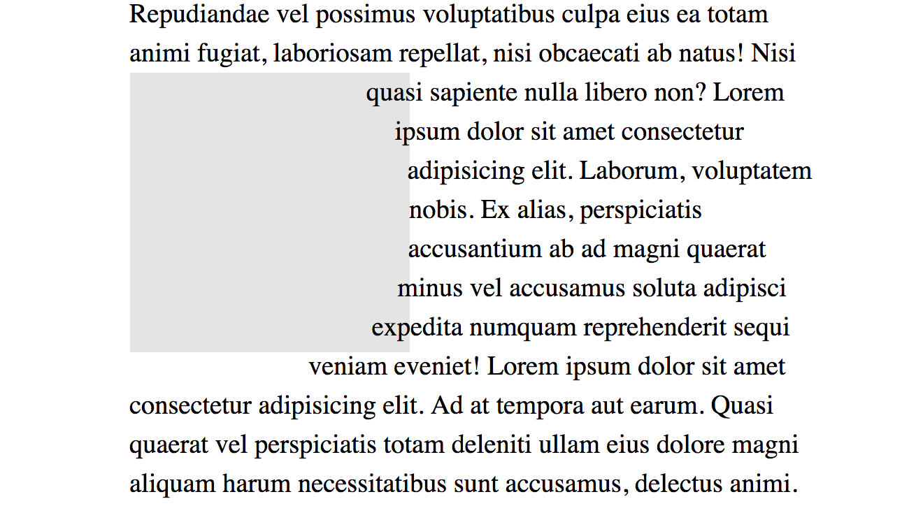
Firefox 62 is shipping out of beta on September 5th. The big notable thing for CSS developers is that it will now support the shape-outside property with polygon(), circle(), and ellipse(), joining Chrome and Safari.
What will be nice about the Firefox release (well, it’s kinda already nice if you use something like Firefox Developer Edition which is already on 62), is that it has a shape editor built right into DevTools.
Chrome supports shape-outside as well, but there is no native DevTools helper for working with them. Thankfully, Razvan Caliman has a Chrome Plugin that does a great job. (Razvan contributed to the Firefox version as well, I hear.)
I enjoy using shape-outside as it can add real visual interest to a page that isn’t nearly overdone or trendy just yet. Plus, in a lot of cases, it doesn’t matter whether it’s supported because the float behaves as a rectangle. If it causes major issues, you can wrap things in an @supports block and do something different.
@supports (shape-outside: circle(50%)) {
  img {
    /* Only round the image if we can float around it too, otherwise leave it square. */
    shape-outside: circle(50%);
    border-radius: 50%;
  }
}
I do have a few gripes with both the Firefox DevTools and the Chrome plugin though…
I wish it was easier to add a newshape-outside to an existing element. You can do it, but you have to manually add something like shape-outside: polygon(0 0, 10px 0, 20px 0); or something to the element to kick off the tool, then start using it.
I wish they worked with % by default instead of px units.
That second one particularly. It’s so common we size things flexibly these days that hard pixel values are sometimes useless and difficult to convert to flexible percentages.
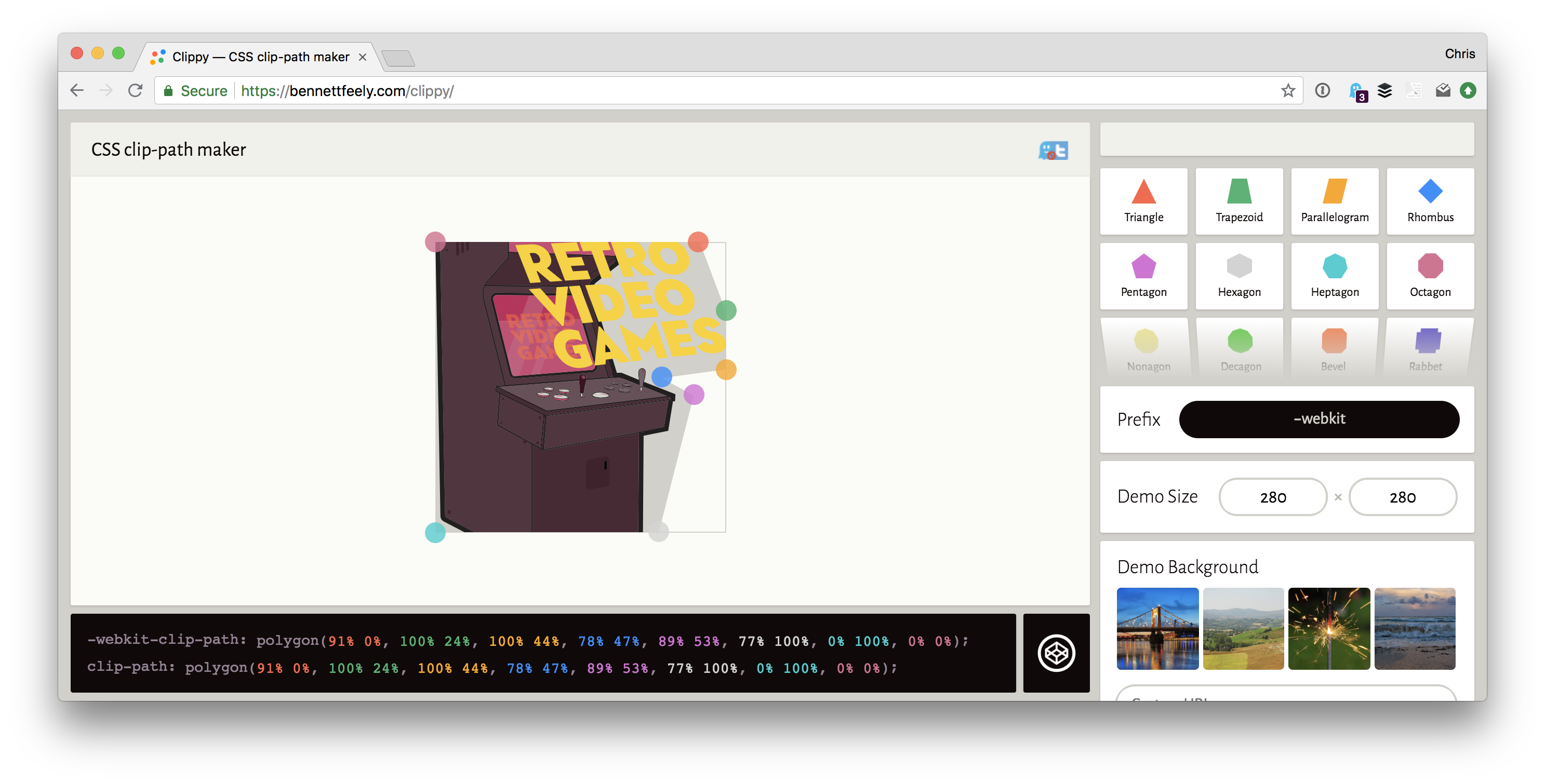
You’re probably better off starting with Bennett Feely’s Clippy (it’s technically for clip-path, but it includes polygon() it works works for either. It works with percentages, so great, moving on from there.
„The frustrations of using CSS Shapes and CSS Exclusions”
That’s what Ben Frain recently blogged and it has some good points about all this. One key point is that using shape-outside doesn’t necessarily mean that you’re clipping the background. Personally, I find that I’m cutting a shape on backgrounds that are transparent anyway, but I take the point.
To fix this you’ll need a clip-path as well.
The other big one is there is no shape-inside() property (yet), so if you’re hoping to put some text inside a shape rather than have it wrap around the outside of a shape, no luck yet.
Note the double-colon ::before versus the single-colon :before. Which one is correct?
Technically, the correct answer is ::before. But that doesn’t mean you should automatically use it.
The situation is that:
double-colon selectors are pseudo-elements.
single-colon selectors are pseudo-selectors.
::before is definitely a pseudo-element, so it should use the double colon.
The distinction between a pseudo-element and pseudo-selector is already confusing. Fortunately, ::after and ::before are fairly straightforward. They literally add something new to the page, an element.
But something like ::first-letter is also a pseudo-element. The way I reason that out in my brain is that it’s selecting a part of something in which there is no existing HTML element for. There is no <span> around that first letter you’re targeting, so that first letter is almost like a new element you’re adding on the page. That differs from pseudo-selectors which are selecting things that already exist, like the :nth-child(2) or whatever.
Even though ::before is a pseudo-element and a double-colon is the correct way to use pseudo-elements, should you?
There is an argument that perhaps you should use :before, which goes like this:
Internet Explorer 8 and below only supported :before, not ::before
All modern browsers support it both ways, since tons of sites use :before and browsers really value backwards compatibility.
Hey it’s one less character as a bonus.
I’ve heard people say that they have a CSS linter that requires (or automates) them to be single-colon. Personally, I’m OK with people doing that. Seems fine. I’d value consistency over which way you choose to go.
On the flip side, there’s an argument for going with ::before that goes like this:
Single-colon pseudo-elements were a mistake. There will never be any more pseudo-elements with a single-colon.
If you have the distinction straight in your mind, might as well train your fingers to do it right.
This is already confusing enough, so let’s just follow the correctly specced way.
I’ve got my linter set up to force me to do double-colons. I don’t support Internet Explorer 8 anyway and it feels good to be doing things the „right” way.
WooCommerce is a powerful eCommerce solution for WordPress sites. If you’re like me, and like working with WordPress and have WordPress-powered sites already, WooCommerce is a no-brainer for helping you sell things online on those sites. But even if you don’t already have a WordPress site, WooCommerce is so good I think it would make sense to spin up a WordPress site so you could use it for your eCommerce solution.
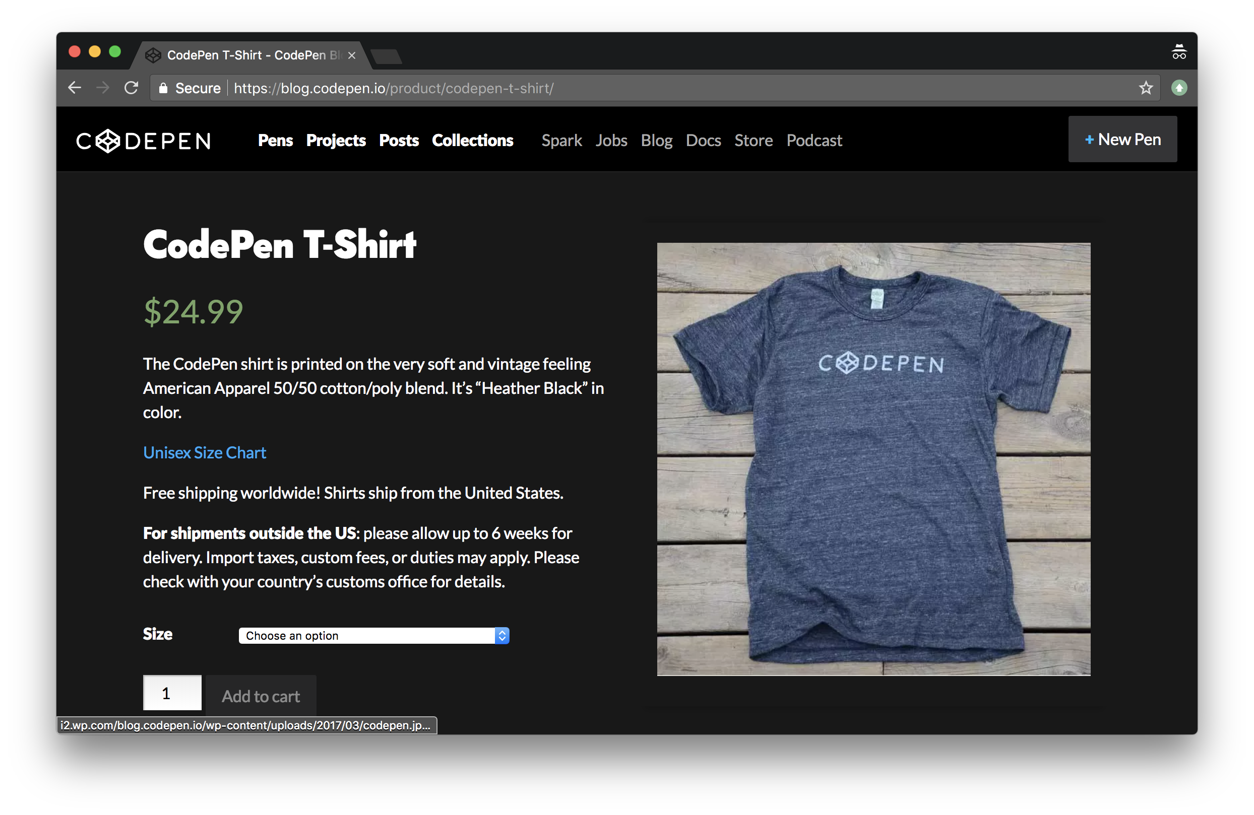
Personally, I’ve used WooCommerce a number of times to sell things. Most recently, I’ve used it to sell T-Shirts (and hats) over on CodePen. We use WordPress already to power our blog, documentation, and podcast. Makes perfect sense to use WordPress for the store as well!
What I think is notable about our WooCommerce installation at CodePen is how painless it was, while doing everything we need it to do. I’d say it was a half-day job with maybe a half-day of maintenance every few months, partially based on us wanting to change something.
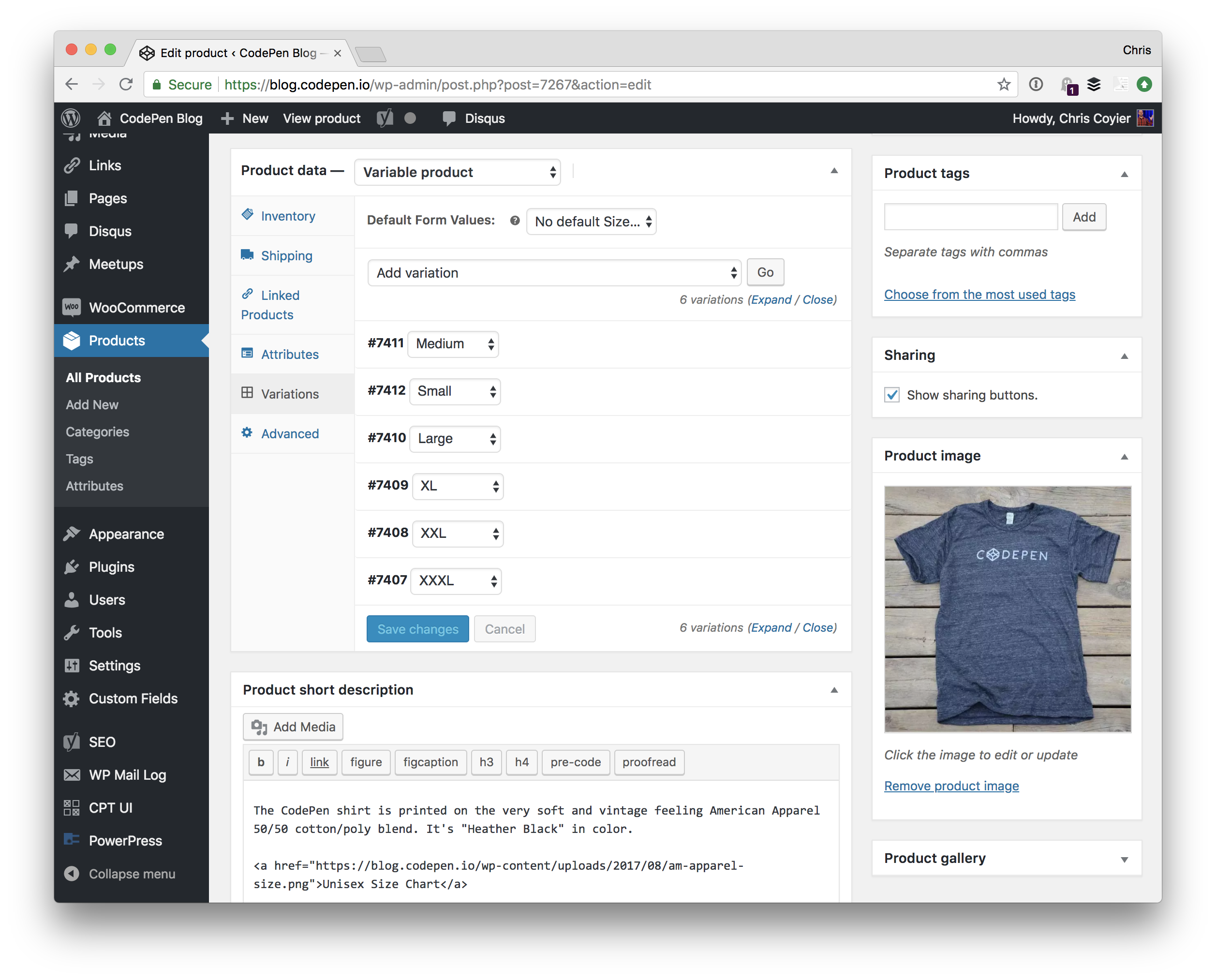
The first step is installing the plugin, and immediately you get a Products post type you can use to add new products. We’re selling a T-Shirt, so that looks like this:
Note the variations in use for size. We even track inventory at the size level so our T-Shirt printing company knows when to re-print different sizes.
What is somewhat astounding about WooCommerce is that you might need to do very little else. You could set a price, flip on the basic PayPal integration and enter your email, publish the product, and start taking orders.
Or, you could start customizing things and do as much or as little as you want:
You could add as many different payment processors as you like. We like using Stripe for credit card processing at CodePen, but also offer PayPal.
You could customize the template of every different page involved, or just use the defaults. At CodePen we have very lightly customized templates for the store homepage and product page.
You could get very detailed with calculating shipping costs, or use flat rates. We use a flat rate shipping cost at CodePen almost as marketing: same shipping cost anywhere in the world!
You could get into integrations, like connecting it with your MailChimp account for further email marketing or Slack account to notify your team of sales.
If you can dream it, you can do it with WooCommerce.
At CodePen, we work with a company called RealThread that actually prints and ships the T-Shirts.
They work great with WooCommerce of course, and the way we set that up is that we use the ShipStationintegration and blast the orders into their account there and they handle all the fulfillment from there. There are all sorts of shipping method plugins though for anything you can think of.
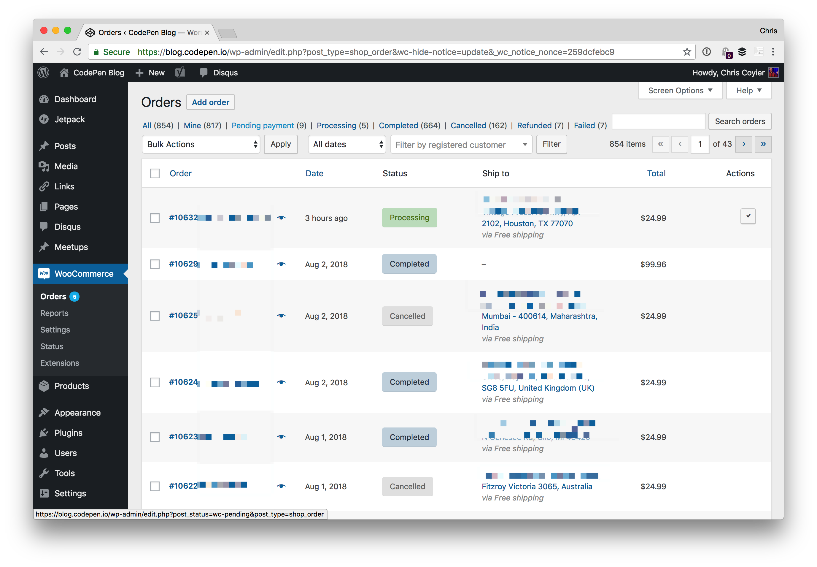
Within WooCommerce, we have a dashboard of all the orders, their status, and even tracking information should we need to look something up.
So essentially:
We use WooCommerce
We use the Stripe plugin to take our credit card payments that way
We use the PayPal plugin to take PayPal payments over Braintree
We use the ShipStation plugin to send orders to that system for our fulfillment company to handle
It was quite easy to set up and works great, and it’s comforting to know that we could do tons more with it if we needed to and support is there to help.
Note the double-colon ::before versus the single-colon :before. Which one is correct?
Technically, the correct answer is ::before. But that doesn’t mean you should automatically use it.
The situation is that:
double-colon selectors are pseudo-elements.
single-colon selectors are pseudo-selectors.
::before is definitely a pseudo-element, so it should use the double colon.
The distinction between a pseudo-element and pseudo-selector is already confusing. Fortunately, ::after and ::before are fairly straightforward. They literally add something new to the page, an element.
But something like ::first-letter is also a pseudo-element. The way I reason that out in my brain is that it’s selecting a part of something in which there is no existing HTML element for. There is no <span> around that first letter you’re targeting, so that first letter is almost like a new element you’re adding on the page. That differs from pseudo-selectors which are selecting things that already exist, like the :nth-child(2) or whatever.
Even though ::before is a pseudo-element and a double-colon is the correct way to use pseudo-elements, should you?
There is an argument that perhaps you should use :before, which goes like this:
Internet Explorer 8 and below only supported :before, not ::before
All modern browsers support it both ways, since tons of sites use :before and browsers really value backwards compatibility.
Hey it’s one less character as a bonus.
I’ve heard people say that they have a CSS linter that requires (or automates) them to be single-colon. Personally, I’m OK with people doing that. Seems fine. I’d value consistency over which way you choose to go.
On the flip side, there’s an argument for going with ::before that goes like this:
Single-colon pseudo-elements were a mistake. There will never be any more pseudo-elements with a single-colon.
If you have the distinction straight in your mind, might as well train your fingers to do it right.
This is already confusing enough, so let’s just follow the correctly specced way.
I’ve got my linter set up to force me to do double-colons. I don’t support Internet Explorer 8 anyway and it feels good to be doing things the „right” way.
WooCommerce is a powerful eCommerce solution for WordPress sites. If you’re like me, and like working with WordPress and have WordPress-powered sites already, WooCommerce is a no-brainer for helping you sell things online on those sites. But even if you don’t already have a WordPress site, WooCommerce is so good I think it would make sense to spin up a WordPress site so you could use it for your eCommerce solution.
Personally, I’ve used WooCommerce a number of times to sell things. Most recently, I’ve used it to sell T-Shirts (and hats) over on CodePen. We use WordPress already to power our blog, documentation, and podcast. Makes perfect sense to use WordPress for the store as well!
What I think is notable about our WooCommerce installation at CodePen is how painless it was, while doing everything we need it to do. I’d say it was a half-day job with maybe a half-day of maintenance every few months, partially based on us wanting to change something.
The first step is installing the plugin, and immediately you get a Products post type you can use to add new products. We’re selling a T-Shirt, so that looks like this:
Note the variations in use for size. We even track inventory at the size level so our T-Shirt printing company knows when to re-print different sizes.
What is somewhat astounding about WooCommerce is that you might need to do very little else. You could set a price, flip on the basic PayPal integration and enter your email, publish the product, and start taking orders.
Or, you could start customizing things and do as much or as little as you want:
You could add as many different payment processors as you like. We like using Stripe for credit card processing at CodePen, but also offer PayPal.
You could customize the template of every different page involved, or just use the defaults. At CodePen we have very lightly customized templates for the store homepage and product page.
You could get very detailed with calculating shipping costs, or use flat rates. We use a flat rate shipping cost at CodePen almost as marketing: same shipping cost anywhere in the world!
You could get into integrations, like connecting it with your MailChimp account for further email marketing or Slack account to notify your team of sales.
If you can dream it, you can do it with WooCommerce.
At CodePen, we work with a company called RealThread that actually prints and ships the T-Shirts.
They work great with WooCommerce of course, and the way we set that up is that we use the ShipStationintegration and blast the orders into their account there and they handle all the fulfillment from there. There are all sorts of shipping method plugins though for anything you can think of.
Within WooCommerce, we have a dashboard of all the orders, their status, and even tracking information should we need to look something up.
So essentially:
We use WooCommerce
We use the Stripe plugin to take our credit card payments that way
We use the PayPal plugin to take PayPal payments over Braintree
We use the ShipStation plugin to send orders to that system for our fulfillment company to handle
It was quite easy to set up and works great, and it’s comforting to know that we could do tons more with it if we needed to and support is there to help.
In early 2017, I presented a couple of workshops on the topic of CSS feature detection, titled CSS Feature Detection in 2017.
A friend of mine, Justin Slack from New Media Labs, recently sent me a link to the phenomenal Feature Query Manager extension (available for both Chrome and Firefox), by Nigerian developer Ire Aderinokun. This seemed to be a perfect addition to my workshop material on the subject.
However, upon returning to the material, I realized how much my work on the subject has aged in the last 18 months.
The CSS landscape has undergone some tectonic shifts:
The Atomic CSS approach, although widely hated at first, has gained some traction through libraries like Tailwind, and perhaps influenced the addition of several new utility classes to Bootstrap 4.
The CSS Grid Layout spec has been adopted by browser vendors with surprising speed, and was almost immediately sanctioned as production ready.
The above prompted me to not only revisit my existing material, but also ponder the state of CSS feature detection in the upcoming 18 months.
In short:
❓ Why do we need CSS feature detection at all?
🛠️ What are good (and not so good) ways to do feature detection?
🤖 What does the future hold for CSS feature detection?
Cross-browser compatible CSS
When working with CSS, it seems that one of the top concerns always ends up being inconsistent feature support among browsers. This means that CSS styling might look perfect on my browsers of choice, but might be completely broken on another (perhaps an even more popular) browser.
Luckily, dealing with inconsistent browser support is trivial due to a key feature in the design of the CSS language itself. This behavior, called fault tolerance, means that browsers ignore CSS code they don’t understand. This is in stark contrast to languages like JavaScript or PHP that stop all execution in order to throw an error.
The critical implication here is that if we layer our CSS accordingly, properties will only be applied if the browser understands what they mean. As an example, you can include the following CSS rule and the browser will just ignore it— overriding the initial yellow color, but ignoring the third nonsensical value:
To illustrate how this can be used in practice, let me start with a contrived, but straightforward situation:
A client comes to you with a strong desire to include a call-to-action (in the form of a popup) on his homepage. With your amazing front-end skills, you are able to quickly produce the most obnoxious pop-up message known to man:
Unfortunately, it turns out that his wife has an old Windows XP machine running Internet Explorer 8. You’re shocked to learn that what she sees no longer resembles a popup in any shape or form.
But! We remember that by using the magic of CSS fault tolerance, we can remedy the situation. We identify all the mission-critical parts of the styling (e.g., the shadow is nice to have, but does not add anything useful usability-wise) and buffer prepend all core styling with fallbacks.
This means that our CSS now looks something like the following (the overrides are highlighted for clarity):
If you’re new to front-end development, you might wonder how on earth does one know the support level of specific CSS properties. The short answer is that the more you work with CSS, the more you will learn these by heart. However, there are a couple of tools that are able to help us along the way:
Can I Use is a widely used directory that contains searchable, up to date support matrices for all CSS features.
Even with all the above at our disposal, learning CSS support by heart will help us plan our styling up front and increase our efficiency when writing it.
Limits of CSS fault tolerance
The next week, your client returns with a new request. He wants to gather some feedback from users on the earlier changes that were made to the homepage—again, with a pop-up:
Once again it will look as follows in Internet Explorer 8:
Being more proactive this time, you use your new fallback skills to establish a base level of styling that works on Internet Explorer 8 and progressive styling for everything else. Unfortunately, we still run into a problem…
In order to replace the default radio buttons with ASCII hearts, we use the ::beforepseudo-element. However this pseudo-element is not supported in Internet Explorer 8. This means that the heart icon does not render; however the display: none property on the <input type="radio"> element still triggers on Internet Explorer 8. The implication being that neither the replacement behavior nor the default behavior is shown.
Credit to John Faulds for pointing out that it is actually possible to get the ’::before’ pseudo-element to work in Internet Explorer 8 if you replace the official double colon syntax with a single colon.
In short, we have a rule (display: none) whose execution should not be bound to its own support (and thus its own fallback structure), but to the support level of a completely separate CSS feature (::before).
For all intents and purposes, the common approach is to explore whether there are more straightforward solutions that do not rely on ::before. However, for the sake of this example, let’s say that the above solution is non-negotiable (and sometimes they are).
Enter User Agent Detection
A solution might be to determine what browser the user is using and then only apply display: none if their browser supports the ::before pseudo-element.
In fact, this approach is almost as old as the web itself. It is known as User Agent Detection or, more colloquially, browser sniffing.
It is usually done as follows:
All browsers add a JavaScript property on the global window object called navigator and this object contains a userAgent string property.
In my case, the userAgent string is: Mozilla/5.0 (Windows NT10.0;Win64;x64) AppleWebKit/537.36 (KHTML, like Gecko) Chrome/67.0.3396.9 Safari/537.36.
Mozilla Developer Network has a comprehensive list of how the above can be used to determine the browser.
If we are using Chrome, then the following should return true: (navigator.userAgent.indexOf("chrome") !== -1).
However, under the Internet Explorer section on MDN, we just get Internet Explorer. IE doesn’t put its name in the BrowserName/VersionNumber format.
Luckily, Internet Explorer provides its own native detection in the form of Conditional Comments.
This means that adding the following in our HTML should suffice:
This means that the above will be applied, should the browser be a version of Internet Explorer lower than version 9 (IE 9 supports ::before)—effectively overriding the display: none property.
Seems straightforward enough?
Unfortunately, over time, some critical flaws emerged in User Agent Detection. So much so that Internet Explorer stopped supporting Conditional Comments from version 10 onward. You will also notice that in the Mozilla Developer Network link itself, the following is presented in an orange alert:
It’s worth re-iterating: it’s very rarely a good idea to use user agent sniffing. You can almost always find a better, more broadly compatible way to solve your problem!
The biggest drawback of User Agent Detection is that browser vendors started spoofing their user agent strings over time due to the following:
Developer adds CSS feature that is not supported in the browser.
Developer adds User Agent Detection code to serve fallbacks to the browser.
Browser eventually adds support for that specific CSS feature.
Original User Agent Detection code is not updated to take this into consideration.
Code always displays the fallback, even if the browser now supports the CSS feature.
Browser uses a fake user agent string to give users the best experience on the web.
Furthermore, even if we were able to infallibly determine every browser type and version, we would have to actively maintain and update our User Agent Detection to reflect the feature support state of those browsers (notwithstanding browsers that have not even been developed yet).
It is important to note that although there are superficial similarities between feature detection and User Agent Detection, feature detection takes a radically different approach than User Agent Detection. According to the Mozilla Developer Network, when we use feature detection, we are essentially doing the following:
🔎 Testing whether a browser is actually able to run a specific line (or lines) of HTML, CSS or JavaScript code.
💪 Taking a specific action based on the outcome of this test.
We can also look to Wikipedia for a more formal definition (emphasis mine):
Feature detection (also feature testing) is a technique used in web development for handling differences between runtime environments (typically web browsers or user agents), by programmatically testing for clues that the environment may or may not offer certain functionality. This information is then used to make the application adapt in some way to suit the environment: to make use of certain APIs, or tailor for a better user experience.
While a bit esoteric, this definition does highlight two important aspects of feature detection:
Feature detection is a technique, as opposed to a specific tool or technology. This means that there are various (equally valid) ways to accomplish feature detection.
Feature detection programmatically tests code. This means that browsers actually run a piece of code to see what happens, as opposed to merely using inference or comparing it against a theoretical reference/list as done with User Agent Detection.
CSS feature detection with @supports
The core concept is not to ask „What browser is this?” It’s to ask „Does your browser support the feature I want to use?”.
Most modern browsers support a set of native CSS rules called CSS conditional rules. These allow us to test for certain conditions within the stylesheet itself. The latest iteration (known as module level 3) is described by the Cascading Style Sheets Working Group as follows:
This module contains the features of CSS for conditional processing of parts of style sheets, conditioned on capabilities of the processor or the document the style sheet is being applied to. It includes and extends the functionality of CSS level 2 [CSS21], which builds on CSS level 1 [CSS1]. The main extensions compared to level 2 are allowing nesting of certain at-rules inside ‘@media’, and the addition of the ‘@supports’ rule for conditional processing.
If you’ve used @media, @document or @import before, then you already have experience working with CSS conditional rules. For example when using CSS media queries we do the following:
Wrap a single or multiple CSS declarations in a code block with curly brackets, { }.
Prepend the code block with a @media query with additional information.
Include an optional media type. This can either be all, print, speech or the commonly used screen type.
Chain expressions with and/or to determine the scope. For example, if we use (min-width: 300px) and (max-width: 800px), it will trigger the query if the screen size is wider than 300 pixels and smaller than 800 pixels.
The feature queries spec (editor’s draft) prescribes behavior that is conveniently similar to the above example. Instead of using a query expression to set a condition based on the screen size, we write an expression to scope our code block according to a browser’s CSS support (emphasis mine):
The ‘@supports rule allows CSS to be conditioned on implementation support for CSS properties and values. This rule makes it much easier for authors to use new CSS features and provide good fallback for implementations that do not support those features. This is particularly important for CSS features that provide new layout mechanisms, and for other cases where a set of related styles needs to be conditioned on property support.
In short, feature queries are a small built-in CSS tool that allow us to only execute code (like the display: none example above) when a browser supports a separate CSS feature—and much like media queries, we are able to chain expressions as follows: @supports (display: grid) and ((animation-name: spin) or (transition: transform(rotate(360deg)).
So, theoretically, we should be able to do the following:
@supports (::before) {
  input {
    display: none;
  }
}
Unfortunately, it seems that in our example above the display: none property did not trigger, in spite of the fact that your browser probably supports ::before.
That’s because there are some caveats to using @supports:
Secondly, you will see that in the above example our @supports (transform: scale(2)) and (animation-name: beat) condition fires correctly. However if we were to test it in Internet Explorer 11 (which supports both transform: scale(2) and animation-name: beat) it does not fire. What gives? In short, @supports is a CSS feature, with a support matrix of its own.
CSS feature detection with Modernizr
Luckily, the fix is fairly easy! It comes in the form of an open source JavaScript library named Modernizr, initially developed by Faruk Ateş (although it now has some pretty big names behind it, like Paul Irish from Chrome and Alex Sexton from Stripe).
Before we dig into Modernizr, let’s address a subject of great confusion for many developers (partly due to the name „Modernizr” itself). Modernizr does not transform your code or magically enable unsupported features. In fact, the only change Modernzr makes to your code is appending specific CSS classes to your <html> tag.
This means that you might end up with something like the following:
That is one big HTML tag! However, it allows us do something super powerful: use the CSS descendant selector to conditionally apply CSS rules.
When Modernizr runs, it uses JavaScript to detect what the user’s browser supports, and if it does support that feature, Modernizr injects the name of it as a class to the <html>. Alternatively, if the browser does not support the feature, it prefixes the injected class with no- (e.g., no-generatedcontent in our ::before example). This means that we can write our conditional rule in the stylesheet as follows:
.generatedcontent input {
  display: none
}
In addition, we are able to replicate the chaining of @supports expressions in Modernizr as follows:
Since Modernizr runs in JavaScript (and does not use any native browser APIs), it’s effectively supported on almost all browsers. This means that by leveraging classes like generatedcontent and csstransforms, we are able to cover all our bases for Internet Explorer 8, while still serving bleeding-edge CSS to the latest browsers.
It is important to note that since the release of Modernizr 3.0, we are no longer able to download a stock-standard modernizr.js file with everything except the kitchen sink. Instead, we have to explicitly generate our own custom Modernizr code via their wizard (to copy or download). This is most likely in response to the increasing global focus on web performance over the last couple of years. Checking for more features contributes to more loading, so Modernizr wants us to only check for what we need.
So, I should always use Modernizr?
Given that Modernizr is effectively supported across all browsers, is there any point in even using CSS feature queries? Ironically, I would not only say that we should but that feature queries should still be our first port of call.
First and foremost, the fact that Modernizr does not plug directly into the browser API is it’s greatest strength—it does not rely on the availability of a specific browser API. However, this benefit comes a cost, and that cost is additional overhead to something most browsers support out of the box through @supports—especially when you’re delivering this additional overhead to all users indiscriminately in order to a small amount of edge users. It is important to note that, in our example above, Internet Explorer 8 currently only stands at 0.18% global usage).
Compared to the light touch of @supports, Modernizr has the following drawbacks:
In the majority of cases, Modernizr needs to be render blocking. This means that Modernizr needs to be downloaded and executed in JavaScript before a web page can even show content on the screen—increasing our page load time (especially on mobile devices)!
In order to run tests, Modernizr often has to actually build hidden HTML nodes and test whether it works. For example, in order to test for <canvas> support, Modernizr executes the follow JavaScript code: return !!(document.createElement('canvas').getContext && document.createElement('canvas').getContext('2d'));. This consumes CPU processing power that could be used elsewhere.
The CSS descendant selector pattern used by Modernizr increases CSS specificity. (See Harry Roberts’ excellent article on why „specificity is a trait best avoided.”)
Although Modernizr covers a lot of tests (150+), it still does not cover the entire spectrum of CSS properties like @support does. The Modernizr team actively maintains a list of these undetectables.
Given that feature queries have already been widely implemented across the browser landscape, (covering about 93.42% of global browsers at the time of writing), it’s been a good while since I’ve used Modernizr. However, it is good to know that it exists as an option should we run into the limitations of @supports or if we need to support users still locked into older browsers or devices for a variety of potential reasons.
Furthermore, when using Modernizr, it is usually in conjunction with @supports as follows:
If ::before is not supported, our CSS will fallback to the default HTML radio select.
If neither transform(scale(2)) nor animation-name: beat are supported but ::before is, then the heart icon will change to black instead of animate when selected.
If transform(scale(2), animation-name: beat and ::before are supported, then the heart icon will animate when selected.
From that moment on, the web community was split in two by an intense debate between those who see CSS as an untouchable layer in the „separation of concerns” paradigm (content + presentation + behaviour, HTML + CSS + JS) and those who have simply ignored this golden rule and found different ways to style the UI, typically applying CSS styles via JavaScript. This debate has become more and more intense every day, bringing division in a community that used to be immune to this kind of „religion wars”.
However, I think exploring how to apply feature detection in the modern CSS-in-JS toolchain might be of value as follows:
It provides an opportunity to explore how CSS feature detection would work in a radically different environment.
It showcasesfeature detection as a technique, as opposed to a specific technology or tool.
With this in mind, let us start by examining an implementation of our pop-up by means of the most widely-used CSS-in-JS library (at least at the time of writing), Styled Components:
This is how it will look in Internet Explorer 8:
In our previous examples, we’ve been able to conditionally execute CSS rules based on the browser support of ::before (via Modernizr) and transform (via @supports). However, by leveraging JavaScript, we are able to take this even further. Since both @supports and Modernizr expose their APIs via JavaScript, we are able to conditionally load entire parts of our pop-up based solely on browser support.
Keep in mind that you will probably need to do a lot of heavy lifting to get React and Styled Components working in a browser that does not even support ::before (checking for display: grid might make more sense in this context), but for the sake of keeping with the above examples, let us assume that we have React and Styled Components running in Internet Explorer 8 or lower.
In the example above, you will notice that we’ve created a component, called ValueSelection. This component returns a clickable button that increments the amount of likes on click. If you are viewing the example on a slightly older browser, you might notice that instead of the button you will see a dropdown with values from 0 to 9.
In order to achieve this, we’re conditionally returning an enhanced version of the component only if the following conditions are met:
What is intriguing about this approach is that the ValueSelection component only exposes two parameters:
The current amount of likes
The function to run when the amount of likes are updated
<Overlay>
  <Popup>
    <Title>How much do you like popups?</Title>
    <form>
      <ValueInterface value={liked} change={changeLike} />
      <Button type="submit">Submit</Button>
    </form>
  </Popup>
</Overlay>
In other words, the component’s logic is completely separate from its presentation. The component itself will internally decide what presentation works best given a browser’s support matrix. Having the conditional presentation abstracted away inside the component itself opens the door to exciting new ways of building cross-browser compatible interfaces when working in a front-end and/or design team.
Here’s the final product:
…and how it should theoretically look in Internet Explorer 8:
Additional Resources
If you are interested in diving deeper into the above you can visit the following resources:
In early 2017, I presented a couple of workshops on the topic of CSS feature detection, titled CSS Feature Detection in 2017.
A friend of mine, Justin Slack from New Media Labs, recently sent me a link to the phenomenal Feature Query Manager extension (available for both Chrome and Firefox), by Nigerian developer Ire Aderinokun. This seemed to be a perfect addition to my workshop material on the subject.
However, upon returning to the material, I realized how much my work on the subject has aged in the last 18 months.
The CSS landscape has undergone some tectonic shifts:
The Atomic CSS approach, although widely hated at first, has gained some traction through libraries like Tailwind, and perhaps influenced the addition of several new utility classes to Bootstrap 4.
The CSS Grid Layout spec has been adopted by browser vendors with surprising speed, and was almost immediately sanctioned as production ready.
The above prompted me to not only revisit my existing material, but also ponder the state of CSS feature detection in the upcoming 18 months.
In short:
❓ Why do we need CSS feature detection at all?
🛠️ What are good (and not so good) ways to do feature detection?
🤖 What does the future hold for CSS feature detection?
Cross-browser compatible CSS
When working with CSS, it seems that one of the top concerns always ends up being inconsistent feature support among browsers. This means that CSS styling might look perfect on my browsers of choice, but might be completely broken on another (perhaps an even more popular) browser.
Luckily, dealing with inconsistent browser support is trivial due to a key feature in the design of the CSS language itself. This behavior, called fault tolerance, means that browsers ignore CSS code they don’t understand. This is in stark contrast to languages like JavaScript or PHP that stop all execution in order to throw an error.
The critical implication here is that if we layer our CSS accordingly, properties will only be applied if the browser understands what they mean. As an example, you can include the following CSS rule and the browser will just ignore it— overriding the initial yellow color, but ignoring the third nonsensical value:
To illustrate how this can be used in practice, let me start with a contrived, but straightforward situation:
A client comes to you with a strong desire to include a call-to-action (in the form of a popup) on his homepage. With your amazing front-end skills, you are able to quickly produce the most obnoxious pop-up message known to man:
Unfortunately, it turns out that his wife has an old Windows XP machine running Internet Explorer 8. You’re shocked to learn that what she sees no longer resembles a popup in any shape or form.
But! We remember that by using the magic of CSS fault tolerance, we can remedy the situation. We identify all the mission-critical parts of the styling (e.g., the shadow is nice to have, but does not add anything useful usability-wise) and buffer prepend all core styling with fallbacks.
This means that our CSS now looks something like the following (the overrides are highlighted for clarity):
If you’re new to front-end development, you might wonder how on earth does one know the support level of specific CSS properties. The short answer is that the more you work with CSS, the more you will learn these by heart. However, there are a couple of tools that are able to help us along the way:
Can I Use is a widely used directory that contains searchable, up to date support matrices for all CSS features.
Even with all the above at our disposal, learning CSS support by heart will help us plan our styling up front and increase our efficiency when writing it.
Limits of CSS fault tolerance
The next week, your client returns with a new request. He wants to gather some feedback from users on the earlier changes that were made to the homepage—again, with a pop-up:
Once again it will look as follows in Internet Explorer 8:
Being more proactive this time, you use your new fallback skills to establish a base level of styling that works on Internet Explorer 8 and progressive styling for everything else. Unfortunately, we still run into a problem…
In order to replace the default radio buttons with ASCII hearts, we use the ::beforepseudo-element. However this pseudo-element is not supported in Internet Explorer 8. This means that the heart icon does not render; however the display: none property on the <input type="radio"> element still triggers on Internet Explorer 8. The implication being that neither the replacement behavior nor the default behavior is shown.
Credit to John Faulds for pointing out that it is actually possible to get the ’::before’ pseudo-element to work in Internet Explorer 8 if you replace the official double colon syntax with a single colon.
In short, we have a rule (display: none) whose execution should not be bound to its own support (and thus its own fallback structure), but to the support level of a completely separate CSS feature (::before).
For all intents and purposes, the common approach is to explore whether there are more straightforward solutions that do not rely on ::before. However, for the sake of this example, let’s say that the above solution is non-negotiable (and sometimes they are).
Enter User Agent Detection
A solution might be to determine what browser the user is using and then only apply display: none if their browser supports the ::before pseudo-element.
In fact, this approach is almost as old as the web itself. It is known as User Agent Detection or, more colloquially, browser sniffing.
It is usually done as follows:
All browsers add a JavaScript property on the global window object called navigator and this object contains a userAgent string property.
In my case, the userAgent string is: Mozilla/5.0 (Windows NT10.0;Win64;x64) AppleWebKit/537.36 (KHTML, like Gecko) Chrome/67.0.3396.9 Safari/537.36.
Mozilla Developer Network has a comprehensive list of how the above can be used to determine the browser.
If we are using Chrome, then the following should return true: (navigator.userAgent.indexOf("chrome") !== -1).
However, under the Internet Explorer section on MDN, we just get Internet Explorer. IE doesn’t put its name in the BrowserName/VersionNumber format.
Luckily, Internet Explorer provides its own native detection in the form of Conditional Comments.
This means that adding the following in our HTML should suffice:
This means that the above will be applied, should the browser be a version of Internet Explorer lower than version 9 (IE 9 supports ::before)—effectively overriding the display: none property.
Seems straightforward enough?
Unfortunately, over time, some critical flaws emerged in User Agent Detection. So much so that Internet Explorer stopped supporting Conditional Comments from version 10 onward. You will also notice that in the Mozilla Developer Network link itself, the following is presented in an orange alert:
It’s worth re-iterating: it’s very rarely a good idea to use user agent sniffing. You can almost always find a better, more broadly compatible way to solve your problem!
The biggest drawback of User Agent Detection is that browser vendors started spoofing their user agent strings over time due to the following:
Developer adds CSS feature that is not supported in the browser.
Developer adds User Agent Detection code to serve fallbacks to the browser.
Browser eventually adds support for that specific CSS feature.
Original User Agent Detection code is not updated to take this into consideration.
Code always displays the fallback, even if the browser now supports the CSS feature.
Browser uses a fake user agent string to give users the best experience on the web.
Furthermore, even if we were able to infallibly determine every browser type and version, we would have to actively maintain and update our User Agent Detection to reflect the feature support state of those browsers (notwithstanding browsers that have not even been developed yet).
It is important to note that although there are superficial similarities between feature detection and User Agent Detection, feature detection takes a radically different approach than User Agent Detection. According to the Mozilla Developer Network, when we use feature detection, we are essentially doing the following:
🔎 Testing whether a browser is actually able to run a specific line (or lines) of HTML, CSS or JavaScript code.
💪 Taking a specific action based on the outcome of this test.
We can also look to Wikipedia for a more formal definition (emphasis mine):
Feature detection (also feature testing) is a technique used in web development for handling differences between runtime environments (typically web browsers or user agents), by programmatically testing for clues that the environment may or may not offer certain functionality. This information is then used to make the application adapt in some way to suit the environment: to make use of certain APIs, or tailor for a better user experience.
While a bit esoteric, this definition does highlight two important aspects of feature detection:
Feature detection is a technique, as opposed to a specific tool or technology. This means that there are various (equally valid) ways to accomplish feature detection.
Feature detection programmatically tests code. This means that browsers actually run a piece of code to see what happens, as opposed to merely using inference or comparing it against a theoretical reference/list as done with User Agent Detection.
CSS feature detection with @supports
The core concept is not to ask „What browser is this?” It’s to ask „Does your browser support the feature I want to use?”.
Most modern browsers support a set of native CSS rules called CSS conditional rules. These allow us to test for certain conditions within the stylesheet itself. The latest iteration (known as module level 3) is described by the Cascading Style Sheets Working Group as follows:
This module contains the features of CSS for conditional processing of parts of style sheets, conditioned on capabilities of the processor or the document the style sheet is being applied to. It includes and extends the functionality of CSS level 2 [CSS21], which builds on CSS level 1 [CSS1]. The main extensions compared to level 2 are allowing nesting of certain at-rules inside ‘@media’, and the addition of the ‘@supports’ rule for conditional processing.
If you’ve used @media, @document or @import before, then you already have experience working with CSS conditional rules. For example when using CSS media queries we do the following:
Wrap a single or multiple CSS declarations in a code block with curly brackets, { }.
Prepend the code block with a @media query with additional information.
Include an optional media type. This can either be all, print, speech or the commonly used screen type.
Chain expressions with and/or to determine the scope. For example, if we use (min-width: 300px) and (max-width: 800px), it will trigger the query if the screen size is wider than 300 pixels and smaller than 800 pixels.
The feature queries spec (editor’s draft) prescribes behavior that is conveniently similar to the above example. Instead of using a query expression to set a condition based on the screen size, we write an expression to scope our code block according to a browser’s CSS support (emphasis mine):
The ‘@supports rule allows CSS to be conditioned on implementation support for CSS properties and values. This rule makes it much easier for authors to use new CSS features and provide good fallback for implementations that do not support those features. This is particularly important for CSS features that provide new layout mechanisms, and for other cases where a set of related styles needs to be conditioned on property support.
In short, feature queries are a small built-in CSS tool that allow us to only execute code (like the display: none example above) when a browser supports a separate CSS feature—and much like media queries, we are able to chain expressions as follows: @supports (display: grid) and ((animation-name: spin) or (transition: transform(rotate(360deg)).
So, theoretically, we should be able to do the following:
@supports (::before) {
  input {
    display: none;
  }
}
Unfortunately, it seems that in our example above the display: none property did not trigger, in spite of the fact that your browser probably supports ::before.
That’s because there are some caveats to using @supports:
Secondly, you will see that in the above example our @supports (transform: scale(2)) and (animation-name: beat) condition fires correctly. However if we were to test it in Internet Explorer 11 (which supports both transform: scale(2) and animation-name: beat) it does not fire. What gives? In short, @supports is a CSS feature, with a support matrix of its own.
CSS feature detection with Modernizr
Luckily, the fix is fairly easy! It comes in the form of an open source JavaScript library named Modernizr, initially developed by Faruk Ateş (although it now has some pretty big names behind it, like Paul Irish from Chrome and Alex Sexton from Stripe).
Before we dig into Modernizr, let’s address a subject of great confusion for many developers (partly due to the name „Modernizr” itself). Modernizr does not transform your code or magically enable unsupported features. In fact, the only change Modernzr makes to your code is appending specific CSS classes to your <html> tag.
This means that you might end up with something like the following:
That is one big HTML tag! However, it allows us do something super powerful: use the CSS descendant selector to conditionally apply CSS rules.
When Modernizr runs, it uses JavaScript to detect what the user’s browser supports, and if it does support that feature, Modernizr injects the name of it as a class to the <html>. Alternatively, if the browser does not support the feature, it prefixes the injected class with no- (e.g., no-generatedcontent in our ::before example). This means that we can write our conditional rule in the stylesheet as follows:
.generatedcontent input {
  display: none
}
In addition, we are able to replicate the chaining of @supports expressions in Modernizr as follows:
Since Modernizr runs in JavaScript (and does not use any native browser APIs), it’s effectively supported on almost all browsers. This means that by leveraging classes like generatedcontent and csstransforms, we are able to cover all our bases for Internet Explorer 8, while still serving bleeding-edge CSS to the latest browsers.
It is important to note that since the release of Modernizr 3.0, we are no longer able to download a stock-standard modernizr.js file with everything except the kitchen sink. Instead, we have to explicitly generate our own custom Modernizr code via their wizard (to copy or download). This is most likely in response to the increasing global focus on web performance over the last couple of years. Checking for more features contributes to more loading, so Modernizr wants us to only check for what we need.
So, I should always use Modernizr?
Given that Modernizr is effectively supported across all browsers, is there any point in even using CSS feature queries? Ironically, I would not only say that we should but that feature queries should still be our first port of call.
First and foremost, the fact that Modernizr does not plug directly into the browser API is it’s greatest strength—it does not rely on the availability of a specific browser API. However, this benefit comes a cost, and that cost is additional overhead to something most browsers support out of the box through @supports—especially when you’re delivering this additional overhead to all users indiscriminately in order to a small amount of edge users. It is important to note that, in our example above, Internet Explorer 8 currently only stands at 0.18% global usage).
Compared to the light touch of @supports, Modernizr has the following drawbacks:
In the majority of cases, Modernizr needs to be render blocking. This means that Modernizr needs to be downloaded and executed in JavaScript before a web page can even show content on the screen—increasing our page load time (especially on mobile devices)!
In order to run tests, Modernizr often has to actually build hidden HTML nodes and test whether it works. For example, in order to test for <canvas> support, Modernizr executes the follow JavaScript code: return !!(document.createElement('canvas').getContext && document.createElement('canvas').getContext('2d'));. This consumes CPU processing power that could be used elsewhere.
The CSS descendant selector pattern used by Modernizr increases CSS specificity. (See Harry Roberts’ excellent article on why „specificity is a trait best avoided.”)
Although Modernizr covers a lot of tests (150+), it still does not cover the entire spectrum of CSS properties like @support does. The Modernizr team actively maintains a list of these undetectables.
Given that feature queries have already been widely implemented across the browser landscape, (covering about 93.42% of global browsers at the time of writing), it’s been a good while since I’ve used Modernizr. However, it is good to know that it exists as an option should we run into the limitations of @supports or if we need to support users still locked into older browsers or devices for a variety of potential reasons.
Furthermore, when using Modernizr, it is usually in conjunction with @supports as follows:
If ::before is not supported, our CSS will fallback to the default HTML radio select.
If neither transform(scale(2)) nor animation-name: beat are supported but ::before is, then the heart icon will change to black instead of animate when selected.
If transform(scale(2), animation-name: beat and ::before are supported, then the heart icon will animate when selected.
From that moment on, the web community was split in two by an intense debate between those who see CSS as an untouchable layer in the „separation of concerns” paradigm (content + presentation + behaviour, HTML + CSS + JS) and those who have simply ignored this golden rule and found different ways to style the UI, typically applying CSS styles via JavaScript. This debate has become more and more intense every day, bringing division in a community that used to be immune to this kind of „religion wars”.
However, I think exploring how to apply feature detection in the modern CSS-in-JS toolchain might be of value as follows:
It provides an opportunity to explore how CSS feature detection would work in a radically different environment.
It showcasesfeature detection as a technique, as opposed to a specific technology or tool.
With this in mind, let us start by examining an implementation of our pop-up by means of the most widely-used CSS-in-JS library (at least at the time of writing), Styled Components:
This is how it will look in Internet Explorer 8:
In our previous examples, we’ve been able to conditionally execute CSS rules based on the browser support of ::before (via Modernizr) and transform (via @supports). However, by leveraging JavaScript, we are able to take this even further. Since both @supports and Modernizr expose their APIs via JavaScript, we are able to conditionally load entire parts of our pop-up based solely on browser support.
Keep in mind that you will probably need to do a lot of heavy lifting to get React and Styled Components working in a browser that does not even support ::before (checking for display: grid might make more sense in this context), but for the sake of keeping with the above examples, let us assume that we have React and Styled Components running in Internet Explorer 8 or lower.
In the example above, you will notice that we’ve created a component, called ValueSelection. This component returns a clickable button that increments the amount of likes on click. If you are viewing the example on a slightly older browser, you might notice that instead of the button you will see a dropdown with values from 0 to 9.
In order to achieve this, we’re conditionally returning an enhanced version of the component only if the following conditions are met:
What is intriguing about this approach is that the ValueSelection component only exposes two parameters:
The current amount of likes
The function to run when the amount of likes are updated
<Overlay>
  <Popup>
    <Title>How much do you like popups?</Title>
    <form>
      <ValueInterface value={liked} change={changeLike} />
      <Button type="submit">Submit</Button>
    </form>
  </Popup>
</Overlay>
In other words, the component’s logic is completely separate from its presentation. The component itself will internally decide what presentation works best given a browser’s support matrix. Having the conditional presentation abstracted away inside the component itself opens the door to exciting new ways of building cross-browser compatible interfaces when working in a front-end and/or design team.
Here’s the final product:
…and how it should theoretically look in Internet Explorer 8:
Additional Resources
If you are interested in diving deeper into the above you can visit the following resources:
This is a follow up to my previous post looking into clip paths. Last time around, we dug into the fundamentals of clipping and how to get started. We looked at some ideas to exemplify what we can do with clipping. We’re going to take things a step further in this post and look at different examples, discuss alternative techniques, and consider how to approach our work to be cross-browser compatible.
One of the biggest drawbacks of CSS clipping, at the time of writing, is browser support. Not having 100% browser coverage means different experiences for viewers in different browsers. We, as developers, can’t control what browsers support — browser vendors are the ones who implement the spec and different vendors will have different agendas.
One thing we can do to overcome inconsistencies is use alternative technologies. The feature set of CSS and SVG sometimes overlap. What works in one may work in the other and vice versa. As it happens, the concept of clipping exists in both CSS and SVG. The SVG clipping syntax is quite different, but it works the same. The good thing about SVG clipping compared to CSS is its maturity level. Support is good all the way back to old IE browsers. Most bugs are fixed by now (or at least one hope they are).
This is what the SVG clipping support looks like:
This browser support data is from Caniuse, which has more detail. A number indicates that browser supports the feature at that version and up.
Desktop
Chrome
Opera
Firefox
IE
Edge
Safari
4
9
3
9
12
3.2
Mobile / Tablet
iOS Safari
Opera Mobile
Opera Mini
Android
Android Chrome
Android Firefox
3.2
10
all
4.4
67
60
Clipping as a transition
A neat use case for clipping is transition effects. Take The Silhouette Slideshow demo on CodePen:
A „regular” slideshow cycles though images. Here, to make it a bit more interesting, there’s a clipping effect when switching images. The next image enters the screen through a silhouette of of the previous image. This creates the illusion that the images are connected to one another, even if they are not.
The transitions follow this process:
Identify the focal point (i.e., main subject) of the image
Create a clipping path for that object
Cut the next image with the path
The cut image (silhouette) fades in
Scale the clipping path until it’s bigger than the viewport
Complete the transition to display the next image
Repeat!
Let’s break down the sequence, starting with the first image. We’ll split this up into multiple pens so we can isolate each step.
For this image, we then want to create a mask of the focal point — in this case, the person’s silhouette. If you’re unsure how to go about creating a clip, check out my previous article for more details because, generally speaking, making cuts in CSS and SVG is fundamentally the same:
Import an image into the SVG editor
Draw a path around the object
Convert the path to the syntax for SVG clip path. This is what goes in the SVG’s <defs> block.
Paste the SVG markup into the HTML
If you’re handy with the editor, you can do most of the above in the editor. Most editors have good support for masks and clip paths. I like to have more control over the markup, so I usually do at least some of the work by hand. I find there’s a balance between working with an SVG editor vs. working with markup. For example, I like to organize the code, rename the classes and clean up any cruft the editor may have dropped in there.
Mozilla Developer Network does a fine job of documenting SVG clip paths. Here’s a stripped-down version of the markup used by the original demo to give you an idea of how a clip path fits in:
Let’s use a colored rectangle as a placeholder for the next image in the slideshow. This helps to clearly visualize the shape that part that’s cut out and will give a clearer idea of the shape and its movement.
Now that we have the silhouette, let’s have a look at the actual transition. In essence, we’re looking at two parts of the transition that work together to create the effect:
First, the mask fades into view.
After a brief delay (200ms), the clip path scales up in size.
Note the translate value in the upscaling rule. It’s there to make sure the mask stays in the focal point as things scale up. This is the CSS for those transitions:
Repeating the above procedure for each image is how we get multiple slides.
The last thing we need is logic to cycle through the images. This is a matter of bookkeeping, determining which is the current image and which is the next, so on and so forth:
Note that this examples is not supported by Firefox at the time of writing because is lacks support for scaling clip paths. I hope this is something that will be addressed in the near future.
Clipping to emerge foreground objects into the background
Another interesting use for clipping is for revealing and hiding effects. We can create parts of the view where objects are either partly or completely hidden making for a fun way to make background images interact with foreground content. For instance, we could have objects disappear behind elements in the background image, say a building or a mountain. It becomes even more interesting when we pair that idea up with animation or scrolling effects.
This example uses a clipping path to create an effect where text submerges into the photo — specifically, floating behind mountains as a user scrolls down the page. To make it even more interesting, the text moves with a parallax effect. In other words, the different layers move at different speeds to enhance the perspective.
We start with a simple div and define a background image for it in the CSS:
The key part in the photo is the line that separates the foreground layer from the layers in the background of the photo. Basically, we want to split the photo into two parts — a perfect use-case for clipping!
Let’s follow the same process we’ve covered before and cut elements out by following a line. In your photo editor, create a clipping path between those two layers. The way I did it was to draw a path following the line in the photo. To close off the path, I connected the line with the top corners.
Here’s visual highlighting the background layers in blue:
Any SVG content drawn below the blue area will be partly or completely hidden. This creates an illusion that content disappears behind the hill. For example, here’s a circle that’s drawn on top of the blue background when part of it overlaps with the foreground layer:
Looks kind of like the moon poking out of the mountain top!
All that’s left to recreate my original demo is to change the circle to text and move it when the user scrolls. One way to do that is through a scroll event listener:
Don’t pay too much attention to the + 5 used when calculating the distance. It’s only there as a sloppy way to offset the element. The important part is where things are divided by 10, which creates the parallax effect. Scrolling a certain amount will proportionally move the element and the clip path. Template literals convert the calculated value to a string which is used for the transform property value as an offset to the SVG nodes.
Combining clipping and masking
Clipping and masking are two interesting concepts. One lets you cut out pieces of content whereas the other let’s you do the opposite. Both techniques are useful by themselves but there is no reason why we can’t combine their powers!
When combining clipping and masking, you can split up objects to create different visual effects on different parts. For example:
I created this effect using both clipping and masking on a logo. The text, split into two parts, blends with the background image, which is a beautiful monochromatic image of the New York’s Statue of Liberty. I use different colors and opacities on different parts of the text to make it stand out. This creates an interesting visual effect where the text blends in with the background when it overlaps with the statue — a splash of color to an otherwise grey image. There is, besides clipping and masking, a parallax effect here as well. The text moves in a different speed relative to the image when the user hovers or moves (touch) over the image.
To illustrate the behavior, here is what we get when the masked part is stripped out:
<p data-height="500" data-theme- data-slug-hash="djvyyj" data-default-tab="result" data-user="ainalem" data-pen-title="parallax logo blend
This is actually a neat feature in itself because the text appears to flow behind the statue. That’s a good use of clipping. But, we’re going to mix in some creative masking to let the text blend into the statue.
Here’s the same demo, but with the mask applied and the clip disabled:
<p data-height="500" data-theme- data-slug-hash="KBWKpz" data-default-tab="result" data-user="ainalem" data-pen-title="parallax logo blend
Notice how masking combines the text with the statue and uses the statue as the visual bounds for the text. Clipping allows us to display the full text while maintaining that blending. Again, the final result:
Clipping is a fun way to create interactions and visual effects. It can enhance slide-shows or make objects stand out of images, among other things. Both SVG and CSS provide the ability to apply clip paths and masks to elements, though with different syntaxes. We can pretty much cut any web content nowadays. It is only your imagination that sets the limit.
If you happen to create anything cool with the things we covered here, please share them with me in the comments!
This is a follow up to my previous post looking into clip paths. Last time around, we dug into the fundamentals of clipping and how to get started. We looked at some ideas to exemplify what we can do with clipping. We’re going to take things a step further in this post and look at different examples, discuss alternative techniques, and consider how to approach our work to be cross-browser compatible.
One of the biggest drawbacks of CSS clipping, at the time of writing, is browser support. Not having 100% browser coverage means different experiences for viewers in different browsers. We, as developers, can’t control what browsers support — browser vendors are the ones who implement the spec and different vendors will have different agendas.
One thing we can do to overcome inconsistencies is use alternative technologies. The feature set of CSS and SVG sometimes overlap. What works in one may work in the other and vice versa. As it happens, the concept of clipping exists in both CSS and SVG. The SVG clipping syntax is quite different, but it works the same. The good thing about SVG clipping compared to CSS is its maturity level. Support is good all the way back to old IE browsers. Most bugs are fixed by now (or at least one hope they are).
This is what the SVG clipping support looks like:
This browser support data is from Caniuse, which has more detail. A number indicates that browser supports the feature at that version and up.
Desktop
Chrome
Opera
Firefox
IE
Edge
Safari
4
9
3
9
12
3.2
Mobile / Tablet
iOS Safari
Opera Mobile
Opera Mini
Android
Android Chrome
Android Firefox
3.2
10
all
4.4
67
60
Clipping as a transition
A neat use case for clipping is transition effects. Take The Silhouette Slideshow demo on CodePen:
A „regular” slideshow cycles though images. Here, to make it a bit more interesting, there’s a clipping effect when switching images. The next image enters the screen through a silhouette of of the previous image. This creates the illusion that the images are connected to one another, even if they are not.
The transitions follow this process:
Identify the focal point (i.e., main subject) of the image
Create a clipping path for that object
Cut the next image with the path
The cut image (silhouette) fades in
Scale the clipping path until it’s bigger than the viewport
Complete the transition to display the next image
Repeat!
Let’s break down the sequence, starting with the first image. We’ll split this up into multiple pens so we can isolate each step.
For this image, we then want to create a mask of the focal point — in this case, the person’s silhouette. If you’re unsure how to go about creating a clip, check out my previous article for more details because, generally speaking, making cuts in CSS and SVG is fundamentally the same:
Import an image into the SVG editor
Draw a path around the object
Convert the path to the syntax for SVG clip path. This is what goes in the SVG’s <defs> block.
Paste the SVG markup into the HTML
If you’re handy with the editor, you can do most of the above in the editor. Most editors have good support for masks and clip paths. I like to have more control over the markup, so I usually do at least some of the work by hand. I find there’s a balance between working with an SVG editor vs. working with markup. For example, I like to organize the code, rename the classes and clean up any cruft the editor may have dropped in there.
Mozilla Developer Network does a fine job of documenting SVG clip paths. Here’s a stripped-down version of the markup used by the original demo to give you an idea of how a clip path fits in:
Let’s use a colored rectangle as a placeholder for the next image in the slideshow. This helps to clearly visualize the shape that part that’s cut out and will give a clearer idea of the shape and its movement.
Now that we have the silhouette, let’s have a look at the actual transition. In essence, we’re looking at two parts of the transition that work together to create the effect:
First, the mask fades into view.
After a brief delay (200ms), the clip path scales up in size.
Note the translate value in the upscaling rule. It’s there to make sure the mask stays in the focal point as things scale up. This is the CSS for those transitions:
Repeating the above procedure for each image is how we get multiple slides.
The last thing we need is logic to cycle through the images. This is a matter of bookkeeping, determining which is the current image and which is the next, so on and so forth:
Note that this examples is not supported by Firefox at the time of writing because is lacks support for scaling clip paths. I hope this is something that will be addressed in the near future.
Clipping to emerge foreground objects into the background
Another interesting use for clipping is for revealing and hiding effects. We can create parts of the view where objects are either partly or completely hidden making for a fun way to make background images interact with foreground content. For instance, we could have objects disappear behind elements in the background image, say a building or a mountain. It becomes even more interesting when we pair that idea up with animation or scrolling effects.
This example uses a clipping path to create an effect where text submerges into the photo — specifically, floating behind mountains as a user scrolls down the page. To make it even more interesting, the text moves with a parallax effect. In other words, the different layers move at different speeds to enhance the perspective.
We start with a simple div and define a background image for it in the CSS:
The key part in the photo is the line that separates the foreground layer from the layers in the background of the photo. Basically, we want to split the photo into two parts — a perfect use-case for clipping!
Let’s follow the same process we’ve covered before and cut elements out by following a line. In your photo editor, create a clipping path between those two layers. The way I did it was to draw a path following the line in the photo. To close off the path, I connected the line with the top corners.
Here’s visual highlighting the background layers in blue:
Any SVG content drawn below the blue area will be partly or completely hidden. This creates an illusion that content disappears behind the hill. For example, here’s a circle that’s drawn on top of the blue background when part of it overlaps with the foreground layer:
Looks kind of like the moon poking out of the mountain top!
All that’s left to recreate my original demo is to change the circle to text and move it when the user scrolls. One way to do that is through a scroll event listener:
Don’t pay too much attention to the + 5 used when calculating the distance. It’s only there as a sloppy way to offset the element. The important part is where things are divided by 10, which creates the parallax effect. Scrolling a certain amount will proportionally move the element and the clip path. Template literals convert the calculated value to a string which is used for the transform property value as an offset to the SVG nodes.
Combining clipping and masking
Clipping and masking are two interesting concepts. One lets you cut out pieces of content whereas the other let’s you do the opposite. Both techniques are useful by themselves but there is no reason why we can’t combine their powers!
When combining clipping and masking, you can split up objects to create different visual effects on different parts. For example:
I created this effect using both clipping and masking on a logo. The text, split into two parts, blends with the background image, which is a beautiful monochromatic image of the New York’s Statue of Liberty. I use different colors and opacities on different parts of the text to make it stand out. This creates an interesting visual effect where the text blends in with the background when it overlaps with the statue — a splash of color to an otherwise grey image. There is, besides clipping and masking, a parallax effect here as well. The text moves in a different speed relative to the image when the user hovers or moves (touch) over the image.
To illustrate the behavior, here is what we get when the masked part is stripped out:
<p data-height="500" data-theme- data-slug-hash="djvyyj" data-default-tab="result" data-user="ainalem" data-pen-title="parallax logo blend
This is actually a neat feature in itself because the text appears to flow behind the statue. That’s a good use of clipping. But, we’re going to mix in some creative masking to let the text blend into the statue.
Here’s the same demo, but with the mask applied and the clip disabled:
<p data-height="500" data-theme- data-slug-hash="KBWKpz" data-default-tab="result" data-user="ainalem" data-pen-title="parallax logo blend
Notice how masking combines the text with the statue and uses the statue as the visual bounds for the text. Clipping allows us to display the full text while maintaining that blending. Again, the final result:
Clipping is a fun way to create interactions and visual effects. It can enhance slide-shows or make objects stand out of images, among other things. Both SVG and CSS provide the ability to apply clip paths and masks to elements, though with different syntaxes. We can pretty much cut any web content nowadays. It is only your imagination that sets the limit.
If you happen to create anything cool with the things we covered here, please share them with me in the comments!
Each Container stores cookies separately, so you can log into the same site with different accounts and online trackers can’t easily connect the browsing.
A great idea for a feature if you ask me. For example, I have two Buffer accounts and my solution is to use different browsers entirely to stay logged into both of them. I know plenty of folks that prefer the browser version of apps like Notion, Front, and Twitter, and it’s cool to have a way to log into the same site with multiple accounts if you need to — and without weird trickery.
This is browsers competing on UI/UX features rather than web platform features, which is a good thing. Relevant: Opera Neon and Refresh.