Archiwum kategorii: Web Tools

The Comprehensive Guide to Bevel and Emboss

Post pobrano z: The Comprehensive Guide to Bevel and Emboss

Final product image
What You’ll Be Creating

Always wondered what a Bevel and Emboss Photoshop layer style is, and most importantly how to use it?

From a comprehensive Bevel and Emboss definition to how to bevel text in Photoshop, how to emboss text in Photoshop, or how to use Bevel and Emboss in Photoshop the following tutorial will do its best at providing all the necessary answers so that in the end you’ll be able to master it.

The Bevel and Emboss layer style is one of Photoshop’s most powerful tools when it comes to stylizing your artwork, since you can use it to emboss text, add an inner bevel or any other type of bevel effect, or even create an emboss Photoshop action, all in a matter of moments.

So, if you want to learn how to bevel in Photoshop, or how to create an emboss effect in Photoshop, or what a Photoshop bevel filter is, or maybe what’s the difference between bevel and emboss, or even what Photoshop bevel edges are, then you should definitely give this tutorial a full read.

By doing so, I will walk you through all its ins and outs, and show you how to do simple things such as how to create an emboss effect in Photoshop, how to create a beveled text in Photoshop, or how to bevel in Photoshop, so that you can create Photoshop beveled text segments of your own.

Follow along with us over on our Envato Tuts+ YouTube channel:

The Uses for Bevel and Emboss

Bevel and Emboss is often considered the most powerful and adaptable tools within Photoshop Layer Styles.

The traditional use for Bevel and Emboss is to make something look more three-dimensional by adding highlights and shadows to different parts of your layer, but it doesn’t stop there.

With some special consideration and careful tweaks, you can create styles ranging from reflective chrome and refractive glass to chiseled stone and subtle letterpress graphics.

example of using the bevel and emboss layer style

How to Bevel and Emboss in Photoshop

The Bevel and Emboss dialog boxes are shown below, giving us a slew of new options. These will allow us to set things like bevel height, lighting direction, texture map, and more.
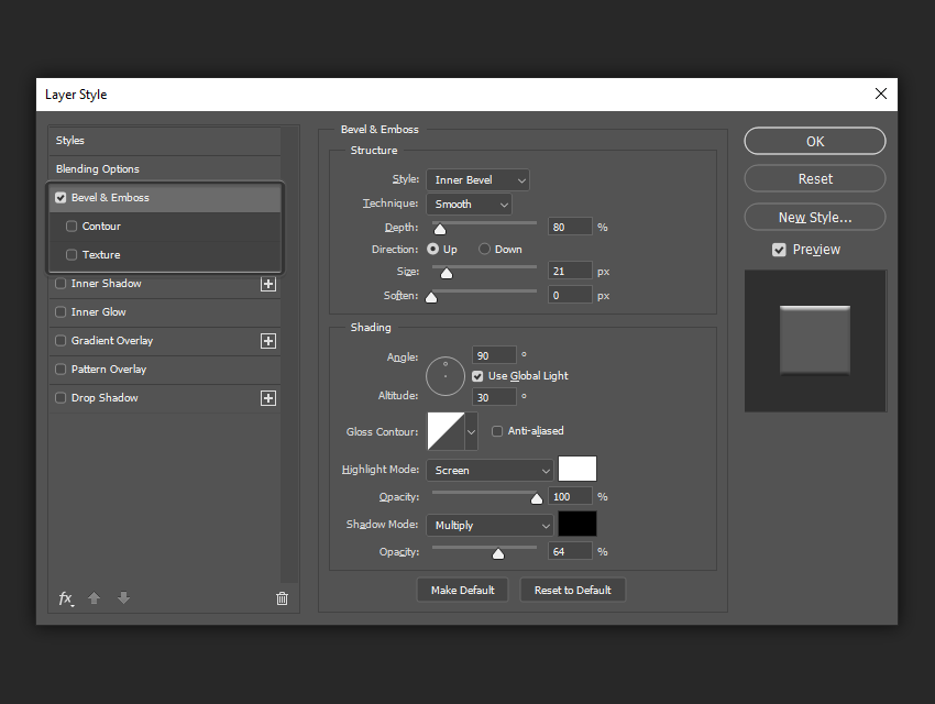
example of bevel and emboss settings

Style

The Style dropdown is where you set the style/location of your bevel and includes the following options:

  • Outer Bevel: This applies the bevel to the outside of the shape you are applying it to.
  • Inner Bevel: This applies the bevel to the inside of the shape you are applying it to.
  • Emboss: This applies the bevel to both the outside and the inside of the shape you are applying it to.
  • Pillow Emboss: This applies the bevel to both the outside and inside of the shape you are applying it to, but in opposite directions.
  • Stroke Emboss: This only works when you also have a stroke effect applied to your layer, and applies the bevel only to the stroke.

It may seem confusing, but simply scrolling through the different Style settings with the Preview box checked will quickly show you how they each work.

example of style settings

In the following example, you can see that with Inner Bevel applied, it only affects the inside of the shape. With the Emboss style applied, the Bevel and Emboss affects both the inside and outside of the shape.

inner bevel versus emboss

Technique

The Technique dropdown menu allows you to set the overall shape of the Bevel and Emboss and includes the following options:

  • Smooth: This setting creates a smooth, rounded edge bevel.
  • Chisel Hard: This setting creates a hard, chiseled edge bevel.
  • Chisel Soft: This setting creates a rougher, chiseled edge bevel.

Again, the best way to see the difference is to scroll through the settings with the Preview box checked.

example of technique settings

In the following example, you can see that text on the left is smoother, while the text on the right looks as if it has been chiseled out of stone.

smooth versus chisel hard

Depth

The Depth slider increases or decreases the apparent depth of the Bevel and Emboss. A lower number creates a less visible 3D effect, while a higher number makes it more dramatic.

depth settings example

In the following example, you can see how increasing the Depth makes the text look more three-dimensional.

example of different depth values

Direction

The Direction radio buttons simply let you choose whether you want your Bevel and Emboss to appear to be extruded towards you or away from you.

direction settings example

In the following example, you can see how the „up” text appears to come out of the page, while the „down” text appears to sink into the page.

example of different direction settings

Size

The Size slider sets the overall size of the Bevel and Emboss. A lower number creates a smaller effect that stays closer to the edges of your shape, while a larger number increases the Bevel and Emboss coverage to a bigger area of your shape.

size settings example

In the following example, the text on the left has a smaller bevel while the one on the right covers much more of the text.

example of different size settings

Soften

The Soften slider allows you to soften any hard edges created by your Bevel and Emboss. It can be helpful in creating soft and squishy looking styles.

soften settings example

In the following example, you can see that increasing the Soften parameter helps us to create a much softer looking surface.

example of different soften settings

Angle and Altitude

The Angle and Altitude area is where you set the position of your light. The Angle sets the horizontal position of your light source, and the Altitude sets the vertical position, or apparent height of your light source. You can also drag the small crosshair around to edit your light source without having to use numeric values.

Checking the „Use Global Light” checkbox will sync these settings with any other lighting related settings in your document like Inner and Outer Shadow.

angle and altitude settings

In the following example, you can see how changing the Angle and Altitude settings affects the perceived location of our light source.

example of different angle and altitude settings

Gloss Contour

Gloss Contour is the secret to creating great glass and metal effects.

The Gloss Contour sets the falloff of the shadows and highlights within our Bevel and Emboss. A linear contour creates a natural-looking falloff, while choosing something like a „sine wave” style contour can create cool, reflective effects.

In addition, the Anti-aliased checkbox will smooth out any jagged edges within your gloss if it is desired.

gloss contour settings example

In the following example, you can see how the text on the left looks nothing like metal, but by changing the Gloss Contour, it begins to look more realistic.

example of different gloss contour settings

Highlight Mode and Opacity

There are two parts to lighting: highlights and shadows.

The Highlight Mode dropdown is where you set the blend mode for your highlights. Screen is the default setting, but you can also try Linear Dodge (Add), and Color Dodge for more dramatic effects.

This is also where you set your highlight color. Most of the time you will leave it at white, but if you want to simulate different color light sources, you can change the highlight to have a tint of color.

The Opacity slider adjusts the intensity of your highlight edges.

highlight and opacity settings example

In the following example you can see how changing the Highlight Mode, Color, and Opacity gives our style a slightly different, warmer look.

example of different highlight modes and opacity levels

Shadow Mode and Opacity

The Shadow Mode dropdown is where you set the blend mode for your shadows. Multiply is the default setting, but you can also try Linear Burn or Color Burn for more dramatic effects.

This is also where you set your shadow color. Most of the time you will leave it at black, but you can also achieve other subtle effects by using different tints of color.

The Opacity slider adjusts the intensity of your shadows.

example of shadow mode and opacity settings

In the following example you can see how changing the Shadow Color and Opacity gives our wood style a subtle „mossy” look.

example of different shadow mode settings

Saving And Loading Default Settings

You can save and load default settings for each effect in the Layer Styles dialog box. By clicking „Make Default”, Photoshop will store whatever settings are currently active as the new default settings for that effect.

By clicking „Reset to Default”, Photoshop will then load whatever settings were last saved. This allows you to experiment and simply reload custom default settings if you want to start over.

example of make default and reset to default options

Contour

The Contour sub-section under Bevel and Emboss allows you to set the overall shape of your bevel. Checking the Anti-aliased checkbox smooths out your Contour, and the Range slider allows you to set the overall coverage of your bevel that you want your chosen contour to apply to.

This is another setting that is easier seen than said.

example of the contour settings

In the following example you can see how changing the Contour to an inverted „U” shape gives our text an indented type of bevel.

example of using different contour settings

Texture

The Texture sub-section under Bevel and Emboss allows you to add a bump map to your style. A bump map makes the surface of your layer to appear higher or lower, giving us the ability to create special effects.

The Pattern area allows us to choose a pattern from Photoshop’s Patterns Palette to use as a bump map. Click the Snap to Origin button to align the Pattern to the origin of your document. You can also click the small „New” icon to create a new preset from your currently select Pattern.

The Scale slider lets you increase or decrease the size of your pattern, and the Depth slider changes the apparent depth of your bump map.

You can check the Invert checkbox to invert your pattern, make white areas black and black areas white.

Lastly, the Link with Layer checkbox locks the Pattern to your layer, so that if you move your layer around after closing the Layer Styles dialog box, the Pattern moves with it.

When the Layer Styles dialog box is open to the Contour sub-section, you can also drag the Pattern around on your canvas to position it manually.

example of the texture settings

In the following example you can see how adding a Pattern to our style can create a dramatically different looking effect. Since the Depth is set to 0 for the text on the left, the Pattern does not affect our style.

example of different texture pattern settings

Expand Your Library

Want to build an extended Photoshop Layer Layer Styles Library, but don’t know exactly where to start? Well, don’t worry since Envato Elements has you covered, giving you a great selection of layer styles such as these ones.

Sloppy Press Layer Styles

Want to give your text that extra typographic feel? This layer style pack is exactly what you’re looking for, since it comes with not one but 33 layer styles that you can use and abuse.

sloppy press photoshop layer styles
Sloppy Press Photoshop Layer Styles by Envato Elements

Ink Stamp Layer Styles

Let’s be honest, giving your artwork that ink stamp look is and will always be an eye-catcher, so why not add this creative layer styles pack to your library in case you need it in future projects.

ink stamp layer styles
Ink Stamp Photoshop Layer Styles by Envato Elements

Retro Etch Vintage Layer Styles

Looking to give your text that vintage look but not too keen on going through the actual process required to do so? Well, if that’s the case, this handcrafted layer style pack has you covered as it will do the job for you.

retro etch vintage layer styles
Retro Etch Vintage Photoshop Layer Styles by Envato Elements

Grow Your Photoshop Skills

Just started out using Adobe Photoshop and feel like learning more of Photoshop? Well, today’s your lucky day since I’ve put together a little list of tutorials that should get you up going for the following days!

The Comprehensive Guide to Bevel and Emboss

Post pobrano z: The Comprehensive Guide to Bevel and Emboss

Final product image
What You’ll Be Creating

Always wondered what a Bevel and Emboss Photoshop layer style is, and most importantly how to use it?

From a comprehensive Bevel and Emboss definition to how to bevel text in Photoshop, how to emboss text in Photoshop, or how to use Bevel and Emboss in Photoshop the following tutorial will do its best at providing all the necessary answers so that in the end you’ll be able to master it.

The Bevel and Emboss layer style is one of Photoshop’s most powerful tools when it comes to stylizing your artwork, since you can use it to emboss text, add an inner bevel or any other type of bevel effect, or even create an emboss Photoshop action, all in a matter of moments.

So, if you want to learn how to bevel in Photoshop, or how to create an emboss effect in Photoshop, or what a Photoshop bevel filter is, or maybe what’s the difference between bevel and emboss, or even what Photoshop bevel edges are, then you should definitely give this tutorial a full read.

By doing so, I will walk you through all its ins and outs, and show you how to do simple things such as how to create an emboss effect in Photoshop, how to create a beveled text in Photoshop, or how to bevel in Photoshop, so that you can create Photoshop beveled text segments of your own.

Follow along with us over on our Envato Tuts+ YouTube channel:

The Uses for Bevel and Emboss

Bevel and Emboss is often considered the most powerful and adaptable tools within Photoshop Layer Styles.

The traditional use for Bevel and Emboss is to make something look more three-dimensional by adding highlights and shadows to different parts of your layer, but it doesn’t stop there.

With some special consideration and careful tweaks, you can create styles ranging from reflective chrome and refractive glass to chiseled stone and subtle letterpress graphics.

example of using the bevel and emboss layer style

How to Bevel and Emboss in Photoshop

The Bevel and Emboss dialog boxes are shown below, giving us a slew of new options. These will allow us to set things like bevel height, lighting direction, texture map, and more.

example of bevel and emboss settings

Style

The Style dropdown is where you set the style/location of your bevel and includes the following options:

  • Outer Bevel: This applies the bevel to the outside of the shape you are applying it to.
  • Inner Bevel: This applies the bevel to the inside of the shape you are applying it to.
  • Emboss: This applies the bevel to both the outside and the inside of the shape you are applying it to.
  • Pillow Emboss: This applies the bevel to both the outside and inside of the shape you are applying it to, but in opposite directions.
  • Stroke Emboss: This only works when you also have a stroke effect applied to your layer, and applies the bevel only to the stroke.

It may seem confusing, but simply scrolling through the different Style settings with the Preview box checked will quickly show you how they each work.

example of style settings

In the following example, you can see that with Inner Bevel applied, it only affects the inside of the shape. With the Emboss style applied, the Bevel and Emboss affects both the inside and outside of the shape.

inner bevel versus emboss

Technique

The Technique dropdown menu allows you to set the overall shape of the Bevel and Emboss and includes the following options:

  • Smooth: This setting creates a smooth, rounded edge bevel.
  • Chisel Hard: This setting creates a hard, chiseled edge bevel.
  • Chisel Soft: This setting creates a rougher, chiseled edge bevel.

Again, the best way to see the difference is to scroll through the settings with the Preview box checked.

example of technique settings

In the following example, you can see that text on the left is smoother, while the text on the right looks as if it has been chiseled out of stone.

smooth versus chisel hard

Depth

The Depth slider increases or decreases the apparent depth of the Bevel and Emboss. A lower number creates a less visible 3D effect, while a higher number makes it more dramatic.

depth settings example

In the following example, you can see how increasing the Depth makes the text look more three-dimensional.

example of different depth values

Direction

The Direction radio buttons simply let you choose whether you want your Bevel and Emboss to appear to be extruded towards you or away from you.

direction settings example

In the following example, you can see how the „up” text appears to come out of the page, while the „down” text appears to sink into the page.

example of different direction settings

Size

The Size slider sets the overall size of the Bevel and Emboss. A lower number creates a smaller effect that stays closer to the edges of your shape, while a larger number increases the Bevel and Emboss coverage to a bigger area of your shape.

size settings example

In the following example, the text on the left has a smaller bevel while the one on the right covers much more of the text.

example of different size settings

Soften

The Soften slider allows you to soften any hard edges created by your Bevel and Emboss. It can be helpful in creating soft and squishy looking styles.

soften settings example

In the following example, you can see that increasing the Soften parameter helps us to create a much softer looking surface.

example of different soften settings

Angle and Altitude

The Angle and Altitude area is where you set the position of your light. The Angle sets the horizontal position of your light source, and the Altitude sets the vertical position, or apparent height of your light source. You can also drag the small crosshair around to edit your light source without having to use numeric values.

Checking the „Use Global Light” checkbox will sync these settings with any other lighting related settings in your document like Inner and Outer Shadow.

angle and altitude settings

In the following example, you can see how changing the Angle and Altitude settings affects the perceived location of our light source.

example of different angle and altitude settings

Gloss Contour

Gloss Contour is the secret to creating great glass and metal effects.

The Gloss Contour sets the falloff of the shadows and highlights within our Bevel and Emboss. A linear contour creates a natural-looking falloff, while choosing something like a „sine wave” style contour can create cool, reflective effects.

In addition, the Anti-aliased checkbox will smooth out any jagged edges within your gloss if it is desired.

gloss contour settings example

In the following example, you can see how the text on the left looks nothing like metal, but by changing the Gloss Contour, it begins to look more realistic.

example of different gloss contour settings

Highlight Mode and Opacity

There are two parts to lighting: highlights and shadows.

The Highlight Mode dropdown is where you set the blend mode for your highlights. Screen is the default setting, but you can also try Linear Dodge (Add), and Color Dodge for more dramatic effects.

This is also where you set your highlight color. Most of the time you will leave it at white, but if you want to simulate different color light sources, you can change the highlight to have a tint of color.

The Opacity slider adjusts the intensity of your highlight edges.

highlight and opacity settings example

In the following example you can see how changing the Highlight Mode, Color, and Opacity gives our style a slightly different, warmer look.

example of different highlight modes and opacity levels

Shadow Mode and Opacity

The Shadow Mode dropdown is where you set the blend mode for your shadows. Multiply is the default setting, but you can also try Linear Burn or Color Burn for more dramatic effects.

This is also where you set your shadow color. Most of the time you will leave it at black, but you can also achieve other subtle effects by using different tints of color.

The Opacity slider adjusts the intensity of your shadows.

example of shadow mode and opacity settings

In the following example you can see how changing the Shadow Color and Opacity gives our wood style a subtle „mossy” look.

example of different shadow mode settings

Saving And Loading Default Settings

You can save and load default settings for each effect in the Layer Styles dialog box. By clicking „Make Default”, Photoshop will store whatever settings are currently active as the new default settings for that effect.

By clicking „Reset to Default”, Photoshop will then load whatever settings were last saved. This allows you to experiment and simply reload custom default settings if you want to start over.

example of make default and reset to default options

Contour

The Contour sub-section under Bevel and Emboss allows you to set the overall shape of your bevel. Checking the Anti-aliased checkbox smooths out your Contour, and the Range slider allows you to set the overall coverage of your bevel that you want your chosen contour to apply to.

This is another setting that is easier seen than said.

example of the contour settings

In the following example you can see how changing the Contour to an inverted „U” shape gives our text an indented type of bevel.

example of using different contour settings

Texture

The Texture sub-section under Bevel and Emboss allows you to add a bump map to your style. A bump map makes the surface of your layer to appear higher or lower, giving us the ability to create special effects.

The Pattern area allows us to choose a pattern from Photoshop’s Patterns Palette to use as a bump map. Click the Snap to Origin button to align the Pattern to the origin of your document. You can also click the small „New” icon to create a new preset from your currently select Pattern.

The Scale slider lets you increase or decrease the size of your pattern, and the Depth slider changes the apparent depth of your bump map.

You can check the Invert checkbox to invert your pattern, make white areas black and black areas white.

Lastly, the Link with Layer checkbox locks the Pattern to your layer, so that if you move your layer around after closing the Layer Styles dialog box, the Pattern moves with it.

When the Layer Styles dialog box is open to the Contour sub-section, you can also drag the Pattern around on your canvas to position it manually.

example of the texture settings

In the following example you can see how adding a Pattern to our style can create a dramatically different looking effect. Since the Depth is set to 0 for the text on the left, the Pattern does not affect our style.

example of different texture pattern settings

Expand Your Library

Want to build an extended Photoshop Layer Layer Styles Library, but don’t know exactly where to start? Well, don’t worry since Envato Elements has you covered, giving you a great selection of layer styles such as these ones.

Sloppy Press Layer Styles

Want to give your text that extra typographic feel? This layer style pack is exactly what you’re looking for, since it comes with not one but 33 layer styles that you can use and abuse.

sloppy press photoshop layer styles
Sloppy Press Photoshop Layer Styles by Envato Elements

Ink Stamp Layer Styles

Let’s be honest, giving your artwork that ink stamp look is and will always be an eye-catcher, so why not add this creative layer styles pack to your library in case you need it in future projects.

ink stamp layer styles
Ink Stamp Photoshop Layer Styles by Envato Elements

Retro Etch Vintage Layer Styles

Looking to give your text that vintage look but not too keen on going through the actual process required to do so? Well, if that’s the case, this handcrafted layer style pack has you covered as it will do the job for you.

retro etch vintage layer styles
Retro Etch Vintage Photoshop Layer Styles by Envato Elements

Grow Your Photoshop Skills

Just started out using Adobe Photoshop and feel like learning more of Photoshop? Well, today’s your lucky day since I’ve put together a little list of tutorials that should get you up going for the following days!

The Comprehensive Guide to Bevel and Emboss

Post pobrano z: The Comprehensive Guide to Bevel and Emboss

Final product image
What You’ll Be Creating

Always wondered what a Bevel and Emboss Photoshop layer style is, and most importantly how to use it?

From a comprehensive Bevel and Emboss definition to how to bevel text in Photoshop, how to emboss text in Photoshop, or how to use Bevel and Emboss in Photoshop the following tutorial will do its best at providing all the necessary answers so that in the end you’ll be able to master it.

The Bevel and Emboss layer style is one of Photoshop’s most powerful tools when it comes to stylizing your artwork, since you can use it to emboss text, add an inner bevel or any other type of bevel effect, or even create an emboss Photoshop action, all in a matter of moments.

So, if you want to learn how to bevel in Photoshop, or how to create an emboss effect in Photoshop, or what a Photoshop bevel filter is, or maybe what’s the difference between bevel and emboss, or even what Photoshop bevel edges are, then you should definitely give this tutorial a full read.

By doing so, I will walk you through all its ins and outs, and show you how to do simple things such as how to create an emboss effect in Photoshop, how to create a beveled text in Photoshop, or how to bevel in Photoshop, so that you can create Photoshop beveled text segments of your own.

Follow along with us over on our Envato Tuts+ YouTube channel:

The Uses for Bevel and Emboss

Bevel and Emboss is often considered the most powerful and adaptable tools within Photoshop Layer Styles.

The traditional use for Bevel and Emboss is to make something look more three-dimensional by adding highlights and shadows to different parts of your layer, but it doesn’t stop there.

With some special consideration and careful tweaks, you can create styles ranging from reflective chrome and refractive glass to chiseled stone and subtle letterpress graphics.

example of using the bevel and emboss layer style

How to Bevel and Emboss in Photoshop

The Bevel and Emboss dialog boxes are shown below, giving us a slew of new options. These will allow us to set things like bevel height, lighting direction, texture map, and more.

example of bevel and emboss settings

Style

The Style dropdown is where you set the style/location of your bevel and includes the following options:

  • Outer Bevel: This applies the bevel to the outside of the shape you are applying it to.
  • Inner Bevel: This applies the bevel to the inside of the shape you are applying it to.
  • Emboss: This applies the bevel to both the outside and the inside of the shape you are applying it to.
  • Pillow Emboss: This applies the bevel to both the outside and inside of the shape you are applying it to, but in opposite directions.
  • Stroke Emboss: This only works when you also have a stroke effect applied to your layer, and applies the bevel only to the stroke.

It may seem confusing, but simply scrolling through the different Style settings with the Preview box checked will quickly show you how they each work.

example of style settings

In the following example, you can see that with Inner Bevel applied, it only affects the inside of the shape. With the Emboss style applied, the Bevel and Emboss affects both the inside and outside of the shape.

inner bevel versus emboss

Technique

The Technique dropdown menu allows you to set the overall shape of the Bevel and Emboss and includes the following options:

  • Smooth: This setting creates a smooth, rounded edge bevel.
  • Chisel Hard: This setting creates a hard, chiseled edge bevel.
  • Chisel Soft: This setting creates a rougher, chiseled edge bevel.

Again, the best way to see the difference is to scroll through the settings with the Preview box checked.

example of technique settings

In the following example, you can see that text on the left is smoother, while the text on the right looks as if it has been chiseled out of stone.

smooth versus chisel hard

Depth

The Depth slider increases or decreases the apparent depth of the Bevel and Emboss. A lower number creates a less visible 3D effect, while a higher number makes it more dramatic.

depth settings example

In the following example, you can see how increasing the Depth makes the text look more three-dimensional.

example of different depth values

Direction

The Direction radio buttons simply let you choose whether you want your Bevel and Emboss to appear to be extruded towards you or away from you.

direction settings example

In the following example, you can see how the „up” text appears to come out of the page, while the „down” text appears to sink into the page.

example of different direction settings

Size

The Size slider sets the overall size of the Bevel and Emboss. A lower number creates a smaller effect that stays closer to the edges of your shape, while a larger number increases the Bevel and Emboss coverage to a bigger area of your shape.

size settings example

In the following example, the text on the left has a smaller bevel while the one on the right covers much more of the text.

example of different size settings

Soften

The Soften slider allows you to soften any hard edges created by your Bevel and Emboss. It can be helpful in creating soft and squishy looking styles.

soften settings example

In the following example, you can see that increasing the Soften parameter helps us to create a much softer looking surface.

example of different soften settings

Angle and Altitude

The Angle and Altitude area is where you set the position of your light. The Angle sets the horizontal position of your light source, and the Altitude sets the vertical position, or apparent height of your light source. You can also drag the small crosshair around to edit your light source without having to use numeric values.

Checking the „Use Global Light” checkbox will sync these settings with any other lighting related settings in your document like Inner and Outer Shadow.

angle and altitude settings

In the following example, you can see how changing the Angle and Altitude settings affects the perceived location of our light source.

example of different angle and altitude settings

Gloss Contour

Gloss Contour is the secret to creating great glass and metal effects.

The Gloss Contour sets the falloff of the shadows and highlights within our Bevel and Emboss. A linear contour creates a natural-looking falloff, while choosing something like a „sine wave” style contour can create cool, reflective effects.

In addition, the Anti-aliased checkbox will smooth out any jagged edges within your gloss if it is desired.

gloss contour settings example

In the following example, you can see how the text on the left looks nothing like metal, but by changing the Gloss Contour, it begins to look more realistic.

example of different gloss contour settings

Highlight Mode and Opacity

There are two parts to lighting: highlights and shadows.

The Highlight Mode dropdown is where you set the blend mode for your highlights. Screen is the default setting, but you can also try Linear Dodge (Add), and Color Dodge for more dramatic effects.

This is also where you set your highlight color. Most of the time you will leave it at white, but if you want to simulate different color light sources, you can change the highlight to have a tint of color.

The Opacity slider adjusts the intensity of your highlight edges.

highlight and opacity settings example

In the following example you can see how changing the Highlight Mode, Color, and Opacity gives our style a slightly different, warmer look.

example of different highlight modes and opacity levels

Shadow Mode and Opacity

The Shadow Mode dropdown is where you set the blend mode for your shadows. Multiply is the default setting, but you can also try Linear Burn or Color Burn for more dramatic effects.

This is also where you set your shadow color. Most of the time you will leave it at black, but you can also achieve other subtle effects by using different tints of color.

The Opacity slider adjusts the intensity of your shadows.

example of shadow mode and opacity settings

In the following example you can see how changing the Shadow Color and Opacity gives our wood style a subtle „mossy” look.

example of different shadow mode settings

Saving And Loading Default Settings

You can save and load default settings for each effect in the Layer Styles dialog box. By clicking „Make Default”, Photoshop will store whatever settings are currently active as the new default settings for that effect.

By clicking „Reset to Default”, Photoshop will then load whatever settings were last saved. This allows you to experiment and simply reload custom default settings if you want to start over.

example of make default and reset to default options

Contour

The Contour sub-section under Bevel and Emboss allows you to set the overall shape of your bevel. Checking the Anti-aliased checkbox smooths out your Contour, and the Range slider allows you to set the overall coverage of your bevel that you want your chosen contour to apply to.

This is another setting that is easier seen than said.

example of the contour settings

In the following example you can see how changing the Contour to an inverted „U” shape gives our text an indented type of bevel.

example of using different contour settings

Texture

The Texture sub-section under Bevel and Emboss allows you to add a bump map to your style. A bump map makes the surface of your layer to appear higher or lower, giving us the ability to create special effects.

The Pattern area allows us to choose a pattern from Photoshop’s Patterns Palette to use as a bump map. Click the Snap to Origin button to align the Pattern to the origin of your document. You can also click the small „New” icon to create a new preset from your currently select Pattern.

The Scale slider lets you increase or decrease the size of your pattern, and the Depth slider changes the apparent depth of your bump map.

You can check the Invert checkbox to invert your pattern, make white areas black and black areas white.

Lastly, the Link with Layer checkbox locks the Pattern to your layer, so that if you move your layer around after closing the Layer Styles dialog box, the Pattern moves with it.

When the Layer Styles dialog box is open to the Contour sub-section, you can also drag the Pattern around on your canvas to position it manually.

example of the texture settings

In the following example you can see how adding a Pattern to our style can create a dramatically different looking effect. Since the Depth is set to 0 for the text on the left, the Pattern does not affect our style.

example of different texture pattern settings

Expand Your Library

Want to build an extended Photoshop Layer Layer Styles Library, but don’t know exactly where to start? Well, don’t worry since Envato Elements has you covered, giving you a great selection of layer styles such as these ones.

Sloppy Press Layer Styles

Want to give your text that extra typographic feel? This layer style pack is exactly what you’re looking for, since it comes with not one but 33 layer styles that you can use and abuse.

sloppy press photoshop layer styles
Sloppy Press Photoshop Layer Styles by Envato Elements

Ink Stamp Layer Styles

Let’s be honest, giving your artwork that ink stamp look is and will always be an eye-catcher, so why not add this creative layer styles pack to your library in case you need it in future projects.

ink stamp layer styles
Ink Stamp Photoshop Layer Styles by Envato Elements

Retro Etch Vintage Layer Styles

Looking to give your text that vintage look but not too keen on going through the actual process required to do so? Well, if that’s the case, this handcrafted layer style pack has you covered as it will do the job for you.

retro etch vintage layer styles
Retro Etch Vintage Photoshop Layer Styles by Envato Elements

Grow Your Photoshop Skills

Just started out using Adobe Photoshop and feel like learning more of Photoshop? Well, today’s your lucky day since I’ve put together a little list of tutorials that should get you up going for the following days!

60 Design Terms You Should Know

Post pobrano z: 60 Design Terms You Should Know

As a designer, explaining and putting visual work into words can be tricky as not everybody is a designer. As a freelancer, it is up to you to get the idea across and describe (a.k.a. sell) your design to potential clients. Not only that, but getting feedback and knowing what you are talking about is important in order to be a credible designer. 

In this article, we put together a list of 60 design terms that can help you translate visual ideas into a verbal conversation. The design language is vast and can get complicated to explain, especially to other non-designers. So we hope this list helps you understand and provides an easy way to describe the terms.

10 Essential Design Principle Terms

Design composition terms

What Is Composition?

Composition, also called layout, is the visual arrangement of design elements that create a complete image. Within a composition, you may use different principles of design to create visually pleasing work to deliver a functional layout.

What Is Balance in Design?

Any element placed on a page has visual weight that can be affected by form, size, color, and texture. In order to make a layout balance, some elements might need to have a certain scale. 

What Are the Type of Alignments?

Alignment refers to the position of the elements on a layout—the way the visual elements are arranged so that they line up. The alignment can be left, right, justified, or centered. 

What Is Repetition in Design?

Repetition creates consistency by repeating the same element within a layout multiple times. 

What Are Some Types of Contrast?

Contrast is the level of differentiation between different design elements to create visual hierarchies. The variation may be in form, color, texture, and size. 

What Is Negative Space?

Negative space is the blank area around a design element. It is used to emphasize certain parts of a layout and to zone into a specific element. 

What Is Hierarchy in Graphic Design?

In graphic design, you’ll quickly learn to arrange elements by the level of importance. Hierarchy is exactly that. In order to create hierarchy, you need to have contrast in your design. If one image is larger than the other, this will place the emphasis on the larger image, and the reader will look at it first. 

What Is the Difference Between Symmetry and Asymmetry?

Symmetry refers to the equal amount of elements reflected on a page. If you were to draw a vertical line through its center, the elements can sometimes be mirrored or the visual weight can be the same from one half to the other.

The opposite of symmetry is asymmetry. The elements on both sides of the centerline aren’t equal and can create an unbalanced design. 

What Is a Grid?

Grids are a group of intersecting vertical and horizontal lines that can help you structure content on a page. There are many types of grids for different uses, but the common denominator is that they help keep the content organized and clean. 

If you are interested in diving into more composition and design terms, be sure to check out: 

10 Important Color Definitions You Should Know

Color related terms

What Is the Difference Between CMYK and RGB?

CMYK stands for cyan, magenta, yellow, and key (black). These are the four most basic colors you can use for print. You’ll notice CMYK colors aren’t as vibrant as RGB. This is because CMYK is subtractive—this means that the colors work with the reflected light.

RGB colors are used on-screen only. RGB stands for red, green, and blue, and this color mode is additive, meaning that by mixing these primary colors in different combinations, we can simulate a bigger range of colors. 

What Is Grayscale?

Grayscale is a monochromatic palette using different shades of gray in an image. A single image is composed of up to 256 combinations of shades of gray. 

What Is the Definition of Opacity?

This refers to the level of transparency on an element. The lower the opacity, the more transparent the element is. If the opacity is set to 100%, it means the object is solid. 

What Is Saturation?

Saturation refers to the intensity of a color. You’ll notice saturated images appear brighter and punchier. Desaturated images are dull and almost colorless. 

What Is the Difference Between Hue, Tone, Tint, and Shade?

Hue is a way to describe a pure color without tint or shade (added white or black). For instance, any color on the color wheel is a hue (blue, yellow). 

Tone refers to a hue with gray added. The tone will lower the intensity of color, and it can become dull. 

Tint refers to a hue with added white to lighten it and make it paler. The tint can range anywhere from a slightly lighter color all the way to completely white, with barely any color. 

Shade refers to black added to a color. This is the opposite of Tint—instead of making the color lighter, shade will darken it. 

What Is a Color Palette?

A color palette is a group of colors that can be used for a specific design project. This color palette usually represents a brand and should be chosen to work in harmony with each other. 

What Is the Pantone System?

PMS or Pantone Matching System is the most widely used system for blending colors that aren’t CMYK. Every hue is identified by a number that is easy for designers to reference and reproduce when printing. 

If you want to check out more about color, we have a section on it in this article:

Image

What Is Resolution in Graphic Design?

The resolution of an image determines the file quality. A high-resolution image will be crisp, and wherever the focus is, it will have defined edges. The higher the resolution, the higher the quality. A low-resolution image will be pixelated and blurry.

What Are Pixels?

A pixel is the smallest basic unit of color on a computer that makes up images. Depending on the amount of these tiny squares, you can have a high- or low-resolution image. 

What Is the Difference Between PPI and DPI?

PPI stands for pixels per inch. It is a measurement used to define the resolution of a screen, most commonly monitors, cameras, and scanners. 

DPI is similar to PPI but is used for printing, and it stands for dots per inch. Printers produce images composed of small dots that affect the printing quality of an image. 

Image related terms crop close-crop trim and rule of thirds

What Is the Difference Between Crop and Close-Crop?

Cropping refers to eliminating unnecessary parts of an image. By doing this, you’ll change entirely the direction, emphasis, and even composition of an image. Cropping improves the framing of an image to fit your project.

Similar to cropping, close-cropping refers to cutting out a specific element from an image. This is mainly done for headshots if you wish to use a different color background. 

What Is Trim Size?

Trim size is the final size of a printed project after it’s been trimmed. The trim size is guided by the crop marks that are on a printed sheet. 

What Is the Rule of Thirds?

This technique is used to determine the focal points of an image or design. Imagine a 3×3 grid on top of an image or a design. The four spots where the lines intersect indicate the focal points, and these areas are where the most important elements should be placed. 

Learn more about grids in this article:

16 Typography Terms You Should Know

What Is the Difference Between Serif and Sans Serif?

A serif is a small extra stroke at the end of each character. A font family using serifs is called a serif typeface. These typefaces are usually easier to read because the extra stroke allows our eyes to follow the characters more easily. Serif typefaces are widely used for body copy as they are deemed elegant and highly legible, depending on the size. 

A sans serif is a character that doesn’t have the small strokes at the end of each character. Sans serifs are also used as body copy but most predominantly on screen as they don’t have small details that can be difficult to render. 

What Is a Script Font?

Script typefaces are based on handwriting, and they can be either historical or modern. They possess a fluidity compared to other traditional typefaces.

What Is a Slab Serif Font?

Slab serifs are characterized by thicker and heavier serifs compared to regular serif fonts. Slab serifs can be square, angular or rounded depending on the typeface. 

What Is Monospace in Typeface Design?

Monospace fonts have a fixed width, meaning each character occupies the same amount of horizontal space. You tend to see this in typewriters or when setting computer codes. 

Typography related terms serif sans serif script slab serif and monospace

What Is the Difference Between Kerning and Tracking?

Kerning is the space between two specific characters. Certain pairs of letters can create awkward spaces, and by kerning them you can adjust the space between them. By adjusting the space, you can improve the legibility. 

Similar to kerning, tracking refers to the spacing between characters. While kerning refers to a pair of characters, tracking applies to a group of letters. 

What Is Leading in Graphic Design?

Leading determines the distance between multiple lines of text. This ensures that the lines aren’t touching and that there’s enough space to read the lines comfortably. 

Typography related terms kerning leading tracking

What Is Weight in Font Design?

Weight refers to the thickness of a character relative to its height. A typeface may come in many different weights, and most usually come with a normal and bold weight. It isn’t unusual to see fonts with anywhere from four to a dozen weights. 

What Is Point Size?

A font is measured in point size, and it dictates the height of the character. There are 72 points in 1 inch or 2.54 cm. 

What Is the Difference Between Uppercase and Lowercase?

Uppercase characters are used at the beginning of sentences or the first letter of proper names. They are also called capitals or caps. The name uppercase comes from the old-school typesetting printing presses. Printers kept capitals in the upper drawer of a desk.

Lowercase glyphs are the non-capital letters that make up the rest of a text block. The name lowercase comes from the old way of setting type with printing presses. Printers kept the lowercase letters in the lower drawer of a desk.

What Are Small Caps in Design?

Small caps are uppercase characters that are shorter than regular uppercase given in a font. Some typefaces come with small caps, while others don’t, and the software you are using will generate them. When small caps are designed as part of a typeface, they will usually be the same height as lowercase characters or just slightly taller.

typography related terms

What Is Lorem Ipsum?

Lorem ipsum is placeholder text that can help you show your design without meaningful content. It is mostly used at the beginning of a design project to mock up the design until the final copy is available. 

What Is Readability vs. Legibility?

Readability refers to the way blocks of text are arranged on a page. Legibility refers to how well one character can be distinguished from another.

What Are Widows and Orphans?

Widows and orphans are seen when typesetting text. A widow is a short line or a word at the end of a paragraph or a column causing too much white space between paragraphs at the bottom of a page. An orphan is a short line or a single word at the beginning of a column or page. 

Widows in Typesetting

Orphans in Typesetting

If you are just as interested in typography as we are, be sure to check out:

The 5 Logo Design Styles You Need to Know

Logo related terms lettermark wordmark pictorial mark abstract mark and emblem

What Is a Lettermark or Monogram?

A lettermark is a type-based logo made of a few letters. It’s often used if a company’s name is made of two or more words. A lettermark will shorten the company name by using only its initials, resulting in simplicity. For instance, NASA is easy to say and remember compared to National Aeronautics and Space Administration. 

What Is a Wordmark?

A wordmark focuses on the business name alone rather than reducing it to a single lettermark. For instance, Google is already a memorable name, but if it’s combined with a strong typeface and colors, it results in a powerful wordmark.

What Is a Pictorial Mark?

Also known as a brand mark, a pictorial mark refers to a graphic-based logo. It’s usually an icon that has been simplified and stylized to represent a brand. For instance, Twitter’s icon is a bird, and it’s recognized around the world as Twitter. 

What Is an Abstract Mark in Logo Design?

The opposite of a pictorial mark, an abstract mark is not based on a real object. Instead, it’s an abstract geometric representation that represents a business. Adidas’s logo doesn’t represent anything from the real world. Instead, the brand distilled their ideas into a geometric shape that best represents them. 

What Is an Emblem?

An emblem logo is a mark in which the name of a business is contained within a single shape. An emblem is not necessarily just for the corporate world—you’ll see emblems representing schools or sports teams. 

10 Must-Know Image File Formats 

What Is a Raster Image?

Raster images are made up of a set of grid pixels that together make an entire image. If you want to stretch a raster image, it’ll get pixelated and blurry.

Different types of raster files GIF JPEG PNG TIFF PSD

What Is GIF?

GIF stands for Graphics Interchange Format. This file format supports animation and transparency. It can only display up to 256 colors, which allows you to have small files. Perfect for the web. 

What Is a JPEG Image?

JPEG is the most widely known raster file. Anywhere from images on an email to photos and anything you find online. JPEG stands for Joint Photographic Experts Group. Unlike PNG, JPEG doesn’t have the ability to be transparent. It’s suitable for web and print.

What Is a PNG?

If you are looking to maintain some quality when an image is compressed, PNG is for you. PNG stands for Portable Network Graphics, and it was created to improve the quality of GIF.

What Is a TIFF Image?

TIFF images are mostly used in layout design and InDesign. It stands for Tagged Image File Format, and the format produces a higher quality image compared to the formats above. 

What Is a PSD File?

Adobe Photoshop’s document format is PSD or Photoshop Document. This version is an uncompressed raster image file.

What Is a Vector?

Vector graphics are made out of small graphics like points, lines, and curves. The shapes within a vector use a mathematical equation that allows the vector to be resized without compromising the quality. Vectors won’t get blurry, unlike the raster image format.

Vector file formats

What Is an AI File?

AI stands for Adobe Illustrator. This format was developed by Adobe to represent single-page vector drawings in EPS and PDF. 

What Is an EPS File?

EPS stands for Encapsulated PostScript, and it’s a resizable format that contains vectors. Mostly used for logos so they can be scaled as needed in any type of project. 

What Is a PDF?

PDF stands for Portable Document Format and was developed by Adobe. This format is the most used format to be downloaded and viewed on any computer. From the vector standpoint, Adobe Illustrator can embed PGF data (Illustrator’s native format) onto a PDF so it can be used as a vector format.

That’s It! 

In this article, we rounded up 60 design terms that you should know. These terms can help you explain your designs to clients and talk about your work like an expert. Many of these terms we learn during our design studies, and it’s easy to forget them if you don’t use them often. Explaining these terms to your clients can also help them to be on the same page as you when it comes to feedback. 

If you liked this article, be sure to check out: 

60 Design Terms You Should Know

Post pobrano z: 60 Design Terms You Should Know

As a designer, explaining and putting visual work into words can be tricky as not everybody is a designer. As a freelancer, it is up to you to get the idea across and describe (a.k.a. sell) your design to potential clients. Not only that, but getting feedback and knowing what you are talking about is important in order to be a credible designer. 

In this article, we put together a list of 60 design terms that can help you translate visual ideas into a verbal conversation. The design language is vast and can get complicated to explain, especially to other non-designers. So we hope this list helps you understand and provides an easy way to describe the terms.

10 Essential Design Principle Terms

Design composition terms

What Is Composition?

Composition, also called layout, is the visual arrangement of design elements that create a complete image. Within a composition, you may use different principles of design to create visually pleasing work to deliver a functional layout.

What Is Balance in Design?

Any element placed on a page has visual weight that can be affected by form, size, color, and texture. In order to make a layout balance, some elements might need to have a certain scale. 

What Are the Type of Alignments?

Alignment refers to the position of the elements on a layout—the way the visual elements are arranged so that they line up. The alignment can be left, right, justified, or centered. 

What Is Repetition in Design?

Repetition creates consistency by repeating the same element within a layout multiple times. 

What Are Some Types of Contrast?

Contrast is the level of differentiation between different design elements to create visual hierarchies. The variation may be in form, color, texture, and size. 

What Is Negative Space?

Negative space is the blank area around a design element. It is used to emphasize certain parts of a layout and to zone into a specific element. 

What Is Hierarchy in Graphic Design?

In graphic design, you’ll quickly learn to arrange elements by the level of importance. Hierarchy is exactly that. In order to create hierarchy, you need to have contrast in your design. If one image is larger than the other, this will place the emphasis on the larger image, and the reader will look at it first. 

What Is the Difference Between Symmetry and Asymmetry?

Symmetry refers to the equal amount of elements reflected on a page. If you were to draw a vertical line through its center, the elements can sometimes be mirrored or the visual weight can be the same from one half to the other.

The opposite of symmetry is asymmetry. The elements on both sides of the centerline aren’t equal and can create an unbalanced design. 

What Is a Grid?

Grids are a group of intersecting vertical and horizontal lines that can help you structure content on a page. There are many types of grids for different uses, but the common denominator is that they help keep the content organized and clean. 

If you are interested in diving into more composition and design terms, be sure to check out: 

10 Important Color Definitions You Should Know

Color related terms

What Is the Difference Between CMYK and RGB?

CMYK stands for cyan, magenta, yellow, and key (black). These are the four most basic colors you can use for print. You’ll notice CMYK colors aren’t as vibrant as RGB. This is because CMYK is subtractive—this means that the colors work with the reflected light.

RGB colors are used on-screen only. RGB stands for red, green, and blue, and this color mode is additive, meaning that by mixing these primary colors in different combinations, we can simulate a bigger range of colors. 

What Is Grayscale?

Grayscale is a monochromatic palette using different shades of gray in an image. A single image is composed of up to 256 combinations of shades of gray. 

What Is the Definition of Opacity?

This refers to the level of transparency on an element. The lower the opacity, the more transparent the element is. If the opacity is set to 100%, it means the object is solid. 

What Is Saturation?

Saturation refers to the intensity of a color. You’ll notice saturated images appear brighter and punchier. Desaturated images are dull and almost colorless. 

What Is the Difference Between Hue, Tone, Tint, and Shade?

Hue is a way to describe a pure color without tint or shade (added white or black). For instance, any color on the color wheel is a hue (blue, yellow). 

Tone refers to a hue with gray added. The tone will lower the intensity of color, and it can become dull. 

Tint refers to a hue with added white to lighten it and make it paler. The tint can range anywhere from a slightly lighter color all the way to completely white, with barely any color. 

Shade refers to black added to a color. This is the opposite of Tint—instead of making the color lighter, shade will darken it. 

What Is a Color Palette?

A color palette is a group of colors that can be used for a specific design project. This color palette usually represents a brand and should be chosen to work in harmony with each other. 

What Is the Pantone System?

PMS or Pantone Matching System is the most widely used system for blending colors that aren’t CMYK. Every hue is identified by a number that is easy for designers to reference and reproduce when printing. 

If you want to check out more about color, we have a section on it in this article:

Image

What Is Resolution in Graphic Design?

The resolution of an image determines the file quality. A high-resolution image will be crisp, and wherever the focus is, it will have defined edges. The higher the resolution, the higher the quality. A low-resolution image will be pixelated and blurry.

What Are Pixels?

A pixel is the smallest basic unit of color on a computer that makes up images. Depending on the amount of these tiny squares, you can have a high- or low-resolution image. 

What Is the Difference Between PPI and DPI?

PPI stands for pixels per inch. It is a measurement used to define the resolution of a screen, most commonly monitors, cameras, and scanners. 

DPI is similar to PPI but is used for printing, and it stands for dots per inch. Printers produce images composed of small dots that affect the printing quality of an image. 

Image related terms crop close-crop trim and rule of thirds

What Is the Difference Between Crop and Close-Crop?

Cropping refers to eliminating unnecessary parts of an image. By doing this, you’ll change entirely the direction, emphasis, and even composition of an image. Cropping improves the framing of an image to fit your project.

Similar to cropping, close-cropping refers to cutting out a specific element from an image. This is mainly done for headshots if you wish to use a different color background. 

What Is Trim Size?

Trim size is the final size of a printed project after it’s been trimmed. The trim size is guided by the crop marks that are on a printed sheet. 

What Is the Rule of Thirds?

This technique is used to determine the focal points of an image or design. Imagine a 3×3 grid on top of an image or a design. The four spots where the lines intersect indicate the focal points, and these areas are where the most important elements should be placed. 

Learn more about grids in this article:

16 Typography Terms You Should Know

What Is the Difference Between Serif and Sans Serif?

A serif is a small extra stroke at the end of each character. A font family using serifs is called a serif typeface. These typefaces are usually easier to read because the extra stroke allows our eyes to follow the characters more easily. Serif typefaces are widely used for body copy as they are deemed elegant and highly legible, depending on the size. 

A sans serif is a character that doesn’t have the small strokes at the end of each character. Sans serifs are also used as body copy but most predominantly on screen as they don’t have small details that can be difficult to render. 

What Is a Script Font?

Script typefaces are based on handwriting, and they can be either historical or modern. They possess a fluidity compared to other traditional typefaces.

What Is a Slab Serif Font?

Slab serifs are characterized by thicker and heavier serifs compared to regular serif fonts. Slab serifs can be square, angular or rounded depending on the typeface. 

What Is Monospace in Typeface Design?

Monospace fonts have a fixed width, meaning each character occupies the same amount of horizontal space. You tend to see this in typewriters or when setting computer codes. 

Typography related terms serif sans serif script slab serif and monospace

What Is the Difference Between Kerning and Tracking?

Kerning is the space between two specific characters. Certain pairs of letters can create awkward spaces, and by kerning them you can adjust the space between them. By adjusting the space, you can improve the legibility. 

Similar to kerning, tracking refers to the spacing between characters. While kerning refers to a pair of characters, tracking applies to a group of letters. 

What Is Leading in Graphic Design?

Leading determines the distance between multiple lines of text. This ensures that the lines aren’t touching and that there’s enough space to read the lines comfortably. 

Typography related terms kerning leading tracking

What Is Weight in Font Design?

Weight refers to the thickness of a character relative to its height. A typeface may come in many different weights, and most usually come with a normal and bold weight. It isn’t unusual to see fonts with anywhere from four to a dozen weights. 

What Is Point Size?

A font is measured in point size, and it dictates the height of the character. There are 72 points in 1 inch or 2.54 cm. 

What Is the Difference Between Uppercase and Lowercase?

Uppercase characters are used at the beginning of sentences or the first letter of proper names. They are also called capitals or caps. The name uppercase comes from the old-school typesetting printing presses. Printers kept capitals in the upper drawer of a desk.

Lowercase glyphs are the non-capital letters that make up the rest of a text block. The name lowercase comes from the old way of setting type with printing presses. Printers kept the lowercase letters in the lower drawer of a desk.

What Are Small Caps in Design?

Small caps are uppercase characters that are shorter than regular uppercase given in a font. Some typefaces come with small caps, while others don’t, and the software you are using will generate them. When small caps are designed as part of a typeface, they will usually be the same height as lowercase characters or just slightly taller.

typography related terms

What Is Lorem Ipsum?

Lorem ipsum is placeholder text that can help you show your design without meaningful content. It is mostly used at the beginning of a design project to mock up the design until the final copy is available. 

What Is Readability vs. Legibility?

Readability refers to the way blocks of text are arranged on a page. Legibility refers to how well one character can be distinguished from another.

What Are Widows and Orphans?

Widows and orphans are seen when typesetting text. A widow is a short line or a word at the end of a paragraph or a column causing too much white space between paragraphs at the bottom of a page. An orphan is a short line or a single word at the beginning of a column or page. 

Widows in Typesetting

Orphans in Typesetting

If you are just as interested in typography as we are, be sure to check out:

The 5 Logo Design Styles You Need to Know

Logo related terms lettermark wordmark pictorial mark abstract mark and emblem

What Is a Lettermark or Monogram?

A lettermark is a type-based logo made of a few letters. It’s often used if a company’s name is made of two or more words. A lettermark will shorten the company name by using only its initials, resulting in simplicity. For instance, NASA is easy to say and remember compared to National Aeronautics and Space Administration. 

What Is a Wordmark?

A wordmark focuses on the business name alone rather than reducing it to a single lettermark. For instance, Google is already a memorable name, but if it’s combined with a strong typeface and colors, it results in a powerful wordmark.

What Is a Pictorial Mark?

Also known as a brand mark, a pictorial mark refers to a graphic-based logo. It’s usually an icon that has been simplified and stylized to represent a brand. For instance, Twitter’s icon is a bird, and it’s recognized around the world as Twitter. 

What Is an Abstract Mark in Logo Design?

The opposite of a pictorial mark, an abstract mark is not based on a real object. Instead, it’s an abstract geometric representation that represents a business. Adidas’s logo doesn’t represent anything from the real world. Instead, the brand distilled their ideas into a geometric shape that best represents them. 

What Is an Emblem?

An emblem logo is a mark in which the name of a business is contained within a single shape. An emblem is not necessarily just for the corporate world—you’ll see emblems representing schools or sports teams. 

10 Must-Know Image File Formats 

What Is a Raster Image?

Raster images are made up of a set of grid pixels that together make an entire image. If you want to stretch a raster image, it’ll get pixelated and blurry.

Different types of raster files GIF JPEG PNG TIFF PSD

What Is GIF?

GIF stands for Graphics Interchange Format. This file format supports animation and transparency. It can only display up to 256 colors, which allows you to have small files. Perfect for the web. 

What Is a JPEG Image?

JPEG is the most widely known raster file. Anywhere from images on an email to photos and anything you find online. JPEG stands for Joint Photographic Experts Group. Unlike PNG, JPEG doesn’t have the ability to be transparent. It’s suitable for web and print.

What Is a PNG?

If you are looking to maintain some quality when an image is compressed, PNG is for you. PNG stands for Portable Network Graphics, and it was created to improve the quality of GIF.

What Is a TIFF Image?

TIFF images are mostly used in layout design and InDesign. It stands for Tagged Image File Format, and the format produces a higher quality image compared to the formats above. 

What Is a PSD File?

Adobe Photoshop’s document format is PSD or Photoshop Document. This version is an uncompressed raster image file.

What Is a Vector?

Vector graphics are made out of small graphics like points, lines, and curves. The shapes within a vector use a mathematical equation that allows the vector to be resized without compromising the quality. Vectors won’t get blurry, unlike the raster image format.

Vector file formats

What Is an AI File?

AI stands for Adobe Illustrator. This format was developed by Adobe to represent single-page vector drawings in EPS and PDF. 

What Is an EPS File?

EPS stands for Encapsulated PostScript, and it’s a resizable format that contains vectors. Mostly used for logos so they can be scaled as needed in any type of project. 

What Is a PDF?

PDF stands for Portable Document Format and was developed by Adobe. This format is the most used format to be downloaded and viewed on any computer. From the vector standpoint, Adobe Illustrator can embed PGF data (Illustrator’s native format) onto a PDF so it can be used as a vector format.

That’s It! 

In this article, we rounded up 60 design terms that you should know. These terms can help you explain your designs to clients and talk about your work like an expert. Many of these terms we learn during our design studies, and it’s easy to forget them if you don’t use them often. Explaining these terms to your clients can also help them to be on the same page as you when it comes to feedback. 

If you liked this article, be sure to check out: 

60 Design Terms You Should Know

Post pobrano z: 60 Design Terms You Should Know

As a designer, explaining and putting visual work into words can be tricky as not everybody is a designer. As a freelancer, it is up to you to get the idea across and describe (a.k.a. sell) your design to potential clients. Not only that, but getting feedback and knowing what you are talking about is important in order to be a credible designer. 

In this article, we put together a list of 60 design terms that can help you translate visual ideas into a verbal conversation. The design language is vast and can get complicated to explain, especially to other non-designers. So we hope this list helps you understand and provides an easy way to describe the terms.

10 Essential Design Principle Terms

Design composition terms

What Is Composition?

Composition, also called layout, is the visual arrangement of design elements that create a complete image. Within a composition, you may use different principles of design to create visually pleasing work to deliver a functional layout.

What Is Balance in Design?

Any element placed on a page has visual weight that can be affected by form, size, color, and texture. In order to make a layout balance, some elements might need to have a certain scale. 

What Are the Type of Alignments?

Alignment refers to the position of the elements on a layout—the way the visual elements are arranged so that they line up. The alignment can be left, right, justified, or centered. 

What Is Repetition in Design?

Repetition creates consistency by repeating the same element within a layout multiple times. 

What Are Some Types of Contrast?

Contrast is the level of differentiation between different design elements to create visual hierarchies. The variation may be in form, color, texture, and size. 

What Is Negative Space?

Negative space is the blank area around a design element. It is used to emphasize certain parts of a layout and to zone into a specific element. 

What Is Hierarchy in Graphic Design?

In graphic design, you’ll quickly learn to arrange elements by the level of importance. Hierarchy is exactly that. In order to create hierarchy, you need to have contrast in your design. If one image is larger than the other, this will place the emphasis on the larger image, and the reader will look at it first. 

What Is the Difference Between Symmetry and Asymmetry?

Symmetry refers to the equal amount of elements reflected on a page. If you were to draw a vertical line through its center, the elements can sometimes be mirrored or the visual weight can be the same from one half to the other.

The opposite of symmetry is asymmetry. The elements on both sides of the centerline aren’t equal and can create an unbalanced design. 

What Is a Grid?

Grids are a group of intersecting vertical and horizontal lines that can help you structure content on a page. There are many types of grids for different uses, but the common denominator is that they help keep the content organized and clean. 

If you are interested in diving into more composition and design terms, be sure to check out: 

10 Important Color Definitions You Should Know

Color related terms

What Is the Difference Between CMYK and RGB?

CMYK stands for cyan, magenta, yellow, and key (black). These are the four most basic colors you can use for print. You’ll notice CMYK colors aren’t as vibrant as RGB. This is because CMYK is subtractive—this means that the colors work with the reflected light.

RGB colors are used on-screen only. RGB stands for red, green, and blue, and this color mode is additive, meaning that by mixing these primary colors in different combinations, we can simulate a bigger range of colors. 

What Is Grayscale?

Grayscale is a monochromatic palette using different shades of gray in an image. A single image is composed of up to 256 combinations of shades of gray. 

What Is the Definition of Opacity?

This refers to the level of transparency on an element. The lower the opacity, the more transparent the element is. If the opacity is set to 100%, it means the object is solid. 

What Is Saturation?

Saturation refers to the intensity of a color. You’ll notice saturated images appear brighter and punchier. Desaturated images are dull and almost colorless. 

What Is the Difference Between Hue, Tone, Tint, and Shade?

Hue is a way to describe a pure color without tint or shade (added white or black). For instance, any color on the color wheel is a hue (blue, yellow). 

Tone refers to a hue with gray added. The tone will lower the intensity of color, and it can become dull. 

Tint refers to a hue with added white to lighten it and make it paler. The tint can range anywhere from a slightly lighter color all the way to completely white, with barely any color. 

Shade refers to black added to a color. This is the opposite of Tint—instead of making the color lighter, shade will darken it. 

What Is a Color Palette?

A color palette is a group of colors that can be used for a specific design project. This color palette usually represents a brand and should be chosen to work in harmony with each other. 

What Is the Pantone System?

PMS or Pantone Matching System is the most widely used system for blending colors that aren’t CMYK. Every hue is identified by a number that is easy for designers to reference and reproduce when printing. 

If you want to check out more about color, we have a section on it in this article:

Image

What Is Resolution in Graphic Design?

The resolution of an image determines the file quality. A high-resolution image will be crisp, and wherever the focus is, it will have defined edges. The higher the resolution, the higher the quality. A low-resolution image will be pixelated and blurry.

What Are Pixels?

A pixel is the smallest basic unit of color on a computer that makes up images. Depending on the amount of these tiny squares, you can have a high- or low-resolution image. 

What Is the Difference Between PPI and DPI?

PPI stands for pixels per inch. It is a measurement used to define the resolution of a screen, most commonly monitors, cameras, and scanners. 

DPI is similar to PPI but is used for printing, and it stands for dots per inch. Printers produce images composed of small dots that affect the printing quality of an image. 

Image related terms crop close-crop trim and rule of thirds

What Is the Difference Between Crop and Close-Crop?

Cropping refers to eliminating unnecessary parts of an image. By doing this, you’ll change entirely the direction, emphasis, and even composition of an image. Cropping improves the framing of an image to fit your project.

Similar to cropping, close-cropping refers to cutting out a specific element from an image. This is mainly done for headshots if you wish to use a different color background. 

What Is Trim Size?

Trim size is the final size of a printed project after it’s been trimmed. The trim size is guided by the crop marks that are on a printed sheet. 

What Is the Rule of Thirds?

This technique is used to determine the focal points of an image or design. Imagine a 3×3 grid on top of an image or a design. The four spots where the lines intersect indicate the focal points, and these areas are where the most important elements should be placed. 

Learn more about grids in this article:

16 Typography Terms You Should Know

What Is the Difference Between Serif and Sans Serif?

A serif is a small extra stroke at the end of each character. A font family using serifs is called a serif typeface. These typefaces are usually easier to read because the extra stroke allows our eyes to follow the characters more easily. Serif typefaces are widely used for body copy as they are deemed elegant and highly legible, depending on the size. 

A sans serif is a character that doesn’t have the small strokes at the end of each character. Sans serifs are also used as body copy but most predominantly on screen as they don’t have small details that can be difficult to render. 

What Is a Script Font?

Script typefaces are based on handwriting, and they can be either historical or modern. They possess a fluidity compared to other traditional typefaces.

What Is a Slab Serif Font?

Slab serifs are characterized by thicker and heavier serifs compared to regular serif fonts. Slab serifs can be square, angular or rounded depending on the typeface. 

What Is Monospace in Typeface Design?

Monospace fonts have a fixed width, meaning each character occupies the same amount of horizontal space. You tend to see this in typewriters or when setting computer codes. 

Typography related terms serif sans serif script slab serif and monospace

What Is the Difference Between Kerning and Tracking?

Kerning is the space between two specific characters. Certain pairs of letters can create awkward spaces, and by kerning them you can adjust the space between them. By adjusting the space, you can improve the legibility. 

Similar to kerning, tracking refers to the spacing between characters. While kerning refers to a pair of characters, tracking applies to a group of letters. 

What Is Leading in Graphic Design?

Leading determines the distance between multiple lines of text. This ensures that the lines aren’t touching and that there’s enough space to read the lines comfortably. 

Typography related terms kerning leading tracking

What Is Weight in Font Design?

Weight refers to the thickness of a character relative to its height. A typeface may come in many different weights, and most usually come with a normal and bold weight. It isn’t unusual to see fonts with anywhere from four to a dozen weights. 

What Is Point Size?

A font is measured in point size, and it dictates the height of the character. There are 72 points in 1 inch or 2.54 cm. 

What Is the Difference Between Uppercase and Lowercase?

Uppercase characters are used at the beginning of sentences or the first letter of proper names. They are also called capitals or caps. The name uppercase comes from the old-school typesetting printing presses. Printers kept capitals in the upper drawer of a desk.

Lowercase glyphs are the non-capital letters that make up the rest of a text block. The name lowercase comes from the old way of setting type with printing presses. Printers kept the lowercase letters in the lower drawer of a desk.

What Are Small Caps in Design?

Small caps are uppercase characters that are shorter than regular uppercase given in a font. Some typefaces come with small caps, while others don’t, and the software you are using will generate them. When small caps are designed as part of a typeface, they will usually be the same height as lowercase characters or just slightly taller.

typography related terms

What Is Lorem Ipsum?

Lorem ipsum is placeholder text that can help you show your design without meaningful content. It is mostly used at the beginning of a design project to mock up the design until the final copy is available. 

What Is Readability vs. Legibility?

Readability refers to the way blocks of text are arranged on a page. Legibility refers to how well one character can be distinguished from another.

What Are Widows and Orphans?

Widows and orphans are seen when typesetting text. A widow is a short line or a word at the end of a paragraph or a column causing too much white space between paragraphs at the bottom of a page. An orphan is a short line or a single word at the beginning of a column or page. 

Widows in Typesetting

Orphans in Typesetting

If you are just as interested in typography as we are, be sure to check out:

The 5 Logo Design Styles You Need to Know

Logo related terms lettermark wordmark pictorial mark abstract mark and emblem

What Is a Lettermark or Monogram?

A lettermark is a type-based logo made of a few letters. It’s often used if a company’s name is made of two or more words. A lettermark will shorten the company name by using only its initials, resulting in simplicity. For instance, NASA is easy to say and remember compared to National Aeronautics and Space Administration. 

What Is a Wordmark?

A wordmark focuses on the business name alone rather than reducing it to a single lettermark. For instance, Google is already a memorable name, but if it’s combined with a strong typeface and colors, it results in a powerful wordmark.

What Is a Pictorial Mark?

Also known as a brand mark, a pictorial mark refers to a graphic-based logo. It’s usually an icon that has been simplified and stylized to represent a brand. For instance, Twitter’s icon is a bird, and it’s recognized around the world as Twitter. 

What Is an Abstract Mark in Logo Design?

The opposite of a pictorial mark, an abstract mark is not based on a real object. Instead, it’s an abstract geometric representation that represents a business. Adidas’s logo doesn’t represent anything from the real world. Instead, the brand distilled their ideas into a geometric shape that best represents them. 

What Is an Emblem?

An emblem logo is a mark in which the name of a business is contained within a single shape. An emblem is not necessarily just for the corporate world—you’ll see emblems representing schools or sports teams. 

10 Must-Know Image File Formats 

What Is a Raster Image?

Raster images are made up of a set of grid pixels that together make an entire image. If you want to stretch a raster image, it’ll get pixelated and blurry.

Different types of raster files GIF JPEG PNG TIFF PSD

What Is GIF?

GIF stands for Graphics Interchange Format. This file format supports animation and transparency. It can only display up to 256 colors, which allows you to have small files. Perfect for the web. 

What Is a JPEG Image?

JPEG is the most widely known raster file. Anywhere from images on an email to photos and anything you find online. JPEG stands for Joint Photographic Experts Group. Unlike PNG, JPEG doesn’t have the ability to be transparent. It’s suitable for web and print.

What Is a PNG?

If you are looking to maintain some quality when an image is compressed, PNG is for you. PNG stands for Portable Network Graphics, and it was created to improve the quality of GIF.

What Is a TIFF Image?

TIFF images are mostly used in layout design and InDesign. It stands for Tagged Image File Format, and the format produces a higher quality image compared to the formats above. 

What Is a PSD File?

Adobe Photoshop’s document format is PSD or Photoshop Document. This version is an uncompressed raster image file.

What Is a Vector?

Vector graphics are made out of small graphics like points, lines, and curves. The shapes within a vector use a mathematical equation that allows the vector to be resized without compromising the quality. Vectors won’t get blurry, unlike the raster image format.

Vector file formats

What Is an AI File?

AI stands for Adobe Illustrator. This format was developed by Adobe to represent single-page vector drawings in EPS and PDF. 

What Is an EPS File?

EPS stands for Encapsulated PostScript, and it’s a resizable format that contains vectors. Mostly used for logos so they can be scaled as needed in any type of project. 

What Is a PDF?

PDF stands for Portable Document Format and was developed by Adobe. This format is the most used format to be downloaded and viewed on any computer. From the vector standpoint, Adobe Illustrator can embed PGF data (Illustrator’s native format) onto a PDF so it can be used as a vector format.

That’s It! 

In this article, we rounded up 60 design terms that you should know. These terms can help you explain your designs to clients and talk about your work like an expert. Many of these terms we learn during our design studies, and it’s easy to forget them if you don’t use them often. Explaining these terms to your clients can also help them to be on the same page as you when it comes to feedback. 

If you liked this article, be sure to check out: 

60 Design Terms You Should Know

Post pobrano z: 60 Design Terms You Should Know

As a designer, explaining and putting visual work into words can be tricky as not everybody is a designer. As a freelancer, it is up to you to get the idea across and describe (a.k.a. sell) your design to potential clients. Not only that, but getting feedback and knowing what you are talking about is important in order to be a credible designer. 

In this article, we put together a list of 60 design terms that can help you translate visual ideas into a verbal conversation. The design language is vast and can get complicated to explain, especially to other non-designers. So we hope this list helps you understand and provides an easy way to describe the terms.

10 Essential Design Principle Terms

Design composition terms

What Is Composition?

Composition, also called layout, is the visual arrangement of design elements that create a complete image. Within a composition, you may use different principles of design to create visually pleasing work to deliver a functional layout.

What Is Balance in Design?

Any element placed on a page has visual weight that can be affected by form, size, color, and texture. In order to make a layout balance, some elements might need to have a certain scale. 

What Are the Type of Alignments?

Alignment refers to the position of the elements on a layout—the way the visual elements are arranged so that they line up. The alignment can be left, right, justified, or centered. 

What Is Repetition in Design?

Repetition creates consistency by repeating the same element within a layout multiple times. 

What Are Some Types of Contrast?

Contrast is the level of differentiation between different design elements to create visual hierarchies. The variation may be in form, color, texture, and size. 

What Is Negative Space?

Negative space is the blank area around a design element. It is used to emphasize certain parts of a layout and to zone into a specific element. 

What Is Hierarchy in Graphic Design?

In graphic design, you’ll quickly learn to arrange elements by the level of importance. Hierarchy is exactly that. In order to create hierarchy, you need to have contrast in your design. If one image is larger than the other, this will place the emphasis on the larger image, and the reader will look at it first. 

What Is the Difference Between Symmetry and Asymmetry?

Symmetry refers to the equal amount of elements reflected on a page. If you were to draw a vertical line through its center, the elements can sometimes be mirrored or the visual weight can be the same from one half to the other.

The opposite of symmetry is asymmetry. The elements on both sides of the centerline aren’t equal and can create an unbalanced design. 

What Is a Grid?

Grids are a group of intersecting vertical and horizontal lines that can help you structure content on a page. There are many types of grids for different uses, but the common denominator is that they help keep the content organized and clean. 

If you are interested in diving into more composition and design terms, be sure to check out: 

10 Important Color Definitions You Should Know

Color related terms

What Is the Difference Between CMYK and RGB?

CMYK stands for cyan, magenta, yellow, and key (black). These are the four most basic colors you can use for print. You’ll notice CMYK colors aren’t as vibrant as RGB. This is because CMYK is subtractive—this means that the colors work with the reflected light.

RGB colors are used on-screen only. RGB stands for red, green, and blue, and this color mode is additive, meaning that by mixing these primary colors in different combinations, we can simulate a bigger range of colors. 

What Is Grayscale?

Grayscale is a monochromatic palette using different shades of gray in an image. A single image is composed of up to 256 combinations of shades of gray. 

What Is the Definition of Opacity?

This refers to the level of transparency on an element. The lower the opacity, the more transparent the element is. If the opacity is set to 100%, it means the object is solid. 

What Is Saturation?

Saturation refers to the intensity of a color. You’ll notice saturated images appear brighter and punchier. Desaturated images are dull and almost colorless. 

What Is the Difference Between Hue, Tone, Tint, and Shade?

Hue is a way to describe a pure color without tint or shade (added white or black). For instance, any color on the color wheel is a hue (blue, yellow). 

Tone refers to a hue with gray added. The tone will lower the intensity of color, and it can become dull. 

Tint refers to a hue with added white to lighten it and make it paler. The tint can range anywhere from a slightly lighter color all the way to completely white, with barely any color. 

Shade refers to black added to a color. This is the opposite of Tint—instead of making the color lighter, shade will darken it. 

What Is a Color Palette?

A color palette is a group of colors that can be used for a specific design project. This color palette usually represents a brand and should be chosen to work in harmony with each other. 

What Is the Pantone System?

PMS or Pantone Matching System is the most widely used system for blending colors that aren’t CMYK. Every hue is identified by a number that is easy for designers to reference and reproduce when printing. 

If you want to check out more about color, we have a section on it in this article:

Image

What Is Resolution in Graphic Design?

The resolution of an image determines the file quality. A high-resolution image will be crisp, and wherever the focus is, it will have defined edges. The higher the resolution, the higher the quality. A low-resolution image will be pixelated and blurry.

What Are Pixels?

A pixel is the smallest basic unit of color on a computer that makes up images. Depending on the amount of these tiny squares, you can have a high- or low-resolution image. 

What Is the Difference Between PPI and DPI?

PPI stands for pixels per inch. It is a measurement used to define the resolution of a screen, most commonly monitors, cameras, and scanners. 

DPI is similar to PPI but is used for printing, and it stands for dots per inch. Printers produce images composed of small dots that affect the printing quality of an image. 

Image related terms crop close-crop trim and rule of thirds

What Is the Difference Between Crop and Close-Crop?

Cropping refers to eliminating unnecessary parts of an image. By doing this, you’ll change entirely the direction, emphasis, and even composition of an image. Cropping improves the framing of an image to fit your project.

Similar to cropping, close-cropping refers to cutting out a specific element from an image. This is mainly done for headshots if you wish to use a different color background. 

What Is Trim Size?

Trim size is the final size of a printed project after it’s been trimmed. The trim size is guided by the crop marks that are on a printed sheet. 

What Is the Rule of Thirds?

This technique is used to determine the focal points of an image or design. Imagine a 3×3 grid on top of an image or a design. The four spots where the lines intersect indicate the focal points, and these areas are where the most important elements should be placed. 

Learn more about grids in this article:

16 Typography Terms You Should Know

What Is the Difference Between Serif and Sans Serif?

A serif is a small extra stroke at the end of each character. A font family using serifs is called a serif typeface. These typefaces are usually easier to read because the extra stroke allows our eyes to follow the characters more easily. Serif typefaces are widely used for body copy as they are deemed elegant and highly legible, depending on the size. 

A sans serif is a character that doesn’t have the small strokes at the end of each character. Sans serifs are also used as body copy but most predominantly on screen as they don’t have small details that can be difficult to render. 

What Is a Script Font?

Script typefaces are based on handwriting, and they can be either historical or modern. They possess a fluidity compared to other traditional typefaces.

What Is a Slab Serif Font?

Slab serifs are characterized by thicker and heavier serifs compared to regular serif fonts. Slab serifs can be square, angular or rounded depending on the typeface. 

What Is Monospace in Typeface Design?

Monospace fonts have a fixed width, meaning each character occupies the same amount of horizontal space. You tend to see this in typewriters or when setting computer codes. 

Typography related terms serif sans serif script slab serif and monospace

What Is the Difference Between Kerning and Tracking?

Kerning is the space between two specific characters. Certain pairs of letters can create awkward spaces, and by kerning them you can adjust the space between them. By adjusting the space, you can improve the legibility. 

Similar to kerning, tracking refers to the spacing between characters. While kerning refers to a pair of characters, tracking applies to a group of letters. 

What Is Leading in Graphic Design?

Leading determines the distance between multiple lines of text. This ensures that the lines aren’t touching and that there’s enough space to read the lines comfortably. 

Typography related terms kerning leading tracking

What Is Weight in Font Design?

Weight refers to the thickness of a character relative to its height. A typeface may come in many different weights, and most usually come with a normal and bold weight. It isn’t unusual to see fonts with anywhere from four to a dozen weights. 

What Is Point Size?

A font is measured in point size, and it dictates the height of the character. There are 72 points in 1 inch or 2.54 cm. 

What Is the Difference Between Uppercase and Lowercase?

Uppercase characters are used at the beginning of sentences or the first letter of proper names. They are also called capitals or caps. The name uppercase comes from the old-school typesetting printing presses. Printers kept capitals in the upper drawer of a desk.

Lowercase glyphs are the non-capital letters that make up the rest of a text block. The name lowercase comes from the old way of setting type with printing presses. Printers kept the lowercase letters in the lower drawer of a desk.

What Are Small Caps in Design?

Small caps are uppercase characters that are shorter than regular uppercase given in a font. Some typefaces come with small caps, while others don’t, and the software you are using will generate them. When small caps are designed as part of a typeface, they will usually be the same height as lowercase characters or just slightly taller.

typography related terms

What Is Lorem Ipsum?

Lorem ipsum is placeholder text that can help you show your design without meaningful content. It is mostly used at the beginning of a design project to mock up the design until the final copy is available. 

What Is Readability vs. Legibility?

Readability refers to the way blocks of text are arranged on a page. Legibility refers to how well one character can be distinguished from another.

What Are Widows and Orphans?

Widows and orphans are seen when typesetting text. A widow is a short line or a word at the end of a paragraph or a column causing too much white space between paragraphs at the bottom of a page. An orphan is a short line or a single word at the beginning of a column or page. 

Widows in Typesetting

Orphans in Typesetting

If you are just as interested in typography as we are, be sure to check out:

The 5 Logo Design Styles You Need to Know

Logo related terms lettermark wordmark pictorial mark abstract mark and emblem

What Is a Lettermark or Monogram?

A lettermark is a type-based logo made of a few letters. It’s often used if a company’s name is made of two or more words. A lettermark will shorten the company name by using only its initials, resulting in simplicity. For instance, NASA is easy to say and remember compared to National Aeronautics and Space Administration. 

What Is a Wordmark?

A wordmark focuses on the business name alone rather than reducing it to a single lettermark. For instance, Google is already a memorable name, but if it’s combined with a strong typeface and colors, it results in a powerful wordmark.

What Is a Pictorial Mark?

Also known as a brand mark, a pictorial mark refers to a graphic-based logo. It’s usually an icon that has been simplified and stylized to represent a brand. For instance, Twitter’s icon is a bird, and it’s recognized around the world as Twitter. 

What Is an Abstract Mark in Logo Design?

The opposite of a pictorial mark, an abstract mark is not based on a real object. Instead, it’s an abstract geometric representation that represents a business. Adidas’s logo doesn’t represent anything from the real world. Instead, the brand distilled their ideas into a geometric shape that best represents them. 

What Is an Emblem?

An emblem logo is a mark in which the name of a business is contained within a single shape. An emblem is not necessarily just for the corporate world—you’ll see emblems representing schools or sports teams. 

10 Must-Know Image File Formats 

What Is a Raster Image?

Raster images are made up of a set of grid pixels that together make an entire image. If you want to stretch a raster image, it’ll get pixelated and blurry.

Different types of raster files GIF JPEG PNG TIFF PSD

What Is GIF?

GIF stands for Graphics Interchange Format. This file format supports animation and transparency. It can only display up to 256 colors, which allows you to have small files. Perfect for the web. 

What Is a JPEG Image?

JPEG is the most widely known raster file. Anywhere from images on an email to photos and anything you find online. JPEG stands for Joint Photographic Experts Group. Unlike PNG, JPEG doesn’t have the ability to be transparent. It’s suitable for web and print.

What Is a PNG?

If you are looking to maintain some quality when an image is compressed, PNG is for you. PNG stands for Portable Network Graphics, and it was created to improve the quality of GIF.

What Is a TIFF Image?

TIFF images are mostly used in layout design and InDesign. It stands for Tagged Image File Format, and the format produces a higher quality image compared to the formats above. 

What Is a PSD File?

Adobe Photoshop’s document format is PSD or Photoshop Document. This version is an uncompressed raster image file.

What Is a Vector?

Vector graphics are made out of small graphics like points, lines, and curves. The shapes within a vector use a mathematical equation that allows the vector to be resized without compromising the quality. Vectors won’t get blurry, unlike the raster image format.

Vector file formats

What Is an AI File?

AI stands for Adobe Illustrator. This format was developed by Adobe to represent single-page vector drawings in EPS and PDF. 

What Is an EPS File?

EPS stands for Encapsulated PostScript, and it’s a resizable format that contains vectors. Mostly used for logos so they can be scaled as needed in any type of project. 

What Is a PDF?

PDF stands for Portable Document Format and was developed by Adobe. This format is the most used format to be downloaded and viewed on any computer. From the vector standpoint, Adobe Illustrator can embed PGF data (Illustrator’s native format) onto a PDF so it can be used as a vector format.

That’s It! 

In this article, we rounded up 60 design terms that you should know. These terms can help you explain your designs to clients and talk about your work like an expert. Many of these terms we learn during our design studies, and it’s easy to forget them if you don’t use them often. Explaining these terms to your clients can also help them to be on the same page as you when it comes to feedback. 

If you liked this article, be sure to check out: 

60 Design Terms You Should Know

Post pobrano z: 60 Design Terms You Should Know

As a designer, explaining and putting visual work into words can be tricky as not everybody is a designer. As a freelancer, it is up to you to get the idea across and describe (a.k.a. sell) your design to potential clients. Not only that, but getting feedback and knowing what you are talking about is important in order to be a credible designer. 

In this article, we put together a list of 60 design terms that can help you translate visual ideas into a verbal conversation. The design language is vast and can get complicated to explain, especially to other non-designers. So we hope this list helps you understand and provides an easy way to describe the terms.

10 Essential Design Principle Terms

Design composition terms

What Is Composition?

Composition, also called layout, is the visual arrangement of design elements that create a complete image. Within a composition, you may use different principles of design to create visually pleasing work to deliver a functional layout.

What Is Balance in Design?

Any element placed on a page has visual weight that can be affected by form, size, color, and texture. In order to make a layout balance, some elements might need to have a certain scale. 

What Are the Type of Alignments?

Alignment refers to the position of the elements on a layout—the way the visual elements are arranged so that they line up. The alignment can be left, right, justified, or centered. 

What Is Repetition in Design?

Repetition creates consistency by repeating the same element within a layout multiple times. 

What Are Some Types of Contrast?

Contrast is the level of differentiation between different design elements to create visual hierarchies. The variation may be in form, color, texture, and size. 

What Is Negative Space?

Negative space is the blank area around a design element. It is used to emphasize certain parts of a layout and to zone into a specific element. 

What Is Hierarchy in Graphic Design?

In graphic design, you’ll quickly learn to arrange elements by the level of importance. Hierarchy is exactly that. In order to create hierarchy, you need to have contrast in your design. If one image is larger than the other, this will place the emphasis on the larger image, and the reader will look at it first. 

What Is the Difference Between Symmetry and Asymmetry?

Symmetry refers to the equal amount of elements reflected on a page. If you were to draw a vertical line through its center, the elements can sometimes be mirrored or the visual weight can be the same from one half to the other.

The opposite of symmetry is asymmetry. The elements on both sides of the centerline aren’t equal and can create an unbalanced design. 

What Is a Grid?

Grids are a group of intersecting vertical and horizontal lines that can help you structure content on a page. There are many types of grids for different uses, but the common denominator is that they help keep the content organized and clean. 

If you are interested in diving into more composition and design terms, be sure to check out: 

10 Important Color Definitions You Should Know

Color related terms

What Is the Difference Between CMYK and RGB?

CMYK stands for cyan, magenta, yellow, and key (black). These are the four most basic colors you can use for print. You’ll notice CMYK colors aren’t as vibrant as RGB. This is because CMYK is subtractive—this means that the colors work with the reflected light.

RGB colors are used on-screen only. RGB stands for red, green, and blue, and this color mode is additive, meaning that by mixing these primary colors in different combinations, we can simulate a bigger range of colors. 

What Is Grayscale?

Grayscale is a monochromatic palette using different shades of gray in an image. A single image is composed of up to 256 combinations of shades of gray. 

What Is the Definition of Opacity?

This refers to the level of transparency on an element. The lower the opacity, the more transparent the element is. If the opacity is set to 100%, it means the object is solid. 

What Is Saturation?

Saturation refers to the intensity of a color. You’ll notice saturated images appear brighter and punchier. Desaturated images are dull and almost colorless. 

What Is the Difference Between Hue, Tone, Tint, and Shade?

Hue is a way to describe a pure color without tint or shade (added white or black). For instance, any color on the color wheel is a hue (blue, yellow). 

Tone refers to a hue with gray added. The tone will lower the intensity of color, and it can become dull. 

Tint refers to a hue with added white to lighten it and make it paler. The tint can range anywhere from a slightly lighter color all the way to completely white, with barely any color. 

Shade refers to black added to a color. This is the opposite of Tint—instead of making the color lighter, shade will darken it. 

What Is a Color Palette?

A color palette is a group of colors that can be used for a specific design project. This color palette usually represents a brand and should be chosen to work in harmony with each other. 

What Is the Pantone System?

PMS or Pantone Matching System is the most widely used system for blending colors that aren’t CMYK. Every hue is identified by a number that is easy for designers to reference and reproduce when printing. 

If you want to check out more about color, we have a section on it in this article:

Image

What Is Resolution in Graphic Design?

The resolution of an image determines the file quality. A high-resolution image will be crisp, and wherever the focus is, it will have defined edges. The higher the resolution, the higher the quality. A low-resolution image will be pixelated and blurry.

What Are Pixels?

A pixel is the smallest basic unit of color on a computer that makes up images. Depending on the amount of these tiny squares, you can have a high- or low-resolution image. 

What Is the Difference Between PPI and DPI?

PPI stands for pixels per inch. It is a measurement used to define the resolution of a screen, most commonly monitors, cameras, and scanners. 

DPI is similar to PPI but is used for printing, and it stands for dots per inch. Printers produce images composed of small dots that affect the printing quality of an image. 

Image related terms crop close-crop trim and rule of thirds

What Is the Difference Between Crop and Close-Crop?

Cropping refers to eliminating unnecessary parts of an image. By doing this, you’ll change entirely the direction, emphasis, and even composition of an image. Cropping improves the framing of an image to fit your project.

Similar to cropping, close-cropping refers to cutting out a specific element from an image. This is mainly done for headshots if you wish to use a different color background. 

What Is Trim Size?

Trim size is the final size of a printed project after it’s been trimmed. The trim size is guided by the crop marks that are on a printed sheet. 

What Is the Rule of Thirds?

This technique is used to determine the focal points of an image or design. Imagine a 3×3 grid on top of an image or a design. The four spots where the lines intersect indicate the focal points, and these areas are where the most important elements should be placed. 

Learn more about grids in this article:

16 Typography Terms You Should Know

What Is the Difference Between Serif and Sans Serif?

A serif is a small extra stroke at the end of each character. A font family using serifs is called a serif typeface. These typefaces are usually easier to read because the extra stroke allows our eyes to follow the characters more easily. Serif typefaces are widely used for body copy as they are deemed elegant and highly legible, depending on the size. 

A sans serif is a character that doesn’t have the small strokes at the end of each character. Sans serifs are also used as body copy but most predominantly on screen as they don’t have small details that can be difficult to render. 

What Is a Script Font?

Script typefaces are based on handwriting, and they can be either historical or modern. They possess a fluidity compared to other traditional typefaces.

What Is a Slab Serif Font?

Slab serifs are characterized by thicker and heavier serifs compared to regular serif fonts. Slab serifs can be square, angular or rounded depending on the typeface. 

What Is Monospace in Typeface Design?

Monospace fonts have a fixed width, meaning each character occupies the same amount of horizontal space. You tend to see this in typewriters or when setting computer codes. 

Typography related terms serif sans serif script slab serif and monospace

What Is the Difference Between Kerning and Tracking?

Kerning is the space between two specific characters. Certain pairs of letters can create awkward spaces, and by kerning them you can adjust the space between them. By adjusting the space, you can improve the legibility. 

Similar to kerning, tracking refers to the spacing between characters. While kerning refers to a pair of characters, tracking applies to a group of letters. 

What Is Leading in Graphic Design?

Leading determines the distance between multiple lines of text. This ensures that the lines aren’t touching and that there’s enough space to read the lines comfortably. 

Typography related terms kerning leading tracking

What Is Weight in Font Design?

Weight refers to the thickness of a character relative to its height. A typeface may come in many different weights, and most usually come with a normal and bold weight. It isn’t unusual to see fonts with anywhere from four to a dozen weights. 

What Is Point Size?

A font is measured in point size, and it dictates the height of the character. There are 72 points in 1 inch or 2.54 cm. 

What Is the Difference Between Uppercase and Lowercase?

Uppercase characters are used at the beginning of sentences or the first letter of proper names. They are also called capitals or caps. The name uppercase comes from the old-school typesetting printing presses. Printers kept capitals in the upper drawer of a desk.

Lowercase glyphs are the non-capital letters that make up the rest of a text block. The name lowercase comes from the old way of setting type with printing presses. Printers kept the lowercase letters in the lower drawer of a desk.

What Are Small Caps in Design?

Small caps are uppercase characters that are shorter than regular uppercase given in a font. Some typefaces come with small caps, while others don’t, and the software you are using will generate them. When small caps are designed as part of a typeface, they will usually be the same height as lowercase characters or just slightly taller.

typography related terms

What Is Lorem Ipsum?

Lorem ipsum is placeholder text that can help you show your design without meaningful content. It is mostly used at the beginning of a design project to mock up the design until the final copy is available. 

What Is Readability vs. Legibility?

Readability refers to the way blocks of text are arranged on a page. Legibility refers to how well one character can be distinguished from another.

What Are Widows and Orphans?

Widows and orphans are seen when typesetting text. A widow is a short line or a word at the end of a paragraph or a column causing too much white space between paragraphs at the bottom of a page. An orphan is a short line or a single word at the beginning of a column or page. 

Widows in Typesetting

Orphans in Typesetting

If you are just as interested in typography as we are, be sure to check out:

The 5 Logo Design Styles You Need to Know

Logo related terms lettermark wordmark pictorial mark abstract mark and emblem

What Is a Lettermark or Monogram?

A lettermark is a type-based logo made of a few letters. It’s often used if a company’s name is made of two or more words. A lettermark will shorten the company name by using only its initials, resulting in simplicity. For instance, NASA is easy to say and remember compared to National Aeronautics and Space Administration. 

What Is a Wordmark?

A wordmark focuses on the business name alone rather than reducing it to a single lettermark. For instance, Google is already a memorable name, but if it’s combined with a strong typeface and colors, it results in a powerful wordmark.

What Is a Pictorial Mark?

Also known as a brand mark, a pictorial mark refers to a graphic-based logo. It’s usually an icon that has been simplified and stylized to represent a brand. For instance, Twitter’s icon is a bird, and it’s recognized around the world as Twitter. 

What Is an Abstract Mark in Logo Design?

The opposite of a pictorial mark, an abstract mark is not based on a real object. Instead, it’s an abstract geometric representation that represents a business. Adidas’s logo doesn’t represent anything from the real world. Instead, the brand distilled their ideas into a geometric shape that best represents them. 

What Is an Emblem?

An emblem logo is a mark in which the name of a business is contained within a single shape. An emblem is not necessarily just for the corporate world—you’ll see emblems representing schools or sports teams. 

10 Must-Know Image File Formats 

What Is a Raster Image?

Raster images are made up of a set of grid pixels that together make an entire image. If you want to stretch a raster image, it’ll get pixelated and blurry.

Different types of raster files GIF JPEG PNG TIFF PSD

What Is GIF?

GIF stands for Graphics Interchange Format. This file format supports animation and transparency. It can only display up to 256 colors, which allows you to have small files. Perfect for the web. 

What Is a JPEG Image?

JPEG is the most widely known raster file. Anywhere from images on an email to photos and anything you find online. JPEG stands for Joint Photographic Experts Group. Unlike PNG, JPEG doesn’t have the ability to be transparent. It’s suitable for web and print.

What Is a PNG?

If you are looking to maintain some quality when an image is compressed, PNG is for you. PNG stands for Portable Network Graphics, and it was created to improve the quality of GIF.

What Is a TIFF Image?

TIFF images are mostly used in layout design and InDesign. It stands for Tagged Image File Format, and the format produces a higher quality image compared to the formats above. 

What Is a PSD File?

Adobe Photoshop’s document format is PSD or Photoshop Document. This version is an uncompressed raster image file.

What Is a Vector?

Vector graphics are made out of small graphics like points, lines, and curves. The shapes within a vector use a mathematical equation that allows the vector to be resized without compromising the quality. Vectors won’t get blurry, unlike the raster image format.

Vector file formats

What Is an AI File?

AI stands for Adobe Illustrator. This format was developed by Adobe to represent single-page vector drawings in EPS and PDF. 

What Is an EPS File?

EPS stands for Encapsulated PostScript, and it’s a resizable format that contains vectors. Mostly used for logos so they can be scaled as needed in any type of project. 

What Is a PDF?

PDF stands for Portable Document Format and was developed by Adobe. This format is the most used format to be downloaded and viewed on any computer. From the vector standpoint, Adobe Illustrator can embed PGF data (Illustrator’s native format) onto a PDF so it can be used as a vector format.

That’s It! 

In this article, we rounded up 60 design terms that you should know. These terms can help you explain your designs to clients and talk about your work like an expert. Many of these terms we learn during our design studies, and it’s easy to forget them if you don’t use them often. Explaining these terms to your clients can also help them to be on the same page as you when it comes to feedback. 

If you liked this article, be sure to check out: 

60 Design Terms You Should Know

Post pobrano z: 60 Design Terms You Should Know

As a designer, explaining and putting visual work into words can be tricky as not everybody is a designer. As a freelancer, it is up to you to get the idea across and describe (a.k.a. sell) your design to potential clients. Not only that, but getting feedback and knowing what you are talking about is important in order to be a credible designer. 

In this article, we put together a list of 60 design terms that can help you translate visual ideas into a verbal conversation. The design language is vast and can get complicated to explain, especially to other non-designers. So we hope this list helps you understand and provides an easy way to describe the terms.

10 Essential Design Principle Terms

Design composition terms

What Is Composition?

Composition, also called layout, is the visual arrangement of design elements that create a complete image. Within a composition, you may use different principles of design to create visually pleasing work to deliver a functional layout.

What Is Balance in Design?

Any element placed on a page has visual weight that can be affected by form, size, color, and texture. In order to make a layout balance, some elements might need to have a certain scale. 

What Are the Type of Alignments?

Alignment refers to the position of the elements on a layout—the way the visual elements are arranged so that they line up. The alignment can be left, right, justified, or centered. 

What Is Repetition in Design?

Repetition creates consistency by repeating the same element within a layout multiple times. 

What Are Some Types of Contrast?

Contrast is the level of differentiation between different design elements to create visual hierarchies. The variation may be in form, color, texture, and size. 

What Is Negative Space?

Negative space is the blank area around a design element. It is used to emphasize certain parts of a layout and to zone into a specific element. 

What Is Hierarchy in Graphic Design?

In graphic design, you’ll quickly learn to arrange elements by the level of importance. Hierarchy is exactly that. In order to create hierarchy, you need to have contrast in your design. If one image is larger than the other, this will place the emphasis on the larger image, and the reader will look at it first. 

What Is the Difference Between Symmetry and Asymmetry?

Symmetry refers to the equal amount of elements reflected on a page. If you were to draw a vertical line through its center, the elements can sometimes be mirrored or the visual weight can be the same from one half to the other.

The opposite of symmetry is asymmetry. The elements on both sides of the centerline aren’t equal and can create an unbalanced design. 

What Is a Grid?

Grids are a group of intersecting vertical and horizontal lines that can help you structure content on a page. There are many types of grids for different uses, but the common denominator is that they help keep the content organized and clean. 

If you are interested in diving into more composition and design terms, be sure to check out: 

10 Important Color Definitions You Should Know

Color related terms

What Is the Difference Between CMYK and RGB?

CMYK stands for cyan, magenta, yellow, and key (black). These are the four most basic colors you can use for print. You’ll notice CMYK colors aren’t as vibrant as RGB. This is because CMYK is subtractive—this means that the colors work with the reflected light.

RGB colors are used on-screen only. RGB stands for red, green, and blue, and this color mode is additive, meaning that by mixing these primary colors in different combinations, we can simulate a bigger range of colors. 

What Is Grayscale?

Grayscale is a monochromatic palette using different shades of gray in an image. A single image is composed of up to 256 combinations of shades of gray. 

What Is the Definition of Opacity?

This refers to the level of transparency on an element. The lower the opacity, the more transparent the element is. If the opacity is set to 100%, it means the object is solid. 

What Is Saturation?

Saturation refers to the intensity of a color. You’ll notice saturated images appear brighter and punchier. Desaturated images are dull and almost colorless. 

What Is the Difference Between Hue, Tone, Tint, and Shade?

Hue is a way to describe a pure color without tint or shade (added white or black). For instance, any color on the color wheel is a hue (blue, yellow). 

Tone refers to a hue with gray added. The tone will lower the intensity of color, and it can become dull. 

Tint refers to a hue with added white to lighten it and make it paler. The tint can range anywhere from a slightly lighter color all the way to completely white, with barely any color. 

Shade refers to black added to a color. This is the opposite of Tint—instead of making the color lighter, shade will darken it. 

What Is a Color Palette?

A color palette is a group of colors that can be used for a specific design project. This color palette usually represents a brand and should be chosen to work in harmony with each other. 

What Is the Pantone System?

PMS or Pantone Matching System is the most widely used system for blending colors that aren’t CMYK. Every hue is identified by a number that is easy for designers to reference and reproduce when printing. 

If you want to check out more about color, we have a section on it in this article:

Image

What Is Resolution in Graphic Design?

The resolution of an image determines the file quality. A high-resolution image will be crisp, and wherever the focus is, it will have defined edges. The higher the resolution, the higher the quality. A low-resolution image will be pixelated and blurry.

What Are Pixels?

A pixel is the smallest basic unit of color on a computer that makes up images. Depending on the amount of these tiny squares, you can have a high- or low-resolution image. 

What Is the Difference Between PPI and DPI?

PPI stands for pixels per inch. It is a measurement used to define the resolution of a screen, most commonly monitors, cameras, and scanners. 

DPI is similar to PPI but is used for printing, and it stands for dots per inch. Printers produce images composed of small dots that affect the printing quality of an image. 

Image related terms crop close-crop trim and rule of thirds

What Is the Difference Between Crop and Close-Crop?

Cropping refers to eliminating unnecessary parts of an image. By doing this, you’ll change entirely the direction, emphasis, and even composition of an image. Cropping improves the framing of an image to fit your project.

Similar to cropping, close-cropping refers to cutting out a specific element from an image. This is mainly done for headshots if you wish to use a different color background. 

What Is Trim Size?

Trim size is the final size of a printed project after it’s been trimmed. The trim size is guided by the crop marks that are on a printed sheet. 

What Is the Rule of Thirds?

This technique is used to determine the focal points of an image or design. Imagine a 3×3 grid on top of an image or a design. The four spots where the lines intersect indicate the focal points, and these areas are where the most important elements should be placed. 

Learn more about grids in this article:

16 Typography Terms You Should Know

What Is the Difference Between Serif and Sans Serif?

A serif is a small extra stroke at the end of each character. A font family using serifs is called a serif typeface. These typefaces are usually easier to read because the extra stroke allows our eyes to follow the characters more easily. Serif typefaces are widely used for body copy as they are deemed elegant and highly legible, depending on the size. 

A sans serif is a character that doesn’t have the small strokes at the end of each character. Sans serifs are also used as body copy but most predominantly on screen as they don’t have small details that can be difficult to render. 

What Is a Script Font?

Script typefaces are based on handwriting, and they can be either historical or modern. They possess a fluidity compared to other traditional typefaces.

What Is a Slab Serif Font?

Slab serifs are characterized by thicker and heavier serifs compared to regular serif fonts. Slab serifs can be square, angular or rounded depending on the typeface. 

What Is Monospace in Typeface Design?

Monospace fonts have a fixed width, meaning each character occupies the same amount of horizontal space. You tend to see this in typewriters or when setting computer codes. 

Typography related terms serif sans serif script slab serif and monospace

What Is the Difference Between Kerning and Tracking?

Kerning is the space between two specific characters. Certain pairs of letters can create awkward spaces, and by kerning them you can adjust the space between them. By adjusting the space, you can improve the legibility. 

Similar to kerning, tracking refers to the spacing between characters. While kerning refers to a pair of characters, tracking applies to a group of letters. 

What Is Leading in Graphic Design?

Leading determines the distance between multiple lines of text. This ensures that the lines aren’t touching and that there’s enough space to read the lines comfortably. 

Typography related terms kerning leading tracking

What Is Weight in Font Design?

Weight refers to the thickness of a character relative to its height. A typeface may come in many different weights, and most usually come with a normal and bold weight. It isn’t unusual to see fonts with anywhere from four to a dozen weights. 

What Is Point Size?

A font is measured in point size, and it dictates the height of the character. There are 72 points in 1 inch or 2.54 cm. 

What Is the Difference Between Uppercase and Lowercase?

Uppercase characters are used at the beginning of sentences or the first letter of proper names. They are also called capitals or caps. The name uppercase comes from the old-school typesetting printing presses. Printers kept capitals in the upper drawer of a desk.

Lowercase glyphs are the non-capital letters that make up the rest of a text block. The name lowercase comes from the old way of setting type with printing presses. Printers kept the lowercase letters in the lower drawer of a desk.

What Are Small Caps in Design?

Small caps are uppercase characters that are shorter than regular uppercase given in a font. Some typefaces come with small caps, while others don’t, and the software you are using will generate them. When small caps are designed as part of a typeface, they will usually be the same height as lowercase characters or just slightly taller.

typography related terms

What Is Lorem Ipsum?

Lorem ipsum is placeholder text that can help you show your design without meaningful content. It is mostly used at the beginning of a design project to mock up the design until the final copy is available. 

What Is Readability vs. Legibility?

Readability refers to the way blocks of text are arranged on a page. Legibility refers to how well one character can be distinguished from another.

What Are Widows and Orphans?

Widows and orphans are seen when typesetting text. A widow is a short line or a word at the end of a paragraph or a column causing too much white space between paragraphs at the bottom of a page. An orphan is a short line or a single word at the beginning of a column or page. 

Widows in Typesetting

Orphans in Typesetting

If you are just as interested in typography as we are, be sure to check out:

The 5 Logo Design Styles You Need to Know

Logo related terms lettermark wordmark pictorial mark abstract mark and emblem

What Is a Lettermark or Monogram?

A lettermark is a type-based logo made of a few letters. It’s often used if a company’s name is made of two or more words. A lettermark will shorten the company name by using only its initials, resulting in simplicity. For instance, NASA is easy to say and remember compared to National Aeronautics and Space Administration. 

What Is a Wordmark?

A wordmark focuses on the business name alone rather than reducing it to a single lettermark. For instance, Google is already a memorable name, but if it’s combined with a strong typeface and colors, it results in a powerful wordmark.

What Is a Pictorial Mark?

Also known as a brand mark, a pictorial mark refers to a graphic-based logo. It’s usually an icon that has been simplified and stylized to represent a brand. For instance, Twitter’s icon is a bird, and it’s recognized around the world as Twitter. 

What Is an Abstract Mark in Logo Design?

The opposite of a pictorial mark, an abstract mark is not based on a real object. Instead, it’s an abstract geometric representation that represents a business. Adidas’s logo doesn’t represent anything from the real world. Instead, the brand distilled their ideas into a geometric shape that best represents them. 

What Is an Emblem?

An emblem logo is a mark in which the name of a business is contained within a single shape. An emblem is not necessarily just for the corporate world—you’ll see emblems representing schools or sports teams. 

10 Must-Know Image File Formats 

What Is a Raster Image?

Raster images are made up of a set of grid pixels that together make an entire image. If you want to stretch a raster image, it’ll get pixelated and blurry.

Different types of raster files GIF JPEG PNG TIFF PSD

What Is GIF?

GIF stands for Graphics Interchange Format. This file format supports animation and transparency. It can only display up to 256 colors, which allows you to have small files. Perfect for the web. 

What Is a JPEG Image?

JPEG is the most widely known raster file. Anywhere from images on an email to photos and anything you find online. JPEG stands for Joint Photographic Experts Group. Unlike PNG, JPEG doesn’t have the ability to be transparent. It’s suitable for web and print.

What Is a PNG?

If you are looking to maintain some quality when an image is compressed, PNG is for you. PNG stands for Portable Network Graphics, and it was created to improve the quality of GIF.

What Is a TIFF Image?

TIFF images are mostly used in layout design and InDesign. It stands for Tagged Image File Format, and the format produces a higher quality image compared to the formats above. 

What Is a PSD File?

Adobe Photoshop’s document format is PSD or Photoshop Document. This version is an uncompressed raster image file.

What Is a Vector?

Vector graphics are made out of small graphics like points, lines, and curves. The shapes within a vector use a mathematical equation that allows the vector to be resized without compromising the quality. Vectors won’t get blurry, unlike the raster image format.

Vector file formats

What Is an AI File?

AI stands for Adobe Illustrator. This format was developed by Adobe to represent single-page vector drawings in EPS and PDF. 

What Is an EPS File?

EPS stands for Encapsulated PostScript, and it’s a resizable format that contains vectors. Mostly used for logos so they can be scaled as needed in any type of project. 

What Is a PDF?

PDF stands for Portable Document Format and was developed by Adobe. This format is the most used format to be downloaded and viewed on any computer. From the vector standpoint, Adobe Illustrator can embed PGF data (Illustrator’s native format) onto a PDF so it can be used as a vector format.

That’s It! 

In this article, we rounded up 60 design terms that you should know. These terms can help you explain your designs to clients and talk about your work like an expert. Many of these terms we learn during our design studies, and it’s easy to forget them if you don’t use them often. Explaining these terms to your clients can also help them to be on the same page as you when it comes to feedback. 

If you liked this article, be sure to check out: 

How to Make an InDesign Book Template (Cover & Layout)

Post pobrano z: How to Make an InDesign Book Template (Cover & Layout)

Final product image
What You’ll Be Creating

In this tutorial, you’ll learn how to make a book in InDesign. Once created, InDesign book templates can be adapted with your own cover design, type formatting and text content to create a unique and professional book layout designs every time. 

We’ll cover a wide range of book design techniques in this tutorial, from how to put together the inside pages to how to design a book cover.

Here we’ll put together a standard-sized paperback (softcover) book, complete with inside pages and a full wraparound cover. 

If you’re looking to self-publish your own books and sell them online, or are making your first steps into professional cover design for clients, this guide will introduce you to the essentials of creating book templates. 

Looking for a quick start? InDesign templates are great value and easy to adapt. You can find a huge range of customizable InDesign book cover templates and book layout templates on Envato Elements and GraphicRiver.

What You’ll Need to Create Your Book Template

We’ll be using Adobe InDesign to create the artwork for the cover and to typeset the inside pages. You’ll also need to download the following fonts for the inside pages template:

To reproduce the cover design pictured, you’ll also need to download the following fonts and graphics:

Install the fonts on your computer, and you’re ready to start creating your book format template. 

1. How to Create the Inside Pages for Your Book Template

Step 1

Open InDesign and go to File > New > Document. 

Choose Print from the options at the top of the New Document window.

Set the Width of the page to 5 in and Height to 8 in. Increase the Number of Pages to 16 (you can always add more later). 

Set the Top Margin to 0.72 in, Inside to 0.75 in, Bottom to 0.7 in, and Outside to 0.5 in. 

Unless you are planning to add background color to the inside pages of your book, you won’t need a bleed, so leave this at 0 in for now. 

new document

Then click Create

first page

Step 2

Expand the Pages panel (Window > Pages) and click on the A-Master icon at the top to bring it up on screen. 

Pull out two guides from the left-hand ruler (View > Show Rulers), dropping them at the two margin lines on the right-hand page. 

margin guides

Pull out a third guide to the center-point between the margins, at roughly 7.62 in. 

center guide

Step 3

From the top ruler, pull down a guide to 2.0839 in.

guide

Then pull down a second to 3.1967 in. 

guide

Step 4

Use the Type Tool (T) to create a text frame on the right-hand page, resting the top edge against the guide you’ve just created and letting the other edges meet the margins on the bottom, left, and right sides. 

text frame

Create a second text frame along the bottom of the right-hand page, centering it on the vertical guide. 

page number frame

Place your type cursor into the frame and head up to Type > Insert Special Character > Markers > Current Page Number. 

Select the text frame and, from either the top Controls panel or the Character and Paragraph panels (Window > Type & Tables > Character / Paragraph), set the Font to George Sans Regular, Size 10 pt, and Align Center. 

george sans font

Step 5

On the A-Master icon in the Pages panel, Right-Click > Master Options for “A-Master”.

master options

Adjust the Name to Opening Page of Chapter and click OK

master options

Step 6

Choose New Master from the Pages panel’s main menu. 

new master

Name this second master Body of Chapter, before clicking OK

new master

Step 7

Select the page number text frame on the A-Master and Edit > Copy it. 

Click on the B-Master icon and Edit > Paste in Place the frame onto the right page. 

page number

Paste again, and move this copy over onto the left-hand page of the B-Master. 

pasted number

Step 8

Create a text frame on the left-hand page, using the margins to guide its dimensions. 

left hand page frames

Then click on the small white square symbol at the bottom-right corner of the text frame and click once onto the facing page, to create a second linked text frame.

threaded frames

Create a text frame for a running header across the top of the left-hand page on the B-Master, setting the Font to George Sans Regular, Size 9 pt, and Align Center. 

 running header

Copy and Paste the header frame, and move over to the top of the right-hand page. 

pasted header

Step 9

Click on the Page 5 icon in the Pages panel, and Right-Click > Numbering & Section Options. 

numbering and section

Check Start Page Numbering at and set this to 1. Choose 1, 2, 3, 4… from the Style menu below, before clicking OK. When the warning message is flagged up, simply click OK. 

new section

Click on the icon for the very first page of the document and Right-Click > Numbering & Section Options. 

numbering and section

As before, check Start Page Numbering at, and set this to 1. This time, choose i, ii, iii, iv… from the Style menu, before clicking OK

numbering and section

Step 10

Right-Click on the [None] master icon at the very top of the Pages panel, and select Apply Master to Pages. 

apply master

In the To Pages box, type in 2-4, and click OK

b master

Right-Click on the B-Master icon and click on Apply Master to Pages. In the To Pages box, type in 2-4, 6-12, and click OK

apply master

Step 11

Click on Page i to bring up the first page of the book on screen. 

Use the Type Tool (T) to add text to this first page, which can list the title, author name, and publisher. Set the Font to George Sans Regular, Align Center. 

book title page

Step 12

On Page ii you can create a contents page. 

Create a list of chapters set in George Sans Regular, Size 12 pt, and rest these against the left margin. 

chapter names

Copy and Paste the text frame and switch the text to Align Right. Edit the text to read ‘X’ for now—these can be updated with page numbers later when the book is finished. 

contents page

Use the Line Tool (\) to create connecting lines between the chapter name and page number. From the Stroke panel (Window > Stroke), set the Weight to about 1.5 pt and the Type to Japanese Dots. 

dotted stroke

Step 13

Page 1 will be the first page of the main body of your book—the first page of the first chapter. 

Create a text frame with the baseline resting on the top horizontal guide. Type in ‘Chapter One’ and set the Font to George Sans Semibold, Size to 14 pt, and Align Center. 

chapter title

Step 14

Set your type cursor into the text frame below (this is carried over from the A-Master), and set the Font to Addington CF Regular, Size to 11 pt, and the Leading to 14 pt. 

From the Paragraph panel, set the First Line Left Indent to 0.125 in. 

font formatting

Now you can drop in your own text, by copying and pasting text over from a Word document, for example. Or go to Type > Fill with Placeholder Text to fill up the frame for now.

placeholder text

Set your type cursor into the first paragraph only, and, from the Paragraph panel, increase the Drop Cap Number of Lines to 2.

drop cap number of lines

Step 15

Now you can start to thread the chapter text across the succeeding pages. 

Click on the white square symbol at the bottom-right of the first text frame to pick up overflowing text (your cursor will show a few lines of text in miniature). Scroll down to the next page, and click once onto the page to continue the flow. 

InDesign will automatically fill the remaining pages with text frames, as these have already been set up on the B-Master. 

threaded frames

Step 16

With the basics of your template now set up, you can use the first chapter as a model for creating further chapters. Copy and Paste pages to tag onto your document. 

You might also want to add few pages for an index or bibliography to the end of your book template. 

With your book template complete and ready to adapt, make sure to head up to File > Save to save it for later use. 

index page

2. How to Create a Cover for Your Book Template

Step 1

In InDesign, go to File > New > Document. 

Choose Print from the options at the top of the New Document window.

Set the Width of the page to 5 in and Height to 8 in. Set the Number of Pages to 3. Deselect Facing Pages.

Set the Margins to 0.5 in. Leave the Bleed value at 0 in for now. 

Then click Create

new document

Step 2

From the Pages panel’s main menu, uncheck Allow Document Pages to Shuffle.

allow pages to shuffle

This will allow you to grab the Page 2 icon and ‘stick’ it to the right side of Page 1. 

combined pages

Then grab the Page 3 icon and ‘stick’ this to the right side of Page 2. 

complete trio of pages

Step 3

Select the Page Tool (Shift-P) and click onto Page 2 to select it. Then head up to Layout > Margins and Columns. 

Set the Left and Right Margins to 0 in and click OK

page tool

This page will form the spine of your book, and the width of this will depend on the page count of your book. For now, you can give it a default width, which can be adjusted later. 

From the top Controls panel, adjust the Width (W) of the page to 0.75 in. 

adjusted page width

Step 4

Expand the Layers panel (Window > Layers) and double-click on Layer 1. Rename it Photo and click OK

Create four more new layers: Type Behind, Retro Dots, Type in Front, and finally, Barcode

layer options

Then lock all the layers except Photo, which we’ll work on first. 

photo layer

Step 5

Expand the Swatches panel (Window > Color > Swatches), and choose New Color Swatch from the panel’s main menu. 

Set the levels to C=4 M=98 Y=88 K=0, name the swatch Red, and click Add and Done

red swatch

Step 6

Working on the Photo layer, use the Rectangle Frame Tool (F) to create an image frame across the bottom half of Page 3 (which will be the front cover). 

File > Place, choosing the woman rushing photo, and Open

woman rushing photo

With the image frame selected, go to Object > Effects > Transparency. Bring the Opacity down to 60%.

transparency

Click on Gradient Feather in the Effects window’s left-hand menu and apply a Linear gradient, at roughly a 110 Degree Angle. Click OK to exit the window. 

gradient feather

Step 7

Use the Rectangle Tool (M) to create a shape along the spine, setting the Fill to Red

spine red

Step 8

Lock the Photo layer and unlock the Type Behind layer. 

Create a large heading across the front cover using the Type Tool (T), setting the Font to Agave Brush and giving the text a Red swatch color. 

agave brush font

Add more text frames above the title, using the same Font and Color, scaling the Font Size down as the text frames get higher up the cover. 

font size reduced

Set the author’s name in the bottom left-hand corner, in George Sans Semibold.

author text

Select all the text frames on the front cover and go to Object > Effects > Transparency. Set the Mode to Multiply and bring the Opacity down to 90%. 

multiply

Step 9

Lock the Type Behind layer and unlock the layer above, Retro Dots. 

Use the Rectangle Frame Tool (F) to create an image frame over the whole of the front cover. File > Place, navigate to the pack of retro dots backgrounds you downloaded earlier, choose the first image, and Open it. 

retro dots

Select the image frame and go to Object > Effects > Transparency. Set the Mode to Hard Light and Opacity to 65%. 

effects panel

Step 10

Copy and Paste the image frame, moving it over to Page 1 (the back cover). 

Paste again, and readjust the width to fit over the top of the spine. 

Pull out the edges of all the background elements across the three pages to create a ‘fake’ bleed. This can be added later when the artwork is exported. 

spine artwork

Step 11

Expand the Type Behind layer in the Layers panel, and identify the large text title’s element. Click to select it, and then click on the Create New Layer button at the bottom of the panel to duplicate it. 

selected header

Unlock the Type in Front layer, and drag the copy of the title up, dropping it into this layer.

Then lock the Type Behind layer.

type in front layer

Step 12

Add text frames to the spine of the cover, on the Type in Front layer. 

To rotate text frames, Right-Click > Transform > Rotate 90 Degrees CW.

type in front

Step 13

Add a review or teaser text to the top of the front cover, set in George Sans Bold. 

review text

Add copies of these to the back cover too. 

reviews on back

You can also add a blurb to the back cover, setting the Font to George Sans Bold, Size 10 pt. 

You can place an optional barcode on the bottom of the back cover, on the Barcode layer. Use the Rectangle Frame Tool (F) to create a frame, and File > Place your barcode image.

blurb on back

Conclusion: Your Finished Book Template

With the basics of your book template in place, you can now File > Save your work and use the two documents you’ve created as a foundation for creating your own unique paperback book layout designs. 

final book mockup

Still unsure about how to start with creating your own book templates? A downloadable InDesign template is a sensible place to get started, and can be great for boosting your confidence when you’re dipping a toe into book design.

You can find a wide range of customizable InDesign book templates for book covers and book layout designs on Envato Elements and GraphicRiver.

Discover our pick of the best book design tutorials for beginners below: