In this Adobe Illustrator baseline shift tutorial, you’ll learn what a baseline is, where the baseline shift is, and how to change it in Illustrator.
We’ll use the Alma Mono font from Envato Elements to better exemplify baseline shift in Illustrator and learn how to change the baseline shift in Illustrator.
Interested in learning more about working with fonts in Illustrator? Don’t miss these useful resources:
What You’ll Learn in This Adobe Illustrator Baseline Shift Tutorial
What is a baseline?
What is Baseline Shift?
Where is Baseline Shift in Illustrator?
How to change the Baseline Shift in Illustrator
What Is a Baseline?
A baseline is the invisible line on which letters sit. Using baseline shift in Illustrator, you can move the entire text or selected characters up or down relative to the baseline.
Where Is Baseline Shift in Illustrator?
To adjust the baseline shift in Adobe Illustrator, you need to go to the Character panel.
You can either go to Window > Type > Character or use the Control-T keyboard shortcut to open this panel. As long as you have some text selected, the Character panel can also be accessed from the control panel. All you have to do is click that underlined Character text which will open the Character fly-out panel.
How to Change the Baseline Shift in Illustrator
Select a piece of text or use the Type Tool (T) to select a part of that text, focus on the Baseline Shift box, and edit the existing value to move the selection relative to the baseline. Additionally, you can deselect your text and set a baseline shift value for the text that you’re about to add.
Alternatively, you can use a keyboard shortcut to adjust the baseline shift in Illustrator. Select your text and press Alt-Shift-Up Arrow to increase the baseline shift or Alt-Shift-Down Arrow to decrease the baseline shift value.
Baseline shift can be particularly useful when you’re working with text on a path as it provides a quick way for you to align and move text along that path.
Congratulations! You’re Done!
Now that you know how to change the baseline shift in Illustrator, feel free to use the technique in your future projects.
You can find some great sources of inspiration at Envato Elements, with interesting solutions to improve your design portfolio.
Want to Learn More?
We have loads of tutorials on Envato Tuts+, from beginner to intermediate level. Take a look!
A halftone effect is a technique that makes an image from dots of different sizes and opacities. You might recognize this distinctive look from comic books and newspaper photos.
In the digital era, you can apply the halftone effect to your existing photos, illustrations, or designs, and you don’t have to be a designer to create your own halftone effect. Instead, apply Photoshop actions or premade textures that will help you skip ahead in the process.
This is a great example of the cool results you can get in halftone photography.
One of my favorite places to grab this type of effect is from the library at Envato Elements. This all-you-can-download subscription service has the shortcuts you need to apply halftone effects.
In this roundup, we’ll look at five Photoshop actions and five general-purpose images that can help you apply a halftone effect to your files. Each of these brings a slightly different effect to the table.
5 Best Photoshop Halftone Effects
Photoshop halftone effect actions are the one-click „easy buttons” for applying a style to an existing image. The selections below are a combination of actions and textures that each apply halftones easily.
This is the classic pop-art style effect that can bring the halftone effect in Photoshop to an image with a single click. Download these actions and apply them to create halftone photography.
Here’s another flexible option for applying a pseudo-halftone effect. You can even use a variety of Photoshop halftone effects in this package to vary the size of the dots for complete creative control!
This is a package of ten different effects, but it shines for the halftone effect for Photoshop included in the package. This takes more of a square halftone approach to the effect on your image.
Do you want to create halftone prints? This download includes a number of different texture effects, including a really slick halftone texture you can apply to any typeface.
Brushes are another way of applying the halftone effect, and these illustration brushes can help you apply a halftone effect to any part of an image. Load these halftone brushes into Photoshop and brush over an image to selectively add halftone details. It’s perfect for halftone prints.
5 Halftone Image Effects
Whether you use Photoshop or another app, the images in this section of the roundup are flexible enough to apply to many projects. These textures and premade images feature alpha channels so that you can use them with your existing projects.
This package is a great example of how helpful textures can be. This is a set of ten different halftone effects that you can overlay on any image in either EPS or PNG format.
Here’s another vector texture that you can apply in practically any situation. Thanks to the vector format, you can scale the overlay up to any size and layer it onto any file to add the halftone effect in Photoshop. You can also work with this as a halftone effect in Illustrator.
This halftone print package is flexible and can be used for a variety of images, including the thumbnail for this tutorial! Because it’s packaged as a vector-based halftone effect Illustrator file, you can scale it up to any size and apply the halftone fade to any of your projects.
This paper-style effect still integrates the halftone effect but in a more organic way thanks to the layered paper textures. Try this out for a true paper effect with halftone printing styles for your content.
Halftone effects don’t have to be clean and homogeneous. This package of halftone effects for Illustrator has a „crime scene meets comic book” effect. Drop these in for a touch of halftone without covering your image.
In this tutorial, you will learn how to make a tiny planet in Photoshop. I will explain everything in so much detail that everyone can create the tiny planet Photoshop effect, even those who have just opened Photoshop for the first time.
Do you want to save time with a ready-made effects? Check out Photoshop actions on Envato Elements, where you can find over 1,000 awesome photo effects!
What You’ll Learn in This Little Planet Tutorial
How to set up a photo to transform it into a little planet Photoshop effect
How to transform a photo to a panorama of a tiny planet
How to remove the seam from our little planet effect
How to make final adjustments to the planet Photoshop effect
How to create your own tiny world photo effect
What You’ll Need
To recreate the design above, you will need the following resources:
First, open the photo that you want to work with. To open your photo, go to File > Open, choose your photo, and click Open.
Step 2
Now we need to make sure that once we transform the photo into a planet Photoshop effect, the edges will be aligned as much as possible where they meet. To do so, choose the Crop Tool (C), click on the Straighten icon, and click and hold on the bottom-left edge of the sand and drag to draw a line to the end at the bottom-right edge of the sand.
Step 3
We need to contract the canvas on the top and bottom so that we have more balanced circular panorama. Go to Image > Canvas Size and use the settings below:
2. How to Create a Little Planet Photoshop Effect
Step 1
In this section, we are going to transform a photo into a panorama of a tiny planet. Double-click on the Background layer to create a new layer from the background.
Step 2
Now go to Image > Image Size, click on the link icon to unlink the image aspect ratio, and copy and paste the Height value to the Width value to make the image square.
Step 3
Go to Edit > Transform > Flip Vertical to flip the image vertically.
Step 4
Now go to Filter > Distort > Polar Coordinates and select the Rectangular to Polar option.
Step 5
Press Control-J on your keyboard to duplicate this layer, and then Control-E to merge the original and copy layers into one layer. You can repeat this step a few times until the meeting edge transparency fills in.
Step 6
Now we need to make the edges of the circle panorama Photoshop effect meet seamlessly. To do so, I have used the Spot Healing Brush Tool (J), Healing Brush Tool (J), and Clone Stamp Tool (S). You can use any tool that you prefer, and you can skip over the ocean part in this step.
Step 7
Choose the Elliptical Marquee Tool (M), and Shift-click and drag to draw a selection as shown below.
Step 8
Now choose the Rectangular Marquee Tool (M), and Alt-click and drag to delete the left part of the circle selection.
Step 9
Press Control-J on your keyboard to create a new layer using the selection. Then, go to Edit > Transform > Flip Horizontal to flip the layer horizontally, and position it as shown below. After that, you can add a layer mask to this layer to soften the edges.
Step 10
Now press Control-E on your keyboard to merge the two layers into one. Name this new layer Tiny Planet.
Step 11
You can check once more if any seams need to be adjusted, using the same methods that we have used previously, or make any other changes. Here is my result:
Step 12
Now Right-click on the Tiny Planet layer and choose Convert to Smart Object. Then, press Control-T on your keyboard to transform this layer, and set the Width and Height to 125% and the Angle to 75°.
3. How to Make Final Adjustments to the Tiny World Photo
Step 1
In this section, we are going to make some final adjustments to the little planet effect. Press D on your keyboard to reset the swatches, go to Layer > New Adjustment Layer > Gradient Map to create a new gradient map adjustment layer, and name it Contrast. Then, change the Blending Mode of this layer to Luminosity and set the Opacity to 30%.
Step 2
Now go to Layer > New Adjustment Layer > Levels to create a new levels adjustment layer, and name it Brightness. Then, Double-click on this layer thumbnail and, in the Properties panel, set the Highlight Input Level to 245.
Step 3
Go to Layer > New Adjustment Layer > Vibrance to create a new vibrance adjustment layer and name it Vibrance/Saturation. Then, Double-click on this layer thumbnail and, in the Properties panel, set the Vibrance to +35 and Saturation to +20.
You Made It!
Congratulations, you’ve succeeded! You’ve now learned how to make a tiny planet in Photoshop. Here is the final result of our tiny world photo effect:
5 Creative Photoshop Actions From Envato Elements
If you liked this circle panorama Photoshop effect, you may want to see some cool Photoshop actions. Check out this list of Photoshop actions from Envato Elements.
Create watercolor artworks with just a couple of clicks! This action will do all the work for you, leaving you fully layered and customizable results, along with even 30 color looks to choose from.
With this Photoshop action you can create polygon effect from your photos quick and easy! There are 7 levels of polygon detail to choose from, and there is a lot of options for customizing the results.
Using this plugin, you can create this abstract effect from your photos in an easy way. The script creates a random look, so every time you run it, you will get a unique look!
Discover More Photoshop Tutorials and Resources
Hope you liked this little planet tutorial. Now that you know how to create a tiny planet in Photoshop, here are some other tutorials you may also like:
In this tutorial you will learn how to create an amazing magic dust effect. I will try to explain everything in so much detail that everyone can create it,…
In this tutorial, you will learn how to create an amazing photo effect inspired by the Grand Theft Auto V video game art style. Even if you’re a Photoshop…
In this tutorial, you will learn how to create an amazing pastel photo effect in Adobe Photoshop. Everything will be explained in so much detail that anyone…
Learn how to create an amazing watercolor photo effect in Adobe Photoshop. Everything’s explained in so much detail that anyone can create it, even those who…
Create an ink sketch Photoshop action and Photoshop inking brushes to convert any photo to an ink sketch. Learn it all in this beginner’s Photoshop tutorial.
In this tutorial, you’ll learn how to create a cyberpunk Photoshop effect action to add amazing photo effects to your photos. I’ll explain everything in so…
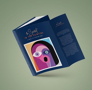
In this tutorial, I’ll show you how to make a dust jacket for a book. Designing book jacket covers can be intimidating. Today, I’ll show you how to set up a dust jacket template that you can reuse over and over again. Using the Page Tool, we will set up every section of the jacket as its own page. This will make the jacket design template easy to alter.
I’ve also included a handy diagram to show you the dimensions and the structure of the book jacket design. Use this as a guide for your future custom book covers and book jackets!
Book Mockup Dust Jacket Template Edition from Envato Elements
And if you prefer to watch video tutorials, we’ve got it covered as well. The Envato Tuts+ YouTube channel has hundreds of amazing design tutorials, like this new video about how to make a dust jacket for a book:
What You’ll Learn in This Book Jacket Design Tutorial
How to set up the structure of a book jacket template in InDesign
How to set up Master Pages, Swatches, and Styles
How to design a book jacket template in InDesign
How to export a book jacket template for printing
What You’ll Need
You’ll need access to Adobe InDesign. If you don’t have the software, you can download a trial from the Adobe website. You’ll also need:
Book jacket template paragraph styles—download the .indd file from the tutorial attachments
Download the assets and make sure the font is installed on your system before starting. I’ll show you how to load Paragraph Styles later in the tutorial. When you are ready, we can dive into creating our InDesign book template!
1. How to Set Up the Structure of a Book Jacket Template in InDesign
For this tutorial, we will start by setting up the InDesign book template with one page. Later, on the Layers panel, we will set up the rest of the structure of the book jacket template, as shown in the diagram below.
Each part of the book cover template will be set up as its own page. Users will then be able to resize the book jacket cover as they need.
Step 1
In InDesign, go to File > New. Name the document Book Jacket Template and set the file to the following dimensions:
Width to 6.375 in
Height to 9.25 in
Orientation to Portrait
Units to Inches
Pages to 1
Uncheck Facing Pages
Margins to 0.5 in
Bleed to 0.125 in (it’s best to seek your professional printer’s preference)
Click Create.
Step 2
On the Pages panel (Windows > Layers), uncheck Allow Document Pages to Shuffle from the main menu. This option will allow us to move pages on the InDesign book template easily.
Step 3
On the Pages panel, add four pages to the book jacket template through the Create New Page button. Also on the Pages panel, drag the pages into a five-page spread.
Step 4
Select the Page Tool (Shift-P) from the Tools panel. Select the first page on the left and head over to the Control panel. Set the Width to 3.5 in.
Select the last page on the right with the Page Tool (Shift-P) and set the Width to 3.5 in. Use the Page Tool (Shift-P) to move the pages next to each other if necessary.
Step 5
On the Layers panel, select the spine section of the book jacket cover and head over to Layout > Margins and Columns. Set the Margins on all sides to 0.25 in. Click OK.
Step 6
Select the Page Tool (Shift-P) from the toolbar. Select the spine page and set the Width to 1 in.
Step 7
Before we start the design of the InDesign book template, we need to alter the margin settings on the front cover and back cover. We need to subtract 0.375 in order to have the design aligned in the center.
On the Layers panel, select page 2 of the InDesign book template. Head over to Layout > Margins and Columns and set the Left margin to 0.875 in. This is to account for the 0.375-inch back wrap and the 0.5-inch margin on all sides.
Repeat the same procedure on the front page of the book jacket cover. On the Layers panel, select page 4. Head over to Layout > Margins and Columns and set the Right margin to 0.875 in.
2. How to Set Up Master Pages, Swatches, and Styles
Step 1
Open the Layers panel by going to Window > Layers. We’llorganize our book cover template into three layers so that users can edit the content.
Bring up the Layers panel by going to Window > Layers. Double-click on Layer 1 and rename it Background.
In the Layers panel main menu, select New Layer. Name it Text. Click OK. Also create a new layer named Images.
Step 2
Head over to Window > Color > Swatches to expand the Swatches panel. Choose New Color Swatch button from the main menu. Set the Swatch Name and values to the following:
Blue: C=100 M=80 Y=20 K=55
Orange:C=0 M=75 Y=95 K=10
Sand:C=10 M=13 Y=15 K=0
Yellow: C=5 M=25 Y=55 K=0
Click Add and OK after you input each of the color values.
Step 3
For this custom book cover tutorial, I created a list of Paragraph Styles that you can use to format the book jacket template.
Head over to Window > Styles > Paragraph Styles to open the Paragraph Styles panel. In the main menu, select Load Paragraph Styles.
Navigate to the Book Jacket Paragraph Styles InDesign document and click Open.
In the Load Styles window, click on Check All and click OK. You’ll have a list of styles on the Paragraph Styles panel ready to be used on your custom book cover template.
3. How to Design a Book Jacket Template in InDesign
Step 1
Bring up the Rules on your custom book cover by pressing Command-R. Using the top ruler, create two guides horizontally. Sit both on the Y axis at 1 in and 2.75 in.
Step 2
In the Layers panel, select the Background layer.
Head over to the toolbarand select the Rectangle Tool (M). Draw a rectangle to cover all of the book jacket template, making sure it is touching the bleeds.
In the Layers panel, lock the Background layer and select the Images layer.
Step 3
Press Command-D to Place an object. Navigate to the Portrait of a young woman file and click Open. In the Control panel, set the Scale Percentage to 12%.
Drag the bottom center point of the frame towards the top to create a square frame. Place it under the top guide we created.
Step 4
In the Layers panel, select the Text layer.
Select the Text Tool (T)and create a text frame that fits the width of the back flap. Place this text frame under the second guide.
Using the Paragraph Styles panel, style the text with the Flap – Quote, Copy, and the Flap – Signature style.
Step 5
Using the Text Tool (T), create three text frames on the back cover. These frames will house a quote, copy, and some information in small text.
Using the Paragraph Styles panel, set the text to the Back Cover – Quote and Copy styles.
For the bottom text, set the frame to the Back Cover – Quote. Head over to the Control panel and set the Type Size to 8 pt. In the Swatches panel, set the color to the [Paper] color.
Step 6
Select the Rectangle Tool (M) from the Toolbar. Create a rectangle to include the barcode if necessary. Place this item on the Images layer.
Step 7
Using the Text Tool (T), create a text frame outside of the spine. Add the title of the book and format it using the Spine style from the Paragraph Styles.
Select the second word and head over to the Control panel. Set the Font to Kaydens Script, and set the Size to 38 pt and the Baseline Shift to -5 pt.
In the Swatches panel, set the color to Yellow. Using the Rotate Tool (R), rotate the text frame -90° and place it along the spine.
Step 8
Press Command-D to Place an image on the front cover.
Navigate to the Six faces vector illustration file and click Open. Using the Selection Tool (V), move the frame to crop closely around any one of the portraits.
Resize the image to fit the front cover of the book cover template. Press Shift-Command to resize the image proportionally and drag from any of the corners. Place the image on the bottom margin.
Step 9
Create two text frames for the word „the” and „Secret”. Set both frames to the Front Cover – Title Line 1 style on the Paragraph Styles panel.
Select „the” and head over to the Control panel. Set the Font Size to 55 pt. Place both frames next to each other, creating good harmony between the two words.
Step 10
Create a text frame under the first line for the rest of the title. Set the style on the Paragraph Styles panel to Front Cover – Title Line 2.
Step 11
Add a final text frame under the title to include the author’s name. Use the Paragraph Styles to format the frame to the Front Cover – Author style.
Step 12
Select the title and press Command-G to Group the frames. Duplicate them by pressing Option and dragging them to the front flap.
Head over to the Control panel and set the Scale Percentage to 45%.
Using the Text Tool (T), create a text frame under the title on the inside flap. Using the Paragraph Styles panel, set the text to the Copy style.
4.How to Export a Book Jacket Template for Printing
Before exporting the book jacket template for printing, it’s useful to take a look around all the edges. This is to make sure all the images and vectors bleeding out are touching the bleeds. I advise you to consult your printer for any specific settings.
Step 1
To export the file, go to File > Export. Name the file Book Jacket Templateand choose Adobe PDF (Print) from the Format dropdown menu. Click Save.
Step 2
In the Export Adobe PDF window, set the Adobe PDF Preset to Press Quality. Under Pages, set the Export As option to Spreads.
On the left side of the panel, select Marks and Bleeds. Check All Printer’s Marks and Use Document Bleed Settings. Click Export. You will have a ready-to-print PDF file.
Great Job! You’ve Finished This Book Jacket Design Tutorial!
In this tutorial, you learned how to make a book jacket. We covered key tools that will help anyone edit a book jacket design template quickly and easily. Today, you learned to:
set up a ready-to-print InDesign book jacket template file
load Paragraph Styles to format text
add Color Swatches
organize multiple Layers
create a multiple-page spread in the Pages panel
use the Page Tool to resize pages
5 Top Book Jacket Design Mockups and Templates
Now that you know everything about book jacket making, you might be in search of digital resources that help you save time.
Envato Elements is a fantastic source for book jacket design templates. This subscription-based marketplace offers you unlimited downloads for a flat fee.
Book jacket making gets so much easier with this template. Once you have your book jacket design ready after this tutorial, you can try this cool mockup to see it in 3D. The download includes eight PSD presentations and a total of 15 different book mockups which are 100% editable.
Here’s another fantastic dust jacket template. No need to worry about how to make a book jacket with this mockup. This book jacket making kit features:
Here’s a beautiful book jacket design mockup if you’ve got a smaller book design. The download includes five PSD book mockups you can easily edit thanks to the smart object layers.
You’ve finished your top book jacket design, and you want to present it in a professional way. This dust jacket template is what you need. It’s specially designed for a digest size book (approximately 14×21 cm) and it features:
four PSD mockups
different poses in each mockup
organized layers
realistic effects and shadows
changeable background
smart objects
Discover More Book Design Tutorials
If you liked this tutorial on how to make a book jacket, you might like these:
If you’re looking to update your font book, consider this your ultimate guide to the most popular fonts right now and brand new trending fonts for 2022. Last year was a fantastic year for cool and quirky type, and in 2022 there’s also plenty to get excited about in the world of type, from Arabian-style scripts to chunky retro display fonts.
To compile our report on the latest trending fonts, we analyzed search data to identify current typography trends and emerging type styles, bringing you the fonts that will define the voice of brands, websites, logos, and print media in the near future. Stay ahead of the curve with this report on font trends for 2022, and discover your next favourite font to use in your design projects.
Looking for your next type infatuation? Explore a huge range of trendy popular fonts for both web and print with a subscription to Envato Elements.
And if you prefer to learn about trending fonts by watching videos, then you need to check out this video from the Envato Tuts+ YouTube channel:
Font Trends 2021: What Were the Trending Fonts?
After a nearly write-off year for font trends in 2020, a unique and individualist spirit pervaded typography in 2021, with distorted and kinetic fonts being just two of the distinctive type trends that helped to give brands a unique voice in a crowded online market. The pandemic fostered a greater sense of locality for consumers as the work from home (WFH) community exploded, while continuing global anxieties led to more interest in brands that were able to offer genuine intimacy and connection with their customer base.
Distinctive and eccentric type styles continue to have traction in the post-pandemic world, but generally we’re starting to see a movement towards more subtle interpretations of the trend for quirk.
The downside of ultra-eccentric type is that style can often be at the expense of substance. Distorted fonts might look cool, but they can also be difficult to read on a small screen. For businesses looking to connect with a wider customer base, accessibility is at the forefront of their branding strategy. In the last couple of years, a range of global businesses, including Uber, Santander, and Badoo, have moved towards simpler, friendlier brand identities with type that reflects a more inclusive aesthetic.
Font Trends 2022: What Are This Year’s Most Popular Fonts?
In 2022 typography trends, we can expect to see a move away from illegible novelty fonts and towards type that is more honest, legible, and inclusive. As the online market becomes increasingly crowded, big brands are shifting towards identities that work better on digital platforms, and type plays a major role. Rounded sans serifs are welcoming and UX-friendly, while fluid, simple scripts and rustic serifs replace fussier serif styles.
Still yearning for an eccentric typeface? Retro styles are going extra chubby and huggable, while the (long-delayed) release of Wes Anderson’s The French Dispatch helped to ignite a craze for all things 1950s and French—channel the look with quietly quirky fonts inspired by vintage journalism.
We predict the most popular 2022 font trends will have an open and honest personality, with legibility and web accessibility a priority. Of course, that doesn’t mean style goes out the window. Quite the opposite—these 2022 fonts trends may be subtle, but they’re all supremely stylish:
Rounded Sans Serifs
High-Contrast Serifs
Quietly Quirky
Fluid and Simple Scripts
Rustic Serifs
Strong and Simple Sans
Chubby Retro
We expect to see examples from all of these font groups across print, branding, packaging, and web design in 2022. Read on to explore these exciting font trends in detail and stay ahead of the type curve.
Font Trend 1: Rounded Sans Serifs
Honest, open, and inclusive, these rounded sans serifs reflect the shift towards fuss-free branding in 2022. Rounded fonts used to be the preserve of child-focussed products, but these more grown-up incarnations of the rounded type style strike the perfect balance between friendly naivety and geometric style.
Ideal for use across a wide range of branding projects, this current font trend is also ultra-legible, boosting online accessibility for visually impaired readers. Use it for logo design, apps, brochures, and ads.
Here’s the next 2022 font trend: taking inspiration from Japanese typefaces, these achingly elegant high-contrast serif typefaces bring a literary personality to print and web projects.
These impactful fonts balance traditional and contemporary style, making logo and brand designs feel both timeless and cutting-edge, perfect for brands that want to look a bit older than their establishment date. High-contrast serifs also work beautifully for body type on websites, and they’re easier to read than old-style serifs. These are some of the best fonts of 2022 that follow the trend:
With Wes Anderson’s much-anticipated tribute to journalism, The French Dispatch, released at the end of 2021, no doubt we can expect to see a wave of designs paying tribute to the rustic, mid-century character of its French setting. Anderson’s graphic designer Erica Dorn created beautiful poster artwork for the film, featuring illustrations by Javi Aznarez, which are embellished with kookily hand-drawn type in a typewriter-inspired, serif style.
These quietly quirky font styles will help you to channel a cosy vintage style in your designs in 2022. Look for traditional serifs and sans-serifs with subtle quirks. If the characters have a slightly hand-crafted wobble, you’re on the right track. Let’s see some of the best fonts of 2022 for this one:
Speaking of cool typography trends, another one that’s been brewing since 2021 is the use of very silky, fluid script fonts that blend elements of Art Nouveau with calligraphic style. These trending script fonts are beautiful and poetic, allowing you to incorporate artistic type into your designs.
In 2022, we’ll see these scripts become even more fluid and simple, with a strong Arabic influence in the styling. These display fonts can be used to embellish packaging, product photography, or websites, and look fantastic layered over photography. They are elegant and only sparingly cursive, making them more legible than fancier script styles. Here are the top 2022 fonts for this elegant trend:
One of the biggest font trends for 2020 was carved, sculptural serifs which looked as if they had been chiselled from stone. While we’ve now reached sculptural saturation point, the serif trend isn’t going anywhere. If you love the look of sculptural serifs but are on the hunt for something a little more trend-leading, let me introduce you to the rustic serif.
Quietly elegant with a small dose of perfected imperfection, these serifs take their cues from European cafe signage. Informal and effortlessly pretty, these new trending fonts can be used to bring more character to print designs such as posters and book covers. These trendy popular fonts have a handwritten quality without appearing hand-drawn, making them an excellent font choice for communications that need to feel warm and personal, such as portfolio websites, resumes, or casual event marketing. Let’s take a look at the latest trending fonts:
After a year of distorted, novelty fonts, there’s no fresher breath of air than a strong and simple sans serif. This current font trend features bold, impactful fonts that are best used for headlines, and are the perfect match for corporate designs or layouts that need to get to the point quickly.
Team your bold, simple serif with high-contrast colour pairings such as black and white or acid neons to maximise its powerful personality. Sports branding, game marketing, technology branding or corporate websites will all benefit from the simple impact of a modern sans serif.
The power of nostalgia marketing has only grown stronger during the pandemic, with consumers increasingly turning to vintage-styled products and designs to feel comforted. While overly retro fonts can feel a little too gimmicky right now, fonts that subtly reference 1970s type styles still feel fresh.
We predict that retro-inspired fonts will also go super-sized in 2022, with chubby retro fonts being used to add a serious dose of cheer and optimism to logos, packaging, signage, and websites. If you’re looking for a font trend to put a smile on your face in 2022, these chubby retro typefaces will certainly lift your mood. Here are the best 2022 fonts for this retro trend:
After font trends in 2020 and 2021 prioritised eccentricity, the best fonts of 2022 will have a quieter but no less impactful mood. Legibility, clarity, and an open, honest personality will help consumers to feel welcomed and comforted by brands, particularly ones they might not have encountered in the crowded digital market before.
Despite the subtler mood pervading typography in the year ahead, there are still plenty of type choices that will bring personality and character to your designs. Chubby retro fonts bring a much-needed dose of optimism, while rustic serif fonts, simple scripts, and quietly quirky display fonts will bring warmth and friendliness to your projects, as well as a serious style hit.
Wondering how to use these trendy popular fonts in 2022? Less is often more, so prioritise elegance and warmth over novelty styles. Your designs—and clients—will thank you for it!
Discover more 2022 font trends for web design and print projects on Envato Elements.
On the hunt for more font inspiration? Read up on what fonts are trending, our edits of the best font styles on the internet, and typography tips to help you make your type designs better than ever:
If you’re looking for the best sans serif fonts available today, check out this collection of the best free sans serif fonts as well as a selection of the…
Trying to figure out how to identify a font? Whether you’re working on how to identify a font on a website, how to identify a font in a logo, or how to…
Love Bebas Neue, and you’d like some Bebas Neue font pairing suggestions? How about some new Bebas Neue similar font designs for your font library? Let’s…
Didot-style fonts are elegant and classy. The Didot typeface and other serif fonts inspired by the Didone genre are a great choice for fashion, packaging,…
Love farmhouse-style fonts? Check out this inspiring collection of some of the best farmhouse fonts you can download right now. Whether you’re looking for a…
With the end of the year fast approaching, it’s time for some fresh font trends. Next year looks set to be an eclectic and eccentric melting pot of type…
Big bold fonts make for perfect display type, and there are so many stylish, modern bold fonts out there to download today. Check out this list of thick bold…
Looking for just the right brush font for your next project? Well you’re in luck. Today we’ll share over twenty-six of the best free brush fonts available on…
The square cross fold brochure is a great way to get your business noticed. In this tutorial, I will teach you how to design a square folded cross brochure in Adobe InDesign. You will learn how to set up your document by applying guides and diecuts and placing property photos, and then you will learn how to design a real estate brochure template.
Open InDesign and create a new document (File > New). Make the Width and Height of your 4-fold brochure 17.1875 in, 2 Pages, 0 in Margins, and 0.125 in Bleed on all sides.
Step 2
In the Layers panel, rename ’Layer 1’ to ’Artwork’. Create a new layer and name it ’Diecut’. Uncheck the Print Layer box. Create another layer and name it ’Guides’ and uncheck the Print Layer box.
Step 3
On the Diecut layer, create a 5.75 in square using the Rectangle Tool (M). Change the Fill to None and the Stroke to the pink color swatch in the Swatches panel. Change the Stroke Weight to 0.5 pt. Make sure Smart Guides are turned on by going to View > Grids & Guides > Smart Guides. Place the square in the middle of the document. The pink guide line will be where the brochure will fold.
Step 4
Copy (Command-C) and paste (Command-V) this square, but change the stroke to green in the Swatches panel. This guide shows where our document will be cut. Change the size of this square to 5.8508 in Width and 5.75 in Height. Move it to the right of the first square. This will be our cover. The cover should extend all the way to the bleed area.
Step 5
Copy (Command-C) and paste (Command-V) the square again. The next three squares will be smaller than the first two squares because they have to fit on top of one another once folded. Place this square at the top of our document. Change the Width to 5.6 in and the Height to 5.8508 in.
Step 6
Create two more squares for the left and bottom panels. Add labels to your document like the image below. This will help you remember how your document folds and which panels are paired with one another.
Step 7
Copy (Command-C) and Paste in Place (Edit > Paste in Place) the pink diecut square and the green fold squares to the second page of our square cross fold brochure. Next, go to Object > Transform > Flip Horizontal so that the inside of our cover is now on the left side. Label the second page as we did the first.
Step 8
Select the Guides layer in the Layers panel. Create four blue squares with an Opacity of 20%. This will show us how far we need to extend the bleed area. Use these sizes for the squares:
Cover: 5.8508 in Width, 6 in Height
A1: 5.8508 in Width, 5.85 in Height
B1: 5.85 in Width, 5.8508 in Height
C1: 5.85 in Width, 5.8508 in Height
Step 9
Create four more squares and Fill them with yellow with an Opacity of 20%. We will use this yellow square to mark our safe margins. We will keep all the important information within this guide so it doesn’t get cut off. Use these dimensions:
Cover: 5.2258 in Width x 5.25 in Height
A1: 5.2188 in Width x 5.1 in Height
B1: 5.1 in Width x 5.2188 in Height
C1: 5.1 in Width x 5.2188 in Height
Step 10
Next, Copy (Command-C) and Paste in Place (Edit > Paste in Place) the yellow and blue guides on the second page. Next, go to Object > Transform > Flip Horizontal as we did in the previous step so that your second page looks like the image below.
2. How to Format and Place Photos in InDesign
Step 1
Open the house with a pool and deck photo in Adobe Photoshop. Change the image to CMYK by going to Image > Mode > CMYK Color. Make sure the image has a Resolution of 300 by going to Image > Image Size. Change the Resolution to 300 and make sure Resample is unchecked. Save this file as a TIFF. Apply these same settings to the rest of the photos we’re using in this cross fold tutorial.
Step 2
Go back to InDesign. Select the Artwork layer and create a frame on the cover using the Rectangle Frame Tool (F). Make the frame the same size as the bleed layer. File > Place the cover image we just saved as a TIFF and resize it so that it’s 38% smaller.
Step 3
Place the remaining 5 photos on the outside panels and the inside back (second page). Make sure you turn the outside panels B1 and C1 upside down because once we fold it, the panels will be right side up.
3. How to Lay Out and Design a 4-Fold Brochure
Step 1
Open the real estate logo in Adobe Illustrator, and change the color to C27 M0 Y0 K17. Copy (Command-C) and paste (Command-V) the icon into InDesign and place it at the top of the cover. Select the Type Tool (T) and add the name of your real estate business using MagnifyBold, 11 pt, and 150 Tracking.
Step 2
Add headers to the four panels using Himalaya and Magnify Bold. Rotate the type by 8°. Select the Glyphs panel (Window > Type & Tables > Glyphs) to use alternate glyphs for the letters 'e’, 'W’, 'D’, 'A’, and 's’.
Step 3
Add the contact information to the back cover along with the logo using the Paper swatch. Use the Pen Tool (P) to create two dividers on either side of the contact information. Use a 1 pt Stroke and Arrowhead for the Start/End points. Create a horizontal rectangle and Fill it with Black. Change the Opacity to 60%. Go to Object > Effects > Gradient Feather and apply a Linear 90° Gradient Feather. Change this layer’s Transparency to 60% and the Blending Mode to Multiply.
Step 4
Let’s move to the second page of our square folded cross brochure. Add purple and green background colors to the panels. Click the hamburger menu in the top-right corner of the Swatches panel and select New Color Swatch. Add two colors, C85 M100 Y32 K17 and C85 M27 Y54 K19. Add the blue logo to each panel and change the Opacity to 50%.
Step 5
Install the PAT file from the geometric pattern folder in Adobe Photoshop. To install the pattern, go to Window > Patterns to open the Pattern panel. Select the hamburger menu, click Import Patterns, and select the PAT file.
Create a new document in Photoshop. Go to File > New and create a 6 x 6 in, 300 Resolution, CMYK document. Drag and drop the pattern onto the document. Double-Click the pattern thumbnail in the Layers panel and change the Scale to 56%. Save this file as a TIFF.
Step 6
Go back to InDesign and File > Place the pattern file we just saved. Change the Opacity to 15%. Add a Radial Gradient Feather by going to Object > Effects > Gradient Feather. Copy (Command-C) and paste (Command-V) this same pattern onto the other panels.
Step 7
Add the information about your business to the panels using Himalaya, Magnify Regular and Nostalgic Memories. Create vertical dividers on the B2 panel using the Pen Tool (P). Use 0.5 pt for the Stroke Weight and the Swatch C12 M33 Y85 K17.
Step 8
Open the vector map in Illustrator. Copy (Command-C) and paste (Command-V) the map and location icons on the A2 panel. Label the map with several locations. Create the 0.55 ptArrowhead dividers using the Pen Tool (P).
All Done! Time to Display Your Beautiful Creation!
Great job following my how to create a cross fold brochure tutorial in InDesign. Now it’s time to display it for all the world to see. Check out this minimalist mockup from Placeit below. Take your designs to the next level and showcase your designs in the best way possible.
5 Brochure Templates to Save You Hours of Work
Whether you’re a freelance designer or an entrepreneur with a product to sell, the last thing you need is more work. That’s why I put together a list of five brochure templates for you to quickly create high-quality marketing materials for your business. They’re easy to customize and print-ready, so you can spend less time designing and more time doing what you love.
Looking for a way to make your business stand out? Download this professional, high-quality brochure folding template. It’s easy to edit and customize with your own content, and it’ll dazzle your customers and clients.
You don’t have time to waste on designing a cross fold brochure for your business. That’s why you need this professional and easy-to-edit brochure template. With this, you can spend more time building your business and less time designing.
Trying to stand out in the crowded market? WOW your customers and clients with this easy-to-edit square trifold brochure. With eye-catching panels, you can easily show off your business credentials, benefits, and services.
What’s the best marketing tool you have? Your brochure. You know that brochures are the most effective way to communicate your message, products and services while also increasing your branding efforts. Sail away in style with this high-quality yacht trifold brochure template.
Here’s a one-stop shop for all your marketing needs. This easy-to-edit template is guaranteed to impress your customers and clients. With a professional and high-quality design, all you have to do is fill in the details and send it out!
Design Brochures Like a Pro With These Resources!
Brochures are a great way to promote your business and get new clients. But sometimes, it can be hard to know how to design them or what you need to include. That’s why I put together this list of tutorials, templates, and other resources for designing brochures!


 How to Turn Off Ligatures in Illustrator
 Andrei Marius13 May 2022
 How to Adjust the Font Size in Illustrator