Archiwum kategorii: Web Tools

Divi Theme Review: A Multipurpose Theme That Meets the Hype?

Post pobrano z: Divi Theme Review: A Multipurpose Theme That Meets the Hype?

Divi, brought to you by Elegant Themes, is one of the most well-known and popular multipurpose themes in the market to date. It boasts having everything you need to build a beautiful website from the ground up, thanks to the built-in visual page builder. And with demo content for industries of all kinds, it would seem this theme really does have everything you’d need to launch a WordPress site.

But does it live up to all the hype?

Today we’re going to dive in and check out everything Divi has to offer when it comes to features and price so you can see for yourself. And as an added bonus, we’re going to run some speed tests on Divi for those that are worried a multipurpose theme might drag down their site’s speed and performance.

So, let’s get started.

What is Divi?

Divi is the flagship creation of Elegant Themes and comes as part of an Elegant Themes membership. With your membership, you have access to two themes, Divi and Extra. You also get the social share plugin Monarch and the email opt-in and lead generation plugin Bloom.

The creators behind Divi claim that Bloom is more than just a WordPress theme; instead it’s a powerful website building platform that replaces the default WordPress editor (yes, even Gutenberg). But more than that, despite its multipurpose essence, Divi is built with beginners in mind.

You don’t have to have any technical, coding, development, or web design skills to build a stunning WordPress site using Divi. Adding to that, there’s no complicated set up either. All you have to do is install and activate the theme like you would any other WordPress theme. From there you can start building with ease.

The frontend customization functionality gives you a real-time live preview of your website as you make changes. And because Divi doesn’t place limits on industry, design, or layouts, it can honestly be called a multipurpose theme.

Last but not least, Divi comes with an exclusive page builder – Divi Builder – which is super convenient. You no longer have to invest in a page builder and a separate WordPress theme when launching a website.

But that’s not all Divi theme has to offer.

Divi Theme: Standout Features All Site Owners Want

1. Divi Builder + Layout Packs

We get it, the WordPress Classic Editor is pretty limiting and Gutenberg is…a work in progress. Luckily, Divi comes with a drag and drop visual editor that helps you avoid both the old and new WordPress editors.

When you set out to create a new post or page, and click the Use The Divi Builder button, you’ll find your screen comprised of:

  • Sections
  • Rows that fit within sections
  • Columns that fit within rows

Here’s an example:

divi builder example

Of course, you can build your post or page’s layout from scratch by adding sections, rows, and columns, as well as modules (more on those later). And any time you want to make a change, just drag the section, row, or column and place it where you want it to go.


Divi Builder also makes it easy to:

  • Bulk edit multiple elements at a time
  • Find and replace changes
  • Copy and paste styles across elements
  • Drag and drop media files right onto your pages
  • Use the built-in keyboard shortcuts for faster site creation

It’s worth noting that the Divi Builder plugin can be purchased separately if you like the idea of using a WordPress page builder, but want to use a different WordPress theme.

Pre-made Layout Packs

If you want to make things even easier on yourself, or just need a little inspiration, use any one of Divi’s 100+ Layout Packs.

divi pre-made layout packs

The Layout Packs are categorized so you can find what you need fast. For example, you might choose to view the Online Store, Technology, or Lifestyle packs. Altogether, there are over 100 Layout Packs and an impressive 800 pre-made website layouts for you to pick from, with new layouts being added every week.

When you click on a layout, another screen appears. Because each layout pack comes as a set, you’ll be able to choose the page or layout you’re creating (e.g., About, Homepage, Landing Page, etc.) and see a preview of it before you decide to use that specific layout.

layout pack details

This makes choosing the right layout for your website a breeze. And remember, you can always customize a layout you choose on the backend or frontend of your site. divi frontend editing

Though it may seem a little confusing at first, once you start messing around with the editor you’ll quickly get the hang of it.

2. 40+ Content Modules

Finding the perfect element for your website can be tough if you aren’t sure what you’re doing. In an effort to cater to beginner site owners, Divi packs over 40 specific content modules into the Divi Builder, making site creation even faster.

divi modules

You can choose from popular modules like:

  • Contact form
  • Image
  • Button
  • Search bar
  • Testimonial
  • Video

Or some more unique modules such as:

  • Countdown timers
  • Login section
  • Toggle
  • Filterable portfolio
  • Blurb

Though Divi inserts pre-designed modules onto your site when you pick one, remember, there are no design constraints.

module customization

You can easily customize everything on any module you select, from color schemes to copy, border width to animations. The options are endless and you are always in control over the way your theme (and website) looks.

more module customization options

3. Easy to Use Dashboard

One of the nicest things about Divi is the dashboard that’s available for customizing some important global settings.

divi dashboard

Here’s a look at some of the most important them options you can configure:

  • General: here you can upload a logo, enable a fixed navigation bar, allow Google Fonts, choose which social media icons to display, and enable translations.
  • Navigation: exclude certain pages from the navigation bar, enable dropdown menus, and select how many dropdown tiers to show.
  • Builder: enable/disable Divi Builder on post types (posts, pages, and projects).
  • Layout: choose whether to show author, date, categories, and comments in post information section, show comments on posts, and place thumbs on posts.
  • Ads: enable ad banners, upload an image, or include a destination URL or Google AdSense code.
  • SEO: optimize homepage, single post, and index page SEO by enabling things like meta descriptions, keywords, and title layouts.
  • Integration: add code to specific parts of your website, such as the <head> of your blog for integrating with third-party services like Google Analytics.
  • Updates: ensure your theme is always up to date with your account username and API key.

This simple interface is easy to access and makes configuring important settings for your website something even a beginner can understand and handle.

4. WordPress Plugin Compatibility

With so many people using WooCommerce these days, it would be a huge mistake if the team behind Divi didn’t make their theme fully compatible. That said, Divi takes things further when it comes to playing nice with WooCommerce stores.

Not only are there ample Layout Packs made specifically for eCommerce shops in general, there are customizations that correspond to your WooCommerce shop you can include while creating your website.

For example, if you assign categories to your WooCommerce products, you can also choose those categories after choosing the Shop module to your site using Divi.

woocommerce shop settings

Adding to that, Divi helps you build an international brand. Supporting 32 languages with RTL support, you can translate both the back and frontends of your website.

divi translations

It also supports the popular translation plugin WPML, so creating a multilingual site is doable no matter which approach to site translations you take.

5. Additional Customizations

There are so many ways to create a unique website with Divi it would be impossible to outline them all. That said, it’s worth noting some of the most stand out customization options available so you can get a feel for the creative freedom Divi offers site owners.

Hover Effects

Make your Divi modules fun and interactive by customizing the hover effects. Change the background color, module position, shadows, text sizes, and so much more – all in real-time so you know it works the way you want it to.

hover effects

In addition, combine your hover effects with Divi’s Module Link options, which turn any module, row, or section into a clickable link.

Fonts and Text Styling

font and text styling

With Divi’s font and text styling customizations, you can do the following:

  • Choose from over 800 font styles
  • Upload custom fonts
  • Search for specific fonts using the search bar
  • Access recently used fonts for consistency
  • Apply font styling such as underline or strikethrough
  • Control font weights with more precision
  • Manage headings individually

Shape Dividers

Perhaps one of the most unique customization options in Divi are the shape dividers. You can easily create dynamic transitions between blocks of content to keep people engaged, organize your pages, and stand out from all the other sites in your industry.

shape dividers

Dividers can be placed above and below each Divi section on your site, complete with transition effects. Choose from 26 shapes, each of which can be flipped, rotated, resized, combined, and customized for a non-traditional look.

shape dividers example

Element Transformations

Another neat thing Divi lets site owners do is move elements around, scale them up or down, rotate them on three different axis, and skew/adjust them with ease.

element transformations

Other great customization features found in Divi include:

  • Responsive editing and different device previews
  • Border additions, complete with sizing, corner adjustments, and custom colors
  • Advanced code editor for those comfortable with CSS (use the editor or Divi code module)
  • Change hue, saturation, brightness, contrast, blur, and more using background and blend modes
  • Add depth to your website by adding drop and text shadows
  • Include animations with any site element, customizing type, speed, and direction
  • Apply custom background colors, gradients, images, and videos to any element

6. Built-in Marketing Tools

divi marketing tools

There’s more to running a successful online business than creating a beautiful website, even if you’re using Divi. Luckily, Elegant Themes understands this and gives website owners plenty of marketing tools to help.

  • eCommerce compatibility (not just WooCommerce)
  • Pricing tables, complete with design and content settings
  • Email opt-in module for list building and lead generation
  • Integration with email service providers like MailChimp, ConvertKit, and Constant Contact
  • Built-in contact form with advanced conditional logic (hide and show fields based on user behavior to increase conversions)
  • Social follow module and Monarch plugin’s social share system

Lastly, Divi comes with built-in split testing, which is something not a lot of WordPress themes offer. Test page designs against one another, choose goals to reach, and see which variation converts the highest by viewing the detailed data collected right in the Divi dashboard.

divi theme split testing results

Whether lead generation, increasing sales, or boosting subscribers is your ultimate goal, Divi helps you reach it.

  • Test individual elements
  • Create an unlimited number of variations
  • Pick a goal you want to meet and let Divi track progress
  • Start tracking results right away
  • Access important data and make improvements

Divi Speed Test

Now that you know all about Divi’s best features as a multipurpose theme, it’s time to look at how it performs. After all, a WordPress theme is only as good as its performance on your site. If your theme slows your page loads, and harms the user experience, it’s not worth it.

We ran our speed test with a fresh WordPress install and performed the following steps:

  1. We tested the site’s performance using LoadImpact. In our graphs, blue represents the response time, while purple is the number of requests.
  2. Using Chrome developer tools and Pingdom’s website speed test we discovered how long the site takes to load.

Of course,  results will vary as you build your site with more content, images, and functionality. It will also depend on the type of WordPress web hosting you use to run your site. But these tests will give you a good starting point.

Divi had an average response time of 95ms with LoadImpact, which at first glance may not seem that impressive.

divi theme loadimpact test

But when you take into account a two minute load test ran 11,945 requests, for an average of 100 requests/second, Divi’s steady response time is actually really great.

Divi loads in 676 ms with Chrome Developer Tools. With Pingdom, Divi loads in 1.25 seconds (with a 322.3KB page size and 22 requests) and has a performance grade of 90%.

Divi Support & Documentation

When you purchase Divi, you’ll have access to their extensive documentation, support forums, and an exceptional support team that’s available around the clock via live chat.

divi theme documentation

In addition, as you build your website using Divi, you’ll have access to multiple help buttons as you create that when clicked, launch the Divi Helper and a playlist of instructional videos that will help you with whatever you’re currently working on.

divi theme divi helper

If you need technical support, you can also use the email ticketing system.

Divi Theme Pricing

As we mentioned earlier, Divi theme is available as part of an Elegant Themes membership that will cost $89/year.

With it, you get access to Divi theme, Extra theme, Bloom plugin, and Monarch plugin. In addition, you’ll receive 100s of Website Packs for easy site creation, products updates, premium support, and unlimited website usage.

divi theme pricing

If you really love Divi and the other premium products that come with being an Elegant Themes member, you can always make a one-time payment of $249  that will give you access to:

  • Divi, Extra, Bloom, and Monarch
  • Hundreds of Website Packs
  • Lifetime updates
  • Lifetime premium support
  • Unlimited website usage

No matter which price point you choose, there’s a 30-day money back guarantee so you can try Divi risk-free.

The Verdict

After carefully evaluating all the features that come with Divi, it’s safe to say it’s an excellent choice for anyone looking to build a highly converting and visually appealing website.

It’s ease of use, extensive functionality, and affordable price are just some of the reasons why website owners of all kinds should consider choosing Divi theme for their WordPress website.

All that said, for those still on the fence, here’s a look at the pros and cons of using Divi theme.

Pros:

  • Ideal for beginner site owners with limited technical knowledge
  • Beautiful pre-made templates that are fully customizable
  • Drag and drop editor that gives you complete creative freedom
  • Compatibility with eCommerce and marketing tools and services
  • Multilingual and RTL support for building a global brand
  • Exceptional documentation and support
  • Great value for your money (including access to additional premium themes and plugins)

Cons:

  • Changing themes can be a problem because of theme lock-in
  • Number of customization options can be overwhelming to novices
  • Lacking advanced developer options

Final Thoughts

In the end, Divi has a lot to offer website owners in all industries and can honestly be labeled one of the best multipurpose themes in the market. And with a generous 30-day money back guarantee, you have nothing to lose by trying Divi on your site to see if you like it.

If you do decide to use Divi, make sure to check out these real-life Divi theme examples to get your creative juices flowing. And don’t forget, every website needs a great domain name, so get one by using any of these best domain name generators.

As an added bonus for being a loyal reader, get 20% OFF an Elegant Themes membership by using our exclusive coupon. No code is necessary, just click and buy!

The post Divi Theme Review: A Multipurpose Theme That Meets the Hype? appeared first on WebresourcesDepot.

How to Create a Cartoon Rainbow Text Effect in Photoshop

Post pobrano z: How to Create a Cartoon Rainbow Text Effect in Photoshop

Final product image
What You’ll Be Creating

Text effects and Photoshop text styles can be a lot of fun—they can be expressive, dynamic, and communicative! In this tutorial, we’ll create a rainbow text effect in Adobe Photoshop, using text effects, layer styles, and some other tricks, too!

Tutorial Assets

The following assets were used in this tutorial:

1. How to Arch Text in Photoshop

Step 1

First, begin with a New Document in Adobe Photoshop. You’re welcome to follow along with my settings, as shown below, but there is no wrong answer here! Choose a size that you prefer.

Example Settings

Step 2

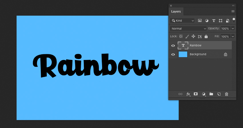
Now, let’s begin with our text. Using the Type Tool, write out the word of your choice. 

I used the word „Rainbow” for this tutorial, but feel free to use any that you like. The techniques we’ll use in this walkthrough could apply to any typeface of your choice, as well.

I used the font Paladise

Example of Text

Step 3

To push the rainbow aesthetic further, we’re going to give the type an arch. 

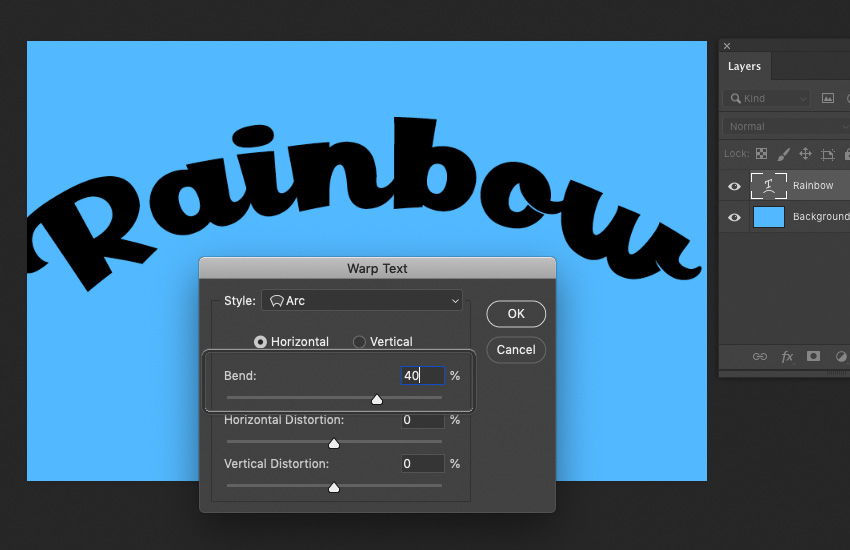
Ever wondered how to curve text in Photoshop? With the Type Tool selected, choose Create Warped Text from the Options Bar. Doing so will bring up the dialog box displayed below.

We want to apply an Arc to our text. Select Horizontal and experiment with the values until you get a curvature that you like. Voila, you know how to arch text in Photoshop! In this case, I chose to set the Bend to 40%.

Example of Arc Added to Text

Step 4

After warping the text, the type might not fit your canvas the way it did prior. In my case, it stretched things out and made the text bigger than I’d originally wanted the text design. Use the Move Tool and your Transform Controls to adjust the type, if necessary.  

Example of Resized Text

2. How to Create the Rainbow Text Effect

Step 1

Now, let’s create the rainbow itself. There’s no right or wrong way to do this, but here is one way you could try.

Start by using the Ellipse Tool to create a rounded shape. Try to follow the curvature of the type. 

Ellipse added on top of Text

Step 2

Copy the ellipse and Move it upwards, changing its color each time. Once I was happy with my colors, I Flattened the ellipses onto one layer.

The red, however, needs to cover more space, to fully cover the top of the type. In this case, I created a New Layer beneath my ellipses and simply created a red rectangle. You could do this with your Shape Tools or simply Fill a selection made with your Selection Tools

Again, this is a case where this could be achieved in many ways. You could, for example, draw the rainbow by hand with a drawing tablet, or you could use the Pen Tool to achieve a similar effect. 

Choose the method you prefer—the important part is that the arc of the rainbow is inspired by the type and that the color completely covers the text area.

Example of initial Rainbow Artwork

Step 3

Once you’re happy with your rainbow, make sure it has all been Flattened onto one Layer. We’re going to Create a Clipping Mask on this Layer.

To do so, Right-Click on the layer (on PC) or Control-Click on the layer (on Mac) to open the Options seen below. Select Create Clipping Mask.

Creating the Clipping Mask

Step 4

Tah dah! Our rainbow has now been applied to the type area. Notice how, when the Clipping Mask is applied, the Layer has a little downwards arrow on it, indicating this.

If you’re unhappy with how your rainbow looks, you can draw directly on this Layer and the contents will still stay confined to the type area. Don’t be afraid to go in and make adjustments! 

Applying the Clipping Mask

3. How to Add Text Effects

Step 1

Now, let’s add some fun effects to push the aesthetic here further.

Rather than using the Drop Shadow Layer Effect, here in Photoshop, let’s create one by hand. 

First, I took our Text Layer and the Clipping Mask Layer and put them into a Folder. This will help keep things organized.

Copy the folder. I labeled these two folders „Rainbow Text Top” and „Rainbow Text Bottom”. The bottom folder is the start of our Drop Shadow. Use the Move Tool to move it downwards.

Creating a Drop Shadow by Hand

Step 2

Now, let’s create a New Layer, right above the rainbow colors applied to our text. Create a Clipping Mask on this Layer, just as we did earlier in this tutorial. 

Fill this Layer with a solid, black color (or, a different color of your choice, if you’d like!). Set the Opacity to 50%—this way, we still see the rainbow colors, but they look a little darker, like a rainbow-tinted shadow. 

Creating an Additional Clipping Mask

Step 3

Next, let’s give our text some depth. 

Copy the rainbow Text Layer and move this Copied Layer to the top of your list of Layers. Change the Color to white.

I have turned off visibility on my other rainbow text layers, so I can visually focus on this one (click the Eye Icons to the left of each Layer to Toggle Visibility On and Off

Duplicating the Text Layer and Making it White

Step 4

We’re going to apply two Layer Effects to the white Text Layer that we just copied. The first one is Bevel & Emboss.

Feel free to copy my settings, as shown below—but again, there is no wrong answer here. Experiment so you get a feel for what the values do! It is, however, important to note that the Highlight Mode is set to Screen and the Shadow Mode is set to Multiply.

Applying Bevel and Emboss

Step 5

Now, let’s also add an Inner Glow. Again, I recommend experimenting with these values to get a feel for what they do (Tip: Keep Preview checked so you can see what changes these values make, in real time). Note that the Blend Mode is set to Screen.

Once you’re happy with the values you’ve selected, click OK.

Applying an Inner Shadow

Step 6

Change the layer’s Blending Mode to Multiply. Notice how the white text disappears into the background, but we’re still left with visible Layer Effects

Changing the Layers Blending Mode

Step 7

Toggle the visibility on for any hidden layers, so we can see everything together now. 

Use the Move Tool to adjust the position of the layer with our Layer Effects, as necessary. I bumped it a little upwards and to the side to get the effect I wanted. 

Adjusting the Layers

4. How to Create Background Elements

Step 1

To push the rainbow aesthetic even further, I thought it would be cute to add in some raindrops. 

I used a drawing tablet to draw some white lines with the Brush Tool. The default Soft Round Brush will do! Then, in varied spots, I drew little spots and dashes to resemble splashes, where the raindrops hit the letters. 

If you don’t have a drawing tablet, that’s okay too! The artwork itself doesn’t have to be perfect—you could use your mouse or the Line Tool, for example, to get the basic shapes down.

Then, apply a Gaussian Blur (located under Filters > Gaussian Blur) to smooth things out and match the hazy white glow at the type of the type. Now, we have a rainy look!

Drawing on Rain Drops

Step 2

Let’s finish things off with a fun background. 

First, on a New Layer below all of the type, I created some simple clouds in a solid, white color. Again, I used my drawing tablet and the Brush Tool to do so—but you could use Shape Tools to achieve a similar result. 

I also added a Gradient, below. The goal was to make the base of the background a little darker than the top. You can do so with the Gradient Tool.

Adding in Clouds and a Gradient

Step 3

Finally, Copy the clouds and Move them so they create a repeated pattern. It doesn’t have to be perfect or symmetrical! Once you’re happy with where you’ve placed them, apply a Gaussian Blur and lower the Opacity of the layer to 80%.

Creating a Cloud Pattern in the Background

And There You Have It!

We’ve created a cartoon rainbow text effect in Adobe Photoshop! Photoshop text effects aren’t as tough as they look, right? I hope these techniques benefit your next project. 

Thank you for following along, and I hope you enjoyed this tutorial! 

Example of Finished Tutorial

If you enjoyed this tutorial, here are some others to check out!

How to Create a Cartoon Rainbow Text Effect in Photoshop

Post pobrano z: How to Create a Cartoon Rainbow Text Effect in Photoshop

Final product image
What You’ll Be Creating

Text effects and Photoshop text styles can be a lot of fun—they can be expressive, dynamic, and communicative! In this tutorial, we’ll create a rainbow text effect in Adobe Photoshop, using text effects, layer styles, and some other tricks, too!

Tutorial Assets

The following assets were used in this tutorial:

1. How to Arch Text in Photoshop

Step 1

First, begin with a New Document in Adobe Photoshop. You’re welcome to follow along with my settings, as shown below, but there is no wrong answer here! Choose a size that you prefer.

Example Settings

Step 2

Now, let’s begin with our text. Using the Type Tool, write out the word of your choice. 

I used the word „Rainbow” for this tutorial, but feel free to use any that you like. The techniques we’ll use in this walkthrough could apply to any typeface of your choice, as well.

I used the font Paladise

Example of Text

Step 3

To push the rainbow aesthetic further, we’re going to give the type an arch. 

Ever wondered how to curve text in Photoshop? With the Type Tool selected, choose Create Warped Text from the Options Bar. Doing so will bring up the dialog box displayed below.

We want to apply an Arc to our text. Select Horizontal and experiment with the values until you get a curvature that you like. Voila, you know how to arch text in Photoshop! In this case, I chose to set the Bend to 40%.

Example of Arc Added to Text

Step 4

After warping the text, the type might not fit your canvas the way it did prior. In my case, it stretched things out and made the text bigger than I’d originally wanted the text design. Use the Move Tool and your Transform Controls to adjust the type, if necessary.  

Example of Resized Text

2. How to Create the Rainbow Text Effect

Step 1

Now, let’s create the rainbow itself. There’s no right or wrong way to do this, but here is one way you could try.

Start by using the Ellipse Tool to create a rounded shape. Try to follow the curvature of the type. 

Ellipse added on top of Text

Step 2

Copy the ellipse and Move it upwards, changing its color each time. Once I was happy with my colors, I Flattened the ellipses onto one layer.

The red, however, needs to cover more space, to fully cover the top of the type. In this case, I created a New Layer beneath my ellipses and simply created a red rectangle. You could do this with your Shape Tools or simply Fill a selection made with your Selection Tools

Again, this is a case where this could be achieved in many ways. You could, for example, draw the rainbow by hand with a drawing tablet, or you could use the Pen Tool to achieve a similar effect. 

Choose the method you prefer—the important part is that the arc of the rainbow is inspired by the type and that the color completely covers the text area.

Example of initial Rainbow Artwork

Step 3

Once you’re happy with your rainbow, make sure it has all been Flattened onto one Layer. We’re going to Create a Clipping Mask on this Layer.

To do so, Right-Click on the layer (on PC) or Control-Click on the layer (on Mac) to open the Options seen below. Select Create Clipping Mask.

Creating the Clipping Mask

Step 4

Tah dah! Our rainbow has now been applied to the type area. Notice how, when the Clipping Mask is applied, the Layer has a little downwards arrow on it, indicating this.

If you’re unhappy with how your rainbow looks, you can draw directly on this Layer and the contents will still stay confined to the type area. Don’t be afraid to go in and make adjustments! 

Applying the Clipping Mask

3. How to Add Text Effects

Step 1

Now, let’s add some fun effects to push the aesthetic here further.

Rather than using the Drop Shadow Layer Effect, here in Photoshop, let’s create one by hand. 

First, I took our Text Layer and the Clipping Mask Layer and put them into a Folder. This will help keep things organized.

Copy the folder. I labeled these two folders „Rainbow Text Top” and „Rainbow Text Bottom”. The bottom folder is the start of our Drop Shadow. Use the Move Tool to move it downwards.

Creating a Drop Shadow by Hand

Step 2

Now, let’s create a New Layer, right above the rainbow colors applied to our text. Create a Clipping Mask on this Layer, just as we did earlier in this tutorial. 

Fill this Layer with a solid, black color (or, a different color of your choice, if you’d like!). Set the Opacity to 50%—this way, we still see the rainbow colors, but they look a little darker, like a rainbow-tinted shadow. 

Creating an Additional Clipping Mask

Step 3

Next, let’s give our text some depth. 

Copy the rainbow Text Layer and move this Copied Layer to the top of your list of Layers. Change the Color to white.

I have turned off visibility on my other rainbow text layers, so I can visually focus on this one (click the Eye Icons to the left of each Layer to Toggle Visibility On and Off

Duplicating the Text Layer and Making it White

Step 4

We’re going to apply two Layer Effects to the white Text Layer that we just copied. The first one is Bevel & Emboss.

Feel free to copy my settings, as shown below—but again, there is no wrong answer here. Experiment so you get a feel for what the values do! It is, however, important to note that the Highlight Mode is set to Screen and the Shadow Mode is set to Multiply.

Applying Bevel and Emboss

Step 5

Now, let’s also add an Inner Glow. Again, I recommend experimenting with these values to get a feel for what they do (Tip: Keep Preview checked so you can see what changes these values make, in real time). Note that the Blend Mode is set to Screen.

Once you’re happy with the values you’ve selected, click OK.

Applying an Inner Shadow

Step 6

Change the layer’s Blending Mode to Multiply. Notice how the white text disappears into the background, but we’re still left with visible Layer Effects

Changing the Layers Blending Mode

Step 7

Toggle the visibility on for any hidden layers, so we can see everything together now. 

Use the Move Tool to adjust the position of the layer with our Layer Effects, as necessary. I bumped it a little upwards and to the side to get the effect I wanted. 

Adjusting the Layers

4. How to Create Background Elements

Step 1

To push the rainbow aesthetic even further, I thought it would be cute to add in some raindrops. 

I used a drawing tablet to draw some white lines with the Brush Tool. The default Soft Round Brush will do! Then, in varied spots, I drew little spots and dashes to resemble splashes, where the raindrops hit the letters. 

If you don’t have a drawing tablet, that’s okay too! The artwork itself doesn’t have to be perfect—you could use your mouse or the Line Tool, for example, to get the basic shapes down.

Then, apply a Gaussian Blur (located under Filters > Gaussian Blur) to smooth things out and match the hazy white glow at the type of the type. Now, we have a rainy look!

Drawing on Rain Drops

Step 2

Let’s finish things off with a fun background. 

First, on a New Layer below all of the type, I created some simple clouds in a solid, white color. Again, I used my drawing tablet and the Brush Tool to do so—but you could use Shape Tools to achieve a similar result. 

I also added a Gradient, below. The goal was to make the base of the background a little darker than the top. You can do so with the Gradient Tool.

Adding in Clouds and a Gradient

Step 3

Finally, Copy the clouds and Move them so they create a repeated pattern. It doesn’t have to be perfect or symmetrical! Once you’re happy with where you’ve placed them, apply a Gaussian Blur and lower the Opacity of the layer to 80%.

Creating a Cloud Pattern in the Background

And There You Have It!

We’ve created a cartoon rainbow text effect in Adobe Photoshop! Photoshop text effects aren’t as tough as they look, right? I hope these techniques benefit your next project. 

Thank you for following along, and I hope you enjoyed this tutorial! 

Example of Finished Tutorial

If you enjoyed this tutorial, here are some others to check out!

How to Create a Cartoon Rainbow Text Effect in Photoshop

Post pobrano z: How to Create a Cartoon Rainbow Text Effect in Photoshop

Final product image
What You’ll Be Creating

Text effects and Photoshop text styles can be a lot of fun—they can be expressive, dynamic, and communicative! In this tutorial, we’ll create a rainbow text effect in Adobe Photoshop, using text effects, layer styles, and some other tricks, too!

Tutorial Assets

The following assets were used in this tutorial:

1. How to Arch Text in Photoshop

Step 1

First, begin with a New Document in Adobe Photoshop. You’re welcome to follow along with my settings, as shown below, but there is no wrong answer here! Choose a size that you prefer.

Example Settings

Step 2

Now, let’s begin with our text. Using the Type Tool, write out the word of your choice. 

I used the word „Rainbow” for this tutorial, but feel free to use any that you like. The techniques we’ll use in this walkthrough could apply to any typeface of your choice, as well.

I used the font Paladise

Example of Text

Step 3

To push the rainbow aesthetic further, we’re going to give the type an arch. 

Ever wondered how to curve text in Photoshop? With the Type Tool selected, choose Create Warped Text from the Options Bar. Doing so will bring up the dialog box displayed below.

We want to apply an Arc to our text. Select Horizontal and experiment with the values until you get a curvature that you like. Voila, you know how to arch text in Photoshop! In this case, I chose to set the Bend to 40%.

Example of Arc Added to Text

Step 4

After warping the text, the type might not fit your canvas the way it did prior. In my case, it stretched things out and made the text bigger than I’d originally wanted the text design. Use the Move Tool and your Transform Controls to adjust the type, if necessary.  

Example of Resized Text

2. How to Create the Rainbow Text Effect

Step 1

Now, let’s create the rainbow itself. There’s no right or wrong way to do this, but here is one way you could try.

Start by using the Ellipse Tool to create a rounded shape. Try to follow the curvature of the type. 

Ellipse added on top of Text

Step 2

Copy the ellipse and Move it upwards, changing its color each time. Once I was happy with my colors, I Flattened the ellipses onto one layer.

The red, however, needs to cover more space, to fully cover the top of the type. In this case, I created a New Layer beneath my ellipses and simply created a red rectangle. You could do this with your Shape Tools or simply Fill a selection made with your Selection Tools

Again, this is a case where this could be achieved in many ways. You could, for example, draw the rainbow by hand with a drawing tablet, or you could use the Pen Tool to achieve a similar effect. 

Choose the method you prefer—the important part is that the arc of the rainbow is inspired by the type and that the color completely covers the text area.

Example of initial Rainbow Artwork

Step 3

Once you’re happy with your rainbow, make sure it has all been Flattened onto one Layer. We’re going to Create a Clipping Mask on this Layer.

To do so, Right-Click on the layer (on PC) or Control-Click on the layer (on Mac) to open the Options seen below. Select Create Clipping Mask.

Creating the Clipping Mask

Step 4

Tah dah! Our rainbow has now been applied to the type area. Notice how, when the Clipping Mask is applied, the Layer has a little downwards arrow on it, indicating this.

If you’re unhappy with how your rainbow looks, you can draw directly on this Layer and the contents will still stay confined to the type area. Don’t be afraid to go in and make adjustments! 

Applying the Clipping Mask

3. How to Add Text Effects

Step 1

Now, let’s add some fun effects to push the aesthetic here further.

Rather than using the Drop Shadow Layer Effect, here in Photoshop, let’s create one by hand. 

First, I took our Text Layer and the Clipping Mask Layer and put them into a Folder. This will help keep things organized.

Copy the folder. I labeled these two folders „Rainbow Text Top” and „Rainbow Text Bottom”. The bottom folder is the start of our Drop Shadow. Use the Move Tool to move it downwards.

Creating a Drop Shadow by Hand

Step 2

Now, let’s create a New Layer, right above the rainbow colors applied to our text. Create a Clipping Mask on this Layer, just as we did earlier in this tutorial. 

Fill this Layer with a solid, black color (or, a different color of your choice, if you’d like!). Set the Opacity to 50%—this way, we still see the rainbow colors, but they look a little darker, like a rainbow-tinted shadow. 

Creating an Additional Clipping Mask

Step 3

Next, let’s give our text some depth. 

Copy the rainbow Text Layer and move this Copied Layer to the top of your list of Layers. Change the Color to white.

I have turned off visibility on my other rainbow text layers, so I can visually focus on this one (click the Eye Icons to the left of each Layer to Toggle Visibility On and Off

Duplicating the Text Layer and Making it White

Step 4

We’re going to apply two Layer Effects to the white Text Layer that we just copied. The first one is Bevel & Emboss.

Feel free to copy my settings, as shown below—but again, there is no wrong answer here. Experiment so you get a feel for what the values do! It is, however, important to note that the Highlight Mode is set to Screen and the Shadow Mode is set to Multiply.

Applying Bevel and Emboss

Step 5

Now, let’s also add an Inner Glow. Again, I recommend experimenting with these values to get a feel for what they do (Tip: Keep Preview checked so you can see what changes these values make, in real time). Note that the Blend Mode is set to Screen.

Once you’re happy with the values you’ve selected, click OK.

Applying an Inner Shadow

Step 6

Change the layer’s Blending Mode to Multiply. Notice how the white text disappears into the background, but we’re still left with visible Layer Effects

Changing the Layers Blending Mode

Step 7

Toggle the visibility on for any hidden layers, so we can see everything together now. 

Use the Move Tool to adjust the position of the layer with our Layer Effects, as necessary. I bumped it a little upwards and to the side to get the effect I wanted. 

Adjusting the Layers

4. How to Create Background Elements

Step 1

To push the rainbow aesthetic even further, I thought it would be cute to add in some raindrops. 

I used a drawing tablet to draw some white lines with the Brush Tool. The default Soft Round Brush will do! Then, in varied spots, I drew little spots and dashes to resemble splashes, where the raindrops hit the letters. 

If you don’t have a drawing tablet, that’s okay too! The artwork itself doesn’t have to be perfect—you could use your mouse or the Line Tool, for example, to get the basic shapes down.

Then, apply a Gaussian Blur (located under Filters > Gaussian Blur) to smooth things out and match the hazy white glow at the type of the type. Now, we have a rainy look!

Drawing on Rain Drops

Step 2

Let’s finish things off with a fun background. 

First, on a New Layer below all of the type, I created some simple clouds in a solid, white color. Again, I used my drawing tablet and the Brush Tool to do so—but you could use Shape Tools to achieve a similar result. 

I also added a Gradient, below. The goal was to make the base of the background a little darker than the top. You can do so with the Gradient Tool.

Adding in Clouds and a Gradient

Step 3

Finally, Copy the clouds and Move them so they create a repeated pattern. It doesn’t have to be perfect or symmetrical! Once you’re happy with where you’ve placed them, apply a Gaussian Blur and lower the Opacity of the layer to 80%.

Creating a Cloud Pattern in the Background

And There You Have It!

We’ve created a cartoon rainbow text effect in Adobe Photoshop! Photoshop text effects aren’t as tough as they look, right? I hope these techniques benefit your next project. 

Thank you for following along, and I hope you enjoyed this tutorial! 

Example of Finished Tutorial

If you enjoyed this tutorial, here are some others to check out!

How to Create a Cartoon Rainbow Text Effect in Photoshop

Post pobrano z: How to Create a Cartoon Rainbow Text Effect in Photoshop

Final product image
What You’ll Be Creating

Text effects and Photoshop text styles can be a lot of fun—they can be expressive, dynamic, and communicative! In this tutorial, we’ll create a rainbow text effect in Adobe Photoshop, using text effects, layer styles, and some other tricks, too!

Tutorial Assets

The following assets were used in this tutorial:

1. How to Arch Text in Photoshop

Step 1

First, begin with a New Document in Adobe Photoshop. You’re welcome to follow along with my settings, as shown below, but there is no wrong answer here! Choose a size that you prefer.

Example Settings

Step 2

Now, let’s begin with our text. Using the Type Tool, write out the word of your choice. 

I used the word „Rainbow” for this tutorial, but feel free to use any that you like. The techniques we’ll use in this walkthrough could apply to any typeface of your choice, as well.

I used the font Paladise

Example of Text

Step 3

To push the rainbow aesthetic further, we’re going to give the type an arch. 

Ever wondered how to curve text in Photoshop? With the Type Tool selected, choose Create Warped Text from the Options Bar. Doing so will bring up the dialog box displayed below.

We want to apply an Arc to our text. Select Horizontal and experiment with the values until you get a curvature that you like. Voila, you know how to arch text in Photoshop! In this case, I chose to set the Bend to 40%.

Example of Arc Added to Text

Step 4

After warping the text, the type might not fit your canvas the way it did prior. In my case, it stretched things out and made the text bigger than I’d originally wanted the text design. Use the Move Tool and your Transform Controls to adjust the type, if necessary.  

Example of Resized Text

2. How to Create the Rainbow Text Effect

Step 1

Now, let’s create the rainbow itself. There’s no right or wrong way to do this, but here is one way you could try.

Start by using the Ellipse Tool to create a rounded shape. Try to follow the curvature of the type. 

Ellipse added on top of Text

Step 2

Copy the ellipse and Move it upwards, changing its color each time. Once I was happy with my colors, I Flattened the ellipses onto one layer.

The red, however, needs to cover more space, to fully cover the top of the type. In this case, I created a New Layer beneath my ellipses and simply created a red rectangle. You could do this with your Shape Tools or simply Fill a selection made with your Selection Tools

Again, this is a case where this could be achieved in many ways. You could, for example, draw the rainbow by hand with a drawing tablet, or you could use the Pen Tool to achieve a similar effect. 

Choose the method you prefer—the important part is that the arc of the rainbow is inspired by the type and that the color completely covers the text area.

Example of initial Rainbow Artwork

Step 3

Once you’re happy with your rainbow, make sure it has all been Flattened onto one Layer. We’re going to Create a Clipping Mask on this Layer.

To do so, Right-Click on the layer (on PC) or Control-Click on the layer (on Mac) to open the Options seen below. Select Create Clipping Mask.

Creating the Clipping Mask

Step 4

Tah dah! Our rainbow has now been applied to the type area. Notice how, when the Clipping Mask is applied, the Layer has a little downwards arrow on it, indicating this.

If you’re unhappy with how your rainbow looks, you can draw directly on this Layer and the contents will still stay confined to the type area. Don’t be afraid to go in and make adjustments! 

Applying the Clipping Mask

3. How to Add Text Effects

Step 1

Now, let’s add some fun effects to push the aesthetic here further.

Rather than using the Drop Shadow Layer Effect, here in Photoshop, let’s create one by hand. 

First, I took our Text Layer and the Clipping Mask Layer and put them into a Folder. This will help keep things organized.

Copy the folder. I labeled these two folders „Rainbow Text Top” and „Rainbow Text Bottom”. The bottom folder is the start of our Drop Shadow. Use the Move Tool to move it downwards.

Creating a Drop Shadow by Hand

Step 2

Now, let’s create a New Layer, right above the rainbow colors applied to our text. Create a Clipping Mask on this Layer, just as we did earlier in this tutorial. 

Fill this Layer with a solid, black color (or, a different color of your choice, if you’d like!). Set the Opacity to 50%—this way, we still see the rainbow colors, but they look a little darker, like a rainbow-tinted shadow. 

Creating an Additional Clipping Mask

Step 3

Next, let’s give our text some depth. 

Copy the rainbow Text Layer and move this Copied Layer to the top of your list of Layers. Change the Color to white.

I have turned off visibility on my other rainbow text layers, so I can visually focus on this one (click the Eye Icons to the left of each Layer to Toggle Visibility On and Off

Duplicating the Text Layer and Making it White

Step 4

We’re going to apply two Layer Effects to the white Text Layer that we just copied. The first one is Bevel & Emboss.

Feel free to copy my settings, as shown below—but again, there is no wrong answer here. Experiment so you get a feel for what the values do! It is, however, important to note that the Highlight Mode is set to Screen and the Shadow Mode is set to Multiply.

Applying Bevel and Emboss

Step 5

Now, let’s also add an Inner Glow. Again, I recommend experimenting with these values to get a feel for what they do (Tip: Keep Preview checked so you can see what changes these values make, in real time). Note that the Blend Mode is set to Screen.

Once you’re happy with the values you’ve selected, click OK.

Applying an Inner Shadow

Step 6

Change the layer’s Blending Mode to Multiply. Notice how the white text disappears into the background, but we’re still left with visible Layer Effects

Changing the Layers Blending Mode

Step 7

Toggle the visibility on for any hidden layers, so we can see everything together now. 

Use the Move Tool to adjust the position of the layer with our Layer Effects, as necessary. I bumped it a little upwards and to the side to get the effect I wanted. 

Adjusting the Layers

4. How to Create Background Elements

Step 1

To push the rainbow aesthetic even further, I thought it would be cute to add in some raindrops. 

I used a drawing tablet to draw some white lines with the Brush Tool. The default Soft Round Brush will do! Then, in varied spots, I drew little spots and dashes to resemble splashes, where the raindrops hit the letters. 

If you don’t have a drawing tablet, that’s okay too! The artwork itself doesn’t have to be perfect—you could use your mouse or the Line Tool, for example, to get the basic shapes down.

Then, apply a Gaussian Blur (located under Filters > Gaussian Blur) to smooth things out and match the hazy white glow at the type of the type. Now, we have a rainy look!

Drawing on Rain Drops

Step 2

Let’s finish things off with a fun background. 

First, on a New Layer below all of the type, I created some simple clouds in a solid, white color. Again, I used my drawing tablet and the Brush Tool to do so—but you could use Shape Tools to achieve a similar result. 

I also added a Gradient, below. The goal was to make the base of the background a little darker than the top. You can do so with the Gradient Tool.

Adding in Clouds and a Gradient

Step 3

Finally, Copy the clouds and Move them so they create a repeated pattern. It doesn’t have to be perfect or symmetrical! Once you’re happy with where you’ve placed them, apply a Gaussian Blur and lower the Opacity of the layer to 80%.

Creating a Cloud Pattern in the Background

And There You Have It!

We’ve created a cartoon rainbow text effect in Adobe Photoshop! Photoshop text effects aren’t as tough as they look, right? I hope these techniques benefit your next project. 

Thank you for following along, and I hope you enjoyed this tutorial! 

Example of Finished Tutorial

If you enjoyed this tutorial, here are some others to check out!

How to Create a Cartoon Rainbow Text Effect in Photoshop

Post pobrano z: How to Create a Cartoon Rainbow Text Effect in Photoshop

Final product image
What You’ll Be Creating

Text effects and Photoshop text styles can be a lot of fun—they can be expressive, dynamic, and communicative! In this tutorial, we’ll create a rainbow text effect in Adobe Photoshop, using text effects, layer styles, and some other tricks, too!

Tutorial Assets

The following assets were used in this tutorial:

1. How to Arch Text in Photoshop

Step 1

First, begin with a New Document in Adobe Photoshop. You’re welcome to follow along with my settings, as shown below, but there is no wrong answer here! Choose a size that you prefer.

Example Settings

Step 2

Now, let’s begin with our text. Using the Type Tool, write out the word of your choice. 

I used the word „Rainbow” for this tutorial, but feel free to use any that you like. The techniques we’ll use in this walkthrough could apply to any typeface of your choice, as well.

I used the font Paladise

Example of Text

Step 3

To push the rainbow aesthetic further, we’re going to give the type an arch. 

Ever wondered how to curve text in Photoshop? With the Type Tool selected, choose Create Warped Text from the Options Bar. Doing so will bring up the dialog box displayed below.

We want to apply an Arc to our text. Select Horizontal and experiment with the values until you get a curvature that you like. Voila, you know how to arch text in Photoshop! In this case, I chose to set the Bend to 40%.

Example of Arc Added to Text

Step 4

After warping the text, the type might not fit your canvas the way it did prior. In my case, it stretched things out and made the text bigger than I’d originally wanted the text design. Use the Move Tool and your Transform Controls to adjust the type, if necessary.  

Example of Resized Text

2. How to Create the Rainbow Text Effect

Step 1

Now, let’s create the rainbow itself. There’s no right or wrong way to do this, but here is one way you could try.

Start by using the Ellipse Tool to create a rounded shape. Try to follow the curvature of the type. 

Ellipse added on top of Text

Step 2

Copy the ellipse and Move it upwards, changing its color each time. Once I was happy with my colors, I Flattened the ellipses onto one layer.

The red, however, needs to cover more space, to fully cover the top of the type. In this case, I created a New Layer beneath my ellipses and simply created a red rectangle. You could do this with your Shape Tools or simply Fill a selection made with your Selection Tools

Again, this is a case where this could be achieved in many ways. You could, for example, draw the rainbow by hand with a drawing tablet, or you could use the Pen Tool to achieve a similar effect. 

Choose the method you prefer—the important part is that the arc of the rainbow is inspired by the type and that the color completely covers the text area.

Example of initial Rainbow Artwork

Step 3

Once you’re happy with your rainbow, make sure it has all been Flattened onto one Layer. We’re going to Create a Clipping Mask on this Layer.

To do so, Right-Click on the layer (on PC) or Control-Click on the layer (on Mac) to open the Options seen below. Select Create Clipping Mask.

Creating the Clipping Mask

Step 4

Tah dah! Our rainbow has now been applied to the type area. Notice how, when the Clipping Mask is applied, the Layer has a little downwards arrow on it, indicating this.

If you’re unhappy with how your rainbow looks, you can draw directly on this Layer and the contents will still stay confined to the type area. Don’t be afraid to go in and make adjustments! 

Applying the Clipping Mask

3. How to Add Text Effects

Step 1

Now, let’s add some fun effects to push the aesthetic here further.

Rather than using the Drop Shadow Layer Effect, here in Photoshop, let’s create one by hand. 

First, I took our Text Layer and the Clipping Mask Layer and put them into a Folder. This will help keep things organized.

Copy the folder. I labeled these two folders „Rainbow Text Top” and „Rainbow Text Bottom”. The bottom folder is the start of our Drop Shadow. Use the Move Tool to move it downwards.

Creating a Drop Shadow by Hand

Step 2

Now, let’s create a New Layer, right above the rainbow colors applied to our text. Create a Clipping Mask on this Layer, just as we did earlier in this tutorial. 

Fill this Layer with a solid, black color (or, a different color of your choice, if you’d like!). Set the Opacity to 50%—this way, we still see the rainbow colors, but they look a little darker, like a rainbow-tinted shadow. 

Creating an Additional Clipping Mask

Step 3

Next, let’s give our text some depth. 

Copy the rainbow Text Layer and move this Copied Layer to the top of your list of Layers. Change the Color to white.

I have turned off visibility on my other rainbow text layers, so I can visually focus on this one (click the Eye Icons to the left of each Layer to Toggle Visibility On and Off

Duplicating the Text Layer and Making it White

Step 4

We’re going to apply two Layer Effects to the white Text Layer that we just copied. The first one is Bevel & Emboss.

Feel free to copy my settings, as shown below—but again, there is no wrong answer here. Experiment so you get a feel for what the values do! It is, however, important to note that the Highlight Mode is set to Screen and the Shadow Mode is set to Multiply.

Applying Bevel and Emboss

Step 5

Now, let’s also add an Inner Glow. Again, I recommend experimenting with these values to get a feel for what they do (Tip: Keep Preview checked so you can see what changes these values make, in real time). Note that the Blend Mode is set to Screen.

Once you’re happy with the values you’ve selected, click OK.

Applying an Inner Shadow

Step 6

Change the layer’s Blending Mode to Multiply. Notice how the white text disappears into the background, but we’re still left with visible Layer Effects

Changing the Layers Blending Mode

Step 7

Toggle the visibility on for any hidden layers, so we can see everything together now. 

Use the Move Tool to adjust the position of the layer with our Layer Effects, as necessary. I bumped it a little upwards and to the side to get the effect I wanted. 

Adjusting the Layers

4. How to Create Background Elements

Step 1

To push the rainbow aesthetic even further, I thought it would be cute to add in some raindrops. 

I used a drawing tablet to draw some white lines with the Brush Tool. The default Soft Round Brush will do! Then, in varied spots, I drew little spots and dashes to resemble splashes, where the raindrops hit the letters. 

If you don’t have a drawing tablet, that’s okay too! The artwork itself doesn’t have to be perfect—you could use your mouse or the Line Tool, for example, to get the basic shapes down.

Then, apply a Gaussian Blur (located under Filters > Gaussian Blur) to smooth things out and match the hazy white glow at the type of the type. Now, we have a rainy look!

Drawing on Rain Drops

Step 2

Let’s finish things off with a fun background. 

First, on a New Layer below all of the type, I created some simple clouds in a solid, white color. Again, I used my drawing tablet and the Brush Tool to do so—but you could use Shape Tools to achieve a similar result. 

I also added a Gradient, below. The goal was to make the base of the background a little darker than the top. You can do so with the Gradient Tool.

Adding in Clouds and a Gradient

Step 3

Finally, Copy the clouds and Move them so they create a repeated pattern. It doesn’t have to be perfect or symmetrical! Once you’re happy with where you’ve placed them, apply a Gaussian Blur and lower the Opacity of the layer to 80%.

Creating a Cloud Pattern in the Background

And There You Have It!

We’ve created a cartoon rainbow text effect in Adobe Photoshop! Photoshop text effects aren’t as tough as they look, right? I hope these techniques benefit your next project. 

Thank you for following along, and I hope you enjoyed this tutorial! 

Example of Finished Tutorial

If you enjoyed this tutorial, here are some others to check out!

How to Make a Sandstorm Photoshop Action (Special Effect)

Post pobrano z: How to Make a Sandstorm Photoshop Action (Special Effect)

Final product image
What You’ll Be Creating

In this tutorial, you will learn how to create a sandstorm Photoshop action to add amazing special effects to your photos. I will explain everything in so much detail that everyone can create it, even those who have just opened Photoshop for the first time.

Want more sandstorm
Photoshop actions? Don’t forget to check our quick list of five amazing sandstorm special
effects for pictures and Photoshop effect actions in this article that you may want to try.

If you want to check out even more fun filters, Photoshop actions and Photoshop filters as well as other special effects for pictures, jump over to GraphicRiver and/or Envato Elements.

What You’ll Need

To recreate the design above, you will need the following resources:

1. How to Start Creating an Action

Step 1

First, open the photo that you want to work with. To open your photo, go to File > Open, choose your photo, and click Open. Now, before we get started, just check a couple of things:

  1. Your photo should be in RGB Color mode, 8 Bits/Channel. To check this, go to Image > Mode.
  2. For best results, your photo size should be 2000–4000 px wide/high. To check this, go to Image > Image Size.
  3. Your photo should be the Background layer. If it is not, go to Layer > New > Background from Layer.
checking image size and mode

Step 2

Now go to Window > Actions, and in the Actions panel click on the menu icon in the top right-hand corner, choose New Set to create a new set, and name it Sandstorm. Then, click on the same menu icon again, choose New Action to create a new action, and name it Sandstorm as shown below:

creating new action

2. How to Select the Subject

Step 1

In this section, we are going to make a selection of our subject and then copy the subject to a separate layer. Choose the Quick Selection Tool (W) and select the background of the photo. Use the Shift-Alt buttons on your keyboard to add or subtract areas from the selection. After you’ve made a perfect selection, press Control-Shift-I on your keyboard to invert the selection.

making selection

Step 2

Now go to Select > Modify > Smooth and set the Sample Radius to 5 px. Next, go to Select > Modify > Contract and set Contract By to 2 px. Finally, go to Select > Modify > Feather and set Feather Radius to 2 px.

modifying selection

Step 3

Press Control-J on your keyboard to create a new layer using a selection, and name this new layer Subject.

creating new layer using selection

3. How to Create the Background

Step 1

In this section, we are going to create the background. Select the Background layer, go to Layer > New Fill Layer > Solid Color to create a new solid color fill layer, name it Background Color, and choose the color #3c2c1c.

creating new solid color fill layer

Step 2

Now change the Blending Mode of this layer to Multiply and set the Opacity to 80%.

changing blending mode and opacity

4. How to Create the Sand Dispersion Effect

Step 1

In this section, we are going to create the sand dispersion effect. Go to Layer > New > Layer to create a new layer and name it SD_1.

creating new layer

Step 2

Now go to Window > Actions, and in the Actions panel click on the rectangle icon in the bottom left-hand corner to stop recording the action. Then, in the same panel, click on the menu icon in the top right-hand corner and choose Insert Stop to record a stop in the action commands. We are going to do the brushing part manually.

Set the foreground color to #000000, choose the Brush Tool (B), and pick the Dust Brush 5 brush from the first brushes link. Then, adjust the Diameter of the brush as you like, and brush as shown below:

brushing onto layer

Step 3

Go to Window > Actions, and in the Actions panel click on the circle icon in the bottom area of the panel to resume recording the action. Then, change the Opacity of this layer to 69%.

changing opacity

Step 4

Now select the Background Color layer, go to Layer > New > Layer to create a new layer, and name it SD_2.

creating new layer

Step 5

Now stop recording the action and record a stop in the action commands as described previously. We are going to do the brushing part manually again. After you finish brushing, resume the action recording as described previously.

Set the foreground color to #000000, choose the Brush Tool (B), and pick the 18 brush from the second brushes link. Then, adjust the Diameter of the brush as you like, and brush as shown below:

brushing onto layer

Step 6

Repeat this process to create as many sand dispersion layers as you want. Don’t forget to stop recording the action and to record a stop in the action commands before each brushing, and then to resume the action recording after you finish with each brushing. Here is my result:

repeating process

Step 7

Now select the SD_1 layer, go to Layer > New Fill Layer > Solid Color to create a new solid color fill layer, name it SD_1_Color, and choose the color #9a8969.

creating new solid color fill layer

Step 8

Now press Control-Alt-G on your keyboard to create a clipping mask. Then, change the Blending Mode of this layer to Pin Light.

creating clipping mask and changing blending mode

Step 9

Repeat this process to colorize as many sand dispersion layers as you want. Here is my result:

repeating process

Step 10

Now select your last sand dispersion layer and Shift-click on the SD_1 layer to select all layers between. Then, go to Layer > New > Group from Layers to create a new group from the selected layers and name it Sand Dispersion.

creating new group from layers

5. How to Blend the Subject

Step 1

In this section, we are going to blend the subject. Select the Subject layer, and go to Layer > Layer Mask > Reveal All to add a layer mask that reveals the whole layer.

adding layer mask

Step 2

Now set the foreground color to #000000, choose the Brush Tool (B), pick a soft brush, and brush as shown below. Feel free to use different settings for the Opacity of the brush.

brushing onto layer mask

6. How to Make the Final Adjustments

Step 1

In this section, we are going to make the final adjustments. Press D on your keyboard to reset the swatches. Then, go to Layer > New Adjustment Layer > Gradient Map to create a new gradient map adjustment layer and name it Overall Contrast.

creating new gradient map adjustment layer

Step 2

Now change the Blending Mode of this layer to Soft Light and set the Opacity to 23%.

changing blending mode and opacity

Step 3

Go to Layer > New Adjustment Layer > Levels to create a new levels adjustment layer, and name it Overall Brightness.

creating new levels adjustment layer

Step 4

Now Double-click on this layer thumbnail and, in the Properties panel, enter the settings below:

adjusting levels

Step 5

Go to Layer > New Fill Layer > Solid Color to create a new solid color fill layer, name it Color_Look_1, and choose the color #a78b6c.

creating new solid color fill layer

Step 6

Change the Blending Mode of this layer to Color and set the Opacity to 49%.

changing blending mode and opacity

Step 7

Now select the Overall Brightness layer, go to Layer > New Fill Layer > Solid Color to create a new solid color fill layer, name it Color_Look_2, and choose the color #2a2118.

creating new solid color fill layer

Step 8

Change the Blending Mode of this layer to Exclusion and set the Opacity to 53%.

changing blending mode and opacity

Step 9

Go to Layer > New Adjustment Layer > Vibrance to create a new vibrance adjustment layer and name it Overall Vibrance/Saturation.

creating new vibrance adjustment layer

Step 10

Now Double-click on this layer thumbnail and, in the Properties panel, set the Vibrance to +11 and Saturation to +7.

adjusting vibrance and saturation

Step 11

Press Control-Alt-Shift-E on your keyboard to make a screenshot, and then press Control-Shift-U to desaturate this layer. Then, go to Filter > Other > High Pass and set the Radius to 2 px.

adding high pass filter

Step 12

Now change the Blending Mode of this layer to Hard Light and name it Overall Sharpening.

changing blending mode

You Made It!

Congratulations, you have succeeded! You have learned how to create a special effect  Photoshop action to create sandstorm photo effects. Here is our final result:

final result

5 Sandstorm Photoshop Actions

Want more sandstorm
Photoshop actions and fun filters? Here is our quick list of five amazing sandstorm special effects and Photoshop effects/actions you may want to try:

Sandstorm Photoshop Action

Create this highly detailed effect from your photos with just a couple of clicks. Make sure to watch the customization tutorial on how to get the most out of this effect. This action is designed to save you an immense amount of work per photo.

SandStorm Photoshop Action

Animated Sand Photoshop Action

Animated Sand is a pack containing 100 animated sand effects (around the
concept of a sandstorm) and a Photoshop action to place them, very
easily, over your images.

Animated Sand Photoshop Action

SandDust Photoshop Action

SandDust Action creates its effect with sand particles and
rays of light. You can choose a beautiful sky as the background image, or
leave only sand particles on your photos to create an awesome
photorealistic sandstorm on your landscape.

SandDust Photoshop Action

Dustum PS Action

This impressive Photoshop action creates the effect of a sandstorm breaking
and shooting pieces of the object on your photo. It offers four actions with
different directions: up, left, right, and down. You’ll get a highly detailed result, and this one-click action is easy to use, customize, and improve. 

Dustum PS Action

Dust Storm Animation Photoshop Action

The item Dust Storm Animation Photoshop Action is one of the best
in its kind. This product is very useful and has been developed with great care.
The main outstanding feature of this product is its quality. This action
might prove a game changer for you.

Dust Storm Animation Photoshop Action

You may also like:

How to Make a Sandstorm Photoshop Action (Special Effect)

Post pobrano z: How to Make a Sandstorm Photoshop Action (Special Effect)

Final product image
What You’ll Be Creating

In this tutorial, you will learn how to create a sandstorm Photoshop action to add amazing special effects to your photos. I will explain everything in so much detail that everyone can create it, even those who have just opened Photoshop for the first time.

Want more sandstorm
Photoshop actions? Don’t forget to check our quick list of five amazing sandstorm special
effects for pictures and Photoshop effect actions in this article that you may want to try.

If you want to check out even more fun filters, Photoshop actions and Photoshop filters as well as other special effects for pictures, jump over to GraphicRiver and/or Envato Elements.

What You’ll Need

To recreate the design above, you will need the following resources:

1. How to Start Creating an Action

Step 1

First, open the photo that you want to work with. To open your photo, go to File > Open, choose your photo, and click Open. Now, before we get started, just check a couple of things:

  1. Your photo should be in RGB Color mode, 8 Bits/Channel. To check this, go to Image > Mode.
  2. For best results, your photo size should be 2000–4000 px wide/high. To check this, go to Image > Image Size.
  3. Your photo should be the Background layer. If it is not, go to Layer > New > Background from Layer.
checking image size and mode

Step 2

Now go to Window > Actions, and in the Actions panel click on the menu icon in the top right-hand corner, choose New Set to create a new set, and name it Sandstorm. Then, click on the same menu icon again, choose New Action to create a new action, and name it Sandstorm as shown below:

creating new action

2. How to Select the Subject

Step 1

In this section, we are going to make a selection of our subject and then copy the subject to a separate layer. Choose the Quick Selection Tool (W) and select the background of the photo. Use the Shift-Alt buttons on your keyboard to add or subtract areas from the selection. After you’ve made a perfect selection, press Control-Shift-I on your keyboard to invert the selection.

making selection

Step 2

Now go to Select > Modify > Smooth and set the Sample Radius to 5 px. Next, go to Select > Modify > Contract and set Contract By to 2 px. Finally, go to Select > Modify > Feather and set Feather Radius to 2 px.

modifying selection

Step 3

Press Control-J on your keyboard to create a new layer using a selection, and name this new layer Subject.

creating new layer using selection

3. How to Create the Background

Step 1

In this section, we are going to create the background. Select the Background layer, go to Layer > New Fill Layer > Solid Color to create a new solid color fill layer, name it Background Color, and choose the color #3c2c1c.

creating new solid color fill layer

Step 2

Now change the Blending Mode of this layer to Multiply and set the Opacity to 80%.

changing blending mode and opacity

4. How to Create the Sand Dispersion Effect

Step 1

In this section, we are going to create the sand dispersion effect. Go to Layer > New > Layer to create a new layer and name it SD_1.

creating new layer

Step 2

Now go to Window > Actions, and in the Actions panel click on the rectangle icon in the bottom left-hand corner to stop recording the action. Then, in the same panel, click on the menu icon in the top right-hand corner and choose Insert Stop to record a stop in the action commands. We are going to do the brushing part manually.

Set the foreground color to #000000, choose the Brush Tool (B), and pick the Dust Brush 5 brush from the first brushes link. Then, adjust the Diameter of the brush as you like, and brush as shown below:

brushing onto layer

Step 3

Go to Window > Actions, and in the Actions panel click on the circle icon in the bottom area of the panel to resume recording the action. Then, change the Opacity of this layer to 69%.

changing opacity

Step 4

Now select the Background Color layer, go to Layer > New > Layer to create a new layer, and name it SD_2.

creating new layer

Step 5

Now stop recording the action and record a stop in the action commands as described previously. We are going to do the brushing part manually again. After you finish brushing, resume the action recording as described previously.

Set the foreground color to #000000, choose the Brush Tool (B), and pick the 18 brush from the second brushes link. Then, adjust the Diameter of the brush as you like, and brush as shown below:

brushing onto layer

Step 6

Repeat this process to create as many sand dispersion layers as you want. Don’t forget to stop recording the action and to record a stop in the action commands before each brushing, and then to resume the action recording after you finish with each brushing. Here is my result:

repeating process

Step 7

Now select the SD_1 layer, go to Layer > New Fill Layer > Solid Color to create a new solid color fill layer, name it SD_1_Color, and choose the color #9a8969.

creating new solid color fill layer

Step 8

Now press Control-Alt-G on your keyboard to create a clipping mask. Then, change the Blending Mode of this layer to Pin Light.

creating clipping mask and changing blending mode

Step 9

Repeat this process to colorize as many sand dispersion layers as you want. Here is my result:

repeating process

Step 10

Now select your last sand dispersion layer and Shift-click on the SD_1 layer to select all layers between. Then, go to Layer > New > Group from Layers to create a new group from the selected layers and name it Sand Dispersion.

creating new group from layers

5. How to Blend the Subject

Step 1

In this section, we are going to blend the subject. Select the Subject layer, and go to Layer > Layer Mask > Reveal All to add a layer mask that reveals the whole layer.

adding layer mask

Step 2

Now set the foreground color to #000000, choose the Brush Tool (B), pick a soft brush, and brush as shown below. Feel free to use different settings for the Opacity of the brush.

brushing onto layer mask

6. How to Make the Final Adjustments

Step 1

In this section, we are going to make the final adjustments. Press D on your keyboard to reset the swatches. Then, go to Layer > New Adjustment Layer > Gradient Map to create a new gradient map adjustment layer and name it Overall Contrast.

creating new gradient map adjustment layer

Step 2

Now change the Blending Mode of this layer to Soft Light and set the Opacity to 23%.

changing blending mode and opacity

Step 3

Go to Layer > New Adjustment Layer > Levels to create a new levels adjustment layer, and name it Overall Brightness.

creating new levels adjustment layer

Step 4

Now Double-click on this layer thumbnail and, in the Properties panel, enter the settings below:

adjusting levels

Step 5

Go to Layer > New Fill Layer > Solid Color to create a new solid color fill layer, name it Color_Look_1, and choose the color #a78b6c.

creating new solid color fill layer

Step 6

Change the Blending Mode of this layer to Color and set the Opacity to 49%.

changing blending mode and opacity

Step 7

Now select the Overall Brightness layer, go to Layer > New Fill Layer > Solid Color to create a new solid color fill layer, name it Color_Look_2, and choose the color #2a2118.

creating new solid color fill layer

Step 8

Change the Blending Mode of this layer to Exclusion and set the Opacity to 53%.

changing blending mode and opacity

Step 9

Go to Layer > New Adjustment Layer > Vibrance to create a new vibrance adjustment layer and name it Overall Vibrance/Saturation.

creating new vibrance adjustment layer

Step 10

Now Double-click on this layer thumbnail and, in the Properties panel, set the Vibrance to +11 and Saturation to +7.

adjusting vibrance and saturation

Step 11

Press Control-Alt-Shift-E on your keyboard to make a screenshot, and then press Control-Shift-U to desaturate this layer. Then, go to Filter > Other > High Pass and set the Radius to 2 px.

adding high pass filter

Step 12

Now change the Blending Mode of this layer to Hard Light and name it Overall Sharpening.

changing blending mode

You Made It!

Congratulations, you have succeeded! You have learned how to create a special effect  Photoshop action to create sandstorm photo effects. Here is our final result:

final result

5 Sandstorm Photoshop Actions

Want more sandstorm
Photoshop actions and fun filters? Here is our quick list of five amazing sandstorm special effects and Photoshop effects/actions you may want to try:

Sandstorm Photoshop Action

Create this highly detailed effect from your photos with just a couple of clicks. Make sure to watch the customization tutorial on how to get the most out of this effect. This action is designed to save you an immense amount of work per photo.

SandStorm Photoshop Action

Animated Sand Photoshop Action

Animated Sand is a pack containing 100 animated sand effects (around the
concept of a sandstorm) and a Photoshop action to place them, very
easily, over your images.

Animated Sand Photoshop Action

SandDust Photoshop Action

SandDust Action creates its effect with sand particles and
rays of light. You can choose a beautiful sky as the background image, or
leave only sand particles on your photos to create an awesome
photorealistic sandstorm on your landscape.

SandDust Photoshop Action

Dustum PS Action

This impressive Photoshop action creates the effect of a sandstorm breaking
and shooting pieces of the object on your photo. It offers four actions with
different directions: up, left, right, and down. You’ll get a highly detailed result, and this one-click action is easy to use, customize, and improve. 

Dustum PS Action

Dust Storm Animation Photoshop Action

The item Dust Storm Animation Photoshop Action is one of the best
in its kind. This product is very useful and has been developed with great care.
The main outstanding feature of this product is its quality. This action
might prove a game changer for you.

Dust Storm Animation Photoshop Action

You may also like:

How to Make a Sandstorm Photoshop Action (Special Effect)

Post pobrano z: How to Make a Sandstorm Photoshop Action (Special Effect)

Final product image
What You’ll Be Creating

In this tutorial, you will learn how to create a sandstorm Photoshop action to add amazing special effects to your photos. I will explain everything in so much detail that everyone can create it, even those who have just opened Photoshop for the first time.

Want more sandstorm
Photoshop actions? Don’t forget to check our quick list of five amazing sandstorm special
effects for pictures and Photoshop effect actions in this article that you may want to try.

If you want to check out even more fun filters, Photoshop actions and Photoshop filters as well as other special effects for pictures, jump over to GraphicRiver and/or Envato Elements.

What You’ll Need

To recreate the design above, you will need the following resources:

1. How to Start Creating an Action

Step 1

First, open the photo that you want to work with. To open your photo, go to File > Open, choose your photo, and click Open. Now, before we get started, just check a couple of things:

  1. Your photo should be in RGB Color mode, 8 Bits/Channel. To check this, go to Image > Mode.
  2. For best results, your photo size should be 2000–4000 px wide/high. To check this, go to Image > Image Size.
  3. Your photo should be the Background layer. If it is not, go to Layer > New > Background from Layer.
checking image size and mode

Step 2

Now go to Window > Actions, and in the Actions panel click on the menu icon in the top right-hand corner, choose New Set to create a new set, and name it Sandstorm. Then, click on the same menu icon again, choose New Action to create a new action, and name it Sandstorm as shown below:

creating new action

2. How to Select the Subject

Step 1

In this section, we are going to make a selection of our subject and then copy the subject to a separate layer. Choose the Quick Selection Tool (W) and select the background of the photo. Use the Shift-Alt buttons on your keyboard to add or subtract areas from the selection. After you’ve made a perfect selection, press Control-Shift-I on your keyboard to invert the selection.

making selection

Step 2

Now go to Select > Modify > Smooth and set the Sample Radius to 5 px. Next, go to Select > Modify > Contract and set Contract By to 2 px. Finally, go to Select > Modify > Feather and set Feather Radius to 2 px.

modifying selection

Step 3

Press Control-J on your keyboard to create a new layer using a selection, and name this new layer Subject.

creating new layer using selection

3. How to Create the Background

Step 1

In this section, we are going to create the background. Select the Background layer, go to Layer > New Fill Layer > Solid Color to create a new solid color fill layer, name it Background Color, and choose the color #3c2c1c.

creating new solid color fill layer

Step 2

Now change the Blending Mode of this layer to Multiply and set the Opacity to 80%.

changing blending mode and opacity

4. How to Create the Sand Dispersion Effect

Step 1

In this section, we are going to create the sand dispersion effect. Go to Layer > New > Layer to create a new layer and name it SD_1.

creating new layer

Step 2

Now go to Window > Actions, and in the Actions panel click on the rectangle icon in the bottom left-hand corner to stop recording the action. Then, in the same panel, click on the menu icon in the top right-hand corner and choose Insert Stop to record a stop in the action commands. We are going to do the brushing part manually.

Set the foreground color to #000000, choose the Brush Tool (B), and pick the Dust Brush 5 brush from the first brushes link. Then, adjust the Diameter of the brush as you like, and brush as shown below:

brushing onto layer

Step 3

Go to Window > Actions, and in the Actions panel click on the circle icon in the bottom area of the panel to resume recording the action. Then, change the Opacity of this layer to 69%.

changing opacity

Step 4

Now select the Background Color layer, go to Layer > New > Layer to create a new layer, and name it SD_2.

creating new layer

Step 5

Now stop recording the action and record a stop in the action commands as described previously. We are going to do the brushing part manually again. After you finish brushing, resume the action recording as described previously.

Set the foreground color to #000000, choose the Brush Tool (B), and pick the 18 brush from the second brushes link. Then, adjust the Diameter of the brush as you like, and brush as shown below:

brushing onto layer

Step 6

Repeat this process to create as many sand dispersion layers as you want. Don’t forget to stop recording the action and to record a stop in the action commands before each brushing, and then to resume the action recording after you finish with each brushing. Here is my result:

repeating process

Step 7

Now select the SD_1 layer, go to Layer > New Fill Layer > Solid Color to create a new solid color fill layer, name it SD_1_Color, and choose the color #9a8969.

creating new solid color fill layer

Step 8

Now press Control-Alt-G on your keyboard to create a clipping mask. Then, change the Blending Mode of this layer to Pin Light.

creating clipping mask and changing blending mode

Step 9

Repeat this process to colorize as many sand dispersion layers as you want. Here is my result:

repeating process

Step 10

Now select your last sand dispersion layer and Shift-click on the SD_1 layer to select all layers between. Then, go to Layer > New > Group from Layers to create a new group from the selected layers and name it Sand Dispersion.

creating new group from layers

5. How to Blend the Subject

Step 1

In this section, we are going to blend the subject. Select the Subject layer, and go to Layer > Layer Mask > Reveal All to add a layer mask that reveals the whole layer.

adding layer mask

Step 2

Now set the foreground color to #000000, choose the Brush Tool (B), pick a soft brush, and brush as shown below. Feel free to use different settings for the Opacity of the brush.

brushing onto layer mask

6. How to Make the Final Adjustments

Step 1

In this section, we are going to make the final adjustments. Press D on your keyboard to reset the swatches. Then, go to Layer > New Adjustment Layer > Gradient Map to create a new gradient map adjustment layer and name it Overall Contrast.

creating new gradient map adjustment layer

Step 2

Now change the Blending Mode of this layer to Soft Light and set the Opacity to 23%.

changing blending mode and opacity

Step 3

Go to Layer > New Adjustment Layer > Levels to create a new levels adjustment layer, and name it Overall Brightness.

creating new levels adjustment layer

Step 4

Now Double-click on this layer thumbnail and, in the Properties panel, enter the settings below:

adjusting levels

Step 5

Go to Layer > New Fill Layer > Solid Color to create a new solid color fill layer, name it Color_Look_1, and choose the color #a78b6c.

creating new solid color fill layer

Step 6

Change the Blending Mode of this layer to Color and set the Opacity to 49%.

changing blending mode and opacity

Step 7

Now select the Overall Brightness layer, go to Layer > New Fill Layer > Solid Color to create a new solid color fill layer, name it Color_Look_2, and choose the color #2a2118.

creating new solid color fill layer

Step 8

Change the Blending Mode of this layer to Exclusion and set the Opacity to 53%.

changing blending mode and opacity

Step 9

Go to Layer > New Adjustment Layer > Vibrance to create a new vibrance adjustment layer and name it Overall Vibrance/Saturation.

creating new vibrance adjustment layer

Step 10

Now Double-click on this layer thumbnail and, in the Properties panel, set the Vibrance to +11 and Saturation to +7.

adjusting vibrance and saturation

Step 11

Press Control-Alt-Shift-E on your keyboard to make a screenshot, and then press Control-Shift-U to desaturate this layer. Then, go to Filter > Other > High Pass and set the Radius to 2 px.

adding high pass filter

Step 12

Now change the Blending Mode of this layer to Hard Light and name it Overall Sharpening.

changing blending mode

You Made It!

Congratulations, you have succeeded! You have learned how to create a special effect  Photoshop action to create sandstorm photo effects. Here is our final result:

final result

5 Sandstorm Photoshop Actions

Want more sandstorm
Photoshop actions and fun filters? Here is our quick list of five amazing sandstorm special effects and Photoshop effects/actions you may want to try:

Sandstorm Photoshop Action

Create this highly detailed effect from your photos with just a couple of clicks. Make sure to watch the customization tutorial on how to get the most out of this effect. This action is designed to save you an immense amount of work per photo.

SandStorm Photoshop Action

Animated Sand Photoshop Action

Animated Sand is a pack containing 100 animated sand effects (around the
concept of a sandstorm) and a Photoshop action to place them, very
easily, over your images.

Animated Sand Photoshop Action

SandDust Photoshop Action

SandDust Action creates its effect with sand particles and
rays of light. You can choose a beautiful sky as the background image, or
leave only sand particles on your photos to create an awesome
photorealistic sandstorm on your landscape.

SandDust Photoshop Action

Dustum PS Action

This impressive Photoshop action creates the effect of a sandstorm breaking
and shooting pieces of the object on your photo. It offers four actions with
different directions: up, left, right, and down. You’ll get a highly detailed result, and this one-click action is easy to use, customize, and improve. 

Dustum PS Action

Dust Storm Animation Photoshop Action

The item Dust Storm Animation Photoshop Action is one of the best
in its kind. This product is very useful and has been developed with great care.
The main outstanding feature of this product is its quality. This action
might prove a game changer for you.

Dust Storm Animation Photoshop Action

You may also like:

How to Make a Sandstorm Photoshop Action (Special Effect)

Post pobrano z: How to Make a Sandstorm Photoshop Action (Special Effect)

Final product image
What You’ll Be Creating

In this tutorial, you will learn how to create a sandstorm Photoshop action to add amazing special effects to your photos. I will explain everything in so much detail that everyone can create it, even those who have just opened Photoshop for the first time.

Want more sandstorm
Photoshop actions? Don’t forget to check our quick list of five amazing sandstorm special
effects for pictures and Photoshop effect actions in this article that you may want to try.

If you want to check out even more fun filters, Photoshop actions and Photoshop filters as well as other special effects for pictures, jump over to GraphicRiver and/or Envato Elements.

What You’ll Need

To recreate the design above, you will need the following resources:

1. How to Start Creating an Action

Step 1

First, open the photo that you want to work with. To open your photo, go to File > Open, choose your photo, and click Open. Now, before we get started, just check a couple of things:

  1. Your photo should be in RGB Color mode, 8 Bits/Channel. To check this, go to Image > Mode.
  2. For best results, your photo size should be 2000–4000 px wide/high. To check this, go to Image > Image Size.
  3. Your photo should be the Background layer. If it is not, go to Layer > New > Background from Layer.
checking image size and mode

Step 2

Now go to Window > Actions, and in the Actions panel click on the menu icon in the top right-hand corner, choose New Set to create a new set, and name it Sandstorm. Then, click on the same menu icon again, choose New Action to create a new action, and name it Sandstorm as shown below:

creating new action

2. How to Select the Subject

Step 1

In this section, we are going to make a selection of our subject and then copy the subject to a separate layer. Choose the Quick Selection Tool (W) and select the background of the photo. Use the Shift-Alt buttons on your keyboard to add or subtract areas from the selection. After you’ve made a perfect selection, press Control-Shift-I on your keyboard to invert the selection.

making selection

Step 2

Now go to Select > Modify > Smooth and set the Sample Radius to 5 px. Next, go to Select > Modify > Contract and set Contract By to 2 px. Finally, go to Select > Modify > Feather and set Feather Radius to 2 px.

modifying selection

Step 3

Press Control-J on your keyboard to create a new layer using a selection, and name this new layer Subject.

creating new layer using selection

3. How to Create the Background

Step 1

In this section, we are going to create the background. Select the Background layer, go to Layer > New Fill Layer > Solid Color to create a new solid color fill layer, name it Background Color, and choose the color #3c2c1c.

creating new solid color fill layer

Step 2

Now change the Blending Mode of this layer to Multiply and set the Opacity to 80%.

changing blending mode and opacity

4. How to Create the Sand Dispersion Effect

Step 1

In this section, we are going to create the sand dispersion effect. Go to Layer > New > Layer to create a new layer and name it SD_1.

creating new layer

Step 2

Now go to Window > Actions, and in the Actions panel click on the rectangle icon in the bottom left-hand corner to stop recording the action. Then, in the same panel, click on the menu icon in the top right-hand corner and choose Insert Stop to record a stop in the action commands. We are going to do the brushing part manually.

Set the foreground color to #000000, choose the Brush Tool (B), and pick the Dust Brush 5 brush from the first brushes link. Then, adjust the Diameter of the brush as you like, and brush as shown below:

brushing onto layer

Step 3

Go to Window > Actions, and in the Actions panel click on the circle icon in the bottom area of the panel to resume recording the action. Then, change the Opacity of this layer to 69%.

changing opacity

Step 4

Now select the Background Color layer, go to Layer > New > Layer to create a new layer, and name it SD_2.

creating new layer

Step 5

Now stop recording the action and record a stop in the action commands as described previously. We are going to do the brushing part manually again. After you finish brushing, resume the action recording as described previously.

Set the foreground color to #000000, choose the Brush Tool (B), and pick the 18 brush from the second brushes link. Then, adjust the Diameter of the brush as you like, and brush as shown below:

brushing onto layer

Step 6

Repeat this process to create as many sand dispersion layers as you want. Don’t forget to stop recording the action and to record a stop in the action commands before each brushing, and then to resume the action recording after you finish with each brushing. Here is my result:

repeating process

Step 7

Now select the SD_1 layer, go to Layer > New Fill Layer > Solid Color to create a new solid color fill layer, name it SD_1_Color, and choose the color #9a8969.

creating new solid color fill layer

Step 8

Now press Control-Alt-G on your keyboard to create a clipping mask. Then, change the Blending Mode of this layer to Pin Light.

creating clipping mask and changing blending mode

Step 9

Repeat this process to colorize as many sand dispersion layers as you want. Here is my result:

repeating process

Step 10

Now select your last sand dispersion layer and Shift-click on the SD_1 layer to select all layers between. Then, go to Layer > New > Group from Layers to create a new group from the selected layers and name it Sand Dispersion.

creating new group from layers

5. How to Blend the Subject

Step 1

In this section, we are going to blend the subject. Select the Subject layer, and go to Layer > Layer Mask > Reveal All to add a layer mask that reveals the whole layer.

adding layer mask

Step 2

Now set the foreground color to #000000, choose the Brush Tool (B), pick a soft brush, and brush as shown below. Feel free to use different settings for the Opacity of the brush.

brushing onto layer mask

6. How to Make the Final Adjustments

Step 1

In this section, we are going to make the final adjustments. Press D on your keyboard to reset the swatches. Then, go to Layer > New Adjustment Layer > Gradient Map to create a new gradient map adjustment layer and name it Overall Contrast.

creating new gradient map adjustment layer

Step 2

Now change the Blending Mode of this layer to Soft Light and set the Opacity to 23%.

changing blending mode and opacity

Step 3

Go to Layer > New Adjustment Layer > Levels to create a new levels adjustment layer, and name it Overall Brightness.

creating new levels adjustment layer

Step 4

Now Double-click on this layer thumbnail and, in the Properties panel, enter the settings below:

adjusting levels

Step 5

Go to Layer > New Fill Layer > Solid Color to create a new solid color fill layer, name it Color_Look_1, and choose the color #a78b6c.

creating new solid color fill layer

Step 6

Change the Blending Mode of this layer to Color and set the Opacity to 49%.

changing blending mode and opacity

Step 7

Now select the Overall Brightness layer, go to Layer > New Fill Layer > Solid Color to create a new solid color fill layer, name it Color_Look_2, and choose the color #2a2118.

creating new solid color fill layer

Step 8

Change the Blending Mode of this layer to Exclusion and set the Opacity to 53%.

changing blending mode and opacity

Step 9

Go to Layer > New Adjustment Layer > Vibrance to create a new vibrance adjustment layer and name it Overall Vibrance/Saturation.

creating new vibrance adjustment layer

Step 10

Now Double-click on this layer thumbnail and, in the Properties panel, set the Vibrance to +11 and Saturation to +7.

adjusting vibrance and saturation

Step 11

Press Control-Alt-Shift-E on your keyboard to make a screenshot, and then press Control-Shift-U to desaturate this layer. Then, go to Filter > Other > High Pass and set the Radius to 2 px.

adding high pass filter

Step 12

Now change the Blending Mode of this layer to Hard Light and name it Overall Sharpening.

changing blending mode

You Made It!

Congratulations, you have succeeded! You have learned how to create a special effect  Photoshop action to create sandstorm photo effects. Here is our final result:

final result

5 Sandstorm Photoshop Actions

Want more sandstorm
Photoshop actions and fun filters? Here is our quick list of five amazing sandstorm special effects and Photoshop effects/actions you may want to try:

Sandstorm Photoshop Action

Create this highly detailed effect from your photos with just a couple of clicks. Make sure to watch the customization tutorial on how to get the most out of this effect. This action is designed to save you an immense amount of work per photo.

SandStorm Photoshop Action

Animated Sand Photoshop Action

Animated Sand is a pack containing 100 animated sand effects (around the
concept of a sandstorm) and a Photoshop action to place them, very
easily, over your images.

Animated Sand Photoshop Action

SandDust Photoshop Action

SandDust Action creates its effect with sand particles and
rays of light. You can choose a beautiful sky as the background image, or
leave only sand particles on your photos to create an awesome
photorealistic sandstorm on your landscape.

SandDust Photoshop Action

Dustum PS Action

This impressive Photoshop action creates the effect of a sandstorm breaking
and shooting pieces of the object on your photo. It offers four actions with
different directions: up, left, right, and down. You’ll get a highly detailed result, and this one-click action is easy to use, customize, and improve. 

Dustum PS Action

Dust Storm Animation Photoshop Action

The item Dust Storm Animation Photoshop Action is one of the best
in its kind. This product is very useful and has been developed with great care.
The main outstanding feature of this product is its quality. This action
might prove a game changer for you.

Dust Storm Animation Photoshop Action

You may also like: