Archiwum kategorii: Web Tools

10 Top Tips for Creating Amazing Infographics

Post pobrano z: 10 Top Tips for Creating Amazing Infographics

Want to convey statistics, facts or survey information in a more exciting way than using text alone? Infographic templates are a beautiful and compelling way to present data, and they are fantastic for making complicated or even dull concepts clearer and more exciting. 

earth data
Illustrated Earth infographic template

In this article, you’ll discover ten top tips for creating infographic design templates that are easy to read and look amazing too. From choosing the right software to create your infographic layout to sourcing stylish icons and charts, this is your one-stop shop for getting started with creating your own infographic template.

You can find a wide range of infographic templates on Envato Elements and GraphicRiver to help you make a quick start on creating your own infographic designs.

1. Get Started With Publishing and Vector Software

An infographic template can be created using a wide range of programs, but generally software that supports vector graphics will be the wisest choice. 

Vector programs like Adobe Illustrator or Inkscape will give you maximum control over importing, editing and creating vector graphics and type, allowing you to scale designs easily without compromising on quality.

line infographic
A selection of line infographics created using Adobe Illustrator.

Publishing software like Adobe InDesign and QuarkXPress also allow you to treat an infographic design as a complete layout, which can be helpful if you’re creating designs for print or multi-page documents like reports. These tutorials show you how you can create beautifully designed infographics using InDesign:

You can also find a wide range of infographic templates for Keynote and PowerPoint, which can be adapted into dynamic presentations with animations and transitions.

keynote template
Sante Keynote and PowerPoint infographic template

2. Collect Your Data and Create a Concept

At the core of every great infographic design is a narrative. 

You might be handling a large range of data, but it’s likely that the information will have a common unifying theme. Ask yourself—what message do you want to convey to your viewers? How can I condense this range of data into a single idea or concept?

If you have a single strong message to convey, such as an environmental message, or have a single topic in mind, such as education, choosing a graphic to represent the theme can be a helpful starting point. 

These infographic templates use this idea effectively, using a single Earth or pencil illustration at the core of the design, before structuring the data around it.

earth data
Illustrated Earth infographic template
pencil infographic
Pencil infographic template

3. Consider a Timeline Infographic Template

Perhaps a single image doesn’t feel like quite the right choice for your infographic design. If you’re dealing instead with a wide range of data that can’t be condensed into one visual element, you can look into alternative ways of presenting the information.

Timeline infographics are a tried-and-tested, effective style that works particularly well for communicating progression, such as history or travel. 

A timeline is also simple to set up and is a helpful method for structuring your infographic design. Begin by drafting a line or arrow down the center of your layout, and build up your data around the perimeter.

timeline
Timeline infographic template

Alternatively, you may want to use a grid-based layout for your design, which can include a variety of charts, icons, and callouts. This is particularly effective when you are dealing with a large quantity of varied data, or data that is more statistical, such as quantities or percentages. 

Simply break your layout up into square sections, rows or columns and place a single item of data, whether a graph, icon or statistic, inside each section. 

flat design
Flat design infographic template

4. Size Your Infographic Template for Online Sharing

Before you begin putting your infographic design together, take a moment to consider the end purpose of your design. Who is the infographic intended for? Will it need to be adapted for multiple purposes?

For example, you might want to incorporate your infographic into a PowerPoint presentation as well as a print poster. With this in mind, you will need to make sure your design can be adapted to a slide size as well as to a portrait sheet of paper.

Infographics are also fantastic for communicating concepts to an online audience. With the ability to quickly catch a browser’s eye and hold their attention for longer than a text-based article, infographics can be a clever way to raise awareness about a topic or issue. 

pinterest
Your infographic design could be competing with lots of other designs on social media sites like Pinterest, so it’s important to carefully consider the size of your design, as well as the size of text and graphics.

If you would like to share your finished infographic online, you will need to size your page appropriately before you start designing. Visual social media like Pinterest will automatically readjust the size of your images to fit them into their feed, so it’s key to ensure your images aren’t going to be warped or too difficult to read. 

Expanded pins on Pinterest are sized to 735 pixels in width, but pins in the feed are reduced even further to a minuscule width of 238 px

Images that are too tall will also lose their visual impact on a Pinterest feed, so it’s important to ensure your infographic looks just as good with a 238 px width as it does at full size.

5. You Don’t Have to Create Everything From Scratch!

Infographics can be very complex, with one design often made up of numerous icons, charts, and other images. If you’re happy to create all your graphics from scratch, then good for you, but you’ll need to put aside a decent chunk of time to do so. 

Most infographic designers opt instead to incorporate and adapt ready-made graphics into their designs to save time. Downloading a set of simple vector icons or charts can save you a ton of time and effort, and help to create an overall more polished and professional effect. 

This tutorial, for example, uses a range of themed vector icons to help reinforce each item of information. 

love icons
Love and wedding vector icons set
love infographic

You can find a wide range of vector icons and infographic elements on Envato Elements, which can be opened in Illustrator or other vector software and used straight away in your designs. 

vector elements
Vector infographic elements
camping icons
Camping infographic elements

6. Layer Your Infographic Template

As you start working on your infographic design, you might start to feel a little overwhelmed with the sheer amount of stuff on the layout. 

Don’t panic! A simple, sensible tactic for tackling any infographic template is to layer your design, splitting the design into easily separated and lockable layers, allowing you to edit individual elements without mistakenly moving or deleting other items on your design. 

In Illustrator or InDesign, you can create layers in the Layers panel. Begin with a background layer, before building up separate layers for images, icons, and text. It’s a simple tip, but it will really help you to organise your work process and avoid any hair-pulling moments. 

In this example, the infographic template is split into a large number of layers, which separates everything from the cars to the trees to the color of the buildings.

smart city
smart city
Smart City infographic template

7. Don’t Neglect Your Type

While infographics might be in large part visual and image-based, text is actually a really intrinsic part of any successful infographic design. 

The visual elements might entice the viewer to take a closer look, but it’s the facts and figures that will really hammer your point home. With this in mind, it’s important to give just as much attention to the presentation of your text as you do to the visuals. 

For starters, a clear and well-sized header is arguably one of the most important elements on your infographic design. After all, if a viewer can’t read your title, the theme and meaning of the infographic will be lost on them. Place your header at the top of your infographic (centered or to the left side for English-language designs), and make the sizing nice and generous. 

This space travel infographic uses a bold and creative header title, which has been converted to outlines and filled with a starry sky image. 

space header
space infographic

Choosing the right font to use on your infographic can be tricky. The choice of fonts can be overwhelming, and some fonts which look beautiful on other types of layouts can suddenly look illegible or clunky on an infographic design. 

A good tip is to always stick to ultra-clear and minimal sans serif typefaces. This is an almost universal feature of good infographic designs, because sans serifs are super easy to read and look clean and modern. They allow the visuals to take center stage too, while serif fonts can feel a little distracting and fussy. 

My personal favorite font to use on infographic designs is Bw Modelica, which has a clean, rounded style which is highly legible at almost any size. You can find a wide range of alternative sans serif fonts on Envato Elements if you fancy trying something different. 

bw modelica
Bw Modelica font family

8. Use Eye-Catching Color on Your Infographic Template

Color plays such a key part in attracting a viewer’s eye, but it’s often one of the last things designers consider when creating infographics. Stand out in a sea of washed-out browns and greys with an attention-grabbing color palette. 

This infographic template uses a simple and striking combination of primary colors to create a stylish and on-trend effect.

colorful infographic
Colorful infographic template

Gradient swatches are another fantastic technique for both catching the eye and building a sense of depth on your infographic layout. 

In this tutorial, I show you how you can create a multi-colored gradient swatch in InDesign to create a rainbow road effect for a Pride infographic. 

infographic gradient
infographic pride

Color can also be a helpful tool for making your design more readable and compelling. Color coding elements on your design is a great idea for giving order and legibility to complex designs. 

In this example, a detailed religious calendar infographic is given more structure and order with a color-coded key at the bottom of the design. 

religious calendar

9. Experiment With 3D and Photographic Elements

Infographic trends have recently been dominated by illustration, with flat design being the most popular with designers of late. 

However, new approaches to infographic design are now presenting fresh and novel ways to craft an infographic style. If you want a break from the dominance of flat design, look to emerging trends in infographic illustration, such as isometric design and 3D styles, to give your design an aesthetic overhaul.

These 3D infographic elements use shadows and highlights to merge the legible appeal of flat design with a more immersive style. 

3d infographic
3D infographic template elements

You certainly don’t need to take a purely illustrated approach to your infographic designs either. Photography might be less commonly used, but it can be incredibly effective, especially when blended with illustrated elements and softened with overlay effects. 

This climate change infographic uses a striking photo at the top of the design to create a visual anchor to the whole design. When teamed with condensed typography and flat illustration, it looks particularly contemporary. 

climate change
climate change infographic

10. Reach Your Audience

When you’ve finished working on your infographic layout template, it’s time to export it and share it with others. 

The final stage in creating an effective infographic design is to make it visible to the right audience. Marketers often use infographics as an effective tool in building brand awareness or to raise awareness of key topics and issues. 

The final tip to take away from this article is to know your audience and target them effectively using a marketing strategy. For example, an infographic celebrating International Women’s Day might have more impact and views on a social media channel that is female-dominated, and it would also be wiser to share and promote the infographic in the days leading up to the event.

Themed infographics will also benefit from a captive audience. For example, try sharing a beer-themed infographic with breweries on Twitter, or share with craft ale groups on Facebook.

beer infographic
Beer brewing infographic template

Conclusion: Ready to Share Your Infographic With the World?

In this article, we’ve looked at ten tips and tricks for designing amazing infographic templates. Infographics can be as conceptual and creative as you like, as long as the information content is clear, so design with confidence and you’ll be sure to catch someone’s eye.

Looking for a fantastic infographic template to help you get started? You can find a wide range of infographic templates on Envato Elements and GraphicRiver to help you make a quick start on creating your own infographic designs.

Don’t miss these infographic tutorials for InDesign and Illustrator:

10 Top Tips for Creating Amazing Infographics

Post pobrano z: 10 Top Tips for Creating Amazing Infographics

Want to convey statistics, facts or survey information in a more exciting way than using text alone? Infographic templates are a beautiful and compelling way to present data, and they are fantastic for making complicated or even dull concepts clearer and more exciting. 

earth data
Illustrated Earth infographic template

In this article, you’ll discover ten top tips for creating infographic design templates that are easy to read and look amazing too. From choosing the right software to create your infographic layout to sourcing stylish icons and charts, this is your one-stop shop for getting started with creating your own infographic template.

You can find a wide range of infographic templates on Envato Elements and GraphicRiver to help you make a quick start on creating your own infographic designs.

1. Get Started With Publishing and Vector Software

An infographic template can be created using a wide range of programs, but generally software that supports vector graphics will be the wisest choice. 

Vector programs like Adobe Illustrator or Inkscape will give you maximum control over importing, editing and creating vector graphics and type, allowing you to scale designs easily without compromising on quality.

line infographic
A selection of line infographics created using Adobe Illustrator.

Publishing software like Adobe InDesign and QuarkXPress also allow you to treat an infographic design as a complete layout, which can be helpful if you’re creating designs for print or multi-page documents like reports. These tutorials show you how you can create beautifully designed infographics using InDesign:

You can also find a wide range of infographic templates for Keynote and PowerPoint, which can be adapted into dynamic presentations with animations and transitions.

keynote template
Sante Keynote and PowerPoint infographic template

2. Collect Your Data and Create a Concept

At the core of every great infographic design is a narrative. 

You might be handling a large range of data, but it’s likely that the information will have a common unifying theme. Ask yourself—what message do you want to convey to your viewers? How can I condense this range of data into a single idea or concept?

If you have a single strong message to convey, such as an environmental message, or have a single topic in mind, such as education, choosing a graphic to represent the theme can be a helpful starting point. 

These infographic templates use this idea effectively, using a single Earth or pencil illustration at the core of the design, before structuring the data around it.

earth data
Illustrated Earth infographic template
pencil infographic
Pencil infographic template

3. Consider a Timeline Infographic Template

Perhaps a single image doesn’t feel like quite the right choice for your infographic design. If you’re dealing instead with a wide range of data that can’t be condensed into one visual element, you can look into alternative ways of presenting the information.

Timeline infographics are a tried-and-tested, effective style that works particularly well for communicating progression, such as history or travel. 

A timeline is also simple to set up and is a helpful method for structuring your infographic design. Begin by drafting a line or arrow down the center of your layout, and build up your data around the perimeter.

timeline
Timeline infographic template

Alternatively, you may want to use a grid-based layout for your design, which can include a variety of charts, icons, and callouts. This is particularly effective when you are dealing with a large quantity of varied data, or data that is more statistical, such as quantities or percentages. 

Simply break your layout up into square sections, rows or columns and place a single item of data, whether a graph, icon or statistic, inside each section. 

flat design
Flat design infographic template

4. Size Your Infographic Template for Online Sharing

Before you begin putting your infographic design together, take a moment to consider the end purpose of your design. Who is the infographic intended for? Will it need to be adapted for multiple purposes?

For example, you might want to incorporate your infographic into a PowerPoint presentation as well as a print poster. With this in mind, you will need to make sure your design can be adapted to a slide size as well as to a portrait sheet of paper.

Infographics are also fantastic for communicating concepts to an online audience. With the ability to quickly catch a browser’s eye and hold their attention for longer than a text-based article, infographics can be a clever way to raise awareness about a topic or issue. 

pinterest
Your infographic design could be competing with lots of other designs on social media sites like Pinterest, so it’s important to carefully consider the size of your design, as well as the size of text and graphics.

If you would like to share your finished infographic online, you will need to size your page appropriately before you start designing. Visual social media like Pinterest will automatically readjust the size of your images to fit them into their feed, so it’s key to ensure your images aren’t going to be warped or too difficult to read. 

Expanded pins on Pinterest are sized to 735 pixels in width, but pins in the feed are reduced even further to a minuscule width of 238 px

Images that are too tall will also lose their visual impact on a Pinterest feed, so it’s important to ensure your infographic looks just as good with a 238 px width as it does at full size.

5. You Don’t Have to Create Everything From Scratch!

Infographics can be very complex, with one design often made up of numerous icons, charts, and other images. If you’re happy to create all your graphics from scratch, then good for you, but you’ll need to put aside a decent chunk of time to do so. 

Most infographic designers opt instead to incorporate and adapt ready-made graphics into their designs to save time. Downloading a set of simple vector icons or charts can save you a ton of time and effort, and help to create an overall more polished and professional effect. 

This tutorial, for example, uses a range of themed vector icons to help reinforce each item of information. 

love icons
Love and wedding vector icons set
love infographic

You can find a wide range of vector icons and infographic elements on Envato Elements, which can be opened in Illustrator or other vector software and used straight away in your designs. 

vector elements
Vector infographic elements
camping icons
Camping infographic elements

6. Layer Your Infographic Template

As you start working on your infographic design, you might start to feel a little overwhelmed with the sheer amount of stuff on the layout. 

Don’t panic! A simple, sensible tactic for tackling any infographic template is to layer your design, splitting the design into easily separated and lockable layers, allowing you to edit individual elements without mistakenly moving or deleting other items on your design. 

In Illustrator or InDesign, you can create layers in the Layers panel. Begin with a background layer, before building up separate layers for images, icons, and text. It’s a simple tip, but it will really help you to organise your work process and avoid any hair-pulling moments. 

In this example, the infographic template is split into a large number of layers, which separates everything from the cars to the trees to the color of the buildings.

smart city
smart city
Smart City infographic template

7. Don’t Neglect Your Type

While infographics might be in large part visual and image-based, text is actually a really intrinsic part of any successful infographic design. 

The visual elements might entice the viewer to take a closer look, but it’s the facts and figures that will really hammer your point home. With this in mind, it’s important to give just as much attention to the presentation of your text as you do to the visuals. 

For starters, a clear and well-sized header is arguably one of the most important elements on your infographic design. After all, if a viewer can’t read your title, the theme and meaning of the infographic will be lost on them. Place your header at the top of your infographic (centered or to the left side for English-language designs), and make the sizing nice and generous. 

This space travel infographic uses a bold and creative header title, which has been converted to outlines and filled with a starry sky image. 

space header
space infographic

Choosing the right font to use on your infographic can be tricky. The choice of fonts can be overwhelming, and some fonts which look beautiful on other types of layouts can suddenly look illegible or clunky on an infographic design. 

A good tip is to always stick to ultra-clear and minimal sans serif typefaces. This is an almost universal feature of good infographic designs, because sans serifs are super easy to read and look clean and modern. They allow the visuals to take center stage too, while serif fonts can feel a little distracting and fussy. 

My personal favorite font to use on infographic designs is Bw Modelica, which has a clean, rounded style which is highly legible at almost any size. You can find a wide range of alternative sans serif fonts on Envato Elements if you fancy trying something different. 

bw modelica
Bw Modelica font family

8. Use Eye-Catching Color on Your Infographic Template

Color plays such a key part in attracting a viewer’s eye, but it’s often one of the last things designers consider when creating infographics. Stand out in a sea of washed-out browns and greys with an attention-grabbing color palette. 

This infographic template uses a simple and striking combination of primary colors to create a stylish and on-trend effect.

colorful infographic
Colorful infographic template

Gradient swatches are another fantastic technique for both catching the eye and building a sense of depth on your infographic layout. 

In this tutorial, I show you how you can create a multi-colored gradient swatch in InDesign to create a rainbow road effect for a Pride infographic. 

infographic gradient
infographic pride

Color can also be a helpful tool for making your design more readable and compelling. Color coding elements on your design is a great idea for giving order and legibility to complex designs. 

In this example, a detailed religious calendar infographic is given more structure and order with a color-coded key at the bottom of the design. 

religious calendar

9. Experiment With 3D and Photographic Elements

Infographic trends have recently been dominated by illustration, with flat design being the most popular with designers of late. 

However, new approaches to infographic design are now presenting fresh and novel ways to craft an infographic style. If you want a break from the dominance of flat design, look to emerging trends in infographic illustration, such as isometric design and 3D styles, to give your design an aesthetic overhaul.

These 3D infographic elements use shadows and highlights to merge the legible appeal of flat design with a more immersive style. 

3d infographic
3D infographic template elements

You certainly don’t need to take a purely illustrated approach to your infographic designs either. Photography might be less commonly used, but it can be incredibly effective, especially when blended with illustrated elements and softened with overlay effects. 

This climate change infographic uses a striking photo at the top of the design to create a visual anchor to the whole design. When teamed with condensed typography and flat illustration, it looks particularly contemporary. 

climate change
climate change infographic

10. Reach Your Audience

When you’ve finished working on your infographic layout template, it’s time to export it and share it with others. 

The final stage in creating an effective infographic design is to make it visible to the right audience. Marketers often use infographics as an effective tool in building brand awareness or to raise awareness of key topics and issues. 

The final tip to take away from this article is to know your audience and target them effectively using a marketing strategy. For example, an infographic celebrating International Women’s Day might have more impact and views on a social media channel that is female-dominated, and it would also be wiser to share and promote the infographic in the days leading up to the event.

Themed infographics will also benefit from a captive audience. For example, try sharing a beer-themed infographic with breweries on Twitter, or share with craft ale groups on Facebook.

beer infographic
Beer brewing infographic template

Conclusion: Ready to Share Your Infographic With the World?

In this article, we’ve looked at ten tips and tricks for designing amazing infographic templates. Infographics can be as conceptual and creative as you like, as long as the information content is clear, so design with confidence and you’ll be sure to catch someone’s eye.

Looking for a fantastic infographic template to help you get started? You can find a wide range of infographic templates on Envato Elements and GraphicRiver to help you make a quick start on creating your own infographic designs.

Don’t miss these infographic tutorials for InDesign and Illustrator:

10 Top Tips for Creating Amazing Infographics

Post pobrano z: 10 Top Tips for Creating Amazing Infographics

Want to convey statistics, facts or survey information in a more exciting way than using text alone? Infographic templates are a beautiful and compelling way to present data, and they are fantastic for making complicated or even dull concepts clearer and more exciting. 

earth data
Illustrated Earth infographic template

In this article, you’ll discover ten top tips for creating infographic design templates that are easy to read and look amazing too. From choosing the right software to create your infographic layout to sourcing stylish icons and charts, this is your one-stop shop for getting started with creating your own infographic template.

You can find a wide range of infographic templates on Envato Elements and GraphicRiver to help you make a quick start on creating your own infographic designs.

1. Get Started With Publishing and Vector Software

An infographic template can be created using a wide range of programs, but generally software that supports vector graphics will be the wisest choice. 

Vector programs like Adobe Illustrator or Inkscape will give you maximum control over importing, editing and creating vector graphics and type, allowing you to scale designs easily without compromising on quality.

line infographic
A selection of line infographics created using Adobe Illustrator.

Publishing software like Adobe InDesign and QuarkXPress also allow you to treat an infographic design as a complete layout, which can be helpful if you’re creating designs for print or multi-page documents like reports. These tutorials show you how you can create beautifully designed infographics using InDesign:

You can also find a wide range of infographic templates for Keynote and PowerPoint, which can be adapted into dynamic presentations with animations and transitions.

keynote template
Sante Keynote and PowerPoint infographic template

2. Collect Your Data and Create a Concept

At the core of every great infographic design is a narrative. 

You might be handling a large range of data, but it’s likely that the information will have a common unifying theme. Ask yourself—what message do you want to convey to your viewers? How can I condense this range of data into a single idea or concept?

If you have a single strong message to convey, such as an environmental message, or have a single topic in mind, such as education, choosing a graphic to represent the theme can be a helpful starting point. 

These infographic templates use this idea effectively, using a single Earth or pencil illustration at the core of the design, before structuring the data around it.

earth data
Illustrated Earth infographic template
pencil infographic
Pencil infographic template

3. Consider a Timeline Infographic Template

Perhaps a single image doesn’t feel like quite the right choice for your infographic design. If you’re dealing instead with a wide range of data that can’t be condensed into one visual element, you can look into alternative ways of presenting the information.

Timeline infographics are a tried-and-tested, effective style that works particularly well for communicating progression, such as history or travel. 

A timeline is also simple to set up and is a helpful method for structuring your infographic design. Begin by drafting a line or arrow down the center of your layout, and build up your data around the perimeter.

timeline
Timeline infographic template

Alternatively, you may want to use a grid-based layout for your design, which can include a variety of charts, icons, and callouts. This is particularly effective when you are dealing with a large quantity of varied data, or data that is more statistical, such as quantities or percentages. 

Simply break your layout up into square sections, rows or columns and place a single item of data, whether a graph, icon or statistic, inside each section. 

flat design
Flat design infographic template

4. Size Your Infographic Template for Online Sharing

Before you begin putting your infographic design together, take a moment to consider the end purpose of your design. Who is the infographic intended for? Will it need to be adapted for multiple purposes?

For example, you might want to incorporate your infographic into a PowerPoint presentation as well as a print poster. With this in mind, you will need to make sure your design can be adapted to a slide size as well as to a portrait sheet of paper.

Infographics are also fantastic for communicating concepts to an online audience. With the ability to quickly catch a browser’s eye and hold their attention for longer than a text-based article, infographics can be a clever way to raise awareness about a topic or issue. 

pinterest
Your infographic design could be competing with lots of other designs on social media sites like Pinterest, so it’s important to carefully consider the size of your design, as well as the size of text and graphics.

If you would like to share your finished infographic online, you will need to size your page appropriately before you start designing. Visual social media like Pinterest will automatically readjust the size of your images to fit them into their feed, so it’s key to ensure your images aren’t going to be warped or too difficult to read. 

Expanded pins on Pinterest are sized to 735 pixels in width, but pins in the feed are reduced even further to a minuscule width of 238 px

Images that are too tall will also lose their visual impact on a Pinterest feed, so it’s important to ensure your infographic looks just as good with a 238 px width as it does at full size.

5. You Don’t Have to Create Everything From Scratch!

Infographics can be very complex, with one design often made up of numerous icons, charts, and other images. If you’re happy to create all your graphics from scratch, then good for you, but you’ll need to put aside a decent chunk of time to do so. 

Most infographic designers opt instead to incorporate and adapt ready-made graphics into their designs to save time. Downloading a set of simple vector icons or charts can save you a ton of time and effort, and help to create an overall more polished and professional effect. 

This tutorial, for example, uses a range of themed vector icons to help reinforce each item of information. 

love icons
Love and wedding vector icons set
love infographic

You can find a wide range of vector icons and infographic elements on Envato Elements, which can be opened in Illustrator or other vector software and used straight away in your designs. 

vector elements
Vector infographic elements
camping icons
Camping infographic elements

6. Layer Your Infographic Template

As you start working on your infographic design, you might start to feel a little overwhelmed with the sheer amount of stuff on the layout. 

Don’t panic! A simple, sensible tactic for tackling any infographic template is to layer your design, splitting the design into easily separated and lockable layers, allowing you to edit individual elements without mistakenly moving or deleting other items on your design. 

In Illustrator or InDesign, you can create layers in the Layers panel. Begin with a background layer, before building up separate layers for images, icons, and text. It’s a simple tip, but it will really help you to organise your work process and avoid any hair-pulling moments. 

In this example, the infographic template is split into a large number of layers, which separates everything from the cars to the trees to the color of the buildings.

smart city
smart city
Smart City infographic template

7. Don’t Neglect Your Type

While infographics might be in large part visual and image-based, text is actually a really intrinsic part of any successful infographic design. 

The visual elements might entice the viewer to take a closer look, but it’s the facts and figures that will really hammer your point home. With this in mind, it’s important to give just as much attention to the presentation of your text as you do to the visuals. 

For starters, a clear and well-sized header is arguably one of the most important elements on your infographic design. After all, if a viewer can’t read your title, the theme and meaning of the infographic will be lost on them. Place your header at the top of your infographic (centered or to the left side for English-language designs), and make the sizing nice and generous. 

This space travel infographic uses a bold and creative header title, which has been converted to outlines and filled with a starry sky image. 

space header
space infographic

Choosing the right font to use on your infographic can be tricky. The choice of fonts can be overwhelming, and some fonts which look beautiful on other types of layouts can suddenly look illegible or clunky on an infographic design. 

A good tip is to always stick to ultra-clear and minimal sans serif typefaces. This is an almost universal feature of good infographic designs, because sans serifs are super easy to read and look clean and modern. They allow the visuals to take center stage too, while serif fonts can feel a little distracting and fussy. 

My personal favorite font to use on infographic designs is Bw Modelica, which has a clean, rounded style which is highly legible at almost any size. You can find a wide range of alternative sans serif fonts on Envato Elements if you fancy trying something different. 

bw modelica
Bw Modelica font family

8. Use Eye-Catching Color on Your Infographic Template

Color plays such a key part in attracting a viewer’s eye, but it’s often one of the last things designers consider when creating infographics. Stand out in a sea of washed-out browns and greys with an attention-grabbing color palette. 

This infographic template uses a simple and striking combination of primary colors to create a stylish and on-trend effect.

colorful infographic
Colorful infographic template

Gradient swatches are another fantastic technique for both catching the eye and building a sense of depth on your infographic layout. 

In this tutorial, I show you how you can create a multi-colored gradient swatch in InDesign to create a rainbow road effect for a Pride infographic. 

infographic gradient
infographic pride

Color can also be a helpful tool for making your design more readable and compelling. Color coding elements on your design is a great idea for giving order and legibility to complex designs. 

In this example, a detailed religious calendar infographic is given more structure and order with a color-coded key at the bottom of the design. 

religious calendar

9. Experiment With 3D and Photographic Elements

Infographic trends have recently been dominated by illustration, with flat design being the most popular with designers of late. 

However, new approaches to infographic design are now presenting fresh and novel ways to craft an infographic style. If you want a break from the dominance of flat design, look to emerging trends in infographic illustration, such as isometric design and 3D styles, to give your design an aesthetic overhaul.

These 3D infographic elements use shadows and highlights to merge the legible appeal of flat design with a more immersive style. 

3d infographic
3D infographic template elements

You certainly don’t need to take a purely illustrated approach to your infographic designs either. Photography might be less commonly used, but it can be incredibly effective, especially when blended with illustrated elements and softened with overlay effects. 

This climate change infographic uses a striking photo at the top of the design to create a visual anchor to the whole design. When teamed with condensed typography and flat illustration, it looks particularly contemporary. 

climate change
climate change infographic

10. Reach Your Audience

When you’ve finished working on your infographic layout template, it’s time to export it and share it with others. 

The final stage in creating an effective infographic design is to make it visible to the right audience. Marketers often use infographics as an effective tool in building brand awareness or to raise awareness of key topics and issues. 

The final tip to take away from this article is to know your audience and target them effectively using a marketing strategy. For example, an infographic celebrating International Women’s Day might have more impact and views on a social media channel that is female-dominated, and it would also be wiser to share and promote the infographic in the days leading up to the event.

Themed infographics will also benefit from a captive audience. For example, try sharing a beer-themed infographic with breweries on Twitter, or share with craft ale groups on Facebook.

beer infographic
Beer brewing infographic template

Conclusion: Ready to Share Your Infographic With the World?

In this article, we’ve looked at ten tips and tricks for designing amazing infographic templates. Infographics can be as conceptual and creative as you like, as long as the information content is clear, so design with confidence and you’ll be sure to catch someone’s eye.

Looking for a fantastic infographic template to help you get started? You can find a wide range of infographic templates on Envato Elements and GraphicRiver to help you make a quick start on creating your own infographic designs.

Don’t miss these infographic tutorials for InDesign and Illustrator:

10 Top Tips for Creating Amazing Infographics

Post pobrano z: 10 Top Tips for Creating Amazing Infographics

Want to convey statistics, facts or survey information in a more exciting way than using text alone? Infographic templates are a beautiful and compelling way to present data, and they are fantastic for making complicated or even dull concepts clearer and more exciting. 

earth data
Illustrated Earth infographic template

In this article, you’ll discover ten top tips for creating infographic design templates that are easy to read and look amazing too. From choosing the right software to create your infographic layout to sourcing stylish icons and charts, this is your one-stop shop for getting started with creating your own infographic template.

You can find a wide range of infographic templates on Envato Elements and GraphicRiver to help you make a quick start on creating your own infographic designs.

1. Get Started With Publishing and Vector Software

An infographic template can be created using a wide range of programs, but generally software that supports vector graphics will be the wisest choice. 

Vector programs like Adobe Illustrator or Inkscape will give you maximum control over importing, editing and creating vector graphics and type, allowing you to scale designs easily without compromising on quality.

line infographic
A selection of line infographics created using Adobe Illustrator.

Publishing software like Adobe InDesign and QuarkXPress also allow you to treat an infographic design as a complete layout, which can be helpful if you’re creating designs for print or multi-page documents like reports. These tutorials show you how you can create beautifully designed infographics using InDesign:

You can also find a wide range of infographic templates for Keynote and PowerPoint, which can be adapted into dynamic presentations with animations and transitions.

keynote template
Sante Keynote and PowerPoint infographic template

2. Collect Your Data and Create a Concept

At the core of every great infographic design is a narrative. 

You might be handling a large range of data, but it’s likely that the information will have a common unifying theme. Ask yourself—what message do you want to convey to your viewers? How can I condense this range of data into a single idea or concept?

If you have a single strong message to convey, such as an environmental message, or have a single topic in mind, such as education, choosing a graphic to represent the theme can be a helpful starting point. 

These infographic templates use this idea effectively, using a single Earth or pencil illustration at the core of the design, before structuring the data around it.

earth data
Illustrated Earth infographic template
pencil infographic
Pencil infographic template

3. Consider a Timeline Infographic Template

Perhaps a single image doesn’t feel like quite the right choice for your infographic design. If you’re dealing instead with a wide range of data that can’t be condensed into one visual element, you can look into alternative ways of presenting the information.

Timeline infographics are a tried-and-tested, effective style that works particularly well for communicating progression, such as history or travel. 

A timeline is also simple to set up and is a helpful method for structuring your infographic design. Begin by drafting a line or arrow down the center of your layout, and build up your data around the perimeter.

timeline
Timeline infographic template

Alternatively, you may want to use a grid-based layout for your design, which can include a variety of charts, icons, and callouts. This is particularly effective when you are dealing with a large quantity of varied data, or data that is more statistical, such as quantities or percentages. 

Simply break your layout up into square sections, rows or columns and place a single item of data, whether a graph, icon or statistic, inside each section. 

flat design
Flat design infographic template

4. Size Your Infographic Template for Online Sharing

Before you begin putting your infographic design together, take a moment to consider the end purpose of your design. Who is the infographic intended for? Will it need to be adapted for multiple purposes?

For example, you might want to incorporate your infographic into a PowerPoint presentation as well as a print poster. With this in mind, you will need to make sure your design can be adapted to a slide size as well as to a portrait sheet of paper.

Infographics are also fantastic for communicating concepts to an online audience. With the ability to quickly catch a browser’s eye and hold their attention for longer than a text-based article, infographics can be a clever way to raise awareness about a topic or issue. 

pinterest
Your infographic design could be competing with lots of other designs on social media sites like Pinterest, so it’s important to carefully consider the size of your design, as well as the size of text and graphics.

If you would like to share your finished infographic online, you will need to size your page appropriately before you start designing. Visual social media like Pinterest will automatically readjust the size of your images to fit them into their feed, so it’s key to ensure your images aren’t going to be warped or too difficult to read. 

Expanded pins on Pinterest are sized to 735 pixels in width, but pins in the feed are reduced even further to a minuscule width of 238 px

Images that are too tall will also lose their visual impact on a Pinterest feed, so it’s important to ensure your infographic looks just as good with a 238 px width as it does at full size.

5. You Don’t Have to Create Everything From Scratch!

Infographics can be very complex, with one design often made up of numerous icons, charts, and other images. If you’re happy to create all your graphics from scratch, then good for you, but you’ll need to put aside a decent chunk of time to do so. 

Most infographic designers opt instead to incorporate and adapt ready-made graphics into their designs to save time. Downloading a set of simple vector icons or charts can save you a ton of time and effort, and help to create an overall more polished and professional effect. 

This tutorial, for example, uses a range of themed vector icons to help reinforce each item of information. 

love icons
Love and wedding vector icons set
love infographic

You can find a wide range of vector icons and infographic elements on Envato Elements, which can be opened in Illustrator or other vector software and used straight away in your designs. 

vector elements
Vector infographic elements
camping icons
Camping infographic elements

6. Layer Your Infographic Template

As you start working on your infographic design, you might start to feel a little overwhelmed with the sheer amount of stuff on the layout. 

Don’t panic! A simple, sensible tactic for tackling any infographic template is to layer your design, splitting the design into easily separated and lockable layers, allowing you to edit individual elements without mistakenly moving or deleting other items on your design. 

In Illustrator or InDesign, you can create layers in the Layers panel. Begin with a background layer, before building up separate layers for images, icons, and text. It’s a simple tip, but it will really help you to organise your work process and avoid any hair-pulling moments. 

In this example, the infographic template is split into a large number of layers, which separates everything from the cars to the trees to the color of the buildings.

smart city
smart city
Smart City infographic template

7. Don’t Neglect Your Type

While infographics might be in large part visual and image-based, text is actually a really intrinsic part of any successful infographic design. 

The visual elements might entice the viewer to take a closer look, but it’s the facts and figures that will really hammer your point home. With this in mind, it’s important to give just as much attention to the presentation of your text as you do to the visuals. 

For starters, a clear and well-sized header is arguably one of the most important elements on your infographic design. After all, if a viewer can’t read your title, the theme and meaning of the infographic will be lost on them. Place your header at the top of your infographic (centered or to the left side for English-language designs), and make the sizing nice and generous. 

This space travel infographic uses a bold and creative header title, which has been converted to outlines and filled with a starry sky image. 

space header
space infographic

Choosing the right font to use on your infographic can be tricky. The choice of fonts can be overwhelming, and some fonts which look beautiful on other types of layouts can suddenly look illegible or clunky on an infographic design. 

A good tip is to always stick to ultra-clear and minimal sans serif typefaces. This is an almost universal feature of good infographic designs, because sans serifs are super easy to read and look clean and modern. They allow the visuals to take center stage too, while serif fonts can feel a little distracting and fussy. 

My personal favorite font to use on infographic designs is Bw Modelica, which has a clean, rounded style which is highly legible at almost any size. You can find a wide range of alternative sans serif fonts on Envato Elements if you fancy trying something different. 

bw modelica
Bw Modelica font family

8. Use Eye-Catching Color on Your Infographic Template

Color plays such a key part in attracting a viewer’s eye, but it’s often one of the last things designers consider when creating infographics. Stand out in a sea of washed-out browns and greys with an attention-grabbing color palette. 

This infographic template uses a simple and striking combination of primary colors to create a stylish and on-trend effect.

colorful infographic
Colorful infographic template

Gradient swatches are another fantastic technique for both catching the eye and building a sense of depth on your infographic layout. 

In this tutorial, I show you how you can create a multi-colored gradient swatch in InDesign to create a rainbow road effect for a Pride infographic. 

infographic gradient
infographic pride

Color can also be a helpful tool for making your design more readable and compelling. Color coding elements on your design is a great idea for giving order and legibility to complex designs. 

In this example, a detailed religious calendar infographic is given more structure and order with a color-coded key at the bottom of the design. 

religious calendar

9. Experiment With 3D and Photographic Elements

Infographic trends have recently been dominated by illustration, with flat design being the most popular with designers of late. 

However, new approaches to infographic design are now presenting fresh and novel ways to craft an infographic style. If you want a break from the dominance of flat design, look to emerging trends in infographic illustration, such as isometric design and 3D styles, to give your design an aesthetic overhaul.

These 3D infographic elements use shadows and highlights to merge the legible appeal of flat design with a more immersive style. 

3d infographic
3D infographic template elements

You certainly don’t need to take a purely illustrated approach to your infographic designs either. Photography might be less commonly used, but it can be incredibly effective, especially when blended with illustrated elements and softened with overlay effects. 

This climate change infographic uses a striking photo at the top of the design to create a visual anchor to the whole design. When teamed with condensed typography and flat illustration, it looks particularly contemporary. 

climate change
climate change infographic

10. Reach Your Audience

When you’ve finished working on your infographic layout template, it’s time to export it and share it with others. 

The final stage in creating an effective infographic design is to make it visible to the right audience. Marketers often use infographics as an effective tool in building brand awareness or to raise awareness of key topics and issues. 

The final tip to take away from this article is to know your audience and target them effectively using a marketing strategy. For example, an infographic celebrating International Women’s Day might have more impact and views on a social media channel that is female-dominated, and it would also be wiser to share and promote the infographic in the days leading up to the event.

Themed infographics will also benefit from a captive audience. For example, try sharing a beer-themed infographic with breweries on Twitter, or share with craft ale groups on Facebook.

beer infographic
Beer brewing infographic template

Conclusion: Ready to Share Your Infographic With the World?

In this article, we’ve looked at ten tips and tricks for designing amazing infographic templates. Infographics can be as conceptual and creative as you like, as long as the information content is clear, so design with confidence and you’ll be sure to catch someone’s eye.

Looking for a fantastic infographic template to help you get started? You can find a wide range of infographic templates on Envato Elements and GraphicRiver to help you make a quick start on creating your own infographic designs.

Don’t miss these infographic tutorials for InDesign and Illustrator:

How to Make a Movie Poster in Photoshop

Post pobrano z: How to Make a Movie Poster in Photoshop

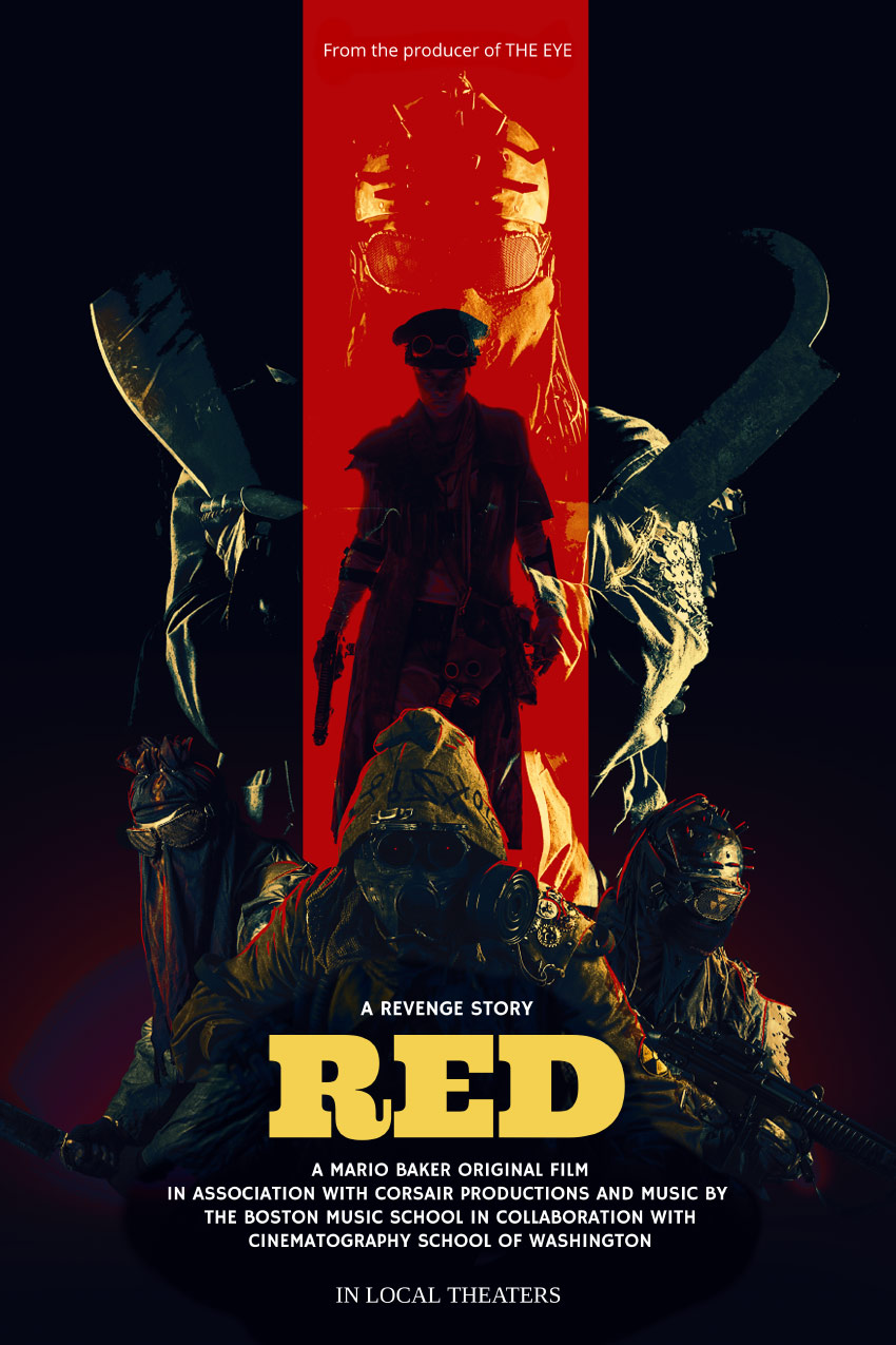
Final product image
What You’ll Be Creating

Today we will be learning how to make a movie poster in Adobe Photoshop, paired with Placeit’s poster maker!

We will be focusing on creating a gritty post-apocalyptic color grade using adjustment layers, and you’ll also learn how to apply quick and easy typography with Placeit. Let’s get started! 

What You’ll Need

You’ll need the following resources to complete this project:

Find more resources on Envato Elements! Or check out this roundup of the best ready-made movie poster templates:

1. How to Create a Red and Black Silhouetted Character

To start everything off, we will be creating our base and the main focus of our poster. In a real movie poster, this is where the hero would be located!

Step 1

Create a 4349 x 5907 px canvas with a Resolution of 300

Step 2

Create a Color Fill Layer and fill it with black. 

Using the Gradient or Brush Tool, create a red #ef0000 to transparent gradient coming from the bottom of the canvas. 

gradient

Step 3

Using a massive, soft, round Brush Tool, paint a black shadow gradient coming in from the left and right sides of the canvas. 

gradient

Step 4

Use the Rectangle Tool to create a long red #ff0000 vertical rectangle going from the top of the canvas to the bottom. 

stripe

Step 5

Drop in the Post-apocalypse female character and clip her into the red rectangle.  

Set the female image to Multiply.

Group all of your background layers into a group named „Base.”

subject

2. How to Plan Out and Place an Effective Composition

Next, we want to place our secondary characters—in this case, our hero’s enemies.

 Step 1

Take Nuclear survivor 1 and Nuclear survivor 2  and place them side by side, but facing away from each other. This will help frame the main female character.

place other subjects

Step 2

Next, place Nuclear survivor 3 between the previous survivors. 

To help place him and get his positioning just right, loosely extract him from his background using the Lasso Tool—just enough so that you can see behind the character. 

place other subject

Step 3

Finally, drag and drop Nuclear survivor 4 onto your canvas, setting the layer to Lighten.

He will represent our main bad guy, so let’s not only make him bigger but also place him looming over all the other characters.

Placing all your characters before extracting them is helpful when you have multiple poses or people to choose from. It will keep you from wasting time removing the background of people or objects you end up not using. 

place final subject

3.  How to Create a Gritty Post-Apocalyptic Photo Effect

Before we go any further, we are going to add a gritty color grade. Most of the time I save this step for last, but given the intensity of this effect in particular, it’s best to do it earlier on so you have a better vision of the outcome.

These are layered from bottom to top and should be placed above all future layers from here on out. 

Step 1

Create a Color Lookup adjustment layer. 

Color Lookup Settings

  • 3DLUT: Bleach Bypass 
  • Opacity: 50%
color lookup result

Step 2

Create a Color Lookup adjustment layer. 

Color Lookup Settings

  • 3DLUT: Foggy Night
  • Opacity: 20%
color lookup result

Step 3

Create a Color Lookup adjustment layer. 

Color Lookup Settings

  • 3DLUT: Crisp Warm
  • Opacity: 40%
color lookup result

Step 4

Create a Color Lookup adjustment layer. 

Color Lookup Settings

  • 3DLUT: Edgey Amber
  • Opacity: 50%
color lookup result

Step 5

Create a Color Lookup adjustment layer. 

Color Lookup Settings

  • 3DLUT: Horror Blue
  • Opacity: 100%
  • Layer Mode: Darker Color
color lookup result

Step 6

Create a Selective Color adjustment layer. 

Selective Color Settings

Reds

  • Yellow: +100%

Blues

  • Cyan: +100%
  • Magenta: +3%
  • Yellow: -96%
selective color result

Step 7

Create a Color Lookup adjustment layer. 

Color Lookup Settings

  • 3DLUT: Teal Orange Plus Contrast 
  • Opacity: 62%
  • Layer Mode: Color

Group all of your adjustment layers together, naming the group „Color Grade.”

color lookup result

4. How to Composite Multiple Subjects Together  

Now that we have our colors fleshed out and our characters placed, we can finally composite them all together.

Step 1

Extract the left and right characters using your preferred method; mine is the Pen Tool. Check out my How to Create a Honey Bee Themed Photo Manipulation to see how I extract subjects!

Now is the time to get their exact positioning just right. 

exstract subjects

Step 2

Extract and place your third subject located in the front. I also went ahead and enlarged him slightly to give the characters more of a hierarchy. 

adjust subjects

Step 3

Extract the fourth, largest character using the Magic Wand Tool. We want this character to have mostly highlights and be roughly extracted with a lot of jagged and torn edges. 

Make sure the layer is still set to Lighten and place it behind all other characters. 

Group all of your characters into a group named „Subjects.”

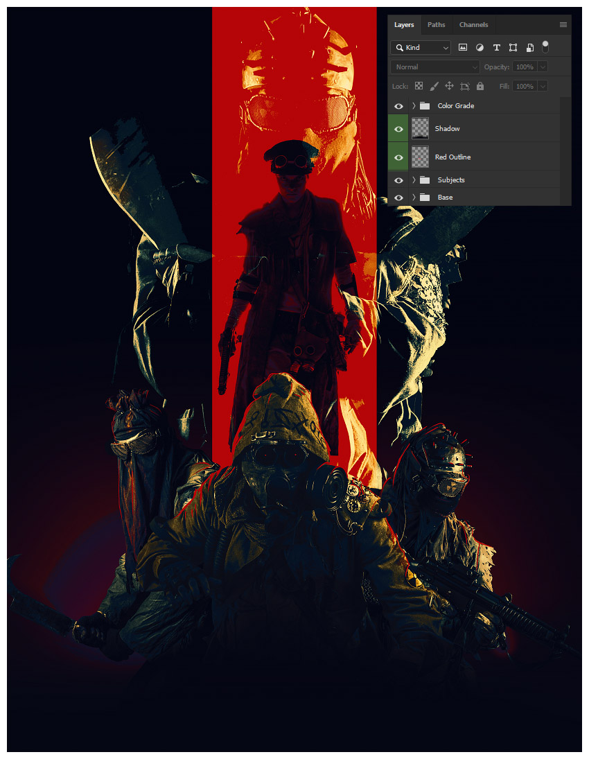
final layers

5. How to Draw Highlights and Blend Characters Quickly

Given the darkness of the overall image, it’s important to make sure your characters pop against their background; adding some strong highlights is a great way to do that!

Step 1

Create a New Layer above the „Subjects” group. 

Paint a red, somewhat sloppy outline around your three lower subjects using a small, hard round Brush. 

If you don’t have a graphics tablet, bring up the Smoothing of the brush to 30-50% and use the Smudge Tool to taper out the ends of the lines.

add red highlight

Step 2

Create a New Layer above your red outline. 

Using a large, soft, round Brush, paint a black shadow below your three lower subjects. 

Make sure not to hide any crucial details such as the subject’s weapons, while also making sure the bottom edges of the subjects aren’t showing and it’s a smooth black transition. 

add shadow

6. How to Add Typography Using Placeit’s Poster Maker

Finally, we will be bringing our poster into Placeit’s poster maker to add our movie’s title and other relevant text!

Step 1

Save your poster design as either a JPG or PNG at a max of 12 MB in size. 

I’d suggest making your width at least 3600 px.

Step 2

See all of the poster templates available by going to www.placeit.net  > Designs and searching „Poster”.

I will be using the first option, Horror Film Poster Template.

templates

Step 3

Scroll down to see some of the horror genres presets available.

I will be using „Ritual”. Although this is a horror preset and our film is more in the post-apocalyptic action genre, Placeit gives you tons of customization options! 

horror presets

Step 4

While Placeit has a library of images available to use, we, of course, will be using our own. 

Do this by selecting Custom Image on the right-hand side where the background images are located.

Select your saved poster PNG or JPG image.

Crop your image using Placeit’s simple slider crop feature if needed. 

crop image

Step 5

Add your own text by replacing the text found on the left-hand side of the screen. 

The changes happen live and in real time!

add text

Step 6

Once all your text is decided, you can start to change the color, font face, and font placement! 

I will be using a pale-yellow color #f4d150 for the title font to make it stand out. 

Use the Color Picker Tool in Photoshop to pick colors right off your poster.

color text

Step 7

Next, I will be changing the font to Ultra.

change placement of text

Step 8

Finally, to finish everything up, I am going to arrange our poster text.

To do this in Placeit, drag and place the text wherever you want it. Once again, it’s all live editing! 

It also has guides to help you align everything perfectly! 

We’ve Done It!

The only thing more important than the composition or color story of a movie poster is the text itself! It must be bold, readable, and something that draws the eye to it!  

So, as always, keep experimenting with different techniques, and don’t forget to post your version below, along with any questions, comments, or critiques!

final

Looking to learn more? Why not check out the following excellent photo manipulation tutorials:

How to Make a Movie Poster in Photoshop

Post pobrano z: How to Make a Movie Poster in Photoshop

Final product image
What You’ll Be Creating

Today we will be learning how to make a movie poster in Adobe Photoshop, paired with Placeit’s poster maker!

We will be focusing on creating a gritty post-apocalyptic color grade using adjustment layers, and you’ll also learn how to apply quick and easy typography with Placeit. Let’s get started! 

What You’ll Need

You’ll need the following resources to complete this project:

Find more resources on Envato Elements! Or check out this roundup of the best ready-made movie poster templates:

1. How to Create a Red and Black Silhouetted Character

To start everything off, we will be creating our base and the main focus of our poster. In a real movie poster, this is where the hero would be located!

Step 1

Create a 4349 x 5907 px canvas with a Resolution of 300

Step 2

Create a Color Fill Layer and fill it with black. 

Using the Gradient or Brush Tool, create a red #ef0000 to transparent gradient coming from the bottom of the canvas. 

gradient

Step 3

Using a massive, soft, round Brush Tool, paint a black shadow gradient coming in from the left and right sides of the canvas. 

gradient

Step 4

Use the Rectangle Tool to create a long red #ff0000 vertical rectangle going from the top of the canvas to the bottom. 

stripe

Step 5

Drop in the Post-apocalypse female character and clip her into the red rectangle.  

Set the female image to Multiply.

Group all of your background layers into a group named „Base.”

subject

2. How to Plan Out and Place an Effective Composition

Next, we want to place our secondary characters—in this case, our hero’s enemies.

 Step 1

Take Nuclear survivor 1 and Nuclear survivor 2  and place them side by side, but facing away from each other. This will help frame the main female character.

place other subjects

Step 2

Next, place Nuclear survivor 3 between the previous survivors. 

To help place him and get his positioning just right, loosely extract him from his background using the Lasso Tool—just enough so that you can see behind the character. 

place other subject

Step 3

Finally, drag and drop Nuclear survivor 4 onto your canvas, setting the layer to Lighten.

He will represent our main bad guy, so let’s not only make him bigger but also place him looming over all the other characters.

Placing all your characters before extracting them is helpful when you have multiple poses or people to choose from. It will keep you from wasting time removing the background of people or objects you end up not using. 

place final subject

3.  How to Create a Gritty Post-Apocalyptic Photo Effect

Before we go any further, we are going to add a gritty color grade. Most of the time I save this step for last, but given the intensity of this effect in particular, it’s best to do it earlier on so you have a better vision of the outcome.

These are layered from bottom to top and should be placed above all future layers from here on out. 

Step 1

Create a Color Lookup adjustment layer. 

Color Lookup Settings

  • 3DLUT: Bleach Bypass 
  • Opacity: 50%
color lookup result

Step 2

Create a Color Lookup adjustment layer. 

Color Lookup Settings

  • 3DLUT: Foggy Night
  • Opacity: 20%
color lookup result

Step 3

Create a Color Lookup adjustment layer. 

Color Lookup Settings

  • 3DLUT: Crisp Warm
  • Opacity: 40%
color lookup result

Step 4

Create a Color Lookup adjustment layer. 

Color Lookup Settings

  • 3DLUT: Edgey Amber
  • Opacity: 50%
color lookup result

Step 5

Create a Color Lookup adjustment layer. 

Color Lookup Settings

  • 3DLUT: Horror Blue
  • Opacity: 100%
  • Layer Mode: Darker Color
color lookup result

Step 6

Create a Selective Color adjustment layer. 

Selective Color Settings

Reds

  • Yellow: +100%

Blues

  • Cyan: +100%
  • Magenta: +3%
  • Yellow: -96%
selective color result

Step 7

Create a Color Lookup adjustment layer. 

Color Lookup Settings

  • 3DLUT: Teal Orange Plus Contrast 
  • Opacity: 62%
  • Layer Mode: Color

Group all of your adjustment layers together, naming the group „Color Grade.”

color lookup result

4. How to Composite Multiple Subjects Together  

Now that we have our colors fleshed out and our characters placed, we can finally composite them all together.

Step 1

Extract the left and right characters using your preferred method; mine is the Pen Tool. Check out my How to Create a Honey Bee Themed Photo Manipulation to see how I extract subjects!

Now is the time to get their exact positioning just right. 

exstract subjects

Step 2

Extract and place your third subject located in the front. I also went ahead and enlarged him slightly to give the characters more of a hierarchy. 

adjust subjects

Step 3

Extract the fourth, largest character using the Magic Wand Tool. We want this character to have mostly highlights and be roughly extracted with a lot of jagged and torn edges. 

Make sure the layer is still set to Lighten and place it behind all other characters. 

Group all of your characters into a group named „Subjects.”

final layers

5. How to Draw Highlights and Blend Characters Quickly

Given the darkness of the overall image, it’s important to make sure your characters pop against their background; adding some strong highlights is a great way to do that!

Step 1

Create a New Layer above the „Subjects” group. 

Paint a red, somewhat sloppy outline around your three lower subjects using a small, hard round Brush. 

If you don’t have a graphics tablet, bring up the Smoothing of the brush to 30-50% and use the Smudge Tool to taper out the ends of the lines.

add red highlight

Step 2

Create a New Layer above your red outline. 

Using a large, soft, round Brush, paint a black shadow below your three lower subjects. 

Make sure not to hide any crucial details such as the subject’s weapons, while also making sure the bottom edges of the subjects aren’t showing and it’s a smooth black transition. 

add shadow

6. How to Add Typography Using Placeit’s Poster Maker

Finally, we will be bringing our poster into Placeit’s poster maker to add our movie’s title and other relevant text!

Step 1

Save your poster design as either a JPG or PNG at a max of 12 MB in size. 

I’d suggest making your width at least 3600 px.

Step 2

See all of the poster templates available by going to www.placeit.net  > Designs and searching „Poster”.

I will be using the first option, Horror Film Poster Template.

templates

Step 3

Scroll down to see some of the horror genres presets available.

I will be using „Ritual”. Although this is a horror preset and our film is more in the post-apocalyptic action genre, Placeit gives you tons of customization options! 

horror presets

Step 4

While Placeit has a library of images available to use, we, of course, will be using our own. 

Do this by selecting Custom Image on the right-hand side where the background images are located.

Select your saved poster PNG or JPG image.

Crop your image using Placeit’s simple slider crop feature if needed. 

crop image

Step 5

Add your own text by replacing the text found on the left-hand side of the screen. 

The changes happen live and in real time!

add text

Step 6

Once all your text is decided, you can start to change the color, font face, and font placement! 

I will be using a pale-yellow color #f4d150 for the title font to make it stand out. 

Use the Color Picker Tool in Photoshop to pick colors right off your poster.

color text

Step 7

Next, I will be changing the font to Ultra.

change placement of text

Step 8

Finally, to finish everything up, I am going to arrange our poster text.

To do this in Placeit, drag and place the text wherever you want it. Once again, it’s all live editing! 

It also has guides to help you align everything perfectly! 

We’ve Done It!

The only thing more important than the composition or color story of a movie poster is the text itself! It must be bold, readable, and something that draws the eye to it!  

So, as always, keep experimenting with different techniques, and don’t forget to post your version below, along with any questions, comments, or critiques!

final

Looking to learn more? Why not check out the following excellent photo manipulation tutorials:

How to Make a Movie Poster in Photoshop

Post pobrano z: How to Make a Movie Poster in Photoshop

Final product image
What You’ll Be Creating

Today we will be learning how to make a movie poster in Adobe Photoshop, paired with Placeit’s poster maker!

We will be focusing on creating a gritty post-apocalyptic color grade using adjustment layers, and you’ll also learn how to apply quick and easy typography with Placeit. Let’s get started! 

What You’ll Need

You’ll need the following resources to complete this project:

Find more resources on Envato Elements! Or check out this roundup of the best ready-made movie poster templates:

1. How to Create a Red and Black Silhouetted Character

To start everything off, we will be creating our base and the main focus of our poster. In a real movie poster, this is where the hero would be located!

Step 1

Create a 4349 x 5907 px canvas with a Resolution of 300

Step 2

Create a Color Fill Layer and fill it with black. 

Using the Gradient or Brush Tool, create a red #ef0000 to transparent gradient coming from the bottom of the canvas. 

gradient

Step 3

Using a massive, soft, round Brush Tool, paint a black shadow gradient coming in from the left and right sides of the canvas. 

gradient

Step 4

Use the Rectangle Tool to create a long red #ff0000 vertical rectangle going from the top of the canvas to the bottom. 

stripe

Step 5

Drop in the Post-apocalypse female character and clip her into the red rectangle.  

Set the female image to Multiply.

Group all of your background layers into a group named „Base.”

subject

2. How to Plan Out and Place an Effective Composition

Next, we want to place our secondary characters—in this case, our hero’s enemies.

 Step 1

Take Nuclear survivor 1 and Nuclear survivor 2  and place them side by side, but facing away from each other. This will help frame the main female character.

place other subjects

Step 2

Next, place Nuclear survivor 3 between the previous survivors. 

To help place him and get his positioning just right, loosely extract him from his background using the Lasso Tool—just enough so that you can see behind the character. 

place other subject

Step 3

Finally, drag and drop Nuclear survivor 4 onto your canvas, setting the layer to Lighten.

He will represent our main bad guy, so let’s not only make him bigger but also place him looming over all the other characters.

Placing all your characters before extracting them is helpful when you have multiple poses or people to choose from. It will keep you from wasting time removing the background of people or objects you end up not using. 

place final subject

3.  How to Create a Gritty Post-Apocalyptic Photo Effect

Before we go any further, we are going to add a gritty color grade. Most of the time I save this step for last, but given the intensity of this effect in particular, it’s best to do it earlier on so you have a better vision of the outcome.

These are layered from bottom to top and should be placed above all future layers from here on out. 

Step 1

Create a Color Lookup adjustment layer. 

Color Lookup Settings

  • 3DLUT: Bleach Bypass 
  • Opacity: 50%
color lookup result

Step 2

Create a Color Lookup adjustment layer. 

Color Lookup Settings

  • 3DLUT: Foggy Night
  • Opacity: 20%
color lookup result

Step 3

Create a Color Lookup adjustment layer. 

Color Lookup Settings

  • 3DLUT: Crisp Warm
  • Opacity: 40%
color lookup result

Step 4

Create a Color Lookup adjustment layer. 

Color Lookup Settings

  • 3DLUT: Edgey Amber
  • Opacity: 50%
color lookup result

Step 5

Create a Color Lookup adjustment layer. 

Color Lookup Settings

  • 3DLUT: Horror Blue
  • Opacity: 100%
  • Layer Mode: Darker Color
color lookup result

Step 6

Create a Selective Color adjustment layer. 

Selective Color Settings

Reds

  • Yellow: +100%

Blues

  • Cyan: +100%
  • Magenta: +3%
  • Yellow: -96%
selective color result

Step 7

Create a Color Lookup adjustment layer. 

Color Lookup Settings

  • 3DLUT: Teal Orange Plus Contrast 
  • Opacity: 62%
  • Layer Mode: Color

Group all of your adjustment layers together, naming the group „Color Grade.”

color lookup result

4. How to Composite Multiple Subjects Together  

Now that we have our colors fleshed out and our characters placed, we can finally composite them all together.

Step 1

Extract the left and right characters using your preferred method; mine is the Pen Tool. Check out my How to Create a Honey Bee Themed Photo Manipulation to see how I extract subjects!

Now is the time to get their exact positioning just right. 

exstract subjects

Step 2

Extract and place your third subject located in the front. I also went ahead and enlarged him slightly to give the characters more of a hierarchy. 

adjust subjects

Step 3

Extract the fourth, largest character using the Magic Wand Tool. We want this character to have mostly highlights and be roughly extracted with a lot of jagged and torn edges. 

Make sure the layer is still set to Lighten and place it behind all other characters. 

Group all of your characters into a group named „Subjects.”

final layers

5. How to Draw Highlights and Blend Characters Quickly

Given the darkness of the overall image, it’s important to make sure your characters pop against their background; adding some strong highlights is a great way to do that!

Step 1

Create a New Layer above the „Subjects” group. 

Paint a red, somewhat sloppy outline around your three lower subjects using a small, hard round Brush. 

If you don’t have a graphics tablet, bring up the Smoothing of the brush to 30-50% and use the Smudge Tool to taper out the ends of the lines.

add red highlight

Step 2

Create a New Layer above your red outline. 

Using a large, soft, round Brush, paint a black shadow below your three lower subjects. 

Make sure not to hide any crucial details such as the subject’s weapons, while also making sure the bottom edges of the subjects aren’t showing and it’s a smooth black transition. 

add shadow

6. How to Add Typography Using Placeit’s Poster Maker

Finally, we will be bringing our poster into Placeit’s poster maker to add our movie’s title and other relevant text!

Step 1

Save your poster design as either a JPG or PNG at a max of 12 MB in size. 

I’d suggest making your width at least 3600 px.

Step 2

See all of the poster templates available by going to www.placeit.net  > Designs and searching „Poster”.

I will be using the first option, Horror Film Poster Template.

templates

Step 3

Scroll down to see some of the horror genres presets available.

I will be using „Ritual”. Although this is a horror preset and our film is more in the post-apocalyptic action genre, Placeit gives you tons of customization options! 

horror presets

Step 4

While Placeit has a library of images available to use, we, of course, will be using our own. 

Do this by selecting Custom Image on the right-hand side where the background images are located.

Select your saved poster PNG or JPG image.

Crop your image using Placeit’s simple slider crop feature if needed. 

crop image

Step 5

Add your own text by replacing the text found on the left-hand side of the screen. 

The changes happen live and in real time!

add text

Step 6

Once all your text is decided, you can start to change the color, font face, and font placement! 

I will be using a pale-yellow color #f4d150 for the title font to make it stand out. 

Use the Color Picker Tool in Photoshop to pick colors right off your poster.

color text

Step 7

Next, I will be changing the font to Ultra.

change placement of text

Step 8

Finally, to finish everything up, I am going to arrange our poster text.

To do this in Placeit, drag and place the text wherever you want it. Once again, it’s all live editing! 

It also has guides to help you align everything perfectly! 

We’ve Done It!

The only thing more important than the composition or color story of a movie poster is the text itself! It must be bold, readable, and something that draws the eye to it!  

So, as always, keep experimenting with different techniques, and don’t forget to post your version below, along with any questions, comments, or critiques!

final

Looking to learn more? Why not check out the following excellent photo manipulation tutorials:

How to Make a Movie Poster in Photoshop

Post pobrano z: How to Make a Movie Poster in Photoshop

Final product image
What You’ll Be Creating

Today we will be learning how to make a movie poster in Adobe Photoshop, paired with Placeit’s poster maker!

We will be focusing on creating a gritty post-apocalyptic color grade using adjustment layers, and you’ll also learn how to apply quick and easy typography with Placeit. Let’s get started! 

What You’ll Need

You’ll need the following resources to complete this project:

Find more resources on Envato Elements! Or check out this roundup of the best ready-made movie poster templates:

1. How to Create a Red and Black Silhouetted Character

To start everything off, we will be creating our base and the main focus of our poster. In a real movie poster, this is where the hero would be located!

Step 1

Create a 4349 x 5907 px canvas with a Resolution of 300

Step 2

Create a Color Fill Layer and fill it with black. 

Using the Gradient or Brush Tool, create a red #ef0000 to transparent gradient coming from the bottom of the canvas. 

gradient

Step 3

Using a massive, soft, round Brush Tool, paint a black shadow gradient coming in from the left and right sides of the canvas. 

gradient

Step 4

Use the Rectangle Tool to create a long red #ff0000 vertical rectangle going from the top of the canvas to the bottom. 

stripe

Step 5

Drop in the Post-apocalypse female character and clip her into the red rectangle.  

Set the female image to Multiply.

Group all of your background layers into a group named „Base.”

subject

2. How to Plan Out and Place an Effective Composition

Next, we want to place our secondary characters—in this case, our hero’s enemies.

 Step 1

Take Nuclear survivor 1 and Nuclear survivor 2  and place them side by side, but facing away from each other. This will help frame the main female character.

place other subjects

Step 2

Next, place Nuclear survivor 3 between the previous survivors. 

To help place him and get his positioning just right, loosely extract him from his background using the Lasso Tool—just enough so that you can see behind the character. 

place other subject

Step 3

Finally, drag and drop Nuclear survivor 4 onto your canvas, setting the layer to Lighten.

He will represent our main bad guy, so let’s not only make him bigger but also place him looming over all the other characters.

Placing all your characters before extracting them is helpful when you have multiple poses or people to choose from. It will keep you from wasting time removing the background of people or objects you end up not using. 

place final subject

3.  How to Create a Gritty Post-Apocalyptic Photo Effect

Before we go any further, we are going to add a gritty color grade. Most of the time I save this step for last, but given the intensity of this effect in particular, it’s best to do it earlier on so you have a better vision of the outcome.

These are layered from bottom to top and should be placed above all future layers from here on out. 

Step 1

Create a Color Lookup adjustment layer. 

Color Lookup Settings

  • 3DLUT: Bleach Bypass 
  • Opacity: 50%
color lookup result

Step 2

Create a Color Lookup adjustment layer. 

Color Lookup Settings

  • 3DLUT: Foggy Night
  • Opacity: 20%
color lookup result

Step 3

Create a Color Lookup adjustment layer. 

Color Lookup Settings

  • 3DLUT: Crisp Warm
  • Opacity: 40%
color lookup result

Step 4

Create a Color Lookup adjustment layer. 

Color Lookup Settings

  • 3DLUT: Edgey Amber
  • Opacity: 50%
color lookup result

Step 5

Create a Color Lookup adjustment layer. 

Color Lookup Settings

  • 3DLUT: Horror Blue
  • Opacity: 100%
  • Layer Mode: Darker Color
color lookup result

Step 6

Create a Selective Color adjustment layer. 

Selective Color Settings

Reds

  • Yellow: +100%

Blues

  • Cyan: +100%
  • Magenta: +3%
  • Yellow: -96%
selective color result

Step 7

Create a Color Lookup adjustment layer. 

Color Lookup Settings

  • 3DLUT: Teal Orange Plus Contrast 
  • Opacity: 62%
  • Layer Mode: Color

Group all of your adjustment layers together, naming the group „Color Grade.”

color lookup result

4. How to Composite Multiple Subjects Together  

Now that we have our colors fleshed out and our characters placed, we can finally composite them all together.

Step 1

Extract the left and right characters using your preferred method; mine is the Pen Tool. Check out my How to Create a Honey Bee Themed Photo Manipulation to see how I extract subjects!

Now is the time to get their exact positioning just right. 

exstract subjects

Step 2

Extract and place your third subject located in the front. I also went ahead and enlarged him slightly to give the characters more of a hierarchy. 

adjust subjects

Step 3

Extract the fourth, largest character using the Magic Wand Tool. We want this character to have mostly highlights and be roughly extracted with a lot of jagged and torn edges. 

Make sure the layer is still set to Lighten and place it behind all other characters. 

Group all of your characters into a group named „Subjects.”

final layers

5. How to Draw Highlights and Blend Characters Quickly

Given the darkness of the overall image, it’s important to make sure your characters pop against their background; adding some strong highlights is a great way to do that!

Step 1

Create a New Layer above the „Subjects” group. 

Paint a red, somewhat sloppy outline around your three lower subjects using a small, hard round Brush. 

If you don’t have a graphics tablet, bring up the Smoothing of the brush to 30-50% and use the Smudge Tool to taper out the ends of the lines.

add red highlight

Step 2

Create a New Layer above your red outline. 

Using a large, soft, round Brush, paint a black shadow below your three lower subjects. 

Make sure not to hide any crucial details such as the subject’s weapons, while also making sure the bottom edges of the subjects aren’t showing and it’s a smooth black transition. 

add shadow

6. How to Add Typography Using Placeit’s Poster Maker

Finally, we will be bringing our poster into Placeit’s poster maker to add our movie’s title and other relevant text!

Step 1

Save your poster design as either a JPG or PNG at a max of 12 MB in size. 

I’d suggest making your width at least 3600 px.

Step 2

See all of the poster templates available by going to www.placeit.net  > Designs and searching „Poster”.

I will be using the first option, Horror Film Poster Template.

templates

Step 3

Scroll down to see some of the horror genres presets available.

I will be using „Ritual”. Although this is a horror preset and our film is more in the post-apocalyptic action genre, Placeit gives you tons of customization options! 

horror presets

Step 4

While Placeit has a library of images available to use, we, of course, will be using our own. 

Do this by selecting Custom Image on the right-hand side where the background images are located.

Select your saved poster PNG or JPG image.

Crop your image using Placeit’s simple slider crop feature if needed. 

crop image

Step 5

Add your own text by replacing the text found on the left-hand side of the screen. 

The changes happen live and in real time!

add text

Step 6

Once all your text is decided, you can start to change the color, font face, and font placement! 

I will be using a pale-yellow color #f4d150 for the title font to make it stand out. 

Use the Color Picker Tool in Photoshop to pick colors right off your poster.

color text

Step 7

Next, I will be changing the font to Ultra.

change placement of text

Step 8

Finally, to finish everything up, I am going to arrange our poster text.

To do this in Placeit, drag and place the text wherever you want it. Once again, it’s all live editing! 

It also has guides to help you align everything perfectly! 

We’ve Done It!

The only thing more important than the composition or color story of a movie poster is the text itself! It must be bold, readable, and something that draws the eye to it!  

So, as always, keep experimenting with different techniques, and don’t forget to post your version below, along with any questions, comments, or critiques!

final

Looking to learn more? Why not check out the following excellent photo manipulation tutorials:

How to Make a Movie Poster in Photoshop

Post pobrano z: How to Make a Movie Poster in Photoshop

Final product image
What You’ll Be Creating

Today we will be learning how to make a movie poster in Adobe Photoshop, paired with Placeit’s poster maker!

We will be focusing on creating a gritty post-apocalyptic color grade using adjustment layers, and you’ll also learn how to apply quick and easy typography with Placeit. Let’s get started! 

What You’ll Need

You’ll need the following resources to complete this project:

Find more resources on Envato Elements! Or check out this roundup of the best ready-made movie poster templates:

1. How to Create a Red and Black Silhouetted Character

To start everything off, we will be creating our base and the main focus of our poster. In a real movie poster, this is where the hero would be located!

Step 1

Create a 4349 x 5907 px canvas with a Resolution of 300

Step 2

Create a Color Fill Layer and fill it with black. 

Using the Gradient or Brush Tool, create a red #ef0000 to transparent gradient coming from the bottom of the canvas. 

gradient

Step 3

Using a massive, soft, round Brush Tool, paint a black shadow gradient coming in from the left and right sides of the canvas. 

gradient

Step 4

Use the Rectangle Tool to create a long red #ff0000 vertical rectangle going from the top of the canvas to the bottom. 

stripe

Step 5

Drop in the Post-apocalypse female character and clip her into the red rectangle.  

Set the female image to Multiply.

Group all of your background layers into a group named „Base.”

subject

2. How to Plan Out and Place an Effective Composition

Next, we want to place our secondary characters—in this case, our hero’s enemies.

 Step 1

Take Nuclear survivor 1 and Nuclear survivor 2  and place them side by side, but facing away from each other. This will help frame the main female character.

place other subjects

Step 2

Next, place Nuclear survivor 3 between the previous survivors. 

To help place him and get his positioning just right, loosely extract him from his background using the Lasso Tool—just enough so that you can see behind the character. 

place other subject

Step 3

Finally, drag and drop Nuclear survivor 4 onto your canvas, setting the layer to Lighten.

He will represent our main bad guy, so let’s not only make him bigger but also place him looming over all the other characters.

Placing all your characters before extracting them is helpful when you have multiple poses or people to choose from. It will keep you from wasting time removing the background of people or objects you end up not using. 

place final subject

3.  How to Create a Gritty Post-Apocalyptic Photo Effect

Before we go any further, we are going to add a gritty color grade. Most of the time I save this step for last, but given the intensity of this effect in particular, it’s best to do it earlier on so you have a better vision of the outcome.

These are layered from bottom to top and should be placed above all future layers from here on out. 

Step 1

Create a Color Lookup adjustment layer. 

Color Lookup Settings

  • 3DLUT: Bleach Bypass 
  • Opacity: 50%
color lookup result

Step 2

Create a Color Lookup adjustment layer. 

Color Lookup Settings

  • 3DLUT: Foggy Night
  • Opacity: 20%
color lookup result

Step 3

Create a Color Lookup adjustment layer. 

Color Lookup Settings

  • 3DLUT: Crisp Warm
  • Opacity: 40%
color lookup result

Step 4

Create a Color Lookup adjustment layer. 

Color Lookup Settings

  • 3DLUT: Edgey Amber
  • Opacity: 50%
color lookup result

Step 5

Create a Color Lookup adjustment layer. 

Color Lookup Settings

  • 3DLUT: Horror Blue
  • Opacity: 100%
  • Layer Mode: Darker Color
color lookup result

Step 6

Create a Selective Color adjustment layer. 

Selective Color Settings

Reds

  • Yellow: +100%

Blues

  • Cyan: +100%
  • Magenta: +3%
  • Yellow: -96%
selective color result

Step 7

Create a Color Lookup adjustment layer. 

Color Lookup Settings

  • 3DLUT: Teal Orange Plus Contrast 
  • Opacity: 62%
  • Layer Mode: Color

Group all of your adjustment layers together, naming the group „Color Grade.”

color lookup result

4. How to Composite Multiple Subjects Together  

Now that we have our colors fleshed out and our characters placed, we can finally composite them all together.

Step 1

Extract the left and right characters using your preferred method; mine is the Pen Tool. Check out my How to Create a Honey Bee Themed Photo Manipulation to see how I extract subjects!

Now is the time to get their exact positioning just right. 

exstract subjects

Step 2

Extract and place your third subject located in the front. I also went ahead and enlarged him slightly to give the characters more of a hierarchy. 

adjust subjects

Step 3

Extract the fourth, largest character using the Magic Wand Tool. We want this character to have mostly highlights and be roughly extracted with a lot of jagged and torn edges. 

Make sure the layer is still set to Lighten and place it behind all other characters. 

Group all of your characters into a group named „Subjects.”

final layers

5. How to Draw Highlights and Blend Characters Quickly

Given the darkness of the overall image, it’s important to make sure your characters pop against their background; adding some strong highlights is a great way to do that!

Step 1

Create a New Layer above the „Subjects” group. 

Paint a red, somewhat sloppy outline around your three lower subjects using a small, hard round Brush. 

If you don’t have a graphics tablet, bring up the Smoothing of the brush to 30-50% and use the Smudge Tool to taper out the ends of the lines.

add red highlight

Step 2

Create a New Layer above your red outline. 

Using a large, soft, round Brush, paint a black shadow below your three lower subjects. 

Make sure not to hide any crucial details such as the subject’s weapons, while also making sure the bottom edges of the subjects aren’t showing and it’s a smooth black transition. 

add shadow

6. How to Add Typography Using Placeit’s Poster Maker

Finally, we will be bringing our poster into Placeit’s poster maker to add our movie’s title and other relevant text!

Step 1

Save your poster design as either a JPG or PNG at a max of 12 MB in size. 

I’d suggest making your width at least 3600 px.

Step 2

See all of the poster templates available by going to www.placeit.net  > Designs and searching „Poster”.

I will be using the first option, Horror Film Poster Template.

templates

Step 3

Scroll down to see some of the horror genres presets available.

I will be using „Ritual”. Although this is a horror preset and our film is more in the post-apocalyptic action genre, Placeit gives you tons of customization options! 

horror presets

Step 4

While Placeit has a library of images available to use, we, of course, will be using our own. 

Do this by selecting Custom Image on the right-hand side where the background images are located.

Select your saved poster PNG or JPG image.

Crop your image using Placeit’s simple slider crop feature if needed. 

crop image

Step 5

Add your own text by replacing the text found on the left-hand side of the screen. 

The changes happen live and in real time!

add text

Step 6

Once all your text is decided, you can start to change the color, font face, and font placement! 

I will be using a pale-yellow color #f4d150 for the title font to make it stand out. 

Use the Color Picker Tool in Photoshop to pick colors right off your poster.

color text

Step 7

Next, I will be changing the font to Ultra.

change placement of text

Step 8

Finally, to finish everything up, I am going to arrange our poster text.

To do this in Placeit, drag and place the text wherever you want it. Once again, it’s all live editing! 

It also has guides to help you align everything perfectly! 

We’ve Done It!

The only thing more important than the composition or color story of a movie poster is the text itself! It must be bold, readable, and something that draws the eye to it!  

So, as always, keep experimenting with different techniques, and don’t forget to post your version below, along with any questions, comments, or critiques!

final

Looking to learn more? Why not check out the following excellent photo manipulation tutorials:

How to Make a Movie Poster in Photoshop

Post pobrano z: How to Make a Movie Poster in Photoshop

Final product image
What You’ll Be Creating

Today we will be learning how to make a movie poster in Adobe Photoshop, paired with Placeit’s poster maker!

We will be focusing on creating a gritty post-apocalyptic color grade using adjustment layers, and you’ll also learn how to apply quick and easy typography with Placeit. Let’s get started! 

What You’ll Need

You’ll need the following resources to complete this project:

Find more resources on Envato Elements! Or check out this roundup of the best ready-made movie poster templates:

1. How to Create a Red and Black Silhouetted Character

To start everything off, we will be creating our base and the main focus of our poster. In a real movie poster, this is where the hero would be located!

Step 1

Create a 4349 x 5907 px canvas with a Resolution of 300

Step 2

Create a Color Fill Layer and fill it with black. 

Using the Gradient or Brush Tool, create a red #ef0000 to transparent gradient coming from the bottom of the canvas. 

gradient

Step 3

Using a massive, soft, round Brush Tool, paint a black shadow gradient coming in from the left and right sides of the canvas. 

gradient

Step 4

Use the Rectangle Tool to create a long red #ff0000 vertical rectangle going from the top of the canvas to the bottom. 

stripe

Step 5

Drop in the Post-apocalypse female character and clip her into the red rectangle.  

Set the female image to Multiply.

Group all of your background layers into a group named „Base.”

subject

2. How to Plan Out and Place an Effective Composition

Next, we want to place our secondary characters—in this case, our hero’s enemies.

 Step 1

Take Nuclear survivor 1 and Nuclear survivor 2  and place them side by side, but facing away from each other. This will help frame the main female character.

place other subjects

Step 2

Next, place Nuclear survivor 3 between the previous survivors. 

To help place him and get his positioning just right, loosely extract him from his background using the Lasso Tool—just enough so that you can see behind the character. 

place other subject

Step 3

Finally, drag and drop Nuclear survivor 4 onto your canvas, setting the layer to Lighten.

He will represent our main bad guy, so let’s not only make him bigger but also place him looming over all the other characters.

Placing all your characters before extracting them is helpful when you have multiple poses or people to choose from. It will keep you from wasting time removing the background of people or objects you end up not using. 

place final subject

3.  How to Create a Gritty Post-Apocalyptic Photo Effect

Before we go any further, we are going to add a gritty color grade. Most of the time I save this step for last, but given the intensity of this effect in particular, it’s best to do it earlier on so you have a better vision of the outcome.

These are layered from bottom to top and should be placed above all future layers from here on out. 

Step 1

Create a Color Lookup adjustment layer. 

Color Lookup Settings

  • 3DLUT: Bleach Bypass 
  • Opacity: 50%
color lookup result

Step 2

Create a Color Lookup adjustment layer. 

Color Lookup Settings

  • 3DLUT: Foggy Night
  • Opacity: 20%
color lookup result

Step 3

Create a Color Lookup adjustment layer. 

Color Lookup Settings

  • 3DLUT: Crisp Warm
  • Opacity: 40%
color lookup result

Step 4

Create a Color Lookup adjustment layer. 

Color Lookup Settings

  • 3DLUT: Edgey Amber
  • Opacity: 50%
color lookup result

Step 5

Create a Color Lookup adjustment layer. 

Color Lookup Settings

  • 3DLUT: Horror Blue
  • Opacity: 100%
  • Layer Mode: Darker Color
color lookup result

Step 6

Create a Selective Color adjustment layer. 

Selective Color Settings

Reds

  • Yellow: +100%

Blues

  • Cyan: +100%
  • Magenta: +3%
  • Yellow: -96%
selective color result

Step 7

Create a Color Lookup adjustment layer. 

Color Lookup Settings

  • 3DLUT: Teal Orange Plus Contrast 
  • Opacity: 62%
  • Layer Mode: Color

Group all of your adjustment layers together, naming the group „Color Grade.”

color lookup result

4. How to Composite Multiple Subjects Together  

Now that we have our colors fleshed out and our characters placed, we can finally composite them all together.

Step 1

Extract the left and right characters using your preferred method; mine is the Pen Tool. Check out my How to Create a Honey Bee Themed Photo Manipulation to see how I extract subjects!

Now is the time to get their exact positioning just right. 

exstract subjects

Step 2

Extract and place your third subject located in the front. I also went ahead and enlarged him slightly to give the characters more of a hierarchy. 

adjust subjects

Step 3

Extract the fourth, largest character using the Magic Wand Tool. We want this character to have mostly highlights and be roughly extracted with a lot of jagged and torn edges. 

Make sure the layer is still set to Lighten and place it behind all other characters. 

Group all of your characters into a group named „Subjects.”

final layers

5. How to Draw Highlights and Blend Characters Quickly

Given the darkness of the overall image, it’s important to make sure your characters pop against their background; adding some strong highlights is a great way to do that!

Step 1

Create a New Layer above the „Subjects” group. 

Paint a red, somewhat sloppy outline around your three lower subjects using a small, hard round Brush. 

If you don’t have a graphics tablet, bring up the Smoothing of the brush to 30-50% and use the Smudge Tool to taper out the ends of the lines.

add red highlight

Step 2

Create a New Layer above your red outline. 

Using a large, soft, round Brush, paint a black shadow below your three lower subjects. 

Make sure not to hide any crucial details such as the subject’s weapons, while also making sure the bottom edges of the subjects aren’t showing and it’s a smooth black transition. 

add shadow

6. How to Add Typography Using Placeit’s Poster Maker

Finally, we will be bringing our poster into Placeit’s poster maker to add our movie’s title and other relevant text!

Step 1

Save your poster design as either a JPG or PNG at a max of 12 MB in size. 

I’d suggest making your width at least 3600 px.

Step 2

See all of the poster templates available by going to www.placeit.net  > Designs and searching „Poster”.

I will be using the first option, Horror Film Poster Template.

templates

Step 3

Scroll down to see some of the horror genres presets available.

I will be using „Ritual”. Although this is a horror preset and our film is more in the post-apocalyptic action genre, Placeit gives you tons of customization options! 

horror presets

Step 4

While Placeit has a library of images available to use, we, of course, will be using our own. 

Do this by selecting Custom Image on the right-hand side where the background images are located.

Select your saved poster PNG or JPG image.

Crop your image using Placeit’s simple slider crop feature if needed. 

crop image

Step 5

Add your own text by replacing the text found on the left-hand side of the screen. 

The changes happen live and in real time!

add text

Step 6

Once all your text is decided, you can start to change the color, font face, and font placement! 

I will be using a pale-yellow color #f4d150 for the title font to make it stand out. 

Use the Color Picker Tool in Photoshop to pick colors right off your poster.

color text

Step 7

Next, I will be changing the font to Ultra.

change placement of text

Step 8

Finally, to finish everything up, I am going to arrange our poster text.

To do this in Placeit, drag and place the text wherever you want it. Once again, it’s all live editing! 

It also has guides to help you align everything perfectly! 

We’ve Done It!

The only thing more important than the composition or color story of a movie poster is the text itself! It must be bold, readable, and something that draws the eye to it!  

So, as always, keep experimenting with different techniques, and don’t forget to post your version below, along with any questions, comments, or critiques!

final

Looking to learn more? Why not check out the following excellent photo manipulation tutorials: