If you are an animal lover, most likely you are also a pet owner. For pet parents, our furry companions are part of the family, not just a pet. As such, pet parents are always looking for creative ways to memorialize the love they have for their pets.
Pet Paintings
One of the most endearing ways people love to create art around their critters is through portrait painting. Whether your cat is posed amidst a black background or your dog is posed in a pumpkin patch waiting for the Great Pumpkin, or your guinea pig is a popcorning Red Baron pilot, portrait paintings are permanent illustrations of your pet’s unique personality. Just be mindful of the strain an awkward pose can put on an animal if made to be in it for a long length of time. Learn to recognize the symptoms of arthritis in dogs and other pets, especially older ones, before proceeding with your masterpiece.
Coffee Cups & Mugs
Creativity is contagious when it comes to our pets. Today, there are many sites that offer the ability to produce merchandise with your pet’s photos and artwork. Coffee cups and coffee mugs can carry a print of your critter’s image so you can carry your kitty, puppy, rabbit, guinea pig or fish with you at work.
Pet Sculptures
Sculptures can come in many forms. If you lack the artistic touch but want to create a sculpture in honor of your pet, polymer clay is one way to go. You can mold your cat, dog, rabbit or even fish from little pieces of clay. And if you make a mistake, you can start over without damage to the clay.
For a more permanent fixture, oven bake clay allows you to create your pet, cook it and color it as you wish. There are many videos online that teach how to bake/cure polymer clay. It’s tricky at first because the cooking time is what determines the success of your piece. However, by following the instructions, you should have no problem.
Mixed Media Pet Art
Mixed media is one of the most creative and fun ways to honor your critter. Usually, mixed media includes a variety of materials such as quality photography, paintings, clue, cut outs, paper, and paper mache, or anything that can be used creatively. Examples of mixed media projects are picture frames, pillows, or decor for your work office or home. Holiday pet cards are among the most popular pet creations. We love cards of our animals on Valentine’s Day, Labor Day or any holiday.
Charcoal & Graphite Drawings of Your Pet
If you know how to draw, then drawing your pooch, cat, bird or mouse is a fun and relaxing way to celebrate your pet. Charcoal and graphite sets come in inexpensive beginner sets. Some sets include a drawing pad. When you draw your pet, you can let your imagination get wild. Your pet is no longer bound by the three-dimensional world. He/she is memorialized in the setting you devise. Petsmart has Youtube videos that show you how to draw your dog. Similarly, you can find may other tutorials online that teach you how to draw your specific pet.
Pet Jewelry
Just like people parents, some dog and cat parents love to imprint the paws of their kittens, puppies and other creatures. The imprints on soft non-toxic animal clay are easy and safe to use. Once you capture your pet’s paw onto the soft-air drying clay, allow the impression to dry. Once the clay has dried, you can glue a metal jewelry necklace holder and metal chain to make a necklace.
Step stones also make nice gifts or decorations for the garden. Milestone sells pet photo stone kits you can decorate with a photo of your pet and stunning color glass gems, number stamps and a reusable mold.
Abstract Pet Art
Abstract creativity is a visually stimulating way to pay tribute to your pet. Abstract lines, drawings, paintings or sculptures can be illustrated in any form. Yarn can be used to create a modernized, colorful design of your pet. There are many DIY sites online and videos that show you how to produce beautiful items you can hang on your wall or decorate your bed with.
Pet parents will always cherish their pets and pay tribute to the unconditional love their furry little-loved gives them.
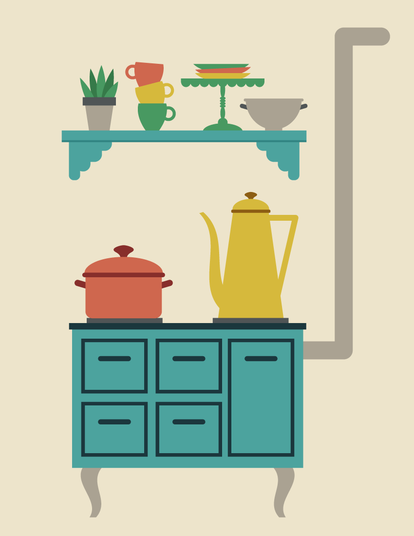
I really love retro style, and it so happens that it’s become very popular. So I decided to draw a retro kitchen. And of course, I will show you how it’s done!
Don’t worry, you do not have to be a professional to do this. We will be using simple shapes and some effects that will make this tutorial a breeze. You will be surprised by just how many things we can create using mostly rectangles and ellipses.
For more inspiration for retro illustrations, check GraphicRiver. They have a great selection of different images.
So, let’s get into a retro mood, and begin!
1. How to Create a Retro Stove
Step 1
Start by creating a new document (File > New) with 850 px Width and 1100 px Height. First, we will create a retro stove with some drawers, where the coffee and the soup will be made.
Take the Rectangle Tool (M) and create a blue rectangle with no stroke color. To get the same color, type in the numbers shown below in the Color panel (Window > Color). Be sure that you have checked RGB on the options of the panel.
Next, create a second, darker rectangle, which should be much thinner. Now, place the darker rectangle on top of the lighter one. When doing this, make sure you are using the selection tool. Other tools can deform the shape, which is not needed in this case.
Step 2
Let’s give our retro stove a few drawers. Draw a dark blue rectangle using the Rectangle Tool (M). The stroke color of this rectangle should be the same as the top of our stove, and the fill color should be left as it is. On the Stroke panel, make the stroke Weight around 3 pt for this rectangle. After you draw the drawer, add a handle. Just create a dark blue rounded rectangle. This is the first drawer.
Select all parts of the drawer and group them (right-click > Group). Holding the Shift and Alt keys, move the drawer down to get another copy of it. Now select two drawers and, while holding the Shift and Alt keys, move both drawers to the right side to get two more drawers.
Finally, to get a large drawer, make a copy of the small drawer, drag the bottom part down, and align its position and size with all the other drawers to get a result similar to the one presented below.
Step 3
Let’s create the legs for the stove. First, using the Rectangle Tool (M), create a grey vertical rectangle. Next, we will apply the Flag effect to this rectangle. Go to Effect > Warp > Flag and use the options shown. Don’t forget to expand the final shape: while keeping it selected, go to Object > Expand Appearance.
Step 4
Now let’s attach the leg behind our stove. Make a vertical copy of this leg: select it and go to Transform > Reflect, enter Axis Vertical, Angle 90 degrees, and press Copy. Move the copy of the leg to the right.
Finally, in this step, add two thin grey rectangles on top of the stove.
Step 5
Using the Rounded Rectangle Tool, create a grey rounded rectangle, horizontally aligned, and place it behind the right side of the stove as shown in the image below.
To get a rounded rectangle with very rounded corners, create a small rounded rectangle first, and then stretch it. Or you can go to View > Show Corner Widget and modify the corners by dragging them inside.
Next, attach a long vertical rounded rectangle and finally a shorter horizontal one. Our retro stove is ready!
2. How to Create the Soup Pot
Step 1
Using the Rounded Rectangle Tool, create a red rounded rectangle. Be sure you have checked View > Show Corner Widget. Take the Direct Selection Tool (A) and select the two upper anchor points of the rectangle. Drag them outside. You will notice that those corners become sharp.
Next, add a thin, dark red rounded rectangle on top. After that, create another dark red rounded rectangle, slightly rotate it to the right, and place it behind the pot. This is the left handle.
To make the right handle, make a reflected copy of the left one. For this, select the left handle, right-click your mouse, and select Transform > Reflect. In the dialogue box, select Axis Vertical, Angle 90 degrees, and press Copy. Move the newly created handle to the right.
Step 2
To make the pot lid, take the Ellipse Tool (L), and draw a light brown ellipse and place it behind the pot. To finish the lid, add a dark red circle. To create an even circle, use the Ellipse Tool (L) while holding down the Shift key. Now let’s modify this. We’ll use the Fish effect: select the circle, go to Effect > Warp > Fish and enter the options below. Expand this shape: select it and go to Object > Expand Appearance. Our soup pot is ready!
3. How to Create the Coffee Pot
Step 1
To create the coffee pot, we will start with a copy of the lid of the soup pot. Now, decrease its size and change its color as shown in the image below. Add a vertical rectangle for the body of our coffee pot. After this, apply the Arc effect to this rectangle: go to Effect > Warp > Arc and enter the presented options. Expand the shape (Object > Expand Appearance).
Finally, in this step, we will add the coffee pot handle. For this, we need to draw a triangle: take the Polygon Tool and click on your artboard. In the new dialogue window, type 3 Sides with any Radius. Then click OK. Set the necessary stroke color and remove the fill color (Shift-X). Finally, resize this triangle, turn it upside down, and place it behind the coffee pot body.
Step 2
To create the spout of our coffee pot, we will start with a yellow rectangle. Next, we will apply the Flag effect: go to Effect > Warp > Flag and use the shown options. Expand the final shape. And finally, place it to the left of the coffee pot’s body.
Step 3
Place the created pots on the stove.
4. How to Create the Shelf
To create the shelf, we will start with a blue rectangle. Make a copy of it behind: Control-C, Control-B. Then move this back rectangle down a bit and change its color so it is darker.
Behind these rectangles on the left side, create a set of different sized rounded rectangles as shown below. Of course, you can place them however you want. Just remember that the black stroke color is not needed; it is only there for better visibility.
After that, while keeping all the rounded rectangles selected, unite them by pressing the Unite button on the Pathfinder panel (Window > Pathfinder). You will end up with a single shape. To add another piece on the right, select this shape and create a vertical reflection of it (Transform > Reflect, Copy). Move the vertical copy to the right.
5. How to Create the House Plant
Step 1
Now, we will create the plant pot. First, create a grey rectangle. To deform the shape, go to Effect > Warp > Arc. In the new dialogue window, adjust the options as you see in the image below. Create a new dark grey rectangle on top of the previous one.
Step 2
Let’s create the leaves for our plant.
Draw a green ellipse. Select this ellipse and, using the Convert Anchor Point Tool (Shift-C), make the top and bottom anchor points sharp by clicking on them. Make a few more copies of the created leaf, and slightly rotate them in different directions and place them behind the flower pot. To add a three-dimensional effect, change the color of half of them to the dark green as shown below.
6. How to Create the Cups
Step 1
Using the Rectangle Tool (M), make a green rectangle and go to Effect > Warp > Bulge. In the new window, enter the options shown. Expand the object: Object > Expand Appearance. For the handle, create a circle with green stroke color and no fill color (press Shift-X). Place this circle on the right of the modified rectangle.
Step 2
Create two more copies of the cup and change their colors. You can use the Eyedropper Tool (I) to take the colors from the coffee and soup pots. Place them on top of each other. Be sure that the image of each cup on top is placed behind the bottom one.
7. How to Create the Plates
For the plate, we will use a green rectangle. Now, go to Effect > Warp > Bulge. In the new window, enter the options shown in the image below. Don’t forget to expand this shape.
Create another two copies of the plate, change their colors, and place them on top of each other, in a similar way to the cups in the previous step.
8. How to Create the Cake Stand
Step 1
Let’s start with the scallops. Using the Ellipse Tool (L), create a green ellipse. Now, we will cut the top half of the ellipse: using the Rectangle Tool (M), create a rectangle and cover the top part of the ellipse. The rectangle will be used as a cutter; therefore its color is not important.
Select both shapes and press the Minus Front button on the Pathfinder panel. This action leaves us with half of the ellipse.
Step 2
While holding down the Shift and Alt buttons, move the half ellipse to the right. Make sure the copies are attached to each other. Then, by pressing Control-D a few more times, create some scallops.
Finally, add a long rectangle on top of the scallops to get the top part of the cake stand.
Step 3
For the cake stand’s leg, create a vertical ellipse and attach it to the cake stand’s top. Next, add four horizontal ellipses, followed by another vertical ellipse and a circle. On the bottom, attach one of the scallops, which should be stretched out. Our cake stand is ready!
Finally, place all the plates on this cake stand.
9. How to Create the Bowl
To start, make a copy of a scallop and change the color to grey. This will be the body of the bowl. On top of this bowl body, add a rounded rectangle for the rim.
For the handle, create a dark grey rounded rectangle, rotate it slightly to the right, and place it as shown below—on the left side of the bowl behind the body (Control-X, Control-B). To make the right handle, create a vertical reflection of the left one and move it to the right.
Add a rectangle on the bottom. The bowl is ready!
10. How to Place All the Objects Together
Step 1
Place the kitchenware and plant on the shelf.
Step 2
Hang the shelf with all the elements above the stove.
11. How to Create the Background
Add a light tan rectangle behind the objects. Hit the Rectangle Tool (M) and click on your artboard. Enter the Width as 850 px and Height as 1100 px. Place the background behind everything. Your entire scene is ready!
Conclusion
Awesome work, you’re done! I can even smell the coffee from the coffee pot. This kitchen will warm up those cold November days. I hope you’ve enjoyed following this tutorial. Have fun creating your own illustrations, and please share your creations in the comments below. See you again in my next tutorial!
Uber is highlighting the absurdity of the traffic situation in Asia’s biggest cities as part of its first ever brand purpose campaign. Using cardboard boxes to represent cars, the film humorously shows the reality of how people get around currently and ends with images of a city being overrun by boxes. The film was shot on the streets of Bangkok with around 200 extras. The Uber boxes commercial was filmed in Bangkok with 200 extras, set to the track “Bare Necessities” from the 1967 Disney film The Jungle Book. The film is a reminder of just how serious the traffic crisis enveloping our cities is becoming. Uber-commissioned research show that people in Asia are stuck in congestion for 52 minutes every day, in addition to the 26 minutes they spend trying to find parking spots. Forty three percent of millennials are considering getting rid of their cars all together.
Ridesharing companies like Uber are part of the solution to traffic congestion because they can create a viable alternative to private car ownership by giving people access to an affordable, reliable and safe ride. Together with good public transit, they make it easier for cities to move to a car-lite future.
“We use boxes as a way to dramatise the traffic situation and highlight some of the funny, absurd and occasionally annoying situations that we face on daily basis in traffic,” says Esh Ponnadurai, Marketing Director, Uber, Asia Pacific. “We also hint at the need for solution, of which ride-sharing plays an important role.”
Uber used two sources for the statistics underpinning this campaign. Firstly, a consumer survey of 9,000 people in nine Asian cities on attitudes towards traffic and parking. Secondly, Uber commissioned the Boston Consulting Group (BCG) to assess the potential benefits that greater ridesharing adoption may bring to Asian cities. The results are online at unlockingcities.com
Uber Boxes Credits
The Uber Boxes commercial was developed at Forsman & Bodenfors by copywriters Jacob Nelson, Rikke Jacobsen, art director John Bergdahl, designers Emelie Lindquist, Johan Fredriksson, planners Tobias Nordström, Leo Bovaller, music supervisor Jenny Ring, producer Alexander Blidner, account supervisor Sanna Fagring, account manager Helen Johansson, account director Alison Arnold, and PR director Bjarne Darwall, working with Uber Asia Pacific marketing director Esh Ponnadurai and rider marketing lead Kunal Gupta.
Activation strategy and orchestration were by Mano Copenhagen. Distribution was through Oath.
Filming was shot by director Adam Berg via Indio with director of photography Mattias Rudh, executive producer Johan Lindström, producer Ben Croker, 1st AD Tony Fernandez and production manager Kate Wynborne.
Visual effects were produced at Swiss by VFX supervisor Leo Wilk, executive producer Emma Rosas Host, producer John Thorstensson, VFX coordinator Jonas From, VFX artists Peter Marin, Jon Wesström, Nicklas Bühlman, John Svensson, Markus Bergqvist, Marcus Krupa, Mattias Josefsson, Benjamin Kraft, Mattias Lind, and Anne Isaksson.
Yesenia Perez-Cruz talks about design systems that aren’t just, as she puts it, Lego bricks for piecing layouts together. Yesenia is Design Director at Vox, which is a parent to many very visually different brands, so you can see how a single inflexible design system might fall over.
Successful design patterns don’t exist in a vacuum.
Good rant. Thankfully it’s a tweetstorm not some readable blog post. 😉
I think about this kind of thing with cable box TV UX. At my parent’s house, changing the channel takes like 4-5 seconds for the new channel to come in with all the overlays and garbage. You used to be able to turn a dial and the new channel was instantly there.
You’d like to think performance is a steady march forward. Computers are so fast these days! But it might just be a steady march backward.
Want to know more about Sketch? In this video from my course, Up and Running With Sketch, I’ll give you an introduction to this useful design app. You’ll learn who it’s for, why you should consider using it, and what you can do with it.
What Is Sketch?
Why Use Sketch?
Sketch is a digital design app from Mac. You can use it for UI, mobile, web and even icon design.
If you’ve been using Photoshop for these things, then you should know that Sketch is a very capable replacement. If you want more detail on switching from Photoshop to Sketch, see my Coffee Break Course:
Here are the top three reasons that I use Sketch from a web designer’s perspective.
1. The Licensing System
Basically, you pay for the app once, and you can use it for as long as you want. Now, while it’s true that you only buy the app once, that license that you buy lasts for one year, and in that year, you have all the updates included.
After your license expires, you can still use the app, but you won’t get any new updates. You will have to purchase a new license for that.
Fortunately, renewing a license is a bit cheaper. While a new license costs $99, renewing one is $69 a year, which is not that much.
2. Sketch Is a Vector-Based App
Being vector-based means that every shape you draw can be resized to any dimension without losing sharpness. So your designs will look great, even on a retina or very high DPI screen.
3. Ease of Use
Sketch is just so much easier to use than an app like Photoshop. I cannot tell you just how much time it has saved me.
And speaking from a web designer’s point of view, one thing that I also love about Sketch is the quality of the render, which means the designs that you can create are very, very close to a finished HTML/CSS result or web page. And because of that, you can really perfect a design, even on the coded version. It’s just great.
Who Is Sketch For?
Now, who is this app for? Well, first of all it’s a Mac app. So, if you don’t have a Mac, unfortunately you are not be going to be able to use it.
There is a Windows app that can interpret Sketch files. So you can open Sketch files in that app, but you cannot edit them—you can only work in Sketch on a Mac.
Now Sketch is actually very lightweight, so you don’t need a monster PC to run it. For example, I’m running it on a four-year-old MacBook Pro. It’s top spec, 16GB of RAM, i7, all that stuff, but I bet this app would work just fine even on the cheapest Mac available, which right now is, I believe, a $500 Mac Mini.
Really anyone with a design background can use Sketch. As I said earlier, you can use it for web design, UI design, mobile, icon design, and pretty much anything you want—except maybe things like heavy 3D renders.
You can even use Sketch for wireframing, or with the help of some plugins you can use it for prototyping, which is very, very cool.
Watch the Full Course
In the full course, Up and Running With Sketch, you’ll learn everything you need to get started with Sketch. From a tour of the user interface to more advanced features like shared styles and symbols, it’s all there for you. By the end, you’ll be confident in using Sketch for all your design projects.
You can take this course straight away with a subscription to Envato Elements. For a single low monthly fee, you get access not only to this course, but also to our growing library of over 1,000 video courses and industry-leading eBooks on Envato Tuts+.
Plus you now get unlimited downloads from the huge Envato Elements library of 300,000+ creative assets. Create with unique fonts, photos, graphics and templates, and deliver better projects faster.
With CSS filter effects and blend modes, we can now leverage various techniques for styling images directly in the browser. However, creating aesthetic theming isn’t all that filter effects are good for. You can use filters to indicate hover state, hide passwords, and now—for web performance.
While playing with profiling performance wins of using blend modes for duotone image effects (I’ll write up an article on this soon), I discovered something even more exciting. A major image optimization win! The idea is to reduce image contrast in the source image, reducing its file size, then boosting the contrast back up with CSS filters!
Start with your image, then remove the contrast, and then reapply it with CSS filters.
How It Works
Let’s put a point on exactly how this works:
Reduce image contrast using a linear transform function (Photoshop can do this)
Apply a contrast filter in CSS to the image to make up for the contrast removal
Step one involves opening your image in a program that lets you linearly reduce contrast in a linear way. Photoshop’s legacy mode does a good job at this (Image > Adjustments > Brightness/Contrast):
You get to this screen via Image > Adjustments > Brightness/Contrast in Photoshop CC.
Not all programs use the same functions to apply image transforms (for example, this would not work with the macOS default image editor, since it uses a different technique to reduct contrast). A lot of the work done to build image effects into the browser was initially done by Adobe, so it makes sense that Photoshop’s Legacy Mode aligns with browser image effects.
Then, we apply some CSS filters to our image. The filters we’ll be using are contrast and (a little bit of) brightness. With the 50% Legacy Photoshop reduction, I applied filter: contrast(1.75) brightness(1.2); to each image.
Major Savings
This technique is very effective for reducing image size and therefore the overall weight of your page. In the following study, I used 4 vibrant photos taken on an iPhone, applied a 50% reduction in contrast using Photoshop Legacy Mode, saved each photo at Maximum quality (10), and then applied filter: contrast(1.75) brightness(1.2); to each image. These are the results:
You can play with thelive demo hereto check it out for yourself!
In each of the above cases, we saved between 23% and 28% in image size by reducing and reapplying the contrast using CSS filters. This is with saving each of the images at maximum quality.
If you look closely, you can see some legitimate losses in image quality. This is especially true with majority-dark images. so this technique is not perfect, but it definitely proves image savings in an interesting way.
Browser Support Considerations
Be aware that browser support for CSS filters is „pretty good”.
This browser support data is from Caniuse, which has more detail. A number indicates that browser supports the feature at that version and up.
Desktop
Chrome
Opera
Firefox
IE
Edge
Safari
18*
15*
35
No
16
6*
Mobile / Tablet
iOS Safari
Opera Mobile
Opera Mini
Android
Android Chrome
Android Firefox
6.0-6.1*
37*
No
4.4*
61
56
As you can see, Internet Explorer and Opera Mini lack support. Edge 16 (the current latest version) supports CSS filters and this technique works like a charm. You’ll have to decide if a reduced-contrast image as a fallback is acceptable or not.
What About Repainting?
You may be thinking: „but while we’re saving in image size, we’re putting more work on the browser, wouldn’t this affect performance?” That’s a great question! CSS filters do trigger a repaint because they set off window.getComputedStyle(). Let’s profile our example.
What I did was open an incognito window in Chrome, disable JavaScript (just to be certain for the extensions I have), set the network to „Slow 3G” and set the CPU to a 6x slowdown:
With a 6x CPU slowdown, the longest Paint Raster took 0.27 ms, AKA 0.00027 seconds.
While the images took a while to load in, the actual repaint was pretty quick. With a 6x CPU slowdown, the longest individual Rasterize Paint took 0.27 ms, AKA 0.00027 seconds.
CSS filters originated from SVG filters, and are relatively browser optimized versions of the most popular SVG filter effect transformations. So I think its pretty safe to use as progressive enhancement at this point (being aware of IE users and Opera Mini users!).
Conclusion and the Future
There are still major savings to be had when reducing image quality (again, in this small study, the images were saved at high qualities for more of a balanced result). Running images through optimizers like ImageOptim, and sending smaller image file sizes based on screen sized (like responsive images in HTML or CSS) will give you even bigger savings.
In the web performance optimization world, I find image performance the most effective thing we can do to reduce web cruft and data for our users, since images are the largest chunk of what we send on the web (by far). If we can start leveraging modern CSS to help lift some of the weight of our images, we can look into a whole new world of optimization solutions.
For example, this could potentially be taken even further, playing with other CSS filters such as saturate and brightness. We could leverage automation tools like Gulp and Webpack to apply the image effects for us, just as we use automation tools to run our images through optimizers. Blending this technique with other best practices for image optimization, can lead to major savings in the pixel-based assets we’re sending our users.
Richard Rutter, in support of his new book Web Typography, shares loads of great advice on data table design. Here’s a good one:
You might consider making all the columns an even width. This too does nothing for the readability of the contents. Some table cells will be too wide, leaving the data lost and detached from its neighbours. Other table cells will be too narrow, cramping the data uncomfortably. Table columns should be sized according to the data they contain.
I was excited to be reminded of the possibility for aligning numbers with decimals:
td { text-align: "." center; }
But the support for that is non-existent as best I can tell. Another tip, using font-variant-numeric: lining-nums tabular-nums;does have some support.
Tables can be beautiful but they are not works of art. Instead of painting and decorating them, design tables for your reader.