If you are visually impaired, it can be hard to access many electronic devices. Computers have special equipment to make typing and visiting websites more accessible, but newer techology is often built only for people with full sight.
Korean designer Dot worked on a way to make the smarwatches more accessible and designed the first smartwatch that uses Braille and comes with an impressive set of features.
The watch displays the information with the use of four Brailly cells that move dynamically and allows the user to select the character update speed. It connects to smartphones with Bluetooth and can receive text from apps and services like Messenger or others. The watch can also be used to send messages.
Ordered lists are among the oldest and most semantically rich elements in HTML. Anytime you need to communicate sequence or ranking, the <ol> tag is there to help. The default appearance of the <ol> tag presents numbers next to each item in the list. You can use the list-style-type property in CSS to change the default to use Roman numerals or the letters of the alphabet. If you are feeling exotic, you can even use numbering from other cultures like Hebrew or Greek. The full list of available values is well-documented and easy to use.
Recently, I saw an opportunity to use dice in place of numbers for several ordered lists explaining the features of an HTML5 game I created called Triple Score Bopzee. To accomplish my goal, I first experimented with a now-familiar technique for using a small image file as the background for the li::before selector in a list. One change I made to the usual procedure is that I decided to avoid list-style-type: none in favor of using list-style-type: decimal and setting list-style-image to a 1×1 transparent GIF. That small change helps the page pass accessibility tests because screen readers will still see the list as a valid numbered list.
I created a Pen to demonstrate this classic technique using GIFs of numbers that contain the balls used in four major sports.
This technique would have worked for my needs on the bopzee web site but I got curious about how I could do it without using any images. The answer was to use the Unicode symbols \2680 through \2685 for the six dice. I created a class selector called „dicey” and used the nth-child and before pseudo selectors to position and choose the Unicode character for each list item. I added a link to the Normalize.css library to smooth out the subtle browser differences.
<ol class="dicey">
  <li>I rolled a one.</li>
  <li>I rolled a two.</li>
  <li>I rolled a three.</li>
  <li>I rolled a four.</li>
  <li>I rolled a five.</li>
  <li>I rolled a six.</li>
</ol>
This was the trick:
/* Still use a decimal based list for a11y */
ol {
  margin-left:40px;
  list-style:decimal url(data:image/gif;base64,R0lGODlhAQABAIAAAAAAAP///yH5BAEAAAAALAAAAAABAAEAAAIBRAA7);
}

.dicey li:nth-child(1n):before {position:absolute;left:-1em;}

/* Actually set markers with pseudo element unicode */
.dicey li:nth-child(1):before {content: "\2680";}
.dicey li:nth-child(2):before {content: "\2681";}
.dicey li:nth-child(3):before {content: "\2682";}
.dicey li:nth-child(4):before {content: "\2683";}
.dicey li:nth-child(5):before {content: "\2684";}
.dicey li:nth-child(6):before {content: "\2685";}
Initially, I did not specify the font that would display the Unicode symbols. The result was not bad because today every modern web browser and web enabled device has access to at least one font that contains the necessary symbols from the Unicode block called „Miscellaneous Symbols.” There was some variation in appearance but it was quite tolerable. But I knew that if I wanted real control, I would have to find a free web font. I identified a font called DejaVu that would work by looking through the supported fonts list in the table of glyphs for the Miscellaneous Symbols block.
Once I knew the font name, I was able to create a WebFont kit at Font Squirrel. When creating a WebFont kit, it is important to choose the „No subsetting” option to be sure the fonts contain all the Unicode goodness you need for your icons. Or if you are concerned about file size, you can download the original TrueType or OpenType font, then use Font Squirrel’s WebFont generator in expert mode to include only the Unicode range 2600 to 26FF which captures all characters in the Unicode block called „Miscellaneous Symbols.”
Once you get started with Unicode, the fun never stops. I spent way too much time exploring the many icons that are part of the DejaVu font (complete list). There I found icons for playing card suits, astrological signs, arrows, bullets, musical symbols, geometric shapes, and a whole host of squiggles I can’t begin to name. So I took some of my favorites and created a Pen containing several different kinds of lists.
There is a new CSS rule called @counter-style which will allow us more easily to create custom counter styles for ordered lists, specifying the symbols to be used, the range of the list, and lots of other options. The CSS Counter Styles Level 3 specification is now a Candidate Recommendation at the W3C but as of May 2017 only FireFox supports it (with some issues). I would expect that Chrome, Edge, and Safari will add support sometime soon but the final version of Internet Explorer (version 11) will likely never have it. So if you have to support that browser, you will be stuck with tricks like the one described on this post until people stop using IE11 (perhaps the year 2020?).
Note that the @counter-style rule does not provide any way to style the counter symbol using CSS. So even when it is adopted by all browsers, there may be use cases for alternative solutions like the one presented here. You can read more about @counter-style on MDN. Here is a pen with a demonstration.
We posted not long ago about the difference between native CSS variables (custom properties) and preprocessor variables. There are a few esoteric things preprocessor variables can do that native variables cannot, but for the most part, native variables can do the same things. But, they are more powerful because of how they are live-interpolated. Should their values ever change (e.g. JavaScript, media query hits, etc) the change triggers immediate change on the site.
Cool, right? But still, how actually useful is that? What are the major use cases? I think we’re still seeing those shake out.
One use case, it occurred to me, would be theming of a site (think: custom colors for elements around a site). Rather than writing different CSS for a bunch of different themes, or writing JavaScript that targets all the elements we intend to change and changing them), we just write one base set of CSS that utilizes variables and set those variables to the theme colors.
Imagine we allow the header and footer background of our site to be customized.
The value is plucked out of localStorage and used when the page loads. A default value is also set (in CSS), in case that doesn’t exist.
What makes the above demo so compelling, to me, is how little code it is. Maintaining this as a a feature on a site is largely a CSS endeavour and seems flexible enough to stand the test of time (probably).
Not unusually, I was way behind on this one.
Lots of people think of theming as one of the major use-cases for CSS Custom Properties. Let’s look at some other folks examples.
Giacomo Zinetti has the same kind of color-picker implementation
Harry does a lot of consulting, and to my surprise, finds himself working with companies that want to do this a lot. He warns:
Theming, the vast majority of the time, is a complete nice-to-have. It is not business critical or usually even important. If you are asked to provide such theming, do not do so at the expense of performance or code quality.
They also created react-custom-properties which all about applying Custom Properties to components, taking advantage of the fact that you can set Custom Properties as inline styles:
<div style="--theme-primary-color: blue;">

</div>
More than one color and property
It’s not only colors that can change, a Custom Property can be any valid value. Here’s Keith Clark with a demo with multiple colors as well as font size:
Which meant that you could set those variables and have the component take on new colors.
Support and fallbacks
Support has gotten pretty good recently:
Green indicates full support at the version listed (and above). Yellow indicates partial support. Red indicates no support. See Caniuse for full browser support details.
Desktop
Chrome
Opera
Firefox
IE
Edge
Safari
49
36
31
No
15
9.1
Mobile / Tablet
iOS Safari
Opera Mobile
Opera Mini
Android
Android Chrome
Android Firefox
9.3
37
No
56
57
52
Opera Mini and IE are notably missing. We already covered the idea of a fallback through setting a valid non-variable property before the one using a Custom Property.
Like many modern CSS features, you can use @supports to test for support before using:
It always depends on the situation, but just putting fallbacks on a previous declaration is probably the most useful way to deal with non-support in CSS. There are also edge cases.
When setting colors for text, and the color behind that text, the contrast between those colors is an accessibility issue. Too little contrast, too hard to read.
One somewhat common solution to this is to choose whether the text should be light or dark (white or black) based on the color behind it.
David Halford has a demo calculating this with JavaScript:
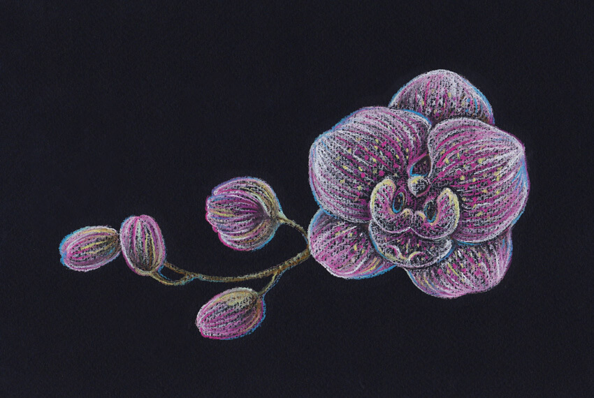
In this tutorial, I’ll show you how to draw an orchid. We will be using pastel pencils and black paper; this extraordinary combination of art supplies provides a broad space for experiments.
Orchids are wonderful, but drawing these flowers may seem challenging. I’ll show you an easy way to draw an orchid from scratch.
Our goal is to create a beautiful, expressive and emotional drawing, and have fun exploring the principles of making pastel sketches!
What You Will Need
Pastel pencils of different colors:
White
Light yellow
Light rosy
Pink
Dark violet
Blue
Light green
Medium green
Dark green
Brown
Grey
Black
And additional supplies:
Black pastel paper (smooth or with a subtle texture)
A graphite pencil
An eraser
A sharpener
1. How to Draw an Orchid With a Graphite Pencil
Step 1
In this part of the tutorial, I’ll show you how to draw an orchid from scratch, using a graphite pencil.
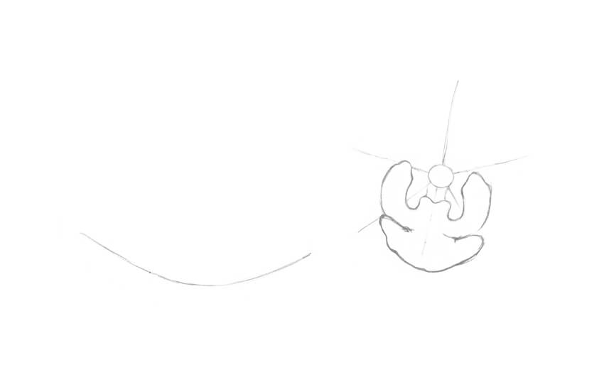
I mark the center of the flower with a small circle and add five divergent lines for the petal shapes. Then I draw a curved line to mark the core of the twig.
Step 2
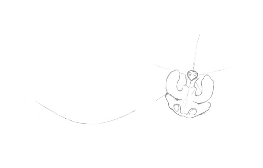
In the central part of the flower, I draw two small vertical shapes that look like narrow petals.
Step 3
I add the lower petal of the orchid; it is also called a lip.
Step 4
It’s time to add details. I refine the central structure of the orchid (known as a column) and add two tendril-like elements to the lip of the flower.
Step 5
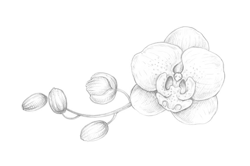
I add two large petals. The lines are slightly irregular; this way of drawing lines helps to emphasize the organic nature of the object.
Step 6
I mark the sepals, which are three petal-like structures of approximately equal size.
Step 7
I refine the twig, making it wider and adding the rough shapes of the buds.
Step 8
I outline the buds. They are facing in slightly different directions; this simple trick makes the floral composition more interesting.
Step 9
I draw a pattern of small circles on the orchid, and then add thin lines that mark the direction from the central point of the flower to the periphery. The flower looks more realistic now.
Step 10
I create a value sketch, marking the places in my drawing that I consider the darkest: under the top petals, between the details of the flowers, and at the sides of the buds.
With regard to working on black paper in future steps, this action becomes especially important. When we are drawing on a dark surface, we have to pay the most attention to the lightest and brightest areas of the drawing. That is why we need to know where they are beforehand.
2. How to Draw With Pastel Pencils
Step 1
It’s time to try our tools and observe how the pastel pencils and black paper work together.
I draw small hatches and dots. As you can see, the strokes look uneven and spontaneous; it’s a perfect fit for the expressive floral sketch.
Step 2
I create a basic hatching, varying the line width and the tilt of the pencil.
Step 3
I incline the pencil and cover the paper with a layer of color. Just relax your hand and make a continuous line with soft rubbing movements.
My paper has a subtle texture, so the result of applying pencil strokes looks fascinating.
Step 4
I draw the same type of a stroke that we’ve tried in the previous step and shade it with my finger. The colors of the pencil and the paper sheet are blending with a blurry effect.
You can also use additional supplies, such as special shading stumps or just an ordinary cotton bud. The choice is entirely up to you.
3. How to Draw an Orchid Twig With Pastel Pencils
Step 1
I outline the main contours of my drawing, trying to keep it visually close to the pencil sketch that I’m using as a reference. I leave very light lines with the grey pastel pencil.
In this step, you can change some elements of your composition if you wish to make your pastel drawing slightly different from the graphite pencil sketch.
Step 2
I apply soft strokes with the white pastel pencil to the orchid flower and buds. The lines are going from the center of the flower to the edges of its petals.
Step 3
I shade the white strokes with my finger. Avoid going outside the contours of the shapes because this will cause a messy effect.
Step 4
I add another layer of long hatches, using the white pencil.
Now we have a base for applying bright colors and creating the pattern of the flower.
Step 5
I add lines with the light rosy pastel pencil to the flower and buds.
Step 6
With the pink pastel pencil, I add more bright hatches and dots to reveal the pattern of the flower.
Step 7
To make the flower and the buds more contrasting, I add more hatches with the white color.
It’s important to work on your drawing gradually and press on the pencils lightly because pastel paper can hold only a limited amount of the color pigment.
Step 8
I mark the twig with the brown pastel pencil. To keep the color unity of the artwork, I also add brown strokes to the central part of the flower and the buds.
Step 9
I add dots and short hatches to the twig with the dark green pencil.
It is also a good idea to leave just a couple of hatches of this color within the buds’ shapes.
Step 10
I intensify the brightness of the orchid, using the pencil of the dark violet color.
The lines are visually blending with the existing pink and light rosy strokes, so the result looks vivid and colorful.
Step 11
It’s time to vary the coloring of the drawing. I add dots and hatches with the light yellow pencil.
The goal of this step is to set up the light accents and emphasize the pattern of the flower.
Step 12
I add more bright, illuminated spots, applying the light green color.
You may notice that the light colors of the pastel pencils look closer to the white color when you are drawing on a dark surface.
Step 13
To make the drawing feel aerial, I add strokes and outline the contours with the blue pencil.
Such nuances of a cool color work great in shady areas of the drawing.
Step 14
Using the black pastel pencil, I make the borders between the elements in my drawing more accurate.
I also strengthen the shadows in the area of the flower buds, giving the objects more volume and contrast.
Step 15
I use the white pencil once again to accent the details, especially in the central part of the orchid.
Step 16
I add bright nuances with the pencil of the medium green color, slightly touching the contours of the flower and the buds.
Such tiny details always help to make the drawing more vivid.
Step 17
I add more hatches with the light rosy pencil.
Step 18
I evaluate my drawing and accent the tips of the petals even more, using the white pencil.
Your Drawing Is Complete
Congratulations—you’ve created a beautiful artwork! I hope you’ve enjoyed the process of working with pastel pencils and black paper.
I wish you much success with this wonderful technique and your creative projects!
The Humanium Metal Initiative, developed in Sweden for IM Swedish Development Partner has won a Yellow Pencil for Good at the D&AD Awards. Humanium is a new material made of recycled metal from weapons destruction programs. The metal is melted and molded into certified units, and is now made available for commercial production. By using Humanium in their production, brands, artists and designers can help the world become a more peaceful place. With every Humanium product sold, new funds are generated to help support the victims, expand weapons destruction programs and rebuild conflict-torn societies. So far IM Swedish Development Partner has worked with weapons destruction programs in El Salvador and Guatemala, and started partnerships with watch manufacturer TRIWA, Swedish bike brand BIKEID, architectural firm Oscar Properties, design company Skultana and menswear company A Day’s March. See the Humanium Metal Initiative site online at humanium-metal.com.
Humanium Metal Certification
The Humanium Metal initiative is based on maintaining close involvement cooperation with public authorities and local organisations. The metal comes from seized firearms, in the control of relevant public authorities and cleared for destruction by competent legal representatives. Principles for agreed fair trade policies are applied in all levels of the operations, as formulated by the World Fair Trade Organisation. Technical specification of metal can be provided for each single batch of melted firearms, in accordance with the documentation handed out by the melting plant.
Humanium Metal Initiative Credits
The Humanium Metal Initiative was developed at Great Works and Akestam Holst by executive creative director Johan Pihl, creative directors Kalle Soderquist and Magnus Jakobsson, creatives Johan Ohrn, Karl Sundin, Kenna Magnusson, Magnus Magnusson, art director/designer Harald Hammar, copywriters Adam Reuterskiold, Fredrik Dahlberg, Randy Gosda, developers Alex Picha, Alexander Svensson, Cristoffer Overgaard, Kalle Peterz, Peter Norbeck, CTO Daniel Skantze, agency producer Julia Staberg, planner Kaj Bouic, photographers Erik Hagman and Johan de Verdier, client director Jacob Odqvist, and PR team Digge Zetterberg and Ida Persson.
The WordPress theme development business has become very competitive today and even Power Elite Authors at ThemeForest are thinking about their future. It is very hard to enter the market with the new product now. The authors have already experimented with prices and products, so the barrier entrance is incredibly high now.
Let me introduce you, Henry Rise, the owner of ThemeRex Power Elite Author account, sharing some valuable information about making a living in this sphere.
ThemeForest has become a much more challenging place to succeed in since 5 years ago. It has become more popular, so you’ll have to compete with thousands of other developers from all around the world. If you want to grow as an independent vendor, you’re going to have to spend a lot of money on advertising your products, something a lot of beginner developers can not afford. So if you don’t have the money, you should join a marketplace. That will give a chance to focus on making quality products instead of having to worry about marketing all the time. That was our way in 2013 and when we started ThemeRex. Since then, we have created 140+ WordPress themes and 35K sales.
Being an Exclusive or a Non-exclusive author.
The difference between an exclusive and a non-exclusive author is the amount of revenue they get from each sale. Envato much favors exclusive authors, which means they get paid more. The fees a non-exclusive author would have on their products could be up to 55% as opposed to 12.5% for exclusive products. So, being an exclusive author would generally be a better idea for a beginner as you would get more money per sale. You wouldn’t be able to sell the goods you have on Envato anywhere else, but again, if you’re a beginner, nobody knows about you and your things probably won’t get too many sales anyway. You would begin to get exposure being a non-exclusive author, but most beginners stick to getting as much money as possible per sale.
It has never been a question for us. Since the first day and until now we are making good money on selling exclusively to Envato. Moreover, there is simply no other point of selling your themes elsewhere. ThemeForest gives you the biggest relevant audience on the internet. The sales on other marketplaces can’t give you even nearly what ThemeForest is giving its users in terms of monthly sales.
The first step
The first step in anything is the most important one and quite often the most difficult one. In the case with Envato, it is getting your theme accepted to the marketplace. It will probably will be the hardest challenge you have to face at first as ThemeForest has a strict review protocol that pays close attention to the theme’s design and code. It must be unique, feature a clean visual hierarchy, readable typography, semantics and so on. I am not going to continue with a full list of requirements, but one thing you should know is that many authors get dozens of theme rejects before they get their first one accepted. So, a good idea would be to start out with something simple, like a PSD template or an HTML5 template. With that approach, you’ll be able to gain better understanding of ThemeForest’s design and code guidelines and pave your future works a way into the marketplace.
Funny story time. We uploaded a bunch of products on the first day. But you know how it goes – some get accepted first, some later and some never get through. You never know which ones will be the first to get accepted. So, our first theme was for a funeral bureau. Quite unexpected, but funny. We’re not superstitious, so we didn’t mind at all. It also brought us tons of sales!
Another thing a beginner should know is that there are lots and lots of authors on the marketplace. So, naturally, the support system is going to be very busy. So don’t get mad at the support staff for not answering your questions for a few days! Trust us, you’re not the only one. But as your skills grow and you gain exposure and start climbing the Envato Elite ladder, you gain perks. One of which is better, faster support. Being a Power Elite Author, your maximum response time would be 2-3 days. It might be a little frustrating at first, but you have to remember that the marketplace is a very, very crowded place.
The Pros and Cons of Selling on ThemeForest
Well, first of all, we should mention that working with a marketplace like this, you never have to worry about advertising your products. It just gets taken care of by the website, so you get exposure much easier and quicker than you would on your own.
You also become a part of a huge community and get a chance to talk to other developers just like yourself. You can share your experiences with each other and exchange some ideas which can be beneficial for each side. There are always people willing to put their time and effort into projects and you might as well collaborate with them for some mutual profits. Of course, that makes the marketplace quite crowded, so you’ll have to keep an eye on what people are up to if you want to get to the top and stay there.
Not only that, but Envato also exposes your products to possibly the largest relevant audience in the world. You get to meet new customers and help their businesses, while they help you with your bills.
It doesn’t happen that much nowadays simply due to the rapidly growing number of templates, but the marketplace used to help new themes get sold. They used to get significant promotion, which helped a lot of Power Elite Authors get their boost.
But this is not the place you want to stay in if you want to build your own brand. While joining the community is beneficial for you and the community itself, you become another author at the marketplace. And people don’t really care that much for names, for them your themes are just different ThemeForest templates. They only care about quality.
The authors get the authority to set their own prices for their products. You should be aware of the fact that lots of people choose to set the lowest possible price in exchange for more sales. That is a risky strategy, but it does work sometimes. But it can also affect the sales of other authors. People got used to buying cheap templates over time. Even though an average ThemeForest template costs less than one from most other template providers, the competition within the marketplace is still tough.
Envato has certain standards for the products. It is good for business because every author has to play by the rules and the customers get high-quality products. But there might be some tension with the WordPress community. The “war” days are over but you can still notice that theme providers split people into two types: those, who sell their products on Envato and those who work with resources like WordPress.org for their freemium model.
Now, you’re not going to get hate just because you’re working with ThemeForest, but a lot of WordPress nerds are always ready to express their opinion on the WP themes that are available on ThemeForest. They don’t think their quality stands up to their standards.
What About Promotion?
Even though you get pretty good exposure and a solid traffic-heavy platform to work on, new themes are being created every day and it becomes harder and harder to get noticed for beginners. When there weren’t that many templates around, Envato used to give a week-long boost for new themes. Even though the exposure is still decent today, that is not the case and if you want to earn more, you might want to consider getting additional promotion.
If you want to grow as a brand, being just another theme vendor on a marketplace won’t do. But nobody restricts you to being just that! While selling your products on a third party platform, you can always start your own website, blog or whatever, be active on social media and seek for customers. You should always seek for opportunities and new customers and, if you have the money, start ad campaigns and promote your business.
We have had a pretty nice experience with ThemeRex and never had any trouble with marketing issues. We have launched our own ThemeREX website and participated in the community life a little bit. But that’s it. Still, we got our Power Elite Author status and reached 35k+ sales. So, Envato can help you out quite a bit. But if you want to grow as a brand, a well thought-through marketing campaign is a must.
How to Be Successful
Rising in the ranks is always difficult, and so it was for us. There were already some big vendors who were getting a large portion of the profit in the business. But now the situation is way more saturated. There are thousands and thousands of developers willing to work at the marketplace. So, coming up with something unique gets harder and harder every day.
You could still get decent revenue as a beginner though. Whether you focus all your attention on singular perfect templates or produce dozens of themes of slightly lower quality weekly, work on multipurpose themes or niche templates, you will still find your audience. Our thing turned out to be micro-niche templates.
But instead of trying to invent something new, it would be much easier for you to concentrate on improving already existing concepts. Like widening the functionality of your themes. If your products can do more for the same price than your competitor’s ones, you’re likely to attract attention. You should analyze the situation on the market, learn all the needs of your customers and all the aspects of the most popular templates and come up with ideas that will improve them. Like, say, adding a loan calculator to an insurance agency theme. Handy, right?
You also should pay attention to the visual aspect of your products. No matter how well they perform and how many functions your themes have, they are not going to get noticed if they look generic or unattractive.
Conclusion
Being a success on ThemeForest got harder than it used to be, but you can still come on top. So, the things you will need to do are:
Develop a strategy for your business
Learn the marketplace and other vendors
Come up with original ideas or ideas that bring something new to already existing concepts
Make sure your products’ visual aspect is as good as their functionality
Run a marketing campaign to gain exposure and get customers (optional)
I hope this article was at least of some help to you and showed you the general idea of how to profit at a marketplace. I wish you luck. And be sure to tell me and the community about your own experiences with ThemeForest in the comment section, I appreciate all the feedback you leave as it always helps to improve. If you have some personal questions, just reach out and ask. Wish you many sales.